Paulemann Vital packaging
Paulemann Vital specializes in health and nutritional supplements for fitness-focused consumers, utilizing a diverse packaging approach that incorporates both rigid and flexible formats. Their packaging strategy emphasizes clean branding, practical structures, and product protection throughout the supply chain.
Packaging Portfolio
Paulemann Vital employs a blend of rigid plastic containers for powders and capsules, flexible stand-up pouches for protein blends, and branded stationery kits for added value. Packaging materials emphasize durability, with food-grade plastics ensuring product safety and shelf life. Design structures feature wide-mouth openings for ease of use and resealable closures on pouches for portion control and freshness. Labels are highly legible, incorporating nutritional data and brand elements in bold, contrasting colors to support regulatory compliance and consumer trust.
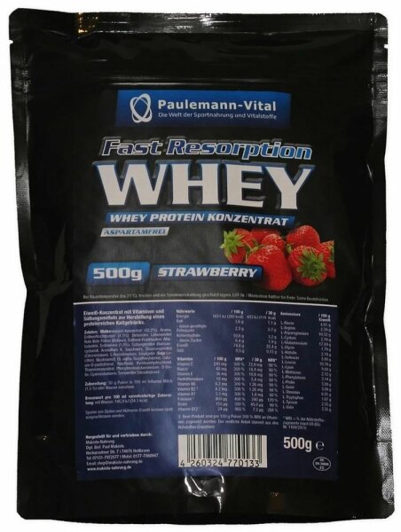
The packaging is a flexible pouch made from a multi-layer film that is typically used for food products. It features a glossy finish with vibrant colors, primarily black and blue, and includes images of strawberries. The front displays the product name 'Fast Resorption WHEY' prominently in bold white letters, along with the weight of 500g. The back of the pouch contains detailed nutritional information and usage instructions, printed in smaller text. The edges of the pouch are sealed, and there is a tear notch at the top for easy opening.
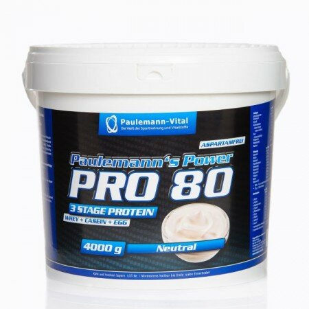
The packaging is a round, white plastic bucket with a prominent lid. The body of the bucket is smooth and features a large label that wraps around the container. The label is predominantly blue and black, with white text. The lid is flat and has a slight lip, indicating a snap-on closure. The overall shape is cylindrical, and the bucket is designed to hold a significant volume, likely for bulk storage.
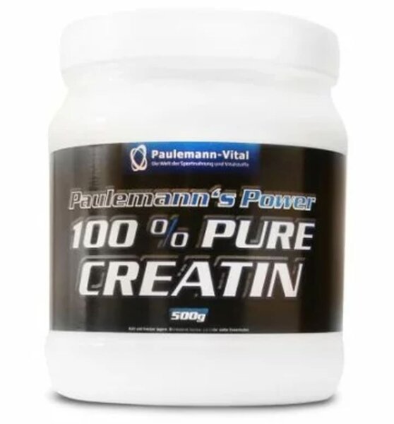
The packaging is a cylindrical plastic container with a wide mouth and a screw-on lid. It features a smooth surface with a glossy finish. The container is predominantly white with a black label that wraps around its body. The label includes bold text and a logo, indicating the product name and weight.
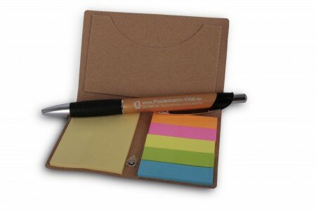
The packaging consists of a folded holder made from a smooth, brown kraft paper material. It features a pocket on one side for holding sticky notes and a pen. The holder is designed to be compact and portable, with clean edges and a simple, functional layout. The interior showcases a set of colorful sticky notes in various shades, arranged neatly alongside a black pen. The overall appearance is minimalistic and practical, suitable for office or personal use.
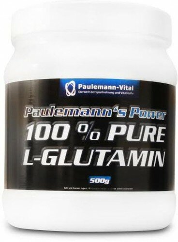
The packaging is a cylindrical plastic container with a wide mouth and a screw-on lid. The container is predominantly white with a black label wrapped around its midsection. The label features bold text stating 'Paulemann's Power 100% PURE L-GLUTAMIN' in a combination of white and silver colors. The container has a smooth surface with no visible fluted layers, indicating it is not corrugated or carton. The overall appearance is clean and professional, suitable for dietary supplements.
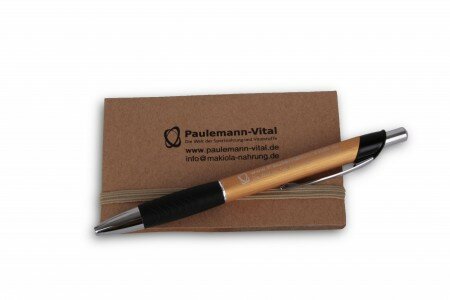
The packaging consists of a kraft-colored notebook with a smooth, flat surface and a pen placed on top. The notebook appears to be made of a single layer of paperboard, characterized by clean edges and a simple design. The pen is a standard ballpoint pen with a wooden barrel and a black grip. The notebook has a subtle elastic band around it, indicating a closure feature.
About the Brand
Paulemann Vital offers a comprehensive portfolio of dietary supplements and fitness products targeting health-conscious individuals in Germany and beyond. The company employs a packaging strategy that prioritizes product integrity and clear communication of nutritional information.
With a B2C e-commerce model, Paulemann Vital focuses on the efficient delivery of sports nutrition products, leveraging packaging formats such as rigid plastic containers, flexible pouches, and branded stationery kits for added brand touchpoints. The packaging consistently features prominent labeling, bold brand visuals, and design choices aligned with the sports nutrition segment.
Key Differentiator: Paulemann Vital’s packaging is distinguished by its bold, functional aesthetic and emphasis on both product protection and clear, accessible information, directly reinforcing the brand’s credibility in the competitive health supplements market.
Design System
Visual Style
Uses sans-serif typography for clarity and modern appeal, bold color palettes dominated by black, blue, and white, and a minimalistic, functional layout that emphasizes product information.
Brand Identity
Brand logo and company name are consistently applied across all packaging formats. Iconography is limited, focusing on text-based communication and nutritional highlights. Visual consistency is maintained through uniform label structures and color codes by product line.
Packaging Design
Material choices prioritize rigid plastics for core product protection and flexible multi-layer films for space and weight efficiency. Structural designs are pragmatic, favoring wide-mouth containers and resealable pouches to ensure product security and consumer convenience.
User Experience
Packaging is optimized for e-commerce logistics and rapid fulfillment. The design facilitates easy product identification, opening, and resealing, supporting a frictionless customer journey while reinforcing the brand’s professional, trustworthy image.
Company Metrics
Business insights for Paulemann Vital based on available data
Market Positioning
Brand Values & Focus
Key Competitors
Target Market: Fitness enthusiasts, athletes, and health-conscious consumers in Germany and the broader European market seeking reliable nutritional supplements.
Packaging Assessment
Overall Grade
Visual appeal and presentation quality
Packaging durability and protection
Eco-friendliness and recyclable materials
Cost efficiency and value for money
Packaging assessment for Paulemann Vital based on industry standards and best practices
Frequently Asked Questions
What types of packaging does Paulemann Vital use for their supplements?
Paulemann Vital utilizes rigid plastic containers with screw lids for powders and capsules, as well as flexible multi-layer pouches for products like whey protein. The packaging is designed to ensure product freshness, durability, and clear branding.
How does Paulemann Vital address sustainability in packaging?
While the company primarily uses plastic-based packaging for product protection and barrier properties, there is limited evidence of significant sustainability initiatives such as recyclable materials or reduced plastic content. The use of kraft paper in branded stationery suggests some consideration for eco-friendly materials in secondary packaging.
Is the unboxing experience a priority in Paulemann Vital’s packaging strategy?
The unboxing experience is functional and professional, focusing on clear labeling and straightforward access to products. Emotional impact and premium presentation are not primary focuses, but the packaging is appropriate for the sports nutrition sector.
Discover other Health companies
Explore more companies in the health industry and their packaging strategies
Comvita
Health
Comvita is a New Zealand-based company specializing in high-quality Mānuka honey and natural health products. Established in 1974, it aims to connect people with the healing power of nature.
Bio-Synergy
Health
Bio-Synergy is a UK-based company specializing in health and fitness products, including nutritional supplements and DNA testing kits. Their mission is to support individuals in achieving their health and fitness goals through innovative products and personalized insights.
Doctor Seaweed
Health
Doctor Seaweed specializes in natural, plant-based nutritional supplements derived from seaweed, aimed at promoting overall wellness.