Omega Equine packaging
Omega Equine specializes in equine nutritional supplements and health products, utilizing a packaging strategy centered on premium branding and functional formats. Their packaging combines robust materials and equine-focused visuals to enhance product security and brand recognition.
Packaging Portfolio
Omega Equine employs a packaging portfolio dominated by stand-up pouches made from multi-layer flexible plastics and composite materials, often with foil or matte finishes to enhance shelf presence and product protection. These pouches are typically resealable, supporting both product freshness and consumer convenience. For certain products, rigid black plastic jars with screw-top lids are used, offering superior moisture and tamper resistance. The packaging structure and material selection reflect a prioritization of durability, logistics safety, and strong visual branding, aligning with industry standards for animal health and supplement products.
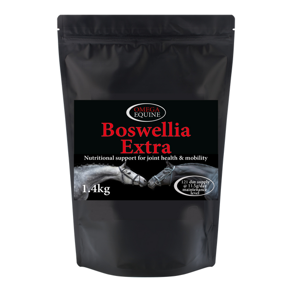
The packaging is a stand-up pouch made from a flexible material, likely a composite of plastic and foil, allowing it to maintain its shape when filled. The pouch features a matte black exterior with a glossy finish on the front, showcasing the product name and branding. The top of the pouch is sealed, and it includes a tear notch for easy opening. The design is sleek and modern, with a clear window on the front to display the product inside.

The packaging is a stand-up pouch made from a multi-layer material that appears to be a combination of plastic and possibly a paper layer for added strength. The front features a large, high-resolution image of two horses, which is visually striking and relevant to the equine market. The background is predominantly black, providing a strong contrast to the white and colored text. The product name 'Omega Rice' is prominently displayed in bold white letters, with additional descriptive text below. The bag has a flat bottom, allowing it to stand upright, and is sealed at the top, likely with a heat seal.
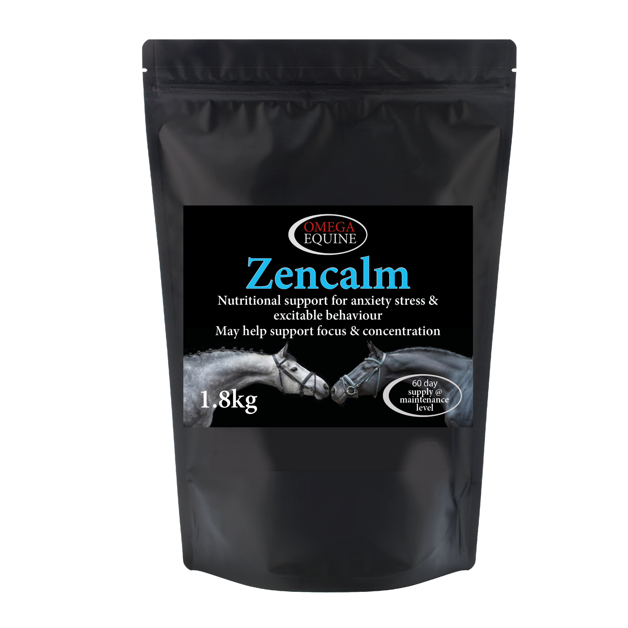
The packaging is a stand-up pouch made from a flexible material that allows it to maintain an upright position. It features a glossy black exterior with a matte finish on the front panel. The front displays a large label with the product name 'Zencalm' prominently featured. The design includes images of horses, enhancing its appeal to equine customers. The top of the pouch has a resealable zipper closure, which is practical for maintaining product freshness.

The packaging is a stand-up pouch made from a flexible material, likely a composite of plastic and foil. It features a black exterior with a glossy finish, giving it a premium appearance. The front displays a large label with a vibrant green font for the product name 'ComfortSkin,' accompanied by a graphic of two horses' heads. The overall design is clean and modern, emphasizing the product's nutritional benefits.

The packaging is a round, opaque black plastic jar with a screw-on lid. The jar has a smooth surface with a matte finish. The label wraps around the jar, featuring a glossy finish with vibrant colors and images of horses' hooves. The text is clear and legible, with a prominent brand name at the top.
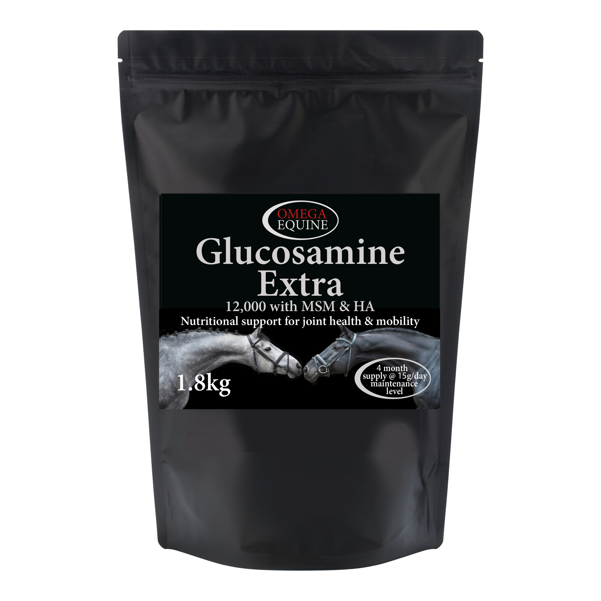
The packaging is a stand-up pouch made from a flexible material that allows it to maintain an upright position. It features a black exterior with a matte finish, providing a sleek and professional appearance. The front of the pouch displays product information prominently, including the product name 'Glucosamine Extra' in bold white font. Below the product name, there is a description of the product's benefits, and the weight is indicated as '1.8kg'. The design includes a graphic of two horses, which adds a visual element related to the equine theme. The top of the pouch has a resealable closure, which is a practical feature for maintaining freshness.
About the Brand
Omega Equine is a UK-based provider of horse supplements and health products with a focus on scientifically formulated solutions and direct-to-consumer sales. Their packaging approach integrates stand-up pouches and jars, prioritizing both product integrity and brand alignment.
The brand leverages over three decades of research and operates its own accredited manufacturing facility, enabling tight quality control across both product and packaging. Omega Equine's packaging is designed not just for durability and protection but also for visual impact, utilizing high-contrast color schemes and equine imagery to appeal to horse owners and riders. The use of resealable pouches and robust plastic jars reflects a balance between user convenience and logistical safety.
Key Differentiator: Omega Equine’s unique differentiator lies in the combination of accredited in-house manufacturing, consistent equine-themed design language, and packaging formats that directly address the needs of the equestrian market.
Design System
Visual Style
Omega Equine’s packaging design utilizes bold sans-serif typography, a primarily black color palette with white and accent colors for differentiation, and high-resolution photographic imagery of horses to reinforce product relevance and category cues.
Brand Identity
The Omega Equine logo is consistently placed on the front-facing panel, with strong use of equine iconography and clear product naming. Visual consistency is maintained through uniform label layouts, recurring imagery, and a standardized information hierarchy.
Packaging Design
The brand favors multi-layer flexible packaging (stand-up pouches) and rigid plastic jars, chosen for durability, product protection, and resealability. Structural design prioritizes upright display, space efficiency, and resistance to moisture or tampering, essential for supplement longevity.
User Experience
Packaging is user-centric, featuring resealable closures for ease of use and information-rich labels for clear dosing instructions. The visual hierarchy aids quick identification of product type and benefits, supporting both first-time and repeat purchase journeys.
Company Metrics
Business insights for Omega Equine based on available data
Market Positioning
Brand Values & Focus
Key Competitors
Target Market: Leisure and professional equestrians, horse owners, and competitive riders across the UK seeking high-quality nutritional supplements and health products for horses.
Packaging Assessment
Overall Grade
Visual appeal and presentation quality
Packaging durability and protection
Eco-friendliness and recyclable materials
Cost efficiency and value for money
Packaging assessment for Omega Equine based on industry standards and best practices
Frequently Asked Questions
What types of packaging formats does Omega Equine use for its supplements?
Omega Equine primarily utilizes stand-up pouches with resealable closures for powders and granules, complemented by rigid plastic jars for certain products. These formats are chosen for their product protection, resealability, and suitability for bulk contents.
How does Omega Equine address sustainability in its packaging?
Omega Equine’s packaging incorporates some recyclable materials, though the primary use of composite plastics and foils limits overall eco-friendliness. The resealable and durable nature of their packaging supports product longevity, but further adoption of sustainable materials could improve their environmental impact.
Does Omega Equine’s packaging align with its premium brand positioning?
Yes, the visual design features high-resolution equine imagery, a consistent black color palette, and prominent branding elements, all of which reinforce the brand’s premium positioning within the equine supplements market.
Discover other Pets & Animals companies
Explore more companies in the pets & animals industry and their packaging strategies
My Furbaby
Pets & Animals
My Furbaby provides premium, NZ-made dog food and pet essentials delivered directly to customers' doors, ensuring pets receive the best nutrition while supporting sustainability.
Natural Trail
Pets & Animals
Natural Trail produces high-quality dry and wet food for dogs and cats, focusing on their natural dietary needs. The company is committed to providing pet owners with nutritious and delicious meal options made from carefully selected ingredients.
MisterMax
Pets & Animals
MisterMax specializes in textile care products and services, focusing on cleaning, stain removal, and odor control solutions for various fabrics and environments.