nomoo packaging
Nomoo specializes in vegan ice cream and frozen desserts, leveraging a direct-to-consumer model and strategic retail partnerships. Their packaging approach integrates branded rigid containers and corrugated shipping boxes, emphasizing both product integrity and environmental sustainability.
Packaging Portfolio
Nomoo employs a packaging portfolio centered on rigid cylindrical paperboard containers for ice cream, providing both visual shelf appeal and structural integrity. Retail cartons utilize single-layer paperboard with glossy finishes, while corrugated kraft shipping boxes ensure product safety during frozen transport. Branding is consistently applied across all formats, with bold typography and vibrant colors that enhance product differentiation. The overall approach balances branding impact, protection for frozen logistics, and a strong commitment to recyclable materials.

The packaging consists of a cylindrical container with a removable lid. The container is made of thick chipboard, providing a sturdy and premium feel. The exterior features a vibrant yellow color with abstract design elements, while the lid is a contrasting pink. The brand name 'NOMOO' is prominently displayed on the front in bold, modern typography. The overall design is clean and appealing, suggesting a focus on quality and aesthetics.
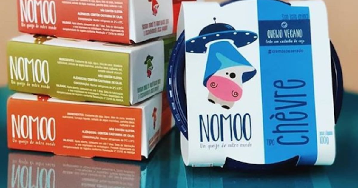
The packaging consists of a folding carton made from single-layer paperboard. It features a smooth, flat construction with clean edges and folds. The carton is predominantly white with colorful graphics, including a blue and green design that incorporates a cartoon cow and a UFO motif. The overall appearance is vibrant and eye-catching, suitable for retail display.
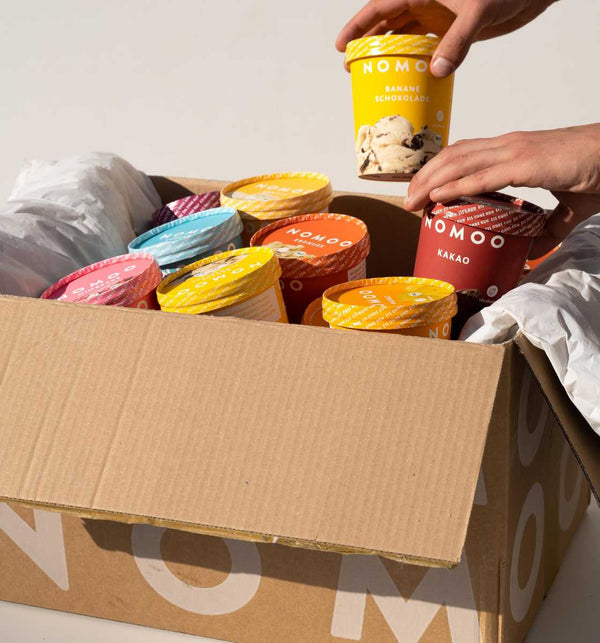
The packaging is a corrugated box with a visible fluted inner layer, featuring a brown kraft exterior. The box is open at the top, revealing several ice cream containers inside. The edges of the box are slightly crushed, indicating handling. The box has a clean, sturdy construction suitable for shipping, with visible corrugated edges when viewed from the side.
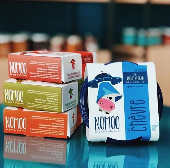
The packaging consists of multiple retail cartons stacked vertically, with a prominent rigid box in the foreground. The cartons are made of smooth, single-layer paperboard, featuring clean edges and precise folds. The colors are vibrant, with shades of red, green, and blue. The rigid box has a thicker construction, providing a premium feel. Each carton displays clear branding elements and product information, with a glossy finish enhancing the visual appeal.

The packaging is a cylindrical container with a removable lid. The exterior features a vibrant pink color with abstract designs in various shades, including white and dark blue. The brand name 'NOMOO' is prominently displayed in a bold, modern font on the front. The lid is a solid gray color, contrasting with the colorful body. The container is designed to hold ice cream, suggesting a sturdy construction to maintain shape and protect contents.
About the Brand
Nomoo is a Cologne-based vegan ice cream company focused on sustainable production and high-quality plant-based ingredients. Their packaging aligns with their commitment to eco-friendly practices, utilizing recyclable paperboard and corrugated materials across retail and shipping formats.
Operating since 2018, Nomoo delivers its frozen desserts directly to consumers and through major German retailers. The company employs a multi-channel distribution strategy that relies on robust, visually distinctive packaging to enhance both product protection and brand recognition. Packaging choices reflect an emphasis on recyclability, durability, and consistent visual branding to appeal to health-conscious, environmentally aware customers.
Key Differentiator: Nomoo differentiates itself through a holistic integration of sustainability in both product and packaging strategy, featuring custom-branded, recyclable rigid containers and secure shipping solutions tailored for frozen delivery.
Design System
Visual Style
Nomoo’s packaging features bold, modern typography and a dynamic color palette with vibrant hues (yellows, pinks, blues, greens) that align with a playful, contemporary aesthetic. Flat graphic elements and abstract motifs reinforce visual impact and shelf standout.
Brand Identity
Logo is prominently displayed on all packaging, with high visual consistency across formats. Iconography is minimal, focusing on flavor cues and brand recognition. Packaging maintains strict adherence to brand colors and typefaces for cohesive identity.
Packaging Design
Material selection prioritizes recyclable paperboard and corrugate, with rigid structures for ice cream containers and robust shipping boxes for D2C logistics. The design philosophy emphasizes both protection and minimal environmental footprint, with minimal plastic use.
User Experience
Packaging supports a positive customer journey through easy-to-open structures, visually engaging unboxing, and clear product information. Design choices reinforce the brand’s sustainable ethos and deliver a premium experience from purchase to consumption.
Company Metrics
Business insights for nomoo based on available data
Market Positioning
Brand Values & Focus
Key Competitors
Target Market: Health-conscious and environmentally aware consumers seeking premium vegan frozen desserts in Germany and surrounding European markets.
Packaging Assessment
Overall Grade
Visual appeal and presentation quality
Packaging durability and protection
Eco-friendliness and recyclable materials
Cost efficiency and value for money
Packaging assessment for nomoo based on industry standards and best practices
Frequently Asked Questions
What types of packaging does Nomoo use for its ice cream products?
Nomoo primarily utilizes rigid cylindrical paperboard containers with vibrant branding for its ice cream, complemented by corrugated shipping boxes designed for frozen logistics. Retail cartons and specialized formats are used for varied product lines.
How does Nomoo address sustainability in its packaging?
Nomoo’s packaging strategy prioritizes eco-friendly materials, such as recyclable paperboard and kraft corrugate, and minimizes plastic use, aligning with their broader environmental and sustainability commitments.
Is Nomoo’s packaging optimized for direct-to-consumer delivery?
Yes, packaging is designed for durability and insulation, ensuring frozen products arrive intact while maintaining a visually appealing unboxing experience for online customers.
Discover other Food & Drink companies
Explore more companies in the food & drink industry and their packaging strategies
Terres de Café
Food & Drink
Terres de Café is a specialty coffee retailer based in Paris, France, known for its commitment to sustainability and high-quality coffee sourcing.
Teegschwendner GmbH
Food & Drink
Teegschwendner GmbH is a specialty tea company based in Germany, offering a wide selection of high-quality teas and tea-related accessories. They focus on providing unique tea experiences through carefully sourced and curated products.
ruf lebensmittelwerk kg
Food & Drink
RUF Lebensmittelwerk KG is a German food production company specializing in a variety of baking mixes and drink products. Founded in 1920, the company is known for its high-quality ingredients and innovative food solutions.