nikura packaging
Nikura is a UK-based provider of essential and fragrance oils with a strong focus on quality and ethical standards. Their packaging strategy utilizes branded retail cartons and premium rigid boxes, reflecting a modern, sustainability-conscious approach in the beauty and wellness sector.
Packaging Portfolio
Nikura’s packaging portfolio includes single-layer carton boxes for essential oils, rigid boxes for premium gift sets, and corrugated cartons for shipping. The use of pastel gradients and abstract patterns provides strong shelf presence, while the sturdy construction of rigid boxes enhances perceived product value. Corrugated outer cartons are employed for logistics safety, indicating attention to both retail and e-commerce requirements. The consistent brand identity and choice of recyclable paper-based materials align with current trends in sustainable beauty packaging.

The image shows a corrugated shipping box that is partially opened, revealing several retail cartons inside. The shipping box is made of layered brown kraft corrugated cardboard, showing visible fluted edges when viewed from the side. The inner cartons are neatly arranged and feature a smooth, flat construction. The shipping box has a sturdy design suitable for shipping, with visible tape securing the flaps. The inner cartons are designed with a pastel color scheme, featuring soft gradients and the brand name 'NIKURA' prominently displayed.
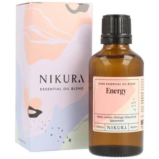
The packaging is a tall, narrow carton with a smooth, flat construction. It features a colorful design with abstract shapes in pastel colors, predominantly pink, orange, and beige. The edges are clean and precise, indicative of a folding carton. The front displays the product name 'Energy' prominently, along with a description of the essential oil blend. The overall appearance is lightweight and retail-friendly, suitable for display on shelves.

The packaging consists of a tall, rectangular carton with a smooth, flat construction. The exterior features a pastel color palette with abstract shapes in pink, blue, and cream. The front of the carton displays a white label with black text indicating the product name 'Lavender French' and additional details about the essential oil. The edges are clean and precise, with no visible fluted layers, indicating it is made from a single-layer paperboard. The carton is designed to hold a glass bottle of essential oil, which is visible through a cut-out window on the front.

The packaging is a rigid box with a premium appearance, featuring thick walls and a decorative exterior. The box is designed with a colorful abstract pattern that includes pastel shades of blue, pink, and green. The brand name 'NIKURA' is prominently displayed in a bold, modern font at the center of the box's front face. The edges are clean and precise, indicating high-quality construction.

The packaging consists of a tall, rectangular carton box that houses a glass bottle of fragrance oil. The box features a smooth, flat construction with clean edges and folds, indicative of single-layer paperboard. The exterior is primarily white with a pastel gradient design that transitions from soft pink to light blue. The front of the box displays a label with product information, including the name 'Lady Millionaire' in bold black font, accompanied by a diamond graphic and a warning symbol. The overall appearance is sleek and modern, suitable for retail display.
About the Brand
Nikura specializes in natural essential oils and fragrance oils, employing a D2C business model that prioritizes quality and customer satisfaction. The company's packaging is designed for both retail display and secure shipping, leveraging visually distinctive materials and structures to enhance brand perception.
Founded in London, Nikura hand-bottles its products in the UK and aligns its packaging with its vegan, cruelty-free, and sustainability values. With a boutique team, Nikura's packaging solutions are tailored for both the logistics of e-commerce and the expectations of a discerning wellness audience. The brand emphasizes recyclable materials and clean, modern designs, supporting both product protection and shelf appeal.
Key Differentiator: Nikura differentiates itself through its consistent use of branded, pastel-themed packaging that reinforces its ethical and wellness-focused brand, combined with a UK-based, small-batch production model.
Design System
Visual Style
Nikura utilizes clean sans-serif typography paired with a pastel color palette including pinks, blues, and creams for a modern, approachable aesthetic. Abstract patterns and gradients reinforce a soft, wellness-oriented visual tone.
Brand Identity
The NIKURA logo is prominently featured on all packaging, supported by consistent use of product labels and occasional iconography such as symbols denoting product type or warnings. Visual consistency is maintained across product categories, enhancing brand recognition.
Packaging Design
Packaging materials prioritize paperboard and cardboard for cartons and rigid boxes, balancing durability with recyclability. Structural design is minimalist yet robust, with precise folds and clean edges that support both product protection and display quality.
User Experience
The design supports a positive customer journey through easy-to-open structures, visually appealing unboxing, and clear product identification. The focus on color and branding ensures emotional engagement while maintaining functional efficiency.
Company Metrics
Business insights for nikura based on available data
Market Positioning
Brand Values & Focus
Key Competitors
Target Market: Health-conscious and wellness-oriented consumers in the UK and Europe seeking high-quality, natural, and ethically sourced beauty products.
Packaging Assessment
Overall Grade
Visual appeal and presentation quality
Packaging durability and protection
Eco-friendliness and recyclable materials
Cost efficiency and value for money
Packaging assessment for nikura based on industry standards and best practices
Frequently Asked Questions
What types of packaging does Nikura use for its products?
Nikura uses a combination of branded carton boxes, rigid luxury gift boxes, and corrugated shipping cartons. These packaging formats are designed to balance retail presentation, product protection, and sustainability.
How does Nikura address sustainability in its packaging?
Nikura emphasizes recyclable materials and minimalistic, lightweight designs to reduce environmental impact. Their packaging aligns with their vegan and cruelty-free product ethos, although the use of rigid boxes for gift sets suggests a premium, less resource-efficient element.
What is the visual design approach of Nikura’s packaging?
Nikura employs a modern aesthetic with pastel color gradients, clean typography, and prominent logo placement. This visual approach is consistent across product lines, supporting both brand recognition and retail impact.
Discover other Beauty & Fitness companies
Explore more companies in the beauty & fitness industry and their packaging strategies
Owari
Beauty & Fitness
Owari specializes in 100% natural beauty and fitness products, designed to enhance health and wellness. The company proudly offers its products made in France, emphasizing quick delivery and customer support.
Orris Paris
Beauty & Fitness
Orris Paris specializes in creating artisanal skincare products that combine potent botanical ingredients with modern cleansing rituals. The company emphasizes natural, holistic practices in its formulations.
Institut Karité Paris
Beauty & Fitness
Institut Karité Paris specializes in luxury beauty products made with natural Shea Butter, offering a wide range of skincare and body care solutions. The brand combines Parisian heritage with a commitment to quality and creativity in its offerings.