Neve Cosmetics packaging
Neve Cosmetics is an Italian beauty brand specializing in makeup and skincare, recognized for its ethical, cruelty-free formulations. Their packaging employs visually striking designs and robust structures, aligning with brand values and enhancing product presentation.

Packaging Portfolio
Neve Cosmetics' packaging portfolio comprises rigid chipboard boxes with iridescent or matte finishes for palettes, folding carton boxes with glossy surfaces and playful graphics for accessories, and clear plastic jars for mineral makeup. The brand maintains high visual uniformity by consistently displaying logos and employing bold, colorful designs. Structural choices prioritize product protection and presentation, while the material mix of paperboard and plastics reflects a balance between durability and sustainability. The overall approach is tailored for retail and e-commerce, optimizing for both shelf impact and shipping resilience.
The packaging is a sturdy, rectangular box designed to hold cosmetics, featuring a thick, premium construction. The box has a smooth, matte surface with a luxurious feel. It is predominantly black with gold lettering, which gives it an elegant appearance. The edges are clean and precise, with no visible fluting, indicating it is made from chipboard rather than corrugated material. The box is likely to have a magnetic closure or a tuck flap, ensuring secure closure. There are no visible signs of wear or damage, indicating it is in excellent condition.
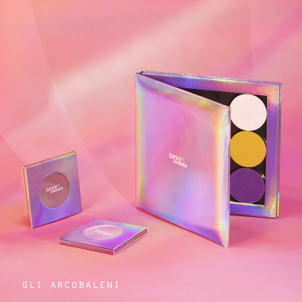
The packaging consists of a thick, sturdy box with a luxurious appearance, featuring an iridescent finish that reflects light in various colors. The box is designed to hold three cosmetic pans securely, with a smooth, flat exterior and clean edges. The interior is likely designed to accommodate the pans snugly, ensuring they do not move during handling.
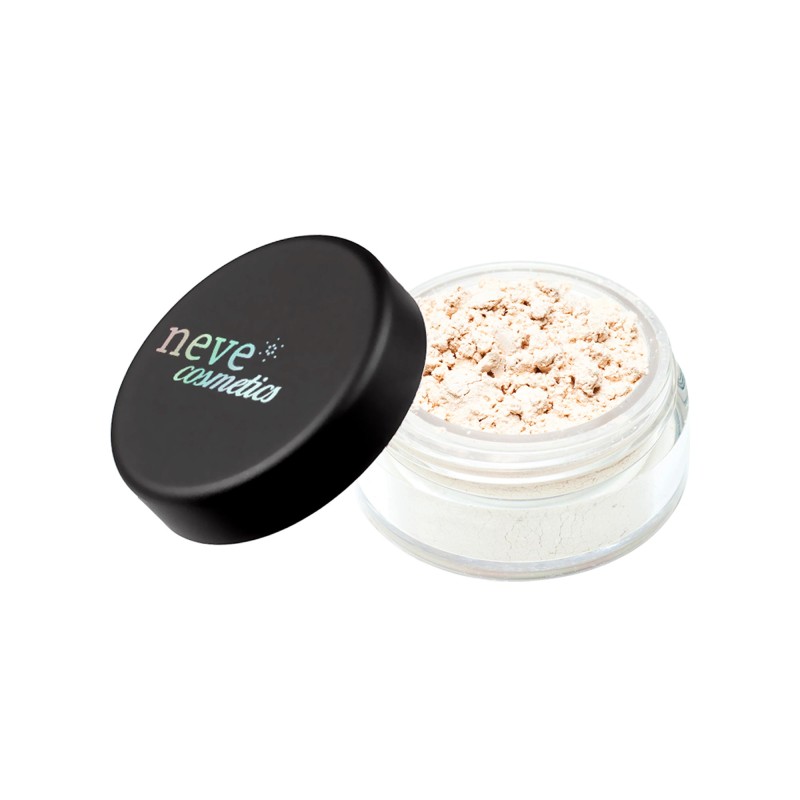
The packaging consists of a clear plastic jar with a black screw-on lid. The jar is cylindrical in shape and has a smooth surface. The lid features a matte finish, while the jar itself is transparent, allowing visibility of the product inside. The jar is filled with a loose powder, which is visible through the clear material. The overall appearance is sleek and modern, suitable for cosmetic products.
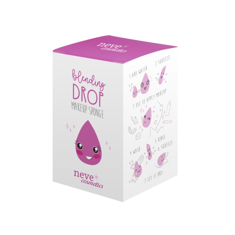
The packaging is a folding carton made of smooth, single-layer paperboard. It features a rectangular shape with a tapered top. The exterior is predominantly white with a vibrant pink top panel. The design includes playful graphics of a water droplet character and step-by-step instructions for using the makeup sponge. The edges are clean and precise, indicating a well-constructed carton. The surface has a glossy finish, enhancing the visual appeal.
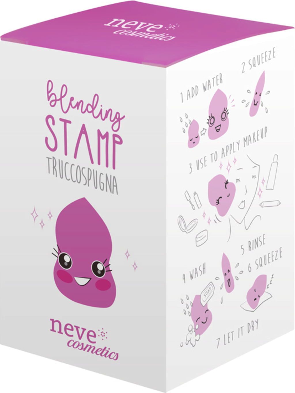
The packaging is a folding carton made of smooth, single-layer paperboard. It features a colorful design with a predominantly white background and a vibrant purple top. The edges are clean and precise, indicating a well-constructed fold. The front displays playful graphics of a makeup sponge character and step-by-step instructions for use, enhancing its appeal. The overall shape is rectangular with a slightly tapered top, typical for retail packaging.
About the Brand
Neve Cosmetics delivers a comprehensive range of makeup and skincare products, emphasizing natural ingredients and cruelty-free standards. The brand's packaging strategy reflects its commitment to high-quality presentation and strong visual identity, utilizing rigid boxes, folding cartons, and cosmetic jars tailored for both protection and shelf appeal.
Operating with a direct-to-consumer model, Neve Cosmetics leverages vibrant and innovative packaging to distinguish its product lines. The use of premium rigid boxes for palettes, detailed cartons for accessories, and clear jars for mineral makeup demonstrates a consistent focus on customer experience and brand impact. Sustainability is addressed through selective material choices, though some use of plastics remains prevalent in certain formats.
Key Differentiator: Neve Cosmetics stands out for its integration of playful, colorful packaging with ethical product positioning—creating a strong visual brand presence while appealing to conscious beauty consumers.
Design System
Visual Style
Typography is predominantly modern sans-serif, paired with a vibrant color palette featuring pinks, purples, and iridescent accents. The overall aesthetic is playful yet sophisticated, emphasizing clarity and visual excitement.
Brand Identity
Brand elements include prominent logo placement, consistent use of the 'neve' typeface, and illustrative iconography. Visual consistency is maintained across packaging types through coordinated color schemes and recurring graphics.
Packaging Design
Material selection favors rigid chipboard for premium formats and single-layer paperboard for cartons, with some use of clear plastics for product visibility. Structural design focuses on secure closure mechanisms and product stability during handling and transit.
User Experience
Packaging is designed to support an engaging customer journey—from first impression through unboxing—by maximizing visual appeal, clarity of information, and tactile quality. Instructions and playful elements further enhance usability and reinforce brand engagement.
Company Metrics
Business insights for Neve Cosmetics based on available data
Market Positioning
Brand Values & Focus
Key Competitors
Target Market: Conscious beauty consumers seeking cruelty-free, vegan, and visually creative makeup and skincare products in the European and international markets.
Packaging Assessment
Overall Grade
Visual appeal and presentation quality
Packaging durability and protection
Eco-friendliness and recyclable materials
Cost efficiency and value for money
Packaging assessment for Neve Cosmetics based on industry standards and best practices
Frequently Asked Questions
What types of packaging does Neve Cosmetics use for its products?
Neve Cosmetics utilizes a mix of rigid boxes for palettes, folding cartons for accessories, and clear plastic jars for loose mineral products. These formats are selected for durability, shelf appeal, and alignment with brand aesthetics.
How does Neve Cosmetics address sustainability in its packaging?
While the brand incorporates recyclable paperboard for many cartons, some packaging elements—such as plastic jars—indicate room for improvement in reducing environmental impact and increasing the use of sustainable materials.
How does Neve Cosmetics’ packaging support its brand identity?
Packaging consistently features the Neve Cosmetics logo, vibrant colors, and playful graphics, reinforcing the brand’s focus on creativity, ethical values, and consumer engagement.
Discover other Beauty & Fitness companies
Explore more companies in the beauty & fitness industry and their packaging strategies
Orris Paris
Beauty & Fitness
Orris Paris specializes in creating artisanal skincare products that combine potent botanical ingredients with modern cleansing rituals. The company emphasizes natural, holistic practices in its formulations.
Institut Karité Paris
Beauty & Fitness
Institut Karité Paris specializes in luxury beauty products made with natural Shea Butter, offering a wide range of skincare and body care solutions. The brand combines Parisian heritage with a commitment to quality and creativity in its offerings.
Owari
Beauty & Fitness
Owari specializes in 100% natural beauty and fitness products, designed to enhance health and wellness. The company proudly offers its products made in France, emphasizing quick delivery and customer support.