Natural Women Care packaging
Natural Women Care specializes in dietary supplements tailored for women's health, leveraging a direct-to-consumer business model. Their packaging strategy prioritizes clean, modern aesthetics and strong brand consistency, utilizing rigid plastic containers and clearly branded labels to enhance shelf presence and consumer trust.
Packaging Portfolio
Natural Women Care employs a portfolio of rigid plastic bottles, jars, and cylindrical containers, all featuring screw-on caps for product integrity. Labels utilize a white and pink color palette, matte or glossy finishes, and minimalist typography for clear communication. The packaging is optimized for retail shelf display and D2C logistics, emphasizing visual cohesion and brand recognition. While materials meet industry standards for supplement protection, advanced eco-friendly innovations are limited.
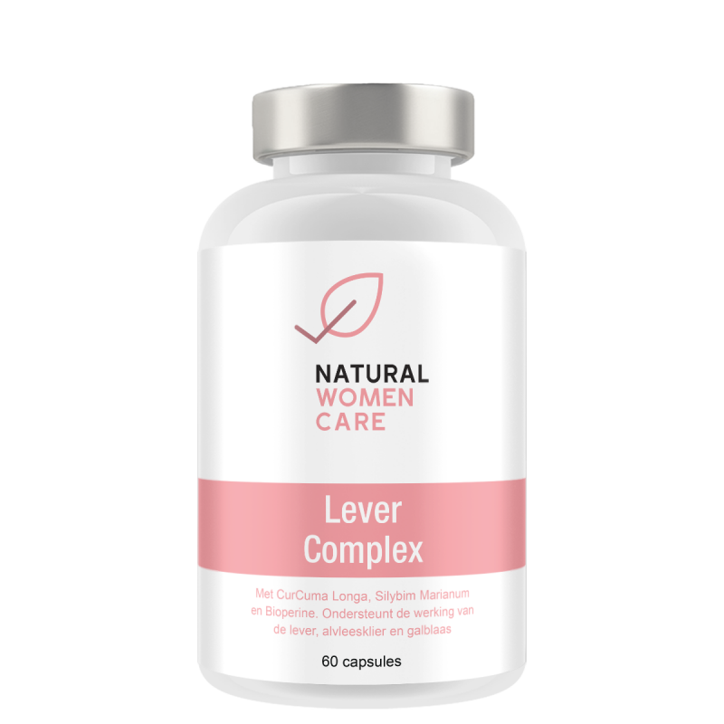
The packaging is a cylindrical bottle with a smooth, glossy surface. It features a white body with a silver screw-on cap. The label is prominently displayed on the front, featuring a pink band at the bottom with product information. The overall design is clean and modern, with a minimalist aesthetic.
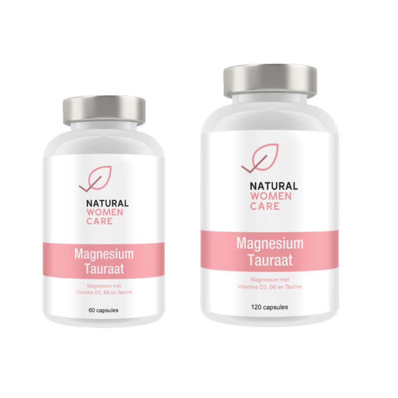
The packaging consists of two clear plastic bottles with white caps. The bottles are cylindrical in shape, with a smooth surface and a glossy finish. Each bottle features a label that includes the brand name 'NATURAL WOMEN CARE' prominently displayed at the top, along with the product name 'Magnesium Tauraat' in a larger font. The labels are predominantly white with pink accents, providing a clean and modern aesthetic.
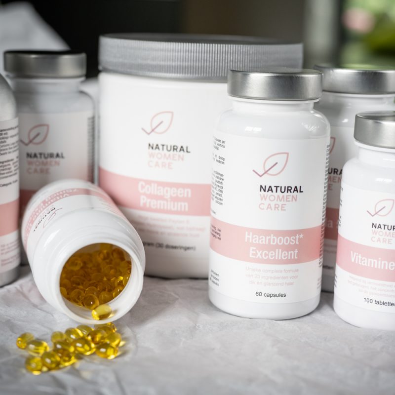
The packaging consists of several rigid bottles made from thick plastic, designed for retail display. Each bottle has a smooth, cylindrical shape with a wide neck for easy access. The surface is predominantly white with a matte finish, providing a clean and modern appearance. The labels are printed in soft pastel colors, primarily pink, with clear text and logos. The caps are typically white and screw-on, ensuring a secure closure.
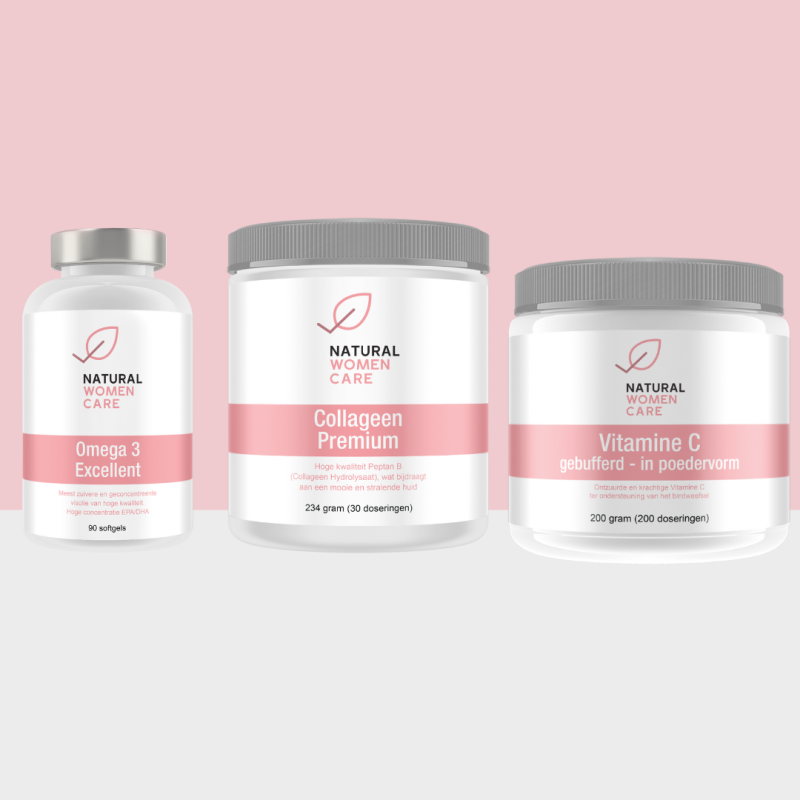
The packaging consists of three distinct jars, each with a smooth, cylindrical shape and a wide opening. The jars are made of thick, sturdy plastic, providing a premium feel. The surface is clean and glossy, enhancing the overall aesthetic. Each jar features a white label with pink accents, showcasing the product name and branding elements. The lids are screw-on type, ensuring secure closure.
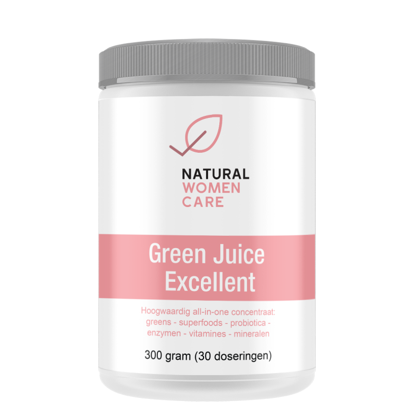
The packaging is a cylindrical container with a smooth, white plastic body and a clear, flat lid. The container is designed to hold powdered supplements, featuring a clean and modern aesthetic. The label wraps around the body, showcasing the product name and branding elements prominently.
About the Brand
Natural Women Care operates within the health and wellness sector, focusing on natural supplements designed to address women's energy, balance, and nutritional needs. The brand employs a digital-first approach with a strong emphasis on educational content and personalized product recommendations.
The company utilizes a range of rigid plastic bottles, jars, and containers with a consistent design language rooted in soft pastel colors and minimalist branding. Packaging is engineered for both retail display and e-commerce fulfillment, balancing visual appeal with practical considerations such as secure closures and clear labeling. This approach builds consumer confidence while supporting efficient logistics and product integrity.
Key Differentiator: Personalized health solutions and a cohesive, feminine packaging system designed to reinforce brand trust and consumer empowerment.
Design System
Visual Style
The visual system uses sans-serif typography with a focus on readability, paired with a predominantly white background accented by soft pinks. The overall aesthetic is minimal, modern, and feminine, supporting clarity and approachability.
Brand Identity
Brand identity relies on consistent use of the Natural Women Care logo, prominent placement of product names, and a restrained color scheme. Iconography is minimal, and labels are designed for immediate brand and product recognition.
Packaging Design
Material selection centers on thick, food-grade plastics for bottles and jars, prioritizing product safety and shelf life. The structural design favors cylindrical shapes for efficient packing and ease of use, with secure screw-on closures to protect product integrity.
User Experience
Packaging design supports the customer journey by providing clear product information, intuitive opening mechanisms, and a visually appealing unboxing experience. The consistent aesthetic builds trust and reinforces the brand's health-focused, modern positioning.
Company Metrics
Business insights for Natural Women Care based on available data
Market Positioning
Brand Values & Focus
Key Competitors
Target Market: Health-conscious women seeking personalized, natural supplements in the Netherlands and broader European D2C market.
Packaging Assessment
Overall Grade
Visual appeal and presentation quality
Packaging durability and protection
Eco-friendliness and recyclable materials
Cost efficiency and value for money
Packaging assessment for Natural Women Care based on industry standards and best practices
Frequently Asked Questions
What types of packaging does Natural Women Care use for its supplements?
Natural Women Care primarily uses rigid plastic bottles and jars with screw-on caps, complemented by clear, modern labels featuring the brand name, logo, and soft pastel color accents.
How does the packaging support product safety during shipping?
The choice of thick, sturdy plastic and secure closure mechanisms ensures protection against physical damage and contamination during logistics, improving overall product safety.
Is the packaging recyclable or eco-friendly?
While the packaging uses recyclable plastics, there is limited evidence of advanced sustainable materials or refill systems. The overall sustainability score reflects standard industry practices rather than leading-edge eco-innovation.
Discover other Health companies
Explore more companies in the health industry and their packaging strategies
Doctor Seaweed
Health
Doctor Seaweed specializes in natural, plant-based nutritional supplements derived from seaweed, aimed at promoting overall wellness.
Smart Protein
Health
Smart Protein is dedicated to transforming nutrition by providing a range of health and wellness products focused on protein supplements and vitamins.
Comvita
Health
Comvita is a New Zealand-based company specializing in high-quality Mānuka honey and natural health products. Established in 1974, it aims to connect people with the healing power of nature.