Naître packaging
Naître develops advanced fertility and prenatal supplements, targeting couples and expectant mothers with scientifically formulated products. Their packaging strategy leverages minimalist, premium designs and a mix of carton, rigid, and flexible formats to reinforce a clean, health-focused brand image.
Packaging Portfolio
Naître’s packaging portfolio encompasses single-layer retail carton boxes, high-end rigid boxes with magnetic closures for premium kits, and flexible sachets for individualized dosing. The use of lightweight paperboard and rigid construction ensures visual clarity and structural integrity, while flexible sachets offer precise, hygienic portioning. Each packaging format is selected for its balance of presentation quality, protection, and user convenience, with consistent branding elements across all materials.
The packaging consists of a sturdy, thick-walled box with a premium appearance. The exterior features a matte finish in two colors: a light cream on the top and a deep green on the bottom. The box has a clean, elegant design with precise edges and folds. Inside, it holds several individual product tubes, which are neatly arranged. The box has a magnetic closure, providing a seamless opening and closing mechanism. The overall shape is rectangular, with a flat top and a slightly deeper base to accommodate the products.

The packaging consists of a slender, elongated sachet with a smooth surface. The sachet is primarily a light peach color with a glossy finish, featuring a rounded top that tapers towards the opening. The design is minimalistic, with a small circular graphic and the brand name 'NAÏTRE' prominently displayed in a modern font. The overall shape is flat and flexible, allowing it to easily conform to its contents.
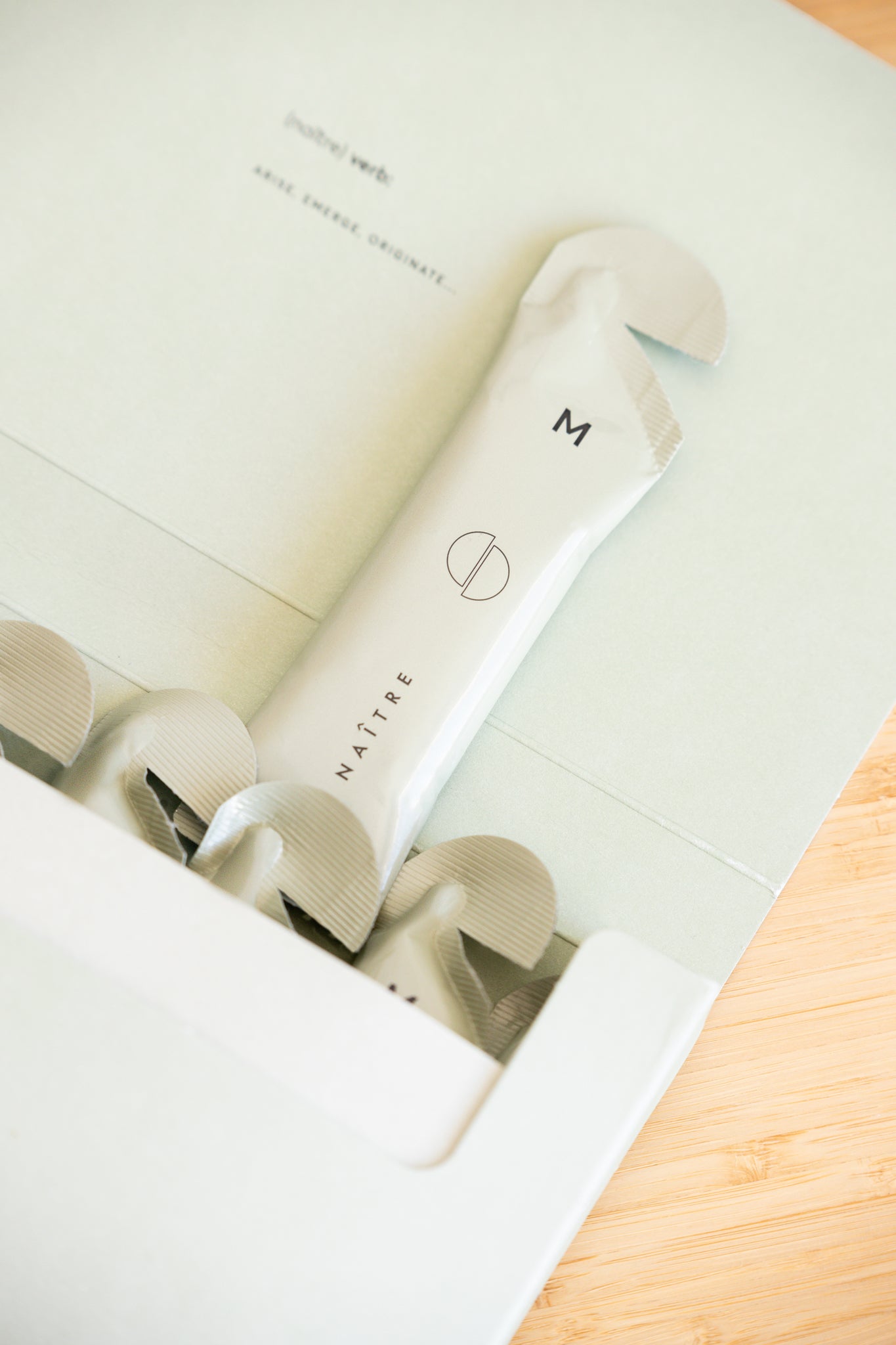
The packaging is a flat, smooth, single-layer carton box with a light pastel green exterior. The box features clean, precise edges and folds, typical of retail packaging. The top flap is partially opened, revealing a product inside, which is a slender, tube-like item. The interior of the box is white, contrasting with the exterior. The overall appearance is lightweight and designed for easy retail display.
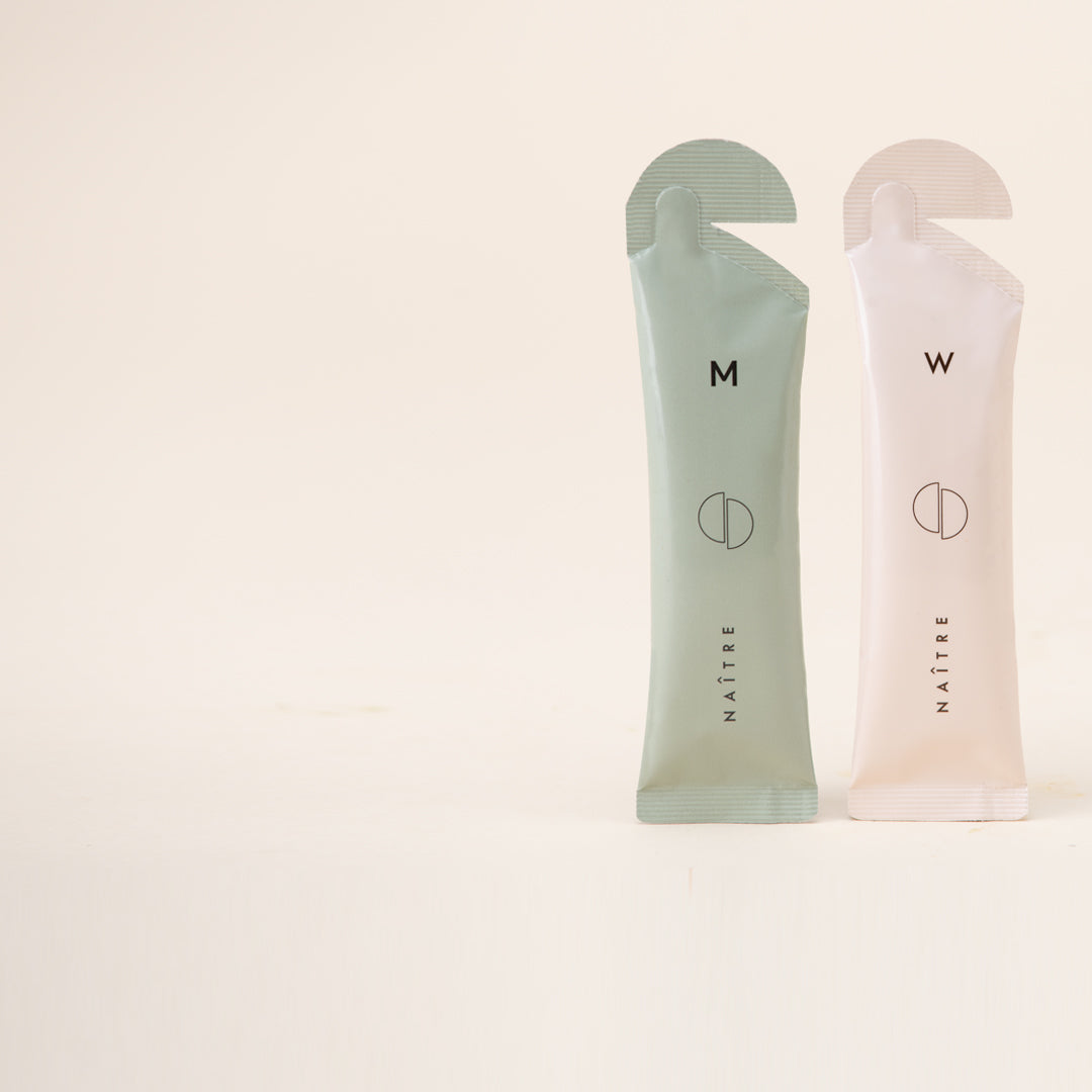
The packaging consists of two slender sachets, one in a soft green color and the other in a pale pink. Each sachet has a rounded top with a small tab for easy opening. The surface is smooth, with a matte finish, and features a minimalist design. The front of each sachet displays a circular logo and the brand name 'NAITRE' in a modern font, centered vertically. The overall appearance is sleek and contemporary, suggesting a focus on aesthetics and functionality.

The packaging consists of two folding cartons, one in a light kraft color and the other in a soft green hue. Each carton features a smooth, flat construction without any visible fluted layers, indicating they are made from single-layer paperboard. The edges are clean and precise, typical of retail packaging. The cartons are designed to hold fertility supplement products, with a modern and minimalistic aesthetic. The overall appearance is lightweight and suitable for retail display.
About the Brand
Naître is a UK-based health and wellness company specializing in liposomal fertility, prenatal, and postnatal supplements. Their direct-to-consumer model emphasizes clean, ethically sourced ingredients and high bioavailability through advanced delivery technologies.
The brand addresses all stages of parenthood, segmenting its product line for fertility, pregnancy, and postnatal needs. Packaging choices are data-driven, focusing on lightweight, visually appealing materials that align with the brand’s scientific credibility and emotional positioning. The use of carton boxes, rigid luxury boxes, and flexible single-use sachets reflects a dual focus on premium presentation and practical dosage delivery.
Key Differentiator: Naître’s packaging system is distinguished by its combination of minimalist luxury aesthetics, strong brand consistency, and the use of liposomal technology messaging to reinforce scientific trust.
Design System
Visual Style
Modern minimalist aesthetic with sans-serif typography, a muted pastel and earth-tone palette (greens, creams, pinks), and matte or soft-touch finishes for tactile engagement.
Brand Identity
Consistent use of the 'NAITRE' logo and brand name, simple iconography, and restrained graphic elements to maintain a clinical yet approachable appearance across all packaging and touchpoints.
Packaging Design
Preference for recyclable paperboard, rigid multi-layered boxes for premium presentation, and flexible laminated sachets for single-use dosing; structural designs prioritize ease of opening and retail display compatibility.
User Experience
Design prioritizes intuitive unboxing, clear product segmentation by stage, and a seamless transition from online purchase to product use, supporting customer confidence and reinforcing scientific trust.
Company Metrics
Business insights for Naître based on available data
Market Positioning
Brand Values & Focus
Key Competitors
Target Market: Couples trying to conceive, pregnant women, and new parents seeking high-bioavailability supplements and scientifically formulated prenatal care.
Packaging Assessment
Overall Grade
Visual appeal and presentation quality
Packaging durability and protection
Eco-friendliness and recyclable materials
Cost efficiency and value for money
Packaging assessment for Naître based on industry standards and best practices
Frequently Asked Questions
What types of packaging does Naître use for its supplements?
Naître utilizes a mix of single-layer carton boxes for retail, rigid magnetic-closure boxes for premium sets, and flexible single-use sachets for individual doses. Each format is selected to optimize product protection, dose convenience, and brand alignment.
How does Naître’s packaging contribute to the customer experience?
The packaging design enhances the unboxing experience through clean, minimalist visuals, tactile finishes, and intuitive structures that reinforce the brand’s premium positioning and the scientific care behind each product.
Is Naître’s packaging environmentally sustainable?
Naître’s packaging uses recyclable paperboard and carton materials for most formats, though the use of flexible sachets may limit full recyclability. Overall, there is a moderate emphasis on sustainability practices relative to industry standards.
Discover other Health companies
Explore more companies in the health industry and their packaging strategies
Smart Protein
Health
Smart Protein is dedicated to transforming nutrition by providing a range of health and wellness products focused on protein supplements and vitamins.
Comvita
Health
Comvita is a New Zealand-based company specializing in high-quality Mānuka honey and natural health products. Established in 1974, it aims to connect people with the healing power of nature.
Bio-Synergy
Health
Bio-Synergy is a UK-based company specializing in health and fitness products, including nutritional supplements and DNA testing kits. Their mission is to support individuals in achieving their health and fitness goals through innovative products and personalized insights.