Nail Fairy packaging
Nail Fairy operates in the beauty and fitness sector with a direct-to-consumer approach, offering specialized nail care products through an e-commerce platform. Their packaging strategy leverages branded folding carton boxes with visually distinctive design elements tailored for both protection and shelf appeal.
Packaging Portfolio
Nail Fairy’s packaging portfolio centers around single-layer paperboard folding cartons featuring glossy finishes, floral graphics, and integrated clear plastic windows for product display. These retail cartons are structurally optimized for small, delicate items such as artificial nails and nail tips, with precise folds and tuck closures that enhance both shelf presence and shipping security. The use of clear inserts ensures product visibility while supporting secure placement, and the overall compact format reduces excess material use. Branding elements—including logos, color palettes, and descriptive typography—are consistently applied across SKUs for unified market positioning.

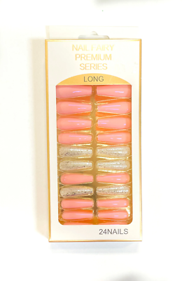
The packaging consists of a flat, rectangular folding carton made of single-layer paperboard. The exterior is predominantly pink with a glossy finish, featuring a clear plastic window that showcases the product inside. The edges are clean and precise, indicating a well-constructed fold. The carton has a tuck flap closure at the top, allowing easy access to the contents.

The packaging is a retail carton designed for nail tips, featuring a smooth, flat construction without fluted layers. The exterior is predominantly pink with a glossy finish, adorned with floral graphics and a prominent logo. The front showcases six nail tips arranged in a clear plastic insert, allowing visibility of the product. The edges are clean and precise, with a tuck-top closure.
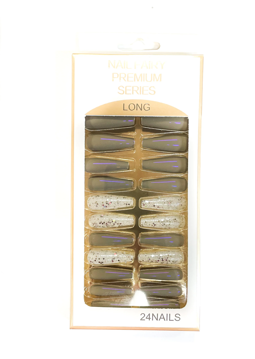
The packaging is a folding carton made from a single layer of paperboard. It features a smooth, flat construction with clean edges and folds. The front displays a transparent plastic window that allows visibility of the nail tips inside. The carton is predominantly white with gold accents, including the brand name 'Nail Fairy' and product details printed in a stylish font. The back of the carton contains additional product information and instructions. The overall design is sleek and modern, appealing to a beauty-conscious audience.

The packaging consists of several folding cartons, each designed to hold sets of artificial nails. The boxes are made of smooth, flat paperboard, featuring clean edges and precise folds. The exterior is predominantly pink with floral designs, and the boxes have a glossy finish. Each box contains a clear plastic insert that holds the nail sets securely in place. The front of the boxes displays the product name and brand in bold lettering, with additional decorative elements.
The packaging is a rectangular folding carton designed for retail display. It features a smooth, flat construction without any visible fluted layers, indicating it is made from single-layer paperboard. The exterior is predominantly white with gold accents, giving it a clean and elegant appearance. The front showcases a clear plastic window that displays the contents—24 false nails in various colors, including pink and glittery options. The edges are cleanly folded, and the overall finish appears glossy.

The packaging consists of a rectangular, flat construction made from single-layer paperboard. The exterior is predominantly pink with a glossy finish, featuring a gold foil accent at the top. The front displays a clear plastic window that showcases the contents—nail tips—inside. The edges are clean and precise, indicating a well-constructed folding carton. The back of the packaging includes product information and care instructions printed in a smaller font.
About the Brand
Nail Fairy delivers a curated online shopping experience for nail care enthusiasts, emphasizing high-quality tools and innovative accessories. The brand's packaging is consistently aligned with its visual identity, utilizing sturdy carton-based solutions that accentuate product presentation and safety during transit.
Positioned within a competitive beauty and fitness market, Nail Fairy targets both professional and casual consumers seeking premium nail care solutions. The packaging approach is characterized by glossy-finished, visually engaging folding cartons that integrate clear plastic inserts for product display. This strategy prioritizes both unboxing aesthetics and logistical functionality, while the consistent use of brand elements reinforces recognition and trust.
Key Differentiator: Nail Fairy stands out through cohesive, brand-centric packaging that merges professional-grade presentation with consumer-focused usability.
Design System
Visual Style
Typography is predominantly bold and modern, with stylized serif or sans-serif fonts complementing the feminine and professional aesthetic. The color palette is anchored by pinks, whites, and gold accents, delivering a visually cohesive and brand-aligned presentation.
Brand Identity
The logo and company name are prominently positioned on packaging fronts, supported by floral motifs and premium series labels. Visual consistency is achieved through repeated use of color schemes and iconography, reinforcing brand recall and product differentiation.
Packaging Design
Material selection prioritizes lightweight, single-layer paperboard for cost-efficiency and print clarity, paired with transparent plastic inserts to showcase products. Structural design emphasizes compactness, easy unboxing via tuck-top flaps, and protection for delicate contents.
User Experience
Packaging is designed to deliver an elevated unboxing experience that communicates quality and care. Clear product windows aid pre-purchase decision-making and post-purchase satisfaction, while easy-to-open structures and branded messaging support a positive customer journey.
Company Metrics
Business insights for Nail Fairy based on available data
Market Positioning
Brand Values & Focus
Key Competitors
Target Market: Professional nail technicians, beauty enthusiasts, and personal care consumers seeking premium nail care products via online retail channels.
Packaging Assessment
Overall Grade
Visual appeal and presentation quality
Packaging durability and protection
Eco-friendliness and recyclable materials
Cost efficiency and value for money
Packaging assessment for Nail Fairy based on industry standards and best practices
Frequently Asked Questions
What materials are primarily used in Nail Fairy's packaging?
Nail Fairy predominantly utilizes single-layer paperboard folding cartons with glossy finishes and integrated clear plastic inserts for product visibility.
How does Nail Fairy's packaging support product safety during shipping?
The folding carton construction, combined with secure plastic inserts, provides reliable protection and minimizes product movement or damage during transit.
What sustainability considerations are present in Nail Fairy's packaging?
Current packaging relies on recyclable paperboard but includes plastic components that may reduce overall eco-friendliness. The design is compact, potentially reducing shipping emissions and material usage.
Discover other Beauty & Fitness companies
Explore more companies in the beauty & fitness industry and their packaging strategies
Institut Karité Paris
Beauty & Fitness
Institut Karité Paris specializes in luxury beauty products made with natural Shea Butter, offering a wide range of skincare and body care solutions. The brand combines Parisian heritage with a commitment to quality and creativity in its offerings.
Owari
Beauty & Fitness
Owari specializes in 100% natural beauty and fitness products, designed to enhance health and wellness. The company proudly offers its products made in France, emphasizing quick delivery and customer support.
Orris Paris
Beauty & Fitness
Orris Paris specializes in creating artisanal skincare products that combine potent botanical ingredients with modern cleansing rituals. The company emphasizes natural, holistic practices in its formulations.