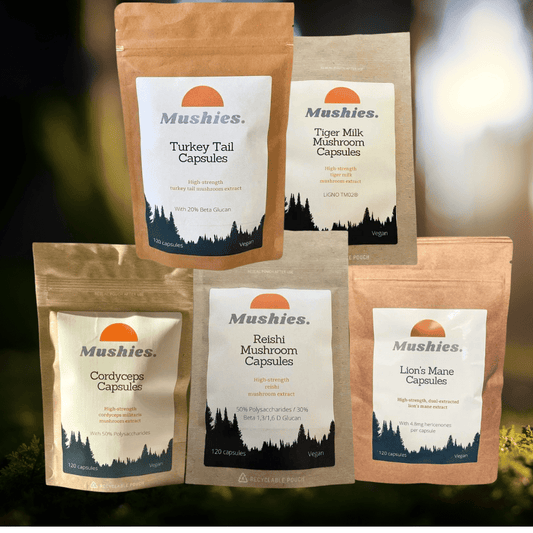
Mushies packaging
Mushies is a UK-based health supplement company specializing in mushroom-derived products, utilizing stand-up pouches and flexible packaging with a focus on natural aesthetics. Their packaging strategy emphasizes resealability, clear product information, and alignment with wellness branding.
Packaging Portfolio
Mushies employs a portfolio of stand-up pouches and flexible bags constructed from kraft paper composites and plastics, often featuring resealable zip closures and clear windows for product display. The packaging structure prioritizes shelf stability, portability, and user convenience, with matte or glossy textures enhancing tactile engagement. Product labels are clear and prominently branded, leveraging both natural motifs and modern design to reinforce category positioning. The choice of materials and formats reflects a balance between sustainability, product protection, and cost efficiency.
The packaging consists of stand-up pouches made from flexible materials. Each pouch features a clear front window allowing visibility of the contents, with a matte finish on the exterior. The pouches have a zip-lock closure at the top for resealability. The design includes a prominent circular logo at the top, with product names and descriptions printed in a clean, modern font. The background features a silhouette of trees, enhancing the natural theme of the product.

The packaging is a stand-up pouch made of a flexible material with a kraft paper exterior. It features a smooth surface with a matte finish. The top of the pouch has a resealable zipper closure, allowing for easy access and storage. The front displays a large white label with product information, including the title 'TURKEY TAIL' in bold black font, ingredients, and other details. The back of the pouch likely contains additional information, although it is not fully visible in the image.

The image features a combination of packaging types: a kraft paper bag and two pouches. The kraft paper bag is brown, with a flat construction, likely made from a single layer of paperboard. The two pouches are made from a flexible material, possibly plastic or a composite, with a glossy finish. Each pouch has a clear front, allowing visibility of the contents, and a resealable top. The pouches are white with colorful graphics and text, while the kraft bag has a more natural appearance with a printed label.

The packaging is a stand-up pouch made from a kraft paper exterior with a smooth finish. It features a resealable top, allowing for easy access and storage. The front displays a large logo and product name, with additional text detailing product information. The overall shape is rectangular with a flat bottom for stability.

The packaging is a stand-up pouch made from a composite material that appears to be a combination of kraft paper and a plastic lining. The front features a large, colorful graphic with the product name 'Mushroom Coffee' prominently displayed. The pouch has a flat bottom, allowing it to stand upright, and is sealed at the top with a heat seal. The surface has a matte finish with a slight texture, giving it a natural look. The back of the pouch likely contains nutritional information and usage instructions, although this is not visible in the image.
About the Brand
Mushies delivers a range of mushroom-based supplements, including capsules, tinctures, and functional coffees, targeting health-conscious consumers seeking natural wellness solutions. The brand operates primarily through a D2C e-commerce model and leverages custom-branded, resealable pouch packaging.
Their packaging system utilizes composite materials such as kraft paper and flexible plastics to create stand-up pouches with matte or glossy finishes, often featuring clear windows for product visibility. Emphasis is placed on both product protection and consumer convenience, with resealable closures supporting freshness and multi-use. The visual identity is grounded in earthy color palettes and clean, modern typography, reflecting the brand’s focus on natural health and sustainability.
Key Differentiator: Mushies stands out through its integration of sustainable packaging cues, strong visual branding, and a portfolio tailored to the mushroom supplement niche, catering to eco-conscious and wellness-driven customers.
Design System
Visual Style
The visual design utilizes clean sans-serif typography, earthy and muted tones (such as browns, greens, and whites), and simple yet bold graphical elements to evoke a natural and trustworthy appeal.
Brand Identity
Branding is consistent across products with prominent logo placement, coherent iconography, and standardized label layouts that reinforce recognition and trust. The use of circular logos and nature-inspired illustrations strengthens connection to the wellness space.
Packaging Design
Material choices favor kraft paper exteriors with inner plastic linings for barrier protection, supporting both sustainability and shelf life. Structural design follows a functional philosophy—stand-up pouches and resealability for user convenience, with transparent windows where possible to allow ingredient visibility.
User Experience
The packaging is designed for ease of opening, resealing, and storage, supporting a positive unboxing and daily use experience. Clear labeling, accessible product information, and tactile finishes foster engagement and align with health-conscious consumer expectations.
Company Metrics
Business insights for Mushies based on available data
Market Positioning
Brand Values & Focus
Key Competitors
Target Market: Health-conscious adults in the UK and Europe seeking natural, functional supplements with an interest in sustainable and transparent product sourcing.
Packaging Assessment
Overall Grade
Visual appeal and presentation quality
Packaging durability and protection
Eco-friendliness and recyclable materials
Cost efficiency and value for money
Packaging assessment for Mushies based on industry standards and best practices
Frequently Asked Questions
What types of packaging does Mushies use for their health supplements?
Mushies primarily utilizes stand-up pouches made from kraft paper composites and flexible plastics, often featuring resealable zip closures and clear product windows to enhance product visibility and maintain freshness.
How does Mushies address sustainability in packaging?
Mushies incorporates kraft paper exteriors and recyclable materials where feasible, aligning packaging choices with consumer expectations for eco-friendliness in the health and wellness sector.
What is the focus of Mushies' packaging design?
The design emphasizes natural aesthetics, easy resealability, informative labeling, and strong brand presence to support a positive customer experience and reinforce the wellness positioning.
Discover other Health companies
Explore more companies in the health industry and their packaging strategies
Comvita
Health
Comvita is a New Zealand-based company specializing in high-quality Mānuka honey and natural health products. Established in 1974, it aims to connect people with the healing power of nature.
Bio-Synergy
Health
Bio-Synergy is a UK-based company specializing in health and fitness products, including nutritional supplements and DNA testing kits. Their mission is to support individuals in achieving their health and fitness goals through innovative products and personalized insights.
Smart Protein
Health
Smart Protein is dedicated to transforming nutrition by providing a range of health and wellness products focused on protein supplements and vitamins.