Moomin Characters packaging
Moomin Characters, a Helsinki-based creative enterprise, offers a diverse portfolio of products inspired by the iconic Moomin universe. Their packaging strategy leverages high-impact visual design, custom graphics, and brand-focused structural choices to reinforce both artistic value and consumer engagement.
Packaging Portfolio
Moomin Characters employs a diverse range of packaging solutions, primarily utilizing high-quality folding carton boxes and rigid tin containers. These structures are selected for their printability, retail shelf appeal, and ability to showcase vibrant illustrations integral to the Moomin brand. Packaging often features die-cut windows for product visibility and reusable tins for premium or collectible lines, reflecting both functional and emotional value. Material selection prioritizes paper-based substrates with moderate integration of metal for limited editions, balancing sustainability with durability and design flexibility.
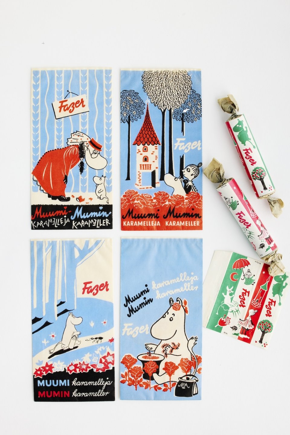
The packaging consists of flat, single-layer paperboard with a smooth finish, featuring colorful graphics and illustrations. The design includes a combination of blue, red, and white colors, with playful illustrations of Moomin characters and text. The edges are clean and precise, indicative of a folding carton used for retail purposes. The overall appearance is lightweight and visually appealing, suitable for displaying products.

The packaging is a square tin container with a metal lid. The container features a colorful design with illustrations of Moomin characters. The base is a light blue color, while the lid is a darker brown. The graphics include playful drawings of Moomin characters, with text in a whimsical font. The edges are smooth and the overall construction is sturdy, indicative of a premium packaging type.
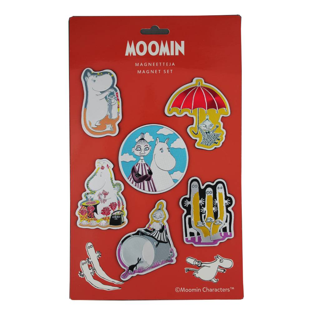
The packaging is a flat, rectangular folding carton made of single-layer paperboard. It features a bright red background with various colorful illustrations of Moomin characters. The edges are clean and precise, indicating a well-constructed retail package. The front displays a clear window showcasing the magnets inside, with a header card at the top for branding.

The packaging is a folding carton made from a single layer of paperboard. It features a smooth, flat construction with clean edges and folds. The carton is predominantly white with colorful graphics depicting Moomin characters. The design is playful and appealing, suitable for retail display. The carton has a tuck flap closure at the top, ensuring easy access to the contents. There are no visible signs of wear or damage, indicating it is in excellent condition.

The packaging is a square folding carton with a smooth, flat construction. It features a light mint green color with illustrations of Moomin characters on all sides. The edges are clean and precise, indicative of a well-constructed retail carton. The front has a die-cut window that allows visibility of the product inside, enhancing its appeal. The overall appearance is vibrant and playful, aligning with the Moomin brand aesthetic.
About the Brand
Moomin Characters operates at the intersection of arts, entertainment, and merchandise, channeling the legacy of Tove Jansson through books, animation, and collectibles. The company emphasizes storytelling and visual engagement across all its offerings.
With a global fanbase, Moomin Characters combines artistic tradition with commercial reach, maintaining a strong focus on product quality and aesthetic cohesion. Their packaging frequently features custom illustrations, die-cut windows, and branded tins or cartons that reflect the whimsical nature of the brand while supporting retail and e-commerce distribution. Sustainability and ethical sourcing are stated priorities, aligning packaging practices with broader brand values.
Key Differentiator: The brand's unique value lies in its integration of cultural heritage and emotional storytelling into packaging, resulting in collectible, highly recognizable solutions that reinforce fan loyalty and brand authenticity.
Design System
Visual Style
Typography is playful yet legible, often utilizing rounded sans-serif fonts that complement the whimsical, hand-drawn illustration style. The color palette is broad and saturated, focusing on pastels and primary colors to evoke nostalgia and approachability. Overall, the aesthetic is cheerful, visually rich, and tailored for both children and adult collectors.
Brand Identity
Logo usage is prominent, with the Moomin logo and character artwork consistently featured across all packaging formats. Iconography centers around branded illustrations, ensuring immediate brand recognition. Visual consistency is maintained through standardized character placement, recurring motifs, and cohesive color schemes.
Packaging Design
Material choices emphasize recyclable paperboard and reusable tin, supporting both sustainability and premium positioning. Structural design favors easy-to-open formats, die-cut display windows, and sturdy builds to protect products. The philosophy centers on balancing aesthetic appeal with practical functionality and environmental responsibility.
User Experience
Packaging is designed to enhance the customer journey by creating an emotional connection from the point of unboxing. Clear branding, tactile materials, and collectible features elevate the perceived value and reinforce long-term brand engagement, while intuitive structures support ease of use and product protection.
Company Metrics
Business insights for Moomin Characters based on available data
Market Positioning
Brand Values & Focus
Key Competitors
Target Market: Global fans of the Moomin brand, collectors, art enthusiasts, and consumers seeking culturally resonant merchandise within the arts & entertainment sector.
Packaging Assessment
Overall Grade
Visual appeal and presentation quality
Packaging durability and protection
Eco-friendliness and recyclable materials
Cost efficiency and value for money
Packaging assessment for Moomin Characters based on industry standards and best practices
Frequently Asked Questions
How does Moomin Characters integrate branding into its packaging solutions?
Moomin Characters consistently incorporates signature Moomin illustrations, logos, and themed color palettes across packaging formats, ensuring strong brand recognition and visual consistency throughout the product line.
What materials are primarily used in Moomin Characters' packaging?
The company predominantly utilizes paperboard folding cartons and rigid tins, chosen for their printability, durability, and suitability for retail display as well as collector appeal.
How does the packaging support sustainability goals?
Moomin Characters shows commitment to sustainability through increased use of recyclable paperboard, reusable tin packaging, and reduced single-use plastics, though further transparency on materials sourcing and lifecycle impact would be beneficial.
Discover other Arts & Entertainment companies
Explore more companies in the arts & entertainment industry and their packaging strategies
Craft Buddy Ltd
Arts & Entertainment
Craft Buddy Ltd is a UK-based company specializing in arts and crafts products, particularly in the realm of creative kits and supplies. Founded in 2011, the company offers a wide range of items catering to various crafting hobbies.
Hunkydory Crafts Limited
Arts & Entertainment
Hunkydory Crafts Limited specializes in the design and supply of a wide range of papercraft and craft-related products. Established in 2008, the company serves a vibrant community of craft enthusiasts across the UK and beyond.
Tonic Studios Ltd
Arts & Entertainment
Tonic Studios is a leading online retailer specializing in arts and crafts products, particularly in paper crafting and mixed media supplies.