Mimitika packaging
Mimitika specializes in sun protection and skincare products with a strong focus on natural, vegan, and gluten-free formulations. Their packaging strategy features visually engaging, retail-ready solutions that reinforce the brand’s commitment to sustainability and user experience.
Packaging Portfolio
Mimitika utilizes a multi-format packaging system comprised of folding paperboard cartons and rigid cosmetic jars, both glass and plastic. Cartons are single-layer, designed for retail shelf visibility, and often feature pastel backgrounds with abstract graphical elements. Jars serve as primary packaging for creams and oils, employing clean, twist-off lids and color-coordinated labels. This approach emphasizes both visual differentiation in-store and product protection while maintaining a moderate sustainability profile through recyclable carton use.
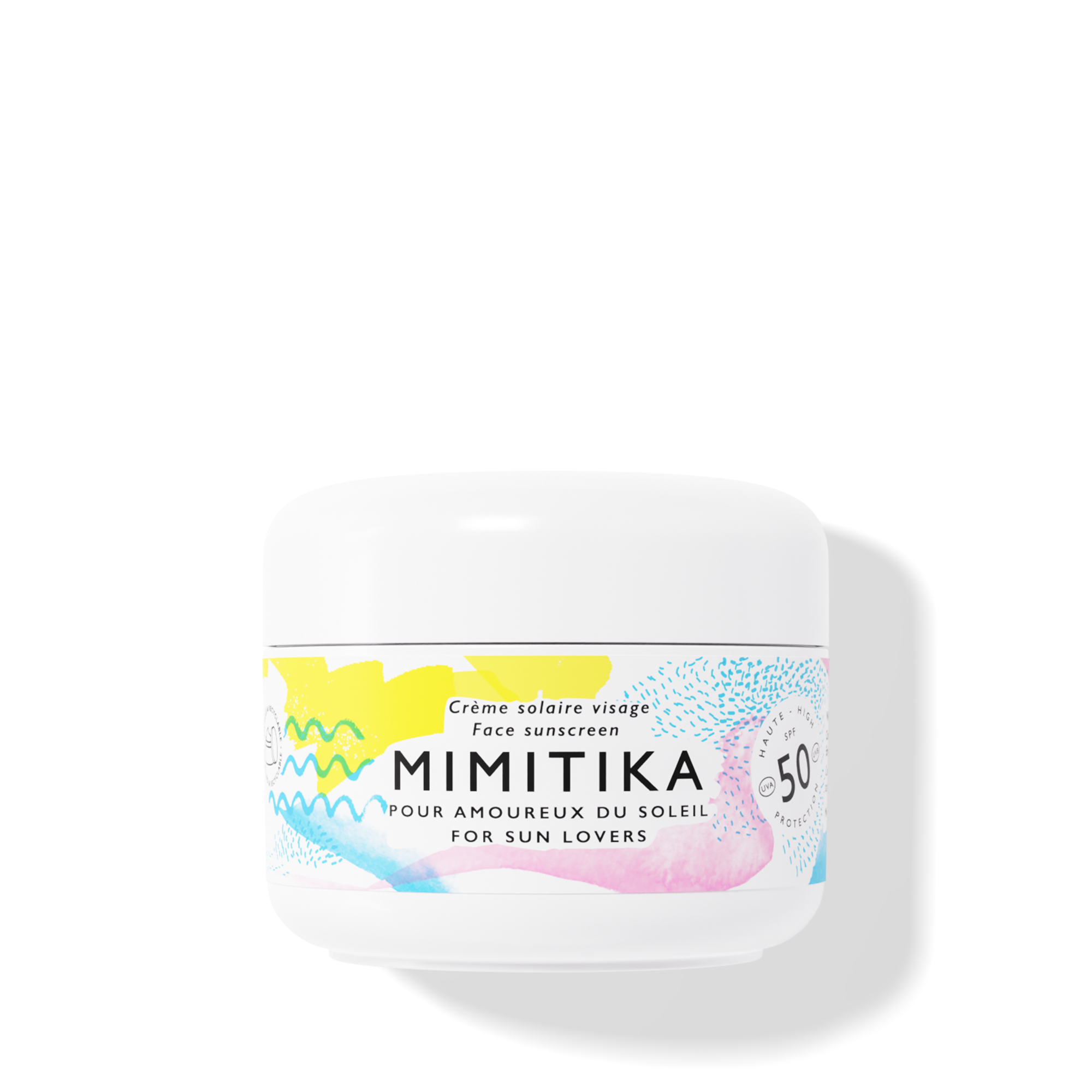
The packaging is a cylindrical jar with a smooth, glossy surface. The jar is predominantly white with colorful, abstract designs in yellow, blue, and pink. The lid is also white and appears to be a twist-off type. The overall appearance is clean and modern, suitable for cosmetic products.
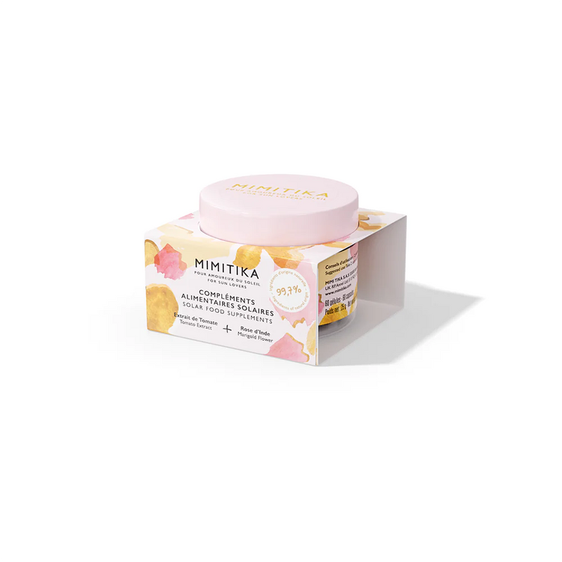
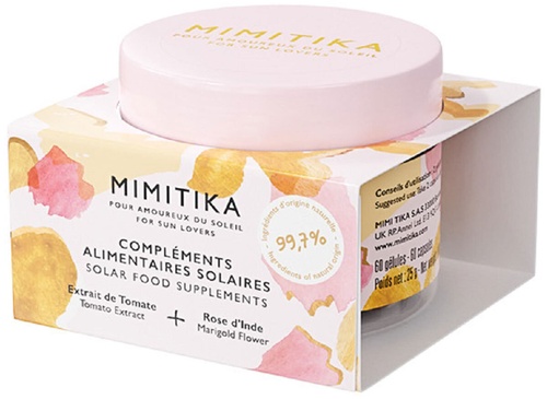
The packaging consists of a smooth, flat construction made from single-layer paperboard. It features a colorful design with floral motifs in pastel shades, predominantly pink, yellow, and orange. The top of the box has a circular cut-out to showcase the product inside, which is a jar with a matching pink lid. The edges are clean and precise, with well-defined folds. The box is lightweight and designed for retail display.
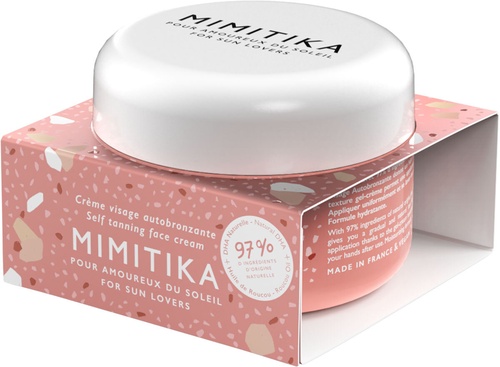
The packaging consists of a folding carton that houses a jar of self-tanning face cream. The outer carton features a smooth, flat construction with clean edges and folds. The primary color scheme is soft pink with abstract shapes in various colors, giving it a modern and playful appearance. The carton has a glossy finish, enhancing its visual appeal. The top of the carton is open, revealing the jar inside, which is made of glass with a white lid.
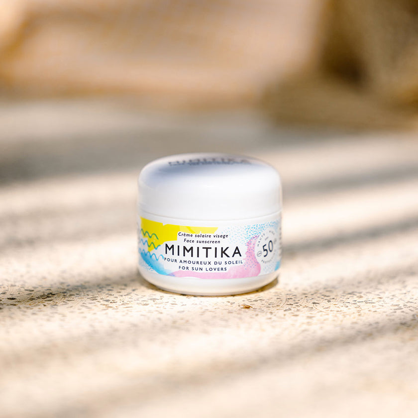
The packaging is a small, round jar with a smooth, white plastic lid and a clear body. The jar features a colorful label with a combination of pastel colors and geometric patterns. The label includes product information and branding elements. The overall appearance is sleek and modern, suitable for cosmetic products.
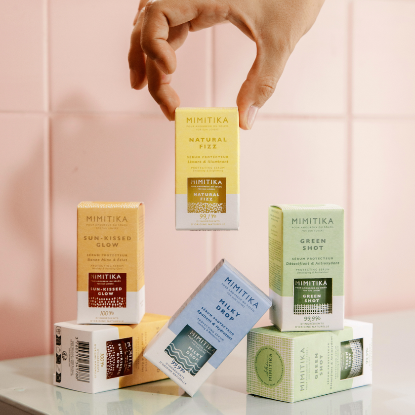
The packaging consists of several small, rectangular folding cartons arranged in a stack. Each carton features a smooth, flat construction without any visible fluted layers, indicating they are made from single-layer paperboard. The cartons are predominantly white with vibrant colors for each variant, including yellow, blue, and green, showcasing a clean and modern design. The edges are precise, and the folds are sharp, typical of retail packaging. Each carton has a distinct label with product names and branding elements prominently displayed.
The packaging is a folding carton with a smooth, flat construction. It features a pastel pink top with a glossy finish and a colorful design that includes abstract shapes in shades of yellow and orange. The sides of the carton are printed with product information and branding elements. The edges are clean and precise, indicating a well-constructed retail package.
About the Brand
Mimitika is a French cosmetics brand focused on sun care, self-tanning, and skincare, leveraging 99.9% natural ingredients and a summer-inspired aesthetic. The company targets consumers seeking clean beauty solutions, emphasizing transparency, product safety, and everyday usability. Packaging is a core element of their brand, designed to enhance shelf appeal and align with eco-conscious values.
Founded in Bordeaux in 2016, Mimitika operates with a compact team and a direct-to-consumer business model. The packaging approach prioritizes both retail display effectiveness and environmental responsibility, utilizing folding cartons and cosmetic jars with playful, pastel-themed graphics. Brand consistency is maintained across all SKUs, supporting a cohesive identity and facilitating consumer recognition in a competitive market.
Key Differentiator: Mimitika stands out for its integration of high natural ingredient content, vegan claims, and a design-forward packaging system that balances sustainability with aesthetic impact.
Design System
Visual Style
Typography is modern and sans-serif, paired with a pastel color palette (pinks, yellows, blues) and abstract, playful graphic elements. The overall aesthetic is bright, inviting, and distinctly summer-inspired.
Brand Identity
Consistent use of the Mimitika logo across all SKUs, with clear product naming and sun motif iconography. Visual elements maintain strong alignment with the brand’s summer and wellness themes, reinforcing recognition.
Packaging Design
Paperboard is used for outer cartons, favoring lightweight, recyclable structures. Jars are typically plastic or glass, chosen for product protection and tactile quality. Structural designs prioritize retail shelf presence and consumer handling experience.
User Experience
Design choices facilitate an emotionally positive unboxing, supporting consumer trust in ingredient safety and brand ethos. Packaging transitions smoothly from e-commerce delivery to in-home use, reinforcing brand loyalty through consistent visual and tactile cues.
Company Metrics
Business insights for Mimitika based on available data
Market Positioning
Brand Values & Focus
Key Competitors
Target Market: Health-conscious, eco-aware beauty consumers seeking natural, vegan, and effective sun care and skincare products in France and broader European markets.
Packaging Assessment
Overall Grade
Visual appeal and presentation quality
Packaging durability and protection
Eco-friendliness and recyclable materials
Cost efficiency and value for money
Packaging assessment for Mimitika based on industry standards and best practices
Frequently Asked Questions
What types of packaging does Mimitika use for its skincare products?
Mimitika employs a range of packaging formats including single-layer folding carton boxes, rigid cosmetic jars, and retail cartons with inner jars. Materials are primarily paperboard for cartons and plastic or glass for jars, all featuring vibrant, brand-consistent designs.
How does Mimitika ensure its packaging aligns with sustainability goals?
The company leverages recyclable paperboard for cartons and minimizes unnecessary secondary packaging. However, the use of plastic jars is noted, suggesting room for further improvement in material sourcing and recyclability.
What is the overall unboxing experience of Mimitika products?
The unboxing experience is highly curated, using pastel colors, glossy finishes, and abstract motifs to create a modern, emotionally engaging presentation that resonates with their target demographic.
Discover other Beauty & Fitness companies
Explore more companies in the beauty & fitness industry and their packaging strategies
Orris Paris
Beauty & Fitness
Orris Paris specializes in creating artisanal skincare products that combine potent botanical ingredients with modern cleansing rituals. The company emphasizes natural, holistic practices in its formulations.
Institut Karité Paris
Beauty & Fitness
Institut Karité Paris specializes in luxury beauty products made with natural Shea Butter, offering a wide range of skincare and body care solutions. The brand combines Parisian heritage with a commitment to quality and creativity in its offerings.
Cultiv Cosmetique
Beauty & Fitness
Cultiv Cosmetique is a French skincare brand that provides organic and eco-friendly beauty products inspired by nature. They focus on effective skincare solutions for various skin concerns.