Lierac packaging
Lierac, a specialist in premium skincare, employs a packaging strategy centered on visual sophistication and structural integrity. The brand leverages high-quality paperboard and rigid box formats to reinforce its premium positioning and deliver a consistent, brand-aligned unboxing experience.
Packaging Portfolio
Lierac’s packaging portfolio is characterized by the use of folding carton boxes and rigid boxes, with a focus on premium-grade paperboard and sophisticated finishes such as matte lamination and metallic accents. Retail cartons are structurally optimized for both shelf display and e-commerce robustness, while luxury gift boxes utilize rigid construction to enhance perceived value. The visual design consistently leverages color differentiation to denote product lines, supported by clear typography and brand iconography for high shelf impact.
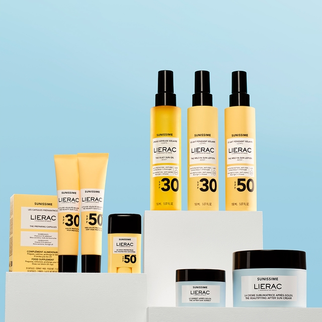
The packaging consists of various retail cartons, primarily made of smooth, flat paperboard. The cartons are designed to hold cosmetic products, featuring clean edges and precise folds. The surface finish appears to be a combination of matte and glossy elements, enhancing the visual appeal. The colors are predominantly yellow and white, with branding elements prominently displayed.
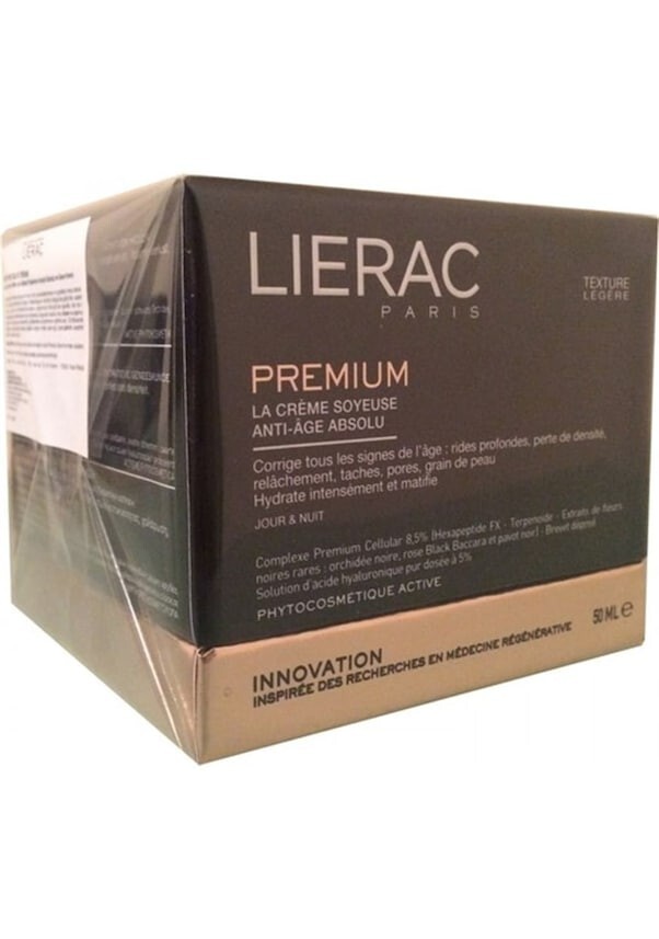
The packaging is a folding carton made from a single layer of paperboard. It has a smooth, flat construction with clean edges and folds. The exterior is predominantly black with gold and white text, giving it a sleek and modern appearance. The box features a glossy finish, enhancing its visual appeal. The front displays the brand name 'LIERAC PARIS' prominently, along with product information in both French and English. The sides of the box have additional details about the product's benefits and ingredients. The top flaps are neatly folded and secured, indicating a well-constructed carton.

The packaging is a flat, folded carton box made from a single layer of paperboard. It features a smooth, flat construction with clean edges and folds. The exterior has a bright yellow color with printed text and graphics. The design includes product information and promotional offers, indicating it is likely used for retail display. The box appears lightweight and is suitable for cosmetic products.

The packaging consists of three distinct products, each housed in smooth, flat paperboard containers. The containers have clean edges and precise folds, indicative of a folding carton design. The overall color scheme is a soft pink, with white labels featuring black text, creating a modern and minimalist aesthetic. The containers are designed for retail display, showcasing the product information clearly on the front.

The image features various skincare products from Lierac, including tubes and cartons. The cartons are made of smooth, flat paperboard with clean edges and folds, typically colored in bright shades. The tubes are cylindrical and made of flexible plastic, with a matte finish. The overall arrangement is neat, showcasing the products in a visually appealing manner.

The packaging features a thick, sturdy construction with a premium appearance. It has a matte black exterior with a smooth finish, complemented by metallic rose gold accents. The box includes a window that showcases the product inside, which is neatly presented. The overall design is elegant and sophisticated, typical of luxury cosmetics packaging.
About the Brand
Lierac focuses on scientifically validated skincare, offering anti-aging, body care, and sun protection products through a direct-to-consumer model. The company integrates clinical research with distinct packaging to support its premium brand positioning.
Lierac’s packaging approach prioritizes both product protection and aesthetic appeal, utilizing folding cartons and rigid boxes with a strong emphasis on visual branding. The company’s portfolio reflects careful consideration of material formats, supporting retail display and e-commerce distribution. Their packaging choices balance luxury cues with functional requirements to optimize shelf presence and consumer engagement.
Key Differentiator: Lierac differentiates itself through the combination of scientific credibility, premium product positioning, and consistently branded packaging that communicates efficacy and quality.
Design System
Visual Style
Lierac employs clean, sans-serif typography paired with a restrained color palette, frequently using soft pinks, black, white, and metallic rose gold accents. The overall aesthetic is modern, minimalist, and aligned with luxury skincare conventions.
Brand Identity
The Lierac logo is consistently featured on all primary and secondary packaging, supported by clear product naming and line-specific branding. Iconography is minimal, focusing on clarity and brand recognition, with strict adherence to visual consistency across product ranges.
Packaging Design
Material selection emphasizes high-quality, recyclable paperboard and rigid substrates. Structural design prioritizes precise folds, clean edges, and secure closures, reflecting a philosophy of combining product protection with elevated presentation.
User Experience
Packaging is engineered to deliver a high-impact unboxing experience, with tactile finishes and organized product layouts that reinforce brand trust and luxury perceptions. Information hierarchy and accessibility are optimized for ease of use and consumer confidence at all touchpoints.
Company Metrics
Business insights for Lierac based on available data
Market Positioning
Brand Values & Focus
Key Competitors
Target Market: Affluent consumers seeking effective, clinically-supported skincare solutions with a preference for premium and aesthetically refined beauty products.
Packaging Assessment
Overall Grade
Visual appeal and presentation quality
Packaging durability and protection
Eco-friendliness and recyclable materials
Cost efficiency and value for money
Packaging assessment for Lierac based on industry standards and best practices
Frequently Asked Questions
What materials does Lierac use in its packaging?
Lierac primarily uses high-grade paperboard for folding cartons and robust rigid boxes for premium product sets, ensuring both product protection and a visually appealing presentation.
How does Lierac’s packaging support its premium brand image?
Through the use of matte finishes, metallic accents, and cohesive color palettes, Lierac’s packaging reinforces its luxury positioning and enhances the unboxing experience.
Is Lierac’s packaging designed for sustainability?
Lierac incorporates recyclable paperboard materials and demonstrates an intent towards environmentally conscious practices, though opportunities remain for further increasing post-consumer recycled content and minimizing packaging weight.
Discover other Beauty & Fitness companies
Explore more companies in the beauty & fitness industry and their packaging strategies
Orris Paris
Beauty & Fitness
Orris Paris specializes in creating artisanal skincare products that combine potent botanical ingredients with modern cleansing rituals. The company emphasizes natural, holistic practices in its formulations.
Institut Karité Paris
Beauty & Fitness
Institut Karité Paris specializes in luxury beauty products made with natural Shea Butter, offering a wide range of skincare and body care solutions. The brand combines Parisian heritage with a commitment to quality and creativity in its offerings.
Cultiv Cosmetique
Beauty & Fitness
Cultiv Cosmetique is a French skincare brand that provides organic and eco-friendly beauty products inspired by nature. They focus on effective skincare solutions for various skin concerns.