Laura Todd packaging
Laura Todd is an e-commerce company specializing in beauty, skincare, and wellness products, leveraging direct-to-consumer online channels. Their packaging approach demonstrates an emphasis on brand consistency, material variety, and customer-centric unboxing experiences, reflecting evolving industry standards.
Packaging Portfolio
Laura Todd’s packaging portfolio incorporates carton boxes, rigid tins, glass jars, and flexible bags, demonstrating a comprehensive approach to product segmentation and shelf appeal. Carton boxes are used for retail cookie and beauty items, providing lightweight yet protective solutions. Rigid tin boxes are leveraged for premium product lines, enhancing perceived value and offering reusability. Flexible pouches and glass jars are deployed for wellness and skincare products, supporting both product protection and user convenience. The integration of consistent branding elements—such as logos, color palettes, and typographic choices—across these formats strengthens brand recall and aligns with industry trends toward modular, multi-material packaging solutions.

The packaging consists of a clear plastic film that encases a cookie. The cookie is round and has visible chocolate chips. The background of the packaging is a bright pink color, which contrasts with the cookie. A circular label is prominently displayed in the center, featuring a dark purple background with white text and an illustration. The text includes 'Laura Todd COOKIES' and the website 'www.lauratodd.fr'.

The packaging consists of a smooth, flat construction without fluted layers, indicative of a carton box. It features clean, precise edges and folds, commonly used for retail packaging. The exterior is a light brown color, likely made from paperboard, with a matte finish. The box is designed to hold cookies, as indicated by the visual elements surrounding it. There are no visible signs of wear or damage, suggesting it is in new condition.

The packaging is a rigid tin box designed for cookies. It features a sturdy construction with thick walls, providing a premium feel. The exterior is decorated with a light-colored background and illustrations of cookies and floral elements, giving it an elegant appearance. The lid fits snugly onto the base, ensuring the contents are secure.
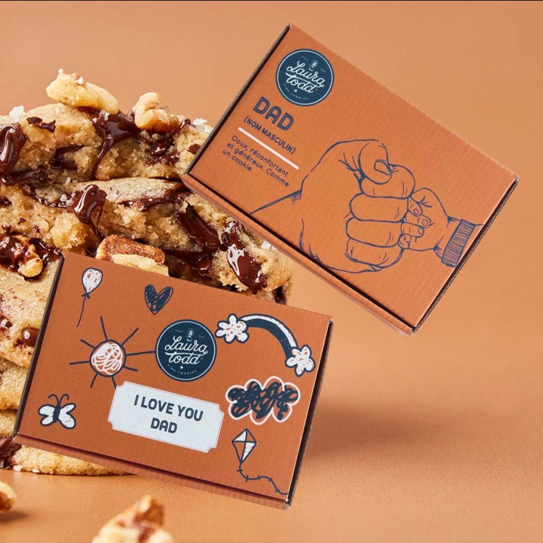
The packaging consists of a smooth, flat construction made from single-layer paperboard, featuring clean edges and folds. The primary color is a warm orange with playful illustrations and text. The design includes a hand illustration and phrases like 'I LOVE YOU DAD' and 'DAD (HONORARY)' prominently displayed. The overall appearance is light and suitable for retail display.

The image features a combination of packaging types. The granola packaging is a kraft paper bag with a flat bottom and a resealable top, showcasing a smooth surface with a matte finish. The jar of spread is in a glass container with a wooden lid, while the tote bag is made of fabric with a simple design. The granola bag displays a prominent blue label with white text, while the jar has a label that matches the branding of the granola. The tote bag is plain with the brand name printed in bold.
About the Brand
Laura Todd operates in the beauty and skincare sector, offering a diverse range of products through a robust e-commerce platform. The brand’s packaging demonstrates a blend of retail-focused carton boxes, rigid premium tins, and flexible pouches, tailored to enhance both product protection and consumer engagement.
The company’s packaging strategy incorporates multiple material types, including recyclable paperboard, rigid tins, glass jars, and flexible bags, balancing cost efficiency with visual appeal. Branding is consistently integrated through logos, color palettes, and messaging across diverse formats, supporting a cohesive customer journey from purchase to unboxing. This approach aligns with modern consumer expectations for both sustainability and aesthetic value.
Key Differentiator: What distinguishes Laura Todd is their commitment to a multi-format packaging portfolio that prioritizes brand identity, user experience, and a balance between premium presentation and logistical practicality.
Design System
Visual Style
The visual design utilizes clean, sans-serif typography paired with warm, pastel-driven color palettes (notably pinks, oranges, and natural browns), and a minimalist aesthetic that balances whitespace with illustrative accents.
Brand Identity
Consistent application of the Laura Todd logo, strategic use of product-specific iconography, and recurring color themes establish strong visual coherence across packaging. Visual consistency is reinforced through aligned label placement and messaging.
Packaging Design
Material choices prioritize recyclable paperboard, reusable rigid tins, and glass for select SKUs, reflecting a partial commitment to sustainability while maintaining premium presentation. Structural designs favor easy-open mechanisms, precise folding, and modularity for efficient storage and logistics.
User Experience
Packaging is developed to heighten the customer journey, with clear product visibility, tactile finishes, and messaging that emphasizes care and brand values. The design supports emotional engagement during unboxing while ensuring practicality for storage and reuse.
Company Metrics
Business insights for Laura Todd based on available data
Market Positioning
Brand Values & Focus
Key Competitors
Target Market: Digitally engaged consumers in the beauty and wellness segment, primarily within France and broader Western European markets, seeking quality, branded, and aesthetically pleasing self-care products.
Packaging Assessment
Overall Grade
Visual appeal and presentation quality
Packaging durability and protection
Eco-friendliness and recyclable materials
Cost efficiency and value for money
Packaging assessment for Laura Todd based on industry standards and best practices
Frequently Asked Questions
How does Laura Todd ensure packaging durability during shipping?
Laura Todd utilizes rigid tins, sturdy carton boxes, and reinforced flexible pouches designed to protect products from damage during transit, maintaining product integrity and presentation quality.
What sustainability practices are reflected in Laura Todd’s packaging?
The portfolio features recyclable paperboard, reusable tins, and glass jars, with visible efforts toward material reduction and minimalistic design, although some plastic components are still present.
How consistent is the Laura Todd brand identity across packaging formats?
Brand identity is maintained through consistent logo application, color palettes, and typography across all packaging types, ensuring strong brand recognition and customer recall.
Discover other Beauty & Fitness companies
Explore more companies in the beauty & fitness industry and their packaging strategies
Owari
Beauty & Fitness
Owari specializes in 100% natural beauty and fitness products, designed to enhance health and wellness. The company proudly offers its products made in France, emphasizing quick delivery and customer support.
Orris Paris
Beauty & Fitness
Orris Paris specializes in creating artisanal skincare products that combine potent botanical ingredients with modern cleansing rituals. The company emphasizes natural, holistic practices in its formulations.
Institut Karité Paris
Beauty & Fitness
Institut Karité Paris specializes in luxury beauty products made with natural Shea Butter, offering a wide range of skincare and body care solutions. The brand combines Parisian heritage with a commitment to quality and creativity in its offerings.