Kurk packaging
Kurk specializes in health supplements and nutrition beverages targeting inflammation management, delivering products directly to consumers. Their packaging emphasizes premium presentation, brand visibility, and secure containment of supplements in both rigid boxes and paperboard cartons.
Packaging Portfolio
Kurk’s packaging portfolio encompasses rigid chipboard boxes for premium presentation and secure transit, single-layer folding cartons for individual retail units, and cylindrical tube containers for tablet-based products. The choice of vibrant paperboard, glossy finishes, and custom die-cut inserts assures both product protection and shelf appeal. Packaging is largely optimized for D2C logistics, with structural designs supporting the safe shipment of glass bottles and liquid formats. Material selection favors visual impact and brand differentiation, though the sustainability profile is moderated by the use of mixed materials and finishes.
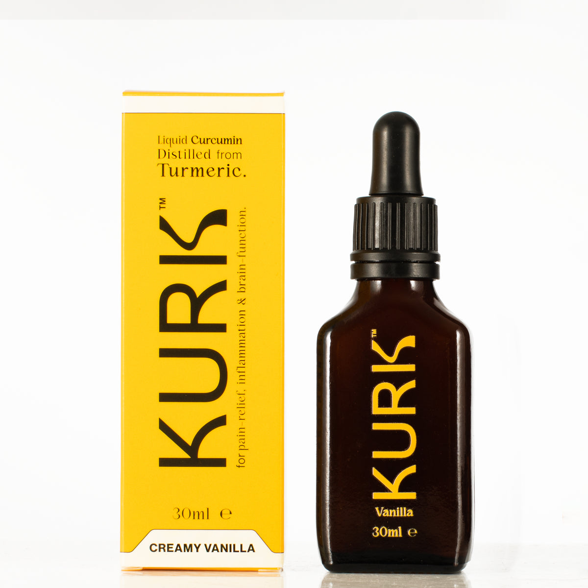
The packaging consists of a tall, rectangular carton and a glass dropper bottle. The carton features a smooth, flat construction with clean edges and folds, predominantly yellow with black text. The bottle is dark glass with a dropper cap, indicating a premium product. The carton has a glossy finish, while the bottle appears matte.
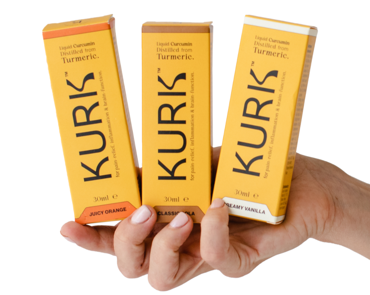
The packaging consists of three slender, rectangular boxes held in a hand. Each box features a smooth, flat construction made from single-layer paperboard, with clean edges and folds. The boxes are predominantly colored in vibrant hues of orange and yellow, with a glossy finish that enhances their visual appeal. Each box has a distinct color and design, showcasing branding elements prominently on the front. The packaging is designed for retail display, suggesting a lightweight appearance suitable for consumer products.
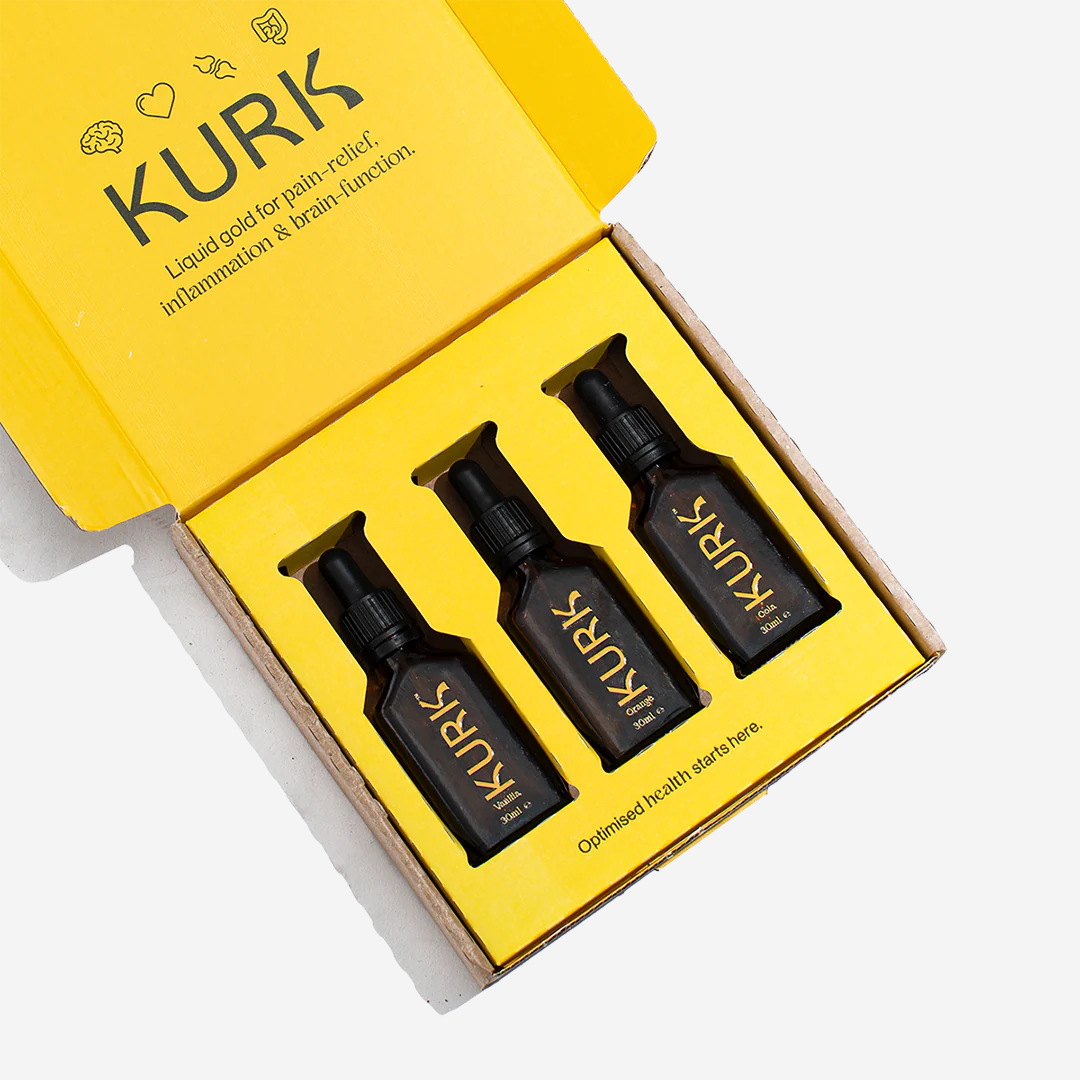
The packaging is a folding carton made of a single layer of paperboard. It features a bright yellow exterior with a smooth finish. The interior is designed to hold three small bottles securely, with cutouts to accommodate the bottles' shapes. The edges are cleanly folded, and the construction appears robust yet lightweight. The carton opens from the top with a tuck flap closure.
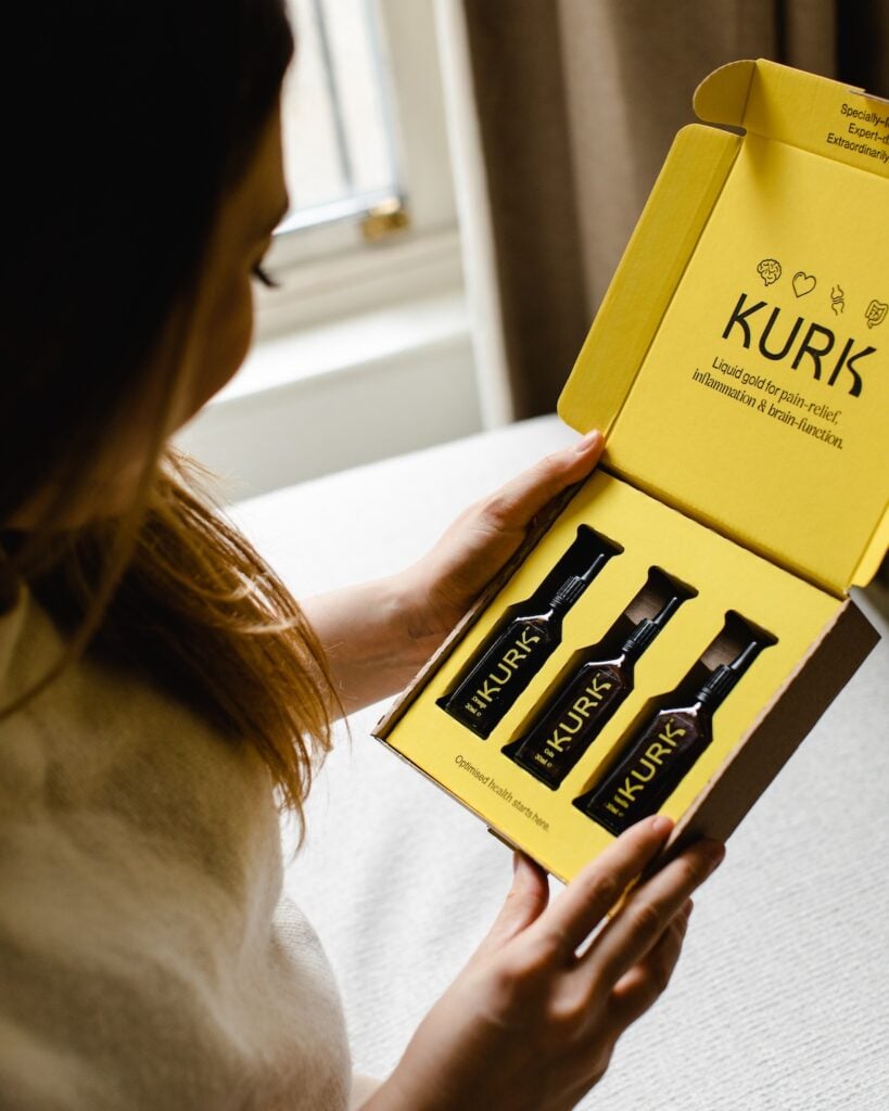
The packaging is a rigid box with a sturdy construction, featuring a thick chipboard material. The exterior is a vibrant yellow with the brand name 'KURK' prominently displayed in bold black letters. The interior is a contrasting color, likely a lighter shade, providing a visually appealing presentation. The box is designed to hold three small bottles securely, with cutouts that fit the bottles snugly. The edges are cleanly folded, and the box has a premium feel, indicative of high-quality construction.
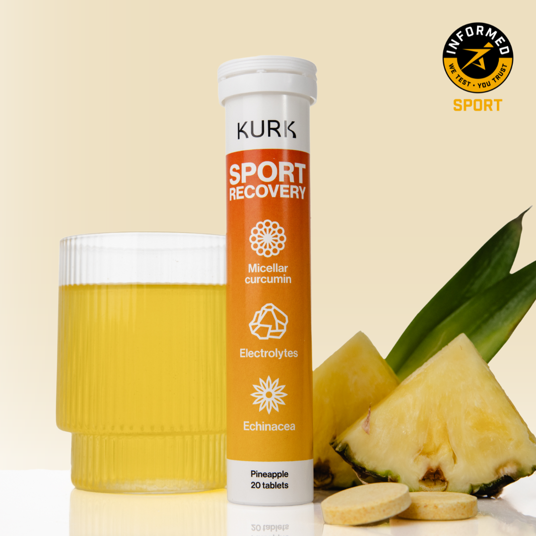
The packaging is a cylindrical tube container, predominantly white with an orange band around the middle. The top is sealed with a plastic cap, and the overall design is sleek and modern. The tube is designed to hold tablets, as indicated by the product information. The surface is smooth with a matte finish, providing a clean appearance. The graphics are vibrant, featuring a combination of white, orange, and black colors.
About the Brand
Kurk is a health-focused D2C company offering plant-based supplements and beverages designed to combat chronic inflammation. Their packaging portfolio utilizes structurally robust rigid boxes, folding cartons, and tube containers to support both retail display and secure shipment of liquid and tablet products.
Founded by cancer survivors and plant science experts, Kurk integrates scientific research and customer insights into both product development and packaging design. The visual identity leverages vibrant color schemes and bold typography to enhance brand recall, while packaging formats are selected to optimize product integrity and consumer unboxing experience. Kurk’s approach demonstrates a balance between premium branding and practical packaging logistics, with some attention to sustainability.
Key Differentiator: Kurk differentiates through its expert-led product formulations and a packaging system that prioritizes both premium consumer experience and robust product protection, reflecting a strong brand identity within the health supplements market.
Design System
Visual Style
Typography is bold and sans-serif, supporting high legibility and modern aesthetics. The color palette is anchored in vibrant yellows, oranges, and whites, creating strong shelf presence and visual consistency across all SKUs. Overall, the aesthetic is clean, energetic, and health-oriented.
Brand Identity
Logo is prominently displayed on all packaging surfaces, supported by consistent iconography and product descriptors. Visual consistency is maintained through repeated use of brand colors, font styles, and layout hierarchies, reinforcing brand recognition.
Packaging Design
Material selection favors rigid chipboard for gift sets, recyclable paperboard for cartons, and plastic-capped tubes for tablets. Structural design emphasizes secure containment (die-cut bottle inserts), easy unboxing (tuck flaps), and retail readiness. Glossy finishes enhance visual appeal but may reduce recyclability.
User Experience
Packaging is designed for both emotional impact and functional ease, delivering a premium unboxing moment while ensuring product safety in transit. Clear labeling, intuitive opening mechanisms, and vibrant design elements support an engaging and trustworthy customer journey.
Company Metrics
Business insights for Kurk based on available data
Market Positioning
Brand Values & Focus
Key Competitors
Target Market: Health-conscious consumers seeking natural, science-backed solutions for inflammation and wellness, primarily in North America via D2C e-commerce channels.
Packaging Assessment
Overall Grade
Visual appeal and presentation quality
Packaging durability and protection
Eco-friendliness and recyclable materials
Cost efficiency and value for money
Packaging assessment for Kurk based on industry standards and best practices
Frequently Asked Questions
What packaging materials does Kurk primarily use?
Kurk primarily utilizes rigid chipboard boxes, single-layer paperboard folding cartons, and cylindrical tube containers for packaging its supplements and beverages.
How does Kurk's packaging support its brand identity?
The packaging features prominent logo placement, vivid color schemes, and consistent typography, aligning closely with Kurk’s health and wellness branding.
Is Kurk’s packaging designed with sustainability in mind?
While Kurk utilizes recyclable paperboard and chipboard for many products, the use of glossy finishes and some plastic components in tube closures may moderate sustainability performance.
Discover other Health companies
Explore more companies in the health industry and their packaging strategies
Doctor Seaweed
Health
Doctor Seaweed specializes in natural, plant-based nutritional supplements derived from seaweed, aimed at promoting overall wellness.
Smart Protein
Health
Smart Protein is dedicated to transforming nutrition by providing a range of health and wellness products focused on protein supplements and vitamins.
Comvita
Health
Comvita is a New Zealand-based company specializing in high-quality Mānuka honey and natural health products. Established in 1974, it aims to connect people with the healing power of nature.