Kenny Anker packaging
Kenny Anker specializes in brow and lash beauty services alongside a curated cosmetics line for home use. Their packaging strategy emphasizes visually distinctive, retail-ready carton boxes tailored to enhance brand presence and consumer appeal.
Packaging Portfolio
Kenny Anker's packaging portfolio centers on retail-oriented carton boxes utilizing single-layer paperboard. The solutions feature a mix of matte and glossy finishes, bold and minimalistic typography, and a diverse yet cohesive color palette reflecting product segmentation. Structural formats are optimized for cosmetic pencils, brushes, and serums, supporting both shelf presence and e-commerce durability. All primary packaging is designed to be lightweight, tamper-evident, and visually impactful, with consistent brand and product labeling across SKUs.

The packaging is a tall, slim rectangular box designed for retail display. It features a smooth, flat construction without any visible fluted layers, indicating it is made from single-layer paperboard. The exterior is a muted olive green color, providing a modern and elegant appearance. The box has clean, precise edges and folds, typical of high-quality folding cartons. The front of the box displays the product name 'EYE BRUSH' in a bold, gold font, which contrasts well against the green background. The overall design is minimalistic, with no additional graphics or images, focusing on the product name and brand identity.
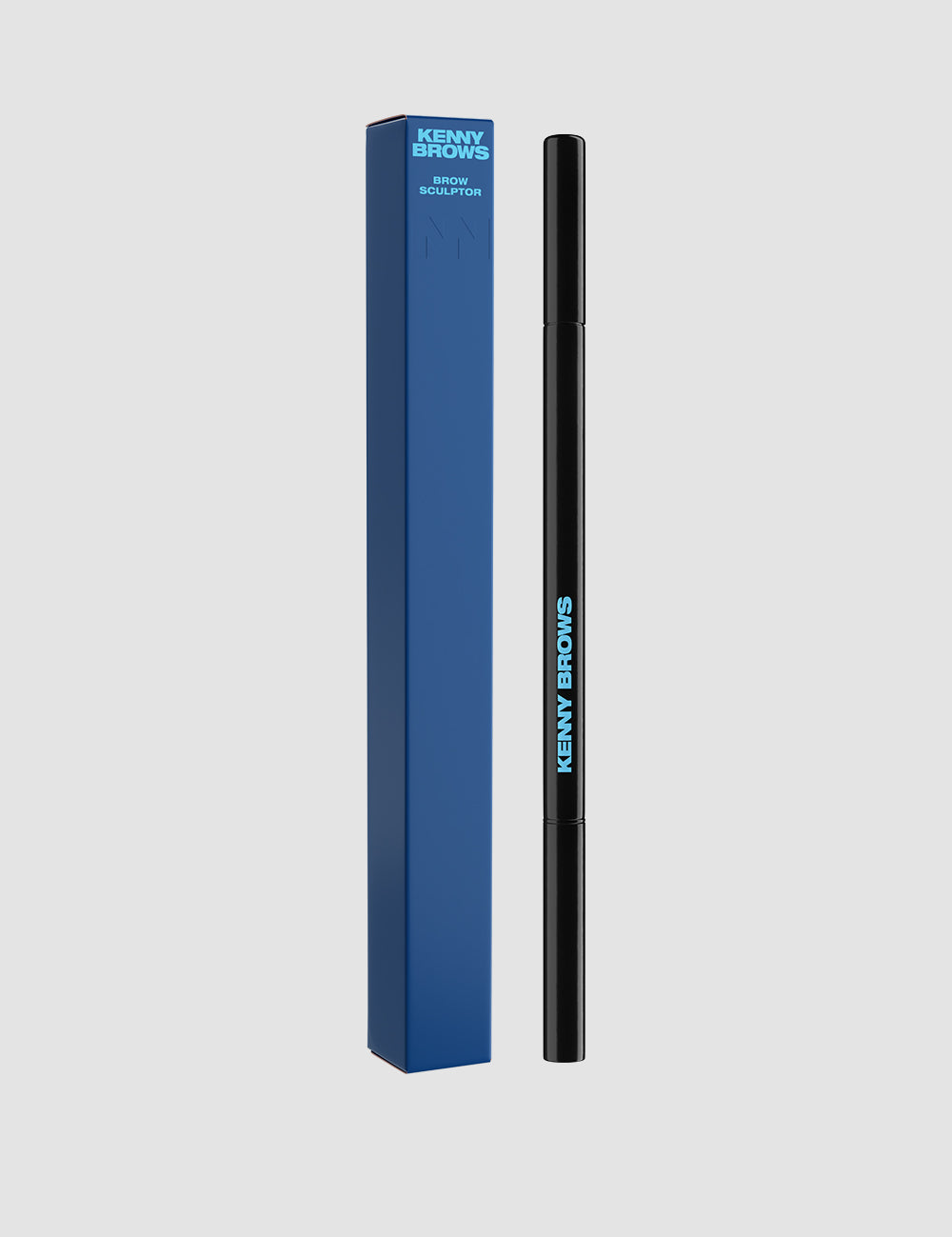
The packaging is a tall, rectangular box with a smooth, flat construction. It features a predominantly blue exterior with a glossy finish. The box has clean, precise edges and folds, indicative of a single-layer paperboard structure. The front displays the brand name 'KENNY BROWN' in bold, bright blue lettering, contrasting against the darker blue background. The overall design is sleek and modern, suitable for retail display.
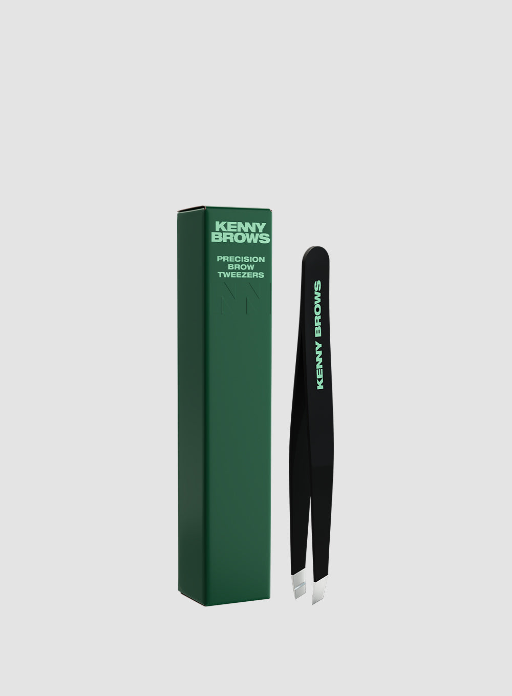
The packaging is a tall, narrow retail carton designed to hold precision tweezers. It features a smooth, flat construction without any visible fluted layers, indicating it is made from single-layer paperboard. The exterior is predominantly green with a matte finish, and the brand name 'KENNY BROWS' is prominently displayed in a bold, white font. The edges are clean and precise, with a rectangular shape that tapers slightly towards the top. The carton is designed to stand upright on retail shelves.

The packaging is a tall, rectangular folding carton made of smooth, single-layer paperboard. It features a vibrant pink exterior with a glossy finish, showcasing a modern design. The front displays the product name 'CHEEK RUSH' in bold white lettering, while the back includes product details and usage instructions in smaller text. The edges are clean and precise, indicating high-quality manufacturing. The carton is designed to hold a cosmetic brush securely, with no visible flaps or tabs protruding, suggesting a tuck-top closure.
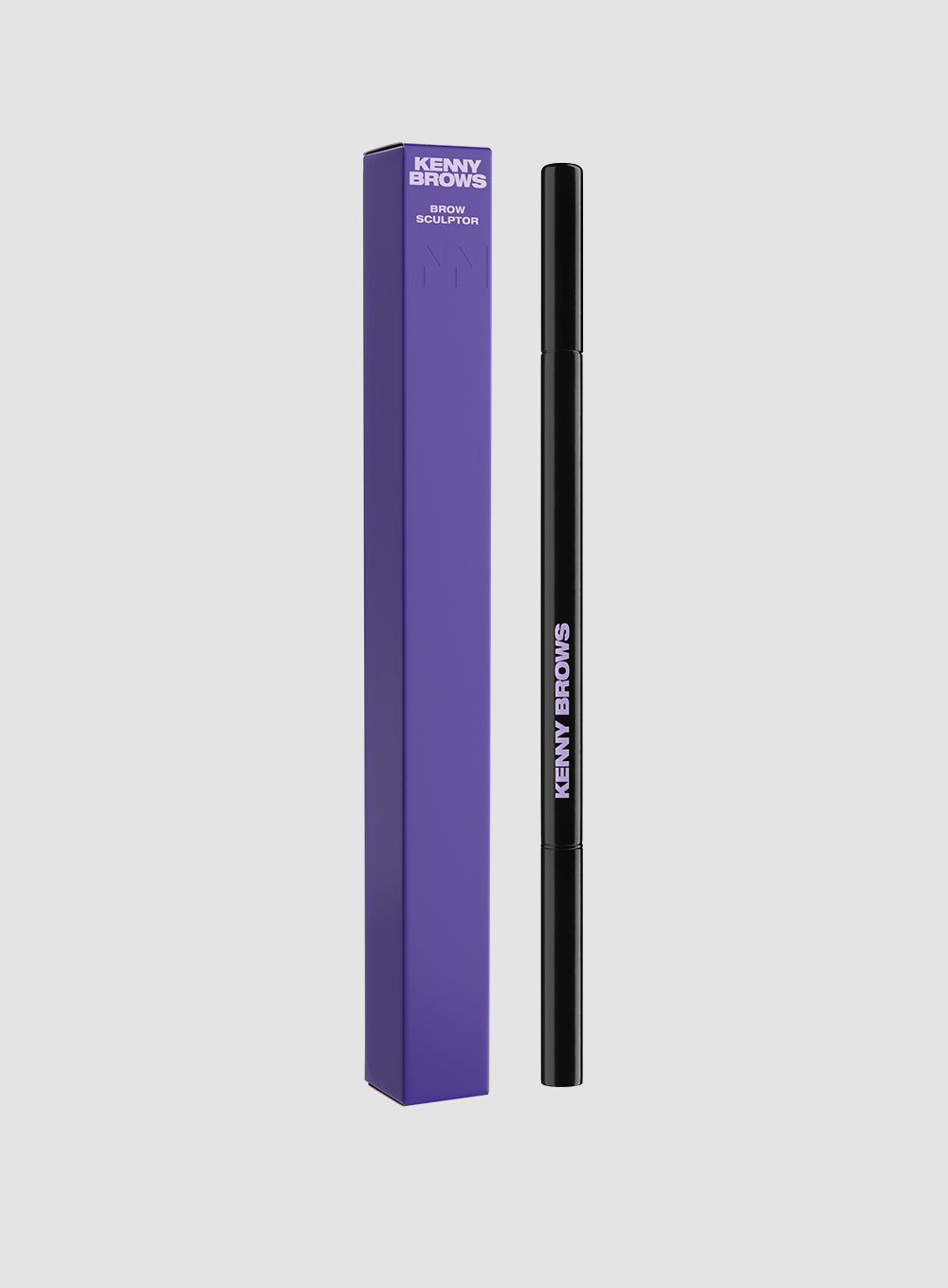
The packaging is a tall, slender box designed to hold a cosmetic product, likely a brow pencil. It features a smooth, flat construction without any visible fluted layers. The box is predominantly purple with a glossy finish, giving it a modern and appealing look. The edges are clean and precise, indicating high-quality manufacturing. The front of the box displays the product name in bold, white lettering, which contrasts sharply against the purple background. There are no visible signs of wear or damage, suggesting it is in new condition.
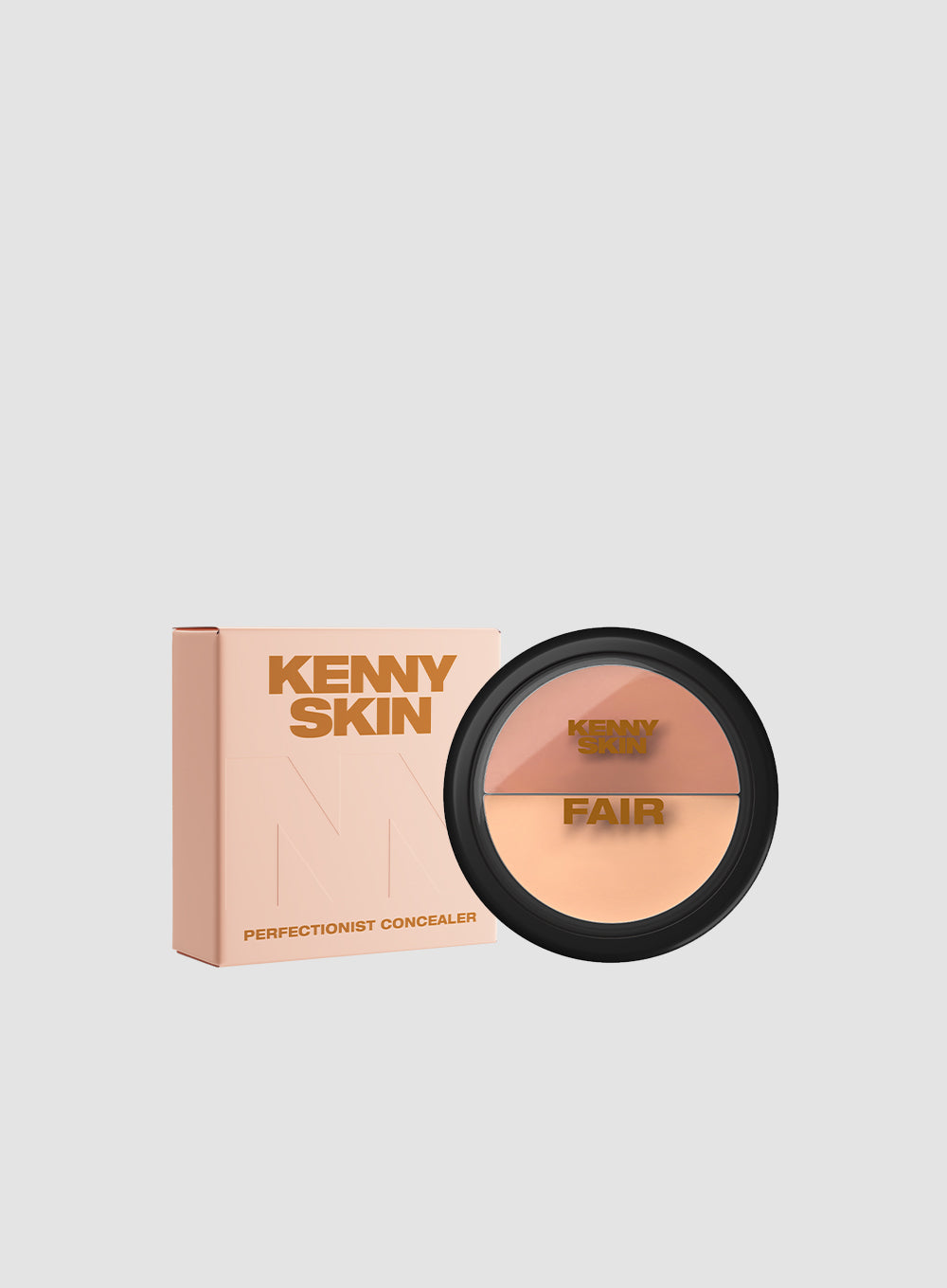
The packaging is a folding carton with a smooth, flat construction. It features a predominantly pastel peach color with a matte finish. The front displays the brand name 'KENNY SKIN' in bold, uppercase letters, with the word 'FAIR' below it, indicating the product shade. The edges are clean and precise, and the overall appearance is lightweight yet sturdy, typical of retail packaging for cosmetics.
About the Brand
Kenny Anker operates within the beauty and cosmetics sector, focusing chiefly on brow and lash enhancement services and related consumer products. The company's packaging approach relies on high-quality, custom-designed carton boxes that align with brand aesthetics and reinforce product identity at the point of sale.
Packaging solutions at Kenny Anker are consistently executed with attention to visual branding, utilizing matte and glossy finishes, bold color palettes, and prominent logotype placement. The packaging structures are optimized for both in-store presentation and e-commerce fulfillment, reflecting a balance between premium branding and practical logistics. The company’s product packaging is largely single-layer paperboard, supporting lightweight, efficient shipping and shelf stability.
Key Differentiator: Kenny Anker distinguishes itself through a cohesive, color-driven packaging system that reinforces brand identity and elevates the retail and unboxing experience for cosmetic consumers.
Design System
Visual Style
The visual design emphasizes clean, modern typography with bold, sans-serif fonts and high-contrast color palettes including pastel peach, olive green, vibrant pink, deep blue, and purple. The overall aesthetic is minimalistic yet expressive, supporting premium beauty positioning.
Brand Identity
Brand identity is reinforced through prominent logo and company name placement, consistent iconography, and disciplined color application across product lines. Packaging leverages both Kenny Anker and sub-brand logotypes, ensuring immediate recognition and visual consistency.
Packaging Design
Structural design favors single-layer paperboard folding cartons for efficiency and recyclability. Material selection prioritizes lightweight, smooth-finish substrates with options for matte or gloss lamination to enhance tactile and visual appeal. Carton formats are tailored to product function, maximizing protection and shelf visibility.
User Experience
Packaging is engineered for effortless unboxing and clear product identification, with a focus on emotional impact and premium feel. Design decisions support a seamless customer journey from purchase to use, reinforcing brand trust and encouraging repeat engagement.
Company Metrics
Business insights for Kenny Anker based on available data
Market Positioning
Brand Values & Focus
Key Competitors
Target Market: Primarily female beauty consumers in Denmark seeking professional brow and lash services and premium cosmetics for at-home use.
Packaging Assessment
Overall Grade
Visual appeal and presentation quality
Packaging durability and protection
Eco-friendliness and recyclable materials
Cost efficiency and value for money
Packaging assessment for Kenny Anker based on industry standards and best practices
Frequently Asked Questions
What type of packaging does Kenny Anker primarily use?
Kenny Anker primarily uses single-layer paperboard carton boxes with matte or glossy finishes, designed for retail cosmetic products such as brow pencils, brushes, and skincare items.
How does Kenny Anker's packaging contribute to brand recognition?
Distinctive color palettes, bold typography, and consistent brand and product naming on packaging reinforce visual identity, supporting brand recall and differentiation in the competitive beauty segment.
Are Kenny Anker's packaging materials sustainable?
Most packaging utilizes recyclable paperboard, contributing to sustainability; however, the focus is primarily on visual impact rather than advanced eco-friendly solutions.
Discover other Beauty & Fitness companies
Explore more companies in the beauty & fitness industry and their packaging strategies
Orris Paris
Beauty & Fitness
Orris Paris specializes in creating artisanal skincare products that combine potent botanical ingredients with modern cleansing rituals. The company emphasizes natural, holistic practices in its formulations.
Institut Karité Paris
Beauty & Fitness
Institut Karité Paris specializes in luxury beauty products made with natural Shea Butter, offering a wide range of skincare and body care solutions. The brand combines Parisian heritage with a commitment to quality and creativity in its offerings.
Cultiv Cosmetique
Beauty & Fitness
Cultiv Cosmetique is a French skincare brand that provides organic and eco-friendly beauty products inspired by nature. They focus on effective skincare solutions for various skin concerns.