Just Bee packaging
Just Bee, founded in Manchester in 2015, produces vitamin-enriched honey and health supplements with a focus on ethical sourcing and minimal processing. Their packaging strategy centers on transparent branding, recyclable materials, and formats tailored for both protection and shelf appeal.
Packaging Portfolio
Just Bee’s packaging portfolio is dominated by clear glass jars with screw or metal lids, delivering both product visibility and robust protection. Secondary structures include single-layer paperboard cartons for multipacks and gift arrangements, and recycled paper bags for ancillary items such as promotional seed packs. The use of recyclable materials is evident throughout, with branding consistently applied on primary containers and outer cartons, though less prominent on some secondary formats. Material selection balances presentation quality, product protection, and environmental considerations, reflecting a data-driven approach to premium food packaging.

The packaging consists of a clear glass jar with a wide mouth, featuring a white plastic screw-on lid. The jar is filled with a golden honey product that has visible turmeric pieces, indicating its contents. The label wraps around the jar, displaying vibrant orange colors with illustrations of turmeric and honey elements. The text is bold and easy to read, emphasizing the product's benefits.

The packaging is a folding carton designed to hold three jars of honey. It features a smooth, flat construction without visible fluted layers, indicating it is made from single-layer paperboard. The exterior is a light brown kraft color with a clean finish. The box has a handle cut-out at the top for easy carrying, and the edges are neatly folded and glued. The front displays a colorful label with the brand name and product information, while the interior is plain kraft paper. The overall shape is rectangular, designed to securely hold the jars in place.
The packaging consists of a clear glass jar with a wide mouth and a metal lid. The jar is cylindrical in shape, showcasing the honey inside. The label is wrapped around the jar, featuring vibrant colors and graphics. The lid is metallic and has a smooth finish, adding a premium feel to the packaging.

The packaging is a clear glass jar with a white plastic lid. The jar is cylindrical in shape, featuring a smooth surface with a slight curve towards the base. The lid is flat and securely fits on top, providing a tight seal. The jar is filled with a golden-orange honey, which is visible through the clear glass. The label wraps around the jar, displaying product information and branding elements.

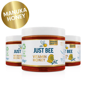
The packaging consists of a series of glass jars with a smooth, cylindrical shape. Each jar features a wide mouth and a white plastic screw-on lid. The jars are filled with a golden honey product, and the labels are prominently displayed around the body of the jars. The labels are colorful, featuring a dark blue background with yellow and white graphics, including a bee and honeycomb patterns. The text is bold and clear, indicating the product name and key features.
About the Brand
Just Bee specializes in health-focused honey products, emphasizing natural ingredients and vitamin fortification. Their packaging solutions primarily utilize glass jars and recyclable paperboard, aligning with sustainability objectives and clear brand communication.
The brand’s packaging approach leverages visibility of the product through clear glass, supplemented by paper-based outer cartons for gifting and retail multipacks. Consistent branding elements, such as bold typography and vibrant color palettes, are applied across all touchpoints to reinforce premium positioning and health-forward messaging. Operationally, the compact team structure allows for agile packaging innovation and quick adaptation to consumer preferences.
Key Differentiator: Integration of vitamin-enrichment and sustainability messaging into both product and packaging, supported by transparent, recyclable materials and consistent brand visuals.
Design System
Visual Style
Typography combines bold, modern sans-serif fonts for product names and key information, with handwritten or script elements for artisanal cues. Color palette is vibrant, incorporating natural tones (honey gold, orange, green) alongside clean whites and kraft browns, yielding a fresh, health-oriented aesthetic.
Brand Identity
Logo features stylized bee iconography, consistently displayed on all primary packaging. Iconography leverages honeycomb patterns, bee illustrations, and vitamin callouts. Brand visuals maintain high consistency across jar labels and cartons, with cohesive use of color and layout.
Packaging Design
Material choices prioritize glass for product integrity and recyclability, with paperboard for multipacks and gifting. Structural philosophy focuses on clear product display, ergonomic handling (e.g., carton handles), and modular formats for retail efficiency. Minimalist, low-flute or single-layer constructions reduce material use while maintaining protection.
User Experience
Design supports the customer journey through transparent product presentation, clear nutritional information, and easy-open formats. The unboxing experience is enhanced by premium tactile materials and visually engaging labels, while brand messaging on sustainability and wellness is reinforced at each touchpoint.
Company Metrics
Business insights for Just Bee based on available data
Market Positioning
Brand Values & Focus
Key Competitors
Target Market: Health-conscious consumers in the UK seeking natural, vitamin-enriched honey alternatives; e-commerce buyers prioritizing ethical sourcing and sustainable packaging.
Packaging Assessment
Overall Grade
Visual appeal and presentation quality
Packaging durability and protection
Eco-friendliness and recyclable materials
Cost efficiency and value for money
Packaging assessment for Just Bee based on industry standards and best practices
Frequently Asked Questions
What types of packaging materials does Just Bee use for its honey products?
Just Bee predominantly uses clear glass jars with plastic or metal lids for primary packaging, and paperboard cartons for multipacks and gift boxes. Secondary packaging includes recycled paper bags for ancillary items.
How does Just Bee incorporate sustainability into its packaging?
Sustainability is addressed through the use of recyclable glass, paperboard, and recycled paper materials, as well as eco-friendly branding initiatives such as seed packet inserts. The company places a strong emphasis on minimal processing and eco-conscious sourcing.
Is the packaging branding consistent across all Just Bee products?
Branding is highly consistent on primary product packaging, featuring the Just Bee logo, clear product information, and a cohesive visual style. However, secondary items, such as paper bags, occasionally lack full brand integration.
Discover other Food & Drink companies
Explore more companies in the food & drink industry and their packaging strategies
Terres de Café
Food & Drink
Terres de Café is a specialty coffee retailer based in Paris, France, known for its commitment to sustainability and high-quality coffee sourcing.
Teegschwendner GmbH
Food & Drink
Teegschwendner GmbH is a specialty tea company based in Germany, offering a wide selection of high-quality teas and tea-related accessories. They focus on providing unique tea experiences through carefully sourced and curated products.
ruf lebensmittelwerk kg
Food & Drink
RUF Lebensmittelwerk KG is a German food production company specializing in a variety of baking mixes and drink products. Founded in 1920, the company is known for its high-quality ingredients and innovative food solutions.