Joone Paris packaging
Joone Paris specializes in premium baby care products, delivering diapers and skincare through a direct-to-consumer subscription model. Their packaging strategy emphasizes eco-friendly materials, playful designs, and a strong brand presence, targeting families seeking both sustainability and convenience.
Packaging Portfolio
Joone Paris utilizes a mix of rigid boxes, folding cartons, and flexible pouches, with a preference for single-layer paperboard and kraft materials. Their packaging portfolio is characterized by clean, precise folding, compartmentalized interiors for gift and trial sets, and playful illustrations that reinforce the brand's child-friendly positioning. The packaging structures demonstrate a balance between product protection, logistical efficiency, and visual storytelling, with a strong emphasis on recyclability and minimal plastic use. This approach is tailored for both subscription shipments and retail display, optimizing for both consumer experience and sustainability.
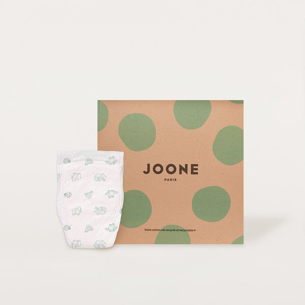
The packaging is a flat, square folding carton made of single-layer paperboard. It features a smooth, clean construction with no visible fluted layers. The exterior is primarily kraft brown with large green polka dots, creating a playful and vibrant appearance. The brand name 'JOONE' is prominently displayed in bold, black letters at the center, with 'PARIS' below it in a smaller font. The edges are cleanly folded, and the overall structure appears lightweight yet sturdy, suitable for retail display.
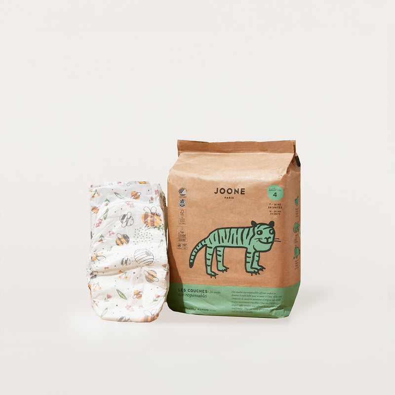
The packaging consists of a flat, smooth construction made from single-layer paperboard. The main bag features a kraft brown color with a playful illustration of a tiger and colorful graphics, indicating a child-friendly product. The edges are clean and precise, with a folded top that appears to be secured with a tuck tab. The overall design is vibrant and appealing, with a matte finish that enhances the visual appeal. The product information is clearly printed on the front, including size and usage instructions.

The packaging is a rigid box featuring a sturdy construction with thick walls. The exterior is adorned with a combination of soft pastel colors, primarily pink and beige, creating a visually appealing aesthetic. The box has a smooth finish, with clean edges and precise folds. The front displays a simple yet artistic design, including abstract shapes and the brand name 'JOONE' prominently featured. The box is designed to hold two products, with a compartmentalized interior that securely houses the items.

The packaging consists of a square, flat bag with a plastic outer layer. The front features a cartoon tiger illustration and the brand name 'JOONE' prominently displayed at the top. The color scheme includes a white background with green and black accents. The bag is sealed at the top and has a smooth surface with no visible fluted layers, indicating it is not corrugated. The edges are clean and the overall appearance is lightweight and flexible.
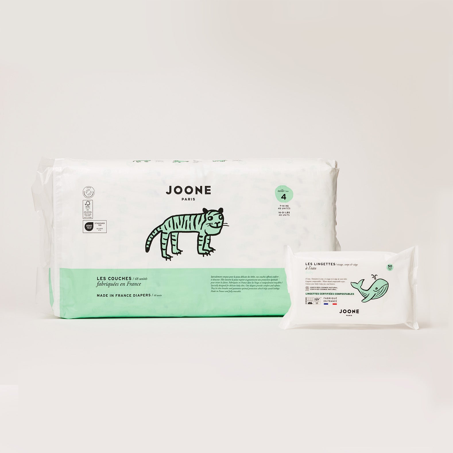
The packaging consists of a rectangular folding carton for diapers and a flexible pouch for wipes. The carton is predominantly white with a green base and features playful illustrations of a tiger. The edges are clean and precise, indicating a well-constructed folding carton. The flexible pouch is also white with a simple design, featuring a whale illustration. Both items have a smooth surface finish with a matte appearance.
The packaging is a folding carton with a smooth, flat construction. It features a light turquoise background with large white polka dots. The edges are clean and precise, indicative of a well-constructed retail box. The box is closed with tuck tabs at the top, providing a secure closure. The overall shape is rectangular, designed to hold multiple items neatly. The box appears to be lightweight and suitable for retail display.
About the Brand
Joone Paris operates in the consumer electronics and baby care sector, focusing on high-quality, eco-conscious products for families. Their packaging solutions are integral to their brand differentiation, highlighting transparency, traceability, and a visually consistent identity across product lines.
Founded in 2016 and based in Paris, Joone Paris leverages a D2C subscription model to distribute diapers, baby skincare, and maternal wellness products. Their packaging is designed to reinforce brand trust and environmental stewardship, incorporating recyclable materials and creative graphics that appeal to their target demographic. Operational decisions, influenced by a supply-chain-centric team structure, further support packaging innovation and logistics efficiency.
Key Differentiator: Joone Paris stands out through its integration of sustainability and traceability into both product development and packaging, utilizing custom designs and eco-friendly formats to enhance the customer experience.
Design System
Visual Style
The visual design employs soft pastel color palettes (notably pink, beige, turquoise, and kraft brown), bold sans-serif typography, and playful graphic patterns such as polka dots and whimsical animal illustrations. The overall aesthetic is modern, approachable, and distinctly child-oriented.
Brand Identity
Joone Paris ensures strong logo visibility and consistent application of their brand name across all packaging. Iconography includes custom illustrations (tigers, whales) and geometric motifs, with a strict adherence to visual coherence and minimalism in layout.
Packaging Design
Material selection prioritizes recyclable paperboard and kraft, with structural designs focused on folding cartons, rigid boxes, and lightweight pouches. The philosophy emphasizes simplicity, protection, and shelf appeal while reducing material complexity and waste.
User Experience
The packaging is engineered to deliver a memorable unboxing experience, with secure compartments, easy-to-open structures, and visually engaging graphics. This supports both product safety during shipping and a positive, reassuring brand interaction for parents and families.
Company Metrics
Business insights for Joone Paris based on available data
Market Positioning
Brand Values & Focus
Key Competitors
Target Market: Eco-conscious families and parents in France and Western Europe seeking high-quality, sustainable baby care products via direct-to-consumer subscriptions.
Packaging Assessment
Overall Grade
Visual appeal and presentation quality
Packaging durability and protection
Eco-friendliness and recyclable materials
Cost efficiency and value for money
Packaging assessment for Joone Paris based on industry standards and best practices
Frequently Asked Questions
What types of packaging formats does Joone Paris use?
Joone Paris employs a variety of packaging formats including rigid boxes for gift sets, single-layer folding cartons, flexible pouches, and retail-ready cartons. These structures are optimized for both logistics safety and a premium unboxing experience.
How does Joone Paris address sustainability in its packaging?
The company prioritizes recyclable materials and minimalistic structures, utilizing paperboard and kraft cartons while minimizing plastic use. This approach supports their commitment to lowering environmental impact and aligns with eco-conscious consumer expectations.
What is the visual style of Joone Paris's packaging?
Joone Paris employs a playful, modern aesthetic featuring pastel colors, bold typography, and whimsical illustrations, fostering a child-friendly and approachable brand presence.
Discover other Consumer Electronics companies
Explore more companies in the consumer electronics industry and their packaging strategies
OtterBox
Consumer Electronics
OtterBox specializes in protective cases and accessories for mobile devices, ensuring durability and style for users. Founded in 1998, the company has built a reputation for quality and innovation in the consumer electronics market.
Tchibo Direct GmbH
Consumer Electronics
Tchibo Direct GmbH is a consumer goods company based in Hamburg, Germany, specializing in coffee products and a variety of other consumer goods. The company operates both online and offline, offering a wide range of products from coffee machines to home and garden items.
Golla
Consumer Electronics
Golla is a company specializing in fashionable and functional tech accessories, primarily focusing on laptop sleeves and backpacks. They combine style with practicality to cater to tech-savvy consumers.