J.J. Darboven packaging
J.J. Darboven specializes in premium coffee, tea, and chocolate products, utilizing a diverse range of packaging formats to reinforce their brand’s commitment to quality and sustainability. Their packaging strategy reflects a balance of functional design, brand consistency, and increasing focus on eco-conscious materials.
Packaging Portfolio
J.J. Darboven's packaging portfolio features a structured mix of carton boxes, retail cartons, and flexible packaging formats such as stand-up pouches and resealable bags. Materials include matte and glossy paperboard, multi-layer films with barrier properties, and compostable or recyclable substrates in select lines. The packaging is engineered for optimal product preservation, strong shelf appeal, and efficient logistics management. Resealable closures, spouts, and clear product windows are utilized to enhance user convenience and product visibility, reflecting a data-driven approach to packaging design and functionality.
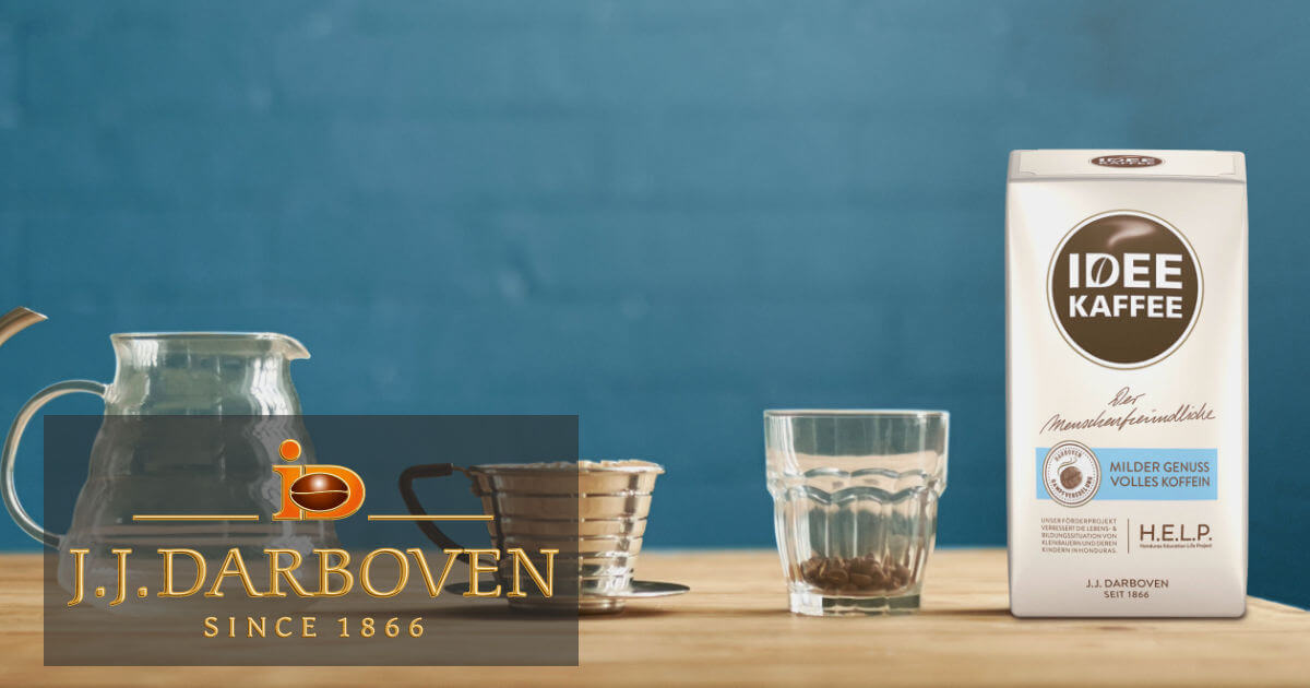
The packaging is a rectangular, upright carton with a smooth, flat construction. It features a white paperboard exterior with a glossy finish, giving it a clean and modern appearance. The edges are precise, and the folds are well-defined, indicating a high-quality manufacturing process. The front of the carton prominently displays the brand name 'IDEE KAFFEE' in bold, dark lettering, accompanied by a tagline and product description. The back and sides may contain additional product information and graphics.

The packaging is a stand-up pouch made of a multi-layered flexible material. It has a matte brown exterior with a glossy finish on the front, featuring a large window that allows visibility of the product inside. The top of the pouch has a resealable zipper closure, and the sides are slightly curved to allow it to stand upright. The overall shape is rectangular with a slight taper towards the bottom.
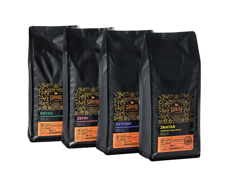
The packaging consists of four individual bags, each with a similar design. The bags are made from a flexible material, likely a multi-layer film that provides barrier properties to protect the contents. Each bag has a matte black finish with vibrant colored labels at the bottom, indicating different coffee varieties. The bags have a flat bottom, allowing them to stand upright, and feature a resealable closure at the top. The overall design is sleek and modern, appealing to a premium coffee market.
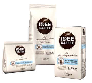
The image features three distinct coffee packages. The leftmost package is a small, square bag with a flat bottom, made from a smooth paperboard material, likely with a matte finish. The middle package is a taller, rectangular bag with a similar smooth surface, while the rightmost package is a rectangular box with clean edges and a glossy finish. All packages display vibrant colors and clear graphics, indicating a cohesive branding strategy.
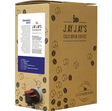
The packaging is a rectangular carton box made from a single layer of paperboard. It features a smooth, flat construction with clean edges and folds. The exterior is predominantly brown with printed graphics, including a label on the front and coffee-related imagery scattered around the sides. The box has a spout for dispensing the cold brew coffee, indicating a functional design for easy pouring.
About the Brand
J.J. Darboven is a well-established European food and drink company with a core focus on hot beverages. Their packaging solutions are engineered to support premium product positioning, safeguard product integrity, and communicate their sustainable brand ethos.
The company leverages over 150 years of industry expertise to develop a packaging approach that prioritizes both product protection and consumer engagement. Packaging formats range from carton boxes and stand-up pouches to resealable flexible bags, each selected for optimal preservation of quality and ease of use in both retail and professional settings. Sustainability considerations are increasingly embedded in their packaging lifecycle, aligning with broader industry trends and consumer preferences.
Key Differentiator: A unique combination of heritage-driven branding, a diversified product portfolio, and a measurable commitment to integrating sustainability into their packaging processes.
Design System
Visual Style
The visual design emphasizes earthy and neutral tones, complemented by vibrant accent colors to differentiate product lines. Typography is modern and legible, with a preference for bold sans-serif fonts for headings and clean serif or sans-serif for body text, supporting clarity and premium positioning.
Brand Identity
Brand logos are consistently placed on the front panel, accompanied by product names, origin details, and clear iconography. Visual consistency is maintained across packaging variants through uniform logo placement, cohesive color palettes, and repeated use of signature brand elements.
Packaging Design
Material selection balances protection and sustainability, favoring recyclable paperboard and high-barrier flexible films. Structural design favors upright cartons and stand-up pouches for stability, efficient stacking, and retail display optimization.
User Experience
Design choices support an intuitive unboxing experience, with resealable closures and spouts for product freshness and ease of use. Informational labeling, tactile finishes, and well-defined graphics facilitate a seamless customer journey from purchase to consumption, reinforcing brand trust and quality perception.
Company Metrics
Business insights for J.J. Darboven based on available data
Market Positioning
Brand Values & Focus
Key Competitors
Target Market: J.J. Darboven targets B2B clients in the European food and beverage industry, including cafés, restaurants, hotels, and specialty retailers seeking premium hot beverage solutions with an emphasis on quality and responsible sourcing.
Packaging Assessment
Overall Grade
Visual appeal and presentation quality
Packaging durability and protection
Eco-friendliness and recyclable materials
Cost efficiency and value for money
Packaging assessment for J.J. Darboven based on industry standards and best practices
Frequently Asked Questions
What types of packaging does J.J. Darboven use for its products?
J.J. Darboven employs a mix of carton boxes, flexible stand-up pouches, and resealable bags. These formats are chosen for their protective qualities, branding potential, and suitability for various hot beverage products.
How does J.J. Darboven address sustainability in its packaging?
The company is progressively incorporating recyclable materials and optimizing packaging design to minimize environmental impact, reflecting a broader shift toward eco-friendly practices in the food and beverage sector.
Discover other Food & Drink companies
Explore more companies in the food & drink industry and their packaging strategies
Terres de Café
Food & Drink
Terres de Café is a specialty coffee retailer based in Paris, France, known for its commitment to sustainability and high-quality coffee sourcing.
Teegschwendner GmbH
Food & Drink
Teegschwendner GmbH is a specialty tea company based in Germany, offering a wide selection of high-quality teas and tea-related accessories. They focus on providing unique tea experiences through carefully sourced and curated products.
ruf lebensmittelwerk kg
Food & Drink
RUF Lebensmittelwerk KG is a German food production company specializing in a variety of baking mixes and drink products. Founded in 1920, the company is known for its high-quality ingredients and innovative food solutions.