isdin packaging
ISDIN is a leading dermatological solutions provider specializing in skincare and wellness products. Their packaging strategy utilizes a mix of carton and rigid box solutions with a focus on premium presentation, visual consistency, and robust brand identity.
Packaging Portfolio
ISDIN’s packaging portfolio is dominated by carton boxes for retail and rigid boxes for premium and gift sets. The use of single-layer, glossy-finished paperboard maximizes shelf appeal and supports high-resolution printing for detailed branding. Rigid boxes and glass cosmetic jars are employed for high-value products, emphasizing a luxury aesthetic. Packaging structures prioritize clean lines, snug product fit, and information-rich surfaces, with a strong focus on front-facing product communication and visual hierarchy. Material selection balances protection with presentation, although premium finishes may compromise some recyclability.
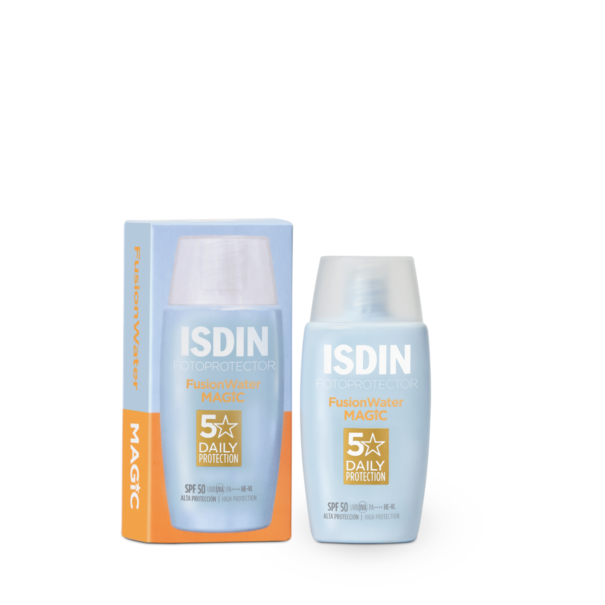
The packaging consists of a folding carton that houses a bottle of sunscreen. The carton is made of smooth, single-layer paperboard with clean edges and precise folds. It features a glossy finish with vibrant colors, predominantly light blue with white and gold accents. The front of the carton displays the product name 'ISDIN FOTOPROTECTOR MAGIC' prominently, along with SPF information. The sides of the carton contain additional product details and usage instructions, printed in a clear, legible font. The overall shape is rectangular, designed to snugly fit the bottle inside.
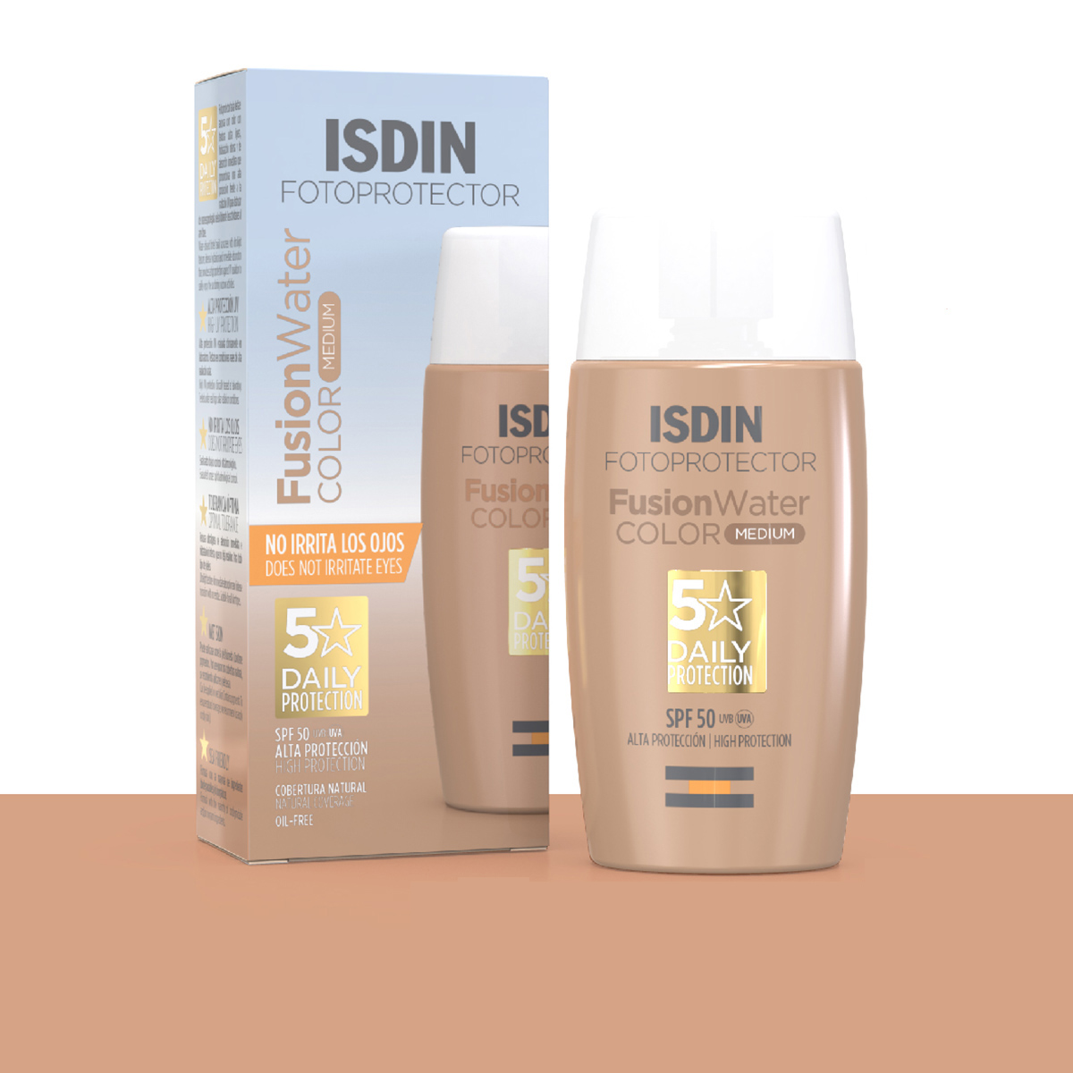
The packaging is a folding carton box made of smooth, single-layer paperboard. It features a rectangular shape with clean edges and precise folds. The exterior is predominantly white with colorful graphics and text. The front displays the product name and key features prominently, while the sides provide additional information and instructions. The box has a glossy finish, enhancing its visual appeal.
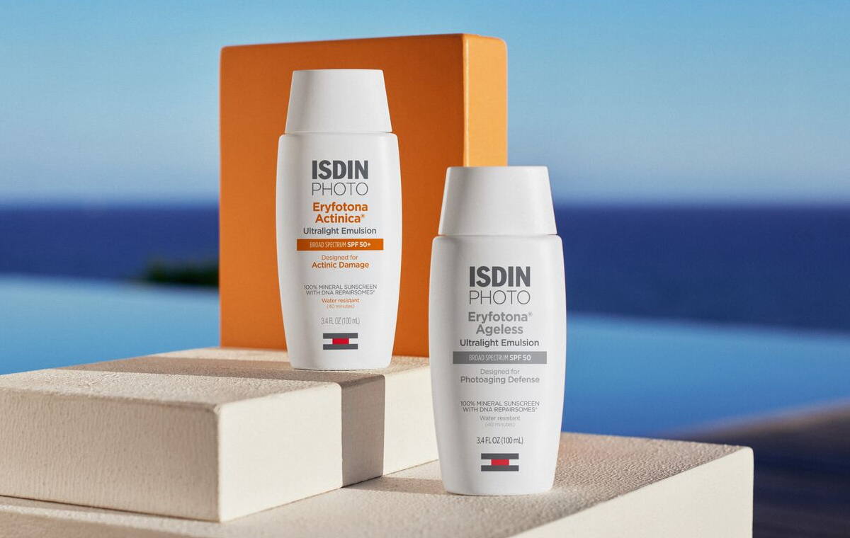
The image features multiple cosmetic containers, including jars and a bottle, all with a premium appearance. The jars have thick walls and are made of clear glass with gold lids, while the bottle is also clear with a gold cap. The overall design is sleek and modern, indicative of high-end cosmetic packaging.
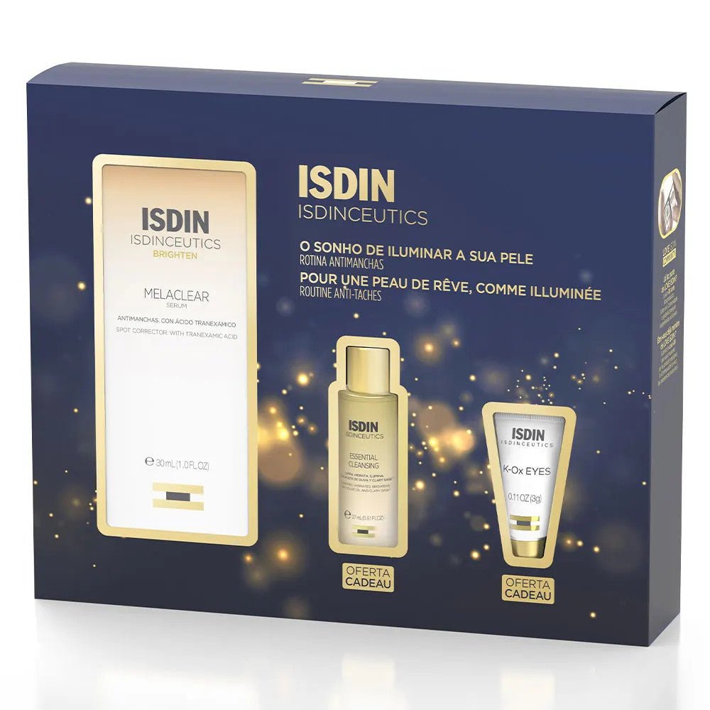
The packaging is a rigid box with a sturdy construction, featuring a premium appearance. It has a glossy finish with a dark background adorned with gold accents and sparkles. The box is rectangular and has a lid that fits over the base. The front displays product information and branding prominently.
The packaging consists of a smooth, flat construction made from single-layer paperboard. It features clean, precise edges and folds, with a predominantly white exterior and a vibrant orange top flap. The carton has a lightweight appearance and is designed for retail display, likely housing a cosmetic or skincare product.
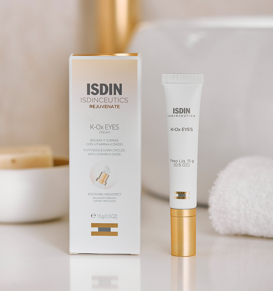
The packaging is a tall, rectangular folding carton made of single-layer paperboard. It features a smooth, flat construction with clean edges and precise folds. The exterior is predominantly white with gold accents, giving it a premium appearance. The front displays the product name 'K-OX EYES' prominently, along with the brand name 'ISDIN' at the top. The carton has a glossy finish, enhancing its visual appeal. There are no visible fluted layers, confirming it as a carton box.
About the Brand
ISDIN delivers advanced skin health products across beauty, face care, and body care categories, leveraging research-driven formulations. Their packaging approach is characterized by high visual consistency, employing premium cartons and rigid boxes that reinforce the brand’s science-oriented, quality-focused image.
Founded in 1975 and headquartered in Barcelona, ISDIN addresses diverse skincare needs with products often recommended by professionals. Their packaging strategy prioritizes shelf appeal and information clarity, utilizing materials such as glossy-finished single-layer paperboard and rigid display boxes for differentiation. Branding elements—logo, product names, and color schemes—are consistently applied, reflecting a structured and disciplined design language. ISDIN’s packaging also considers logistical efficiency and retail display suitability.
Key Differentiator: ISDIN’s distinction lies in its integration of clinical credibility with premium, science-forward packaging design that reinforces trust and product efficacy.
Design System
Visual Style
Modern, scientific visual language; sans-serif typography; color palette of white, gold, orange, and blue; high-contrast layouts; glossy finishes for premium impression.
Brand Identity
Consistent ISDIN logo placement, prominent product names, and recurring use of clinical iconography; visual consistency across SKUs through uniform color schemes and typographic hierarchy.
Packaging Design
Preference for single-layer paperboard and rigid boxes; emphasis on precise folding, clean edges, and snugly-fitted compartments; premium finishes and glass for high-end lines; functional structure for both protection and retail impact.
User Experience
Packaging design supports a positive customer journey through clear product information, easy-to-open structures, and high visual impact at unboxing, reinforcing ISDIN's science-backed trust and brand reliability.
Company Metrics
Business insights for isdin based on available data
Market Positioning
Brand Values & Focus
Key Competitors
Target Market: End consumers seeking dermatologically recommended skincare and beauty solutions, as well as retail and e-commerce distribution channels within the European and global beauty sectors.
Packaging Assessment
Overall Grade
Visual appeal and presentation quality
Packaging durability and protection
Eco-friendliness and recyclable materials
Cost efficiency and value for money
Packaging assessment for isdin based on industry standards and best practices
Frequently Asked Questions
What packaging materials does ISDIN primarily use?
ISDIN primarily utilizes high-quality carton boxes and rigid boxes, often featuring glossy finishes and robust visual branding, to house their skincare and cosmetic products.
How does ISDIN balance packaging aesthetics and logistics?
ISDIN’s packaging is engineered for both visual appeal and logistical safety, with precise folding, snug fit for products, and clear labeling, ensuring both brand consistency and product protection during transit.
What sustainability measures are reflected in ISDIN’s packaging?
While the use of recyclable paperboard is evident, ISDIN’s commitment to sustainability is moderate; premium finishes and rigid structures may limit recyclability, indicating room for improvement.
Discover other Beauty & Fitness companies
Explore more companies in the beauty & fitness industry and their packaging strategies
Cultiv Cosmetique
Beauty & Fitness
Cultiv Cosmetique is a French skincare brand that provides organic and eco-friendly beauty products inspired by nature. They focus on effective skincare solutions for various skin concerns.
Institut Karité Paris
Beauty & Fitness
Institut Karité Paris specializes in luxury beauty products made with natural Shea Butter, offering a wide range of skincare and body care solutions. The brand combines Parisian heritage with a commitment to quality and creativity in its offerings.
Owari
Beauty & Fitness
Owari specializes in 100% natural beauty and fitness products, designed to enhance health and wellness. The company proudly offers its products made in France, emphasizing quick delivery and customer support.