ImproveMe Limited packaging
ImproveMe Limited is a UK-based provider of premium CBD and wellness supplements, utilizing a direct-to-consumer business model. Their packaging strategy emphasizes branded, consumer-focused designs with a consistent use of carton and rigid boxes to enhance product integrity and shelf appeal.
Packaging Portfolio
ImproveMe Limited’s packaging portfolio is dominated by single-layer folding carton boxes for most product lines, complemented by rigid cylindrical containers for soft gel capsules. The cartons utilize high-quality paperboard with glossy or patterned finishes, supporting vibrant color applications and precise die-cutting for clean edges. Rigid packaging formats ensure superior protection for sensitive products, while consistent branding elements—such as logo, product names, and regulatory details—are clearly presented across all packaging types. The approach balances visibility, product safety, and consumer information within the constraints of the health supplement sector.
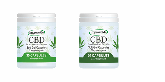
The packaging consists of two cylindrical containers, each with a white base and a clear lid. The containers are designed to hold soft gel capsules, with a smooth, glossy finish. The labels feature a green and white color scheme, with the brand name 'ImproveMe' prominently displayed at the top. The design includes images of cannabis leaves and product information, such as 'Broad Spectrum Cannabis' and 'Food Supplement'. The overall appearance is clean and modern, appealing to health-conscious consumers.

The packaging features a smooth, flat construction typical of folding cartons. It is predominantly purple with swirling patterns that create a visually appealing design. The front displays the product name 'STRONG MALE LIBIDO COMPLEX' prominently, along with an illustration of the product bottles. The edges are clean and precise, indicating a well-constructed carton. There are no visible fluted layers, confirming it as a single-layer paperboard carton.

The packaging is a flat, rectangular box with smooth, flat construction. It features a predominantly green background with white and gold accents. The front displays the product name 'CBD Patches' in bold, clear font, along with additional product details like '20mg CBD isolate per patch' and '7 day supply'. The design includes leaf graphics, enhancing the natural theme of the product.

The packaging features a smooth, flat construction typical of folding cartons, made from a single layer of paperboard. The exterior is predominantly a deep purple color with a glossy finish, showcasing a high-quality appearance. The front displays the product name 'NMN' in bold white font, along with additional product details such as 'Clean', 'High Strength', 'No Fillers', 'No Binders', and '100% Active Ingredients'. The design includes a subtle pattern in the background, enhancing its visual appeal. The edges are clean and precise, indicative of a well-constructed carton.

The packaging features a smooth, flat construction typical of folding cartons. It has a dark background with a geometric pattern, showcasing two bottles of 'Magnesium Complex' capsules. The bottles are prominently displayed in the center, with clear labeling indicating the product name and capsule count. The overall design is clean and modern, with a focus on the product's natural attributes.
About the Brand
ImproveMe Limited specializes in producing and distributing a wide range of CBD-based health supplements, including oils, gummies, gels, balms, and teas. The company’s packaging approach leverages custom-designed cartons and rigid containers to ensure both product protection and a cohesive, premium brand presentation.
Packaging solutions are selected to support product differentiation in a competitive wellness market, with a focus on structural integrity and visual appeal. ImproveMe Limited’s packaging consistently presents strong brand identity cues, such as prominent logo placement, color consistency, and clear product information. Integration of modern materials and finishes targets health-conscious consumers while aligning with regulatory and consumer safety requirements.
Key Differentiator: The brand distinguishes itself through a commitment to high-quality, non-GMO, cruelty-free products, reinforced by premium, information-rich packaging tailored to the health and wellness sector.
Design System
Visual Style
Typography is bold and highly legible, using sans-serif fonts for clarity and modern appeal. Color palette includes deep purples, greens, and whites with occasional gold accents, reinforcing a premium and natural feel. The overall aesthetic is clean, professional, and visually cohesive.
Brand Identity
Logo usage is consistent and prominent on all packaging, typically positioned top-center or upper left. Iconography includes subtle natural motifs, such as leaf graphics, supporting the wellness narrative. Visual consistency is maintained through unified color schemes, repeated graphic elements, and standardized label layouts.
Packaging Design
Material selection favors sturdy paperboard for cartons and durable plastics for rigid containers. Structural design emphasizes product protection, retail display readiness, and efficient space utilization. The design philosophy prioritizes clean lines, minimal clutter, and clear separation of product information.
User Experience
Packaging is designed for straightforward unboxing, with intuitive opening mechanisms and accessible labeling. The user journey is supported through clear dosage, usage, and ingredient information directly on each package, enhancing consumer trust and aiding in product differentiation on digital and physical shelves.
Company Metrics
Business insights for ImproveMe Limited based on available data
Market Positioning
Brand Values & Focus
Key Competitors
Target Market: Health-conscious UK consumers seeking premium, natural CBD supplements and wellness products via direct online channels.
Packaging Assessment
Overall Grade
Visual appeal and presentation quality
Packaging durability and protection
Eco-friendliness and recyclable materials
Cost efficiency and value for money
Packaging assessment for ImproveMe Limited based on industry standards and best practices
Frequently Asked Questions
What types of packaging does ImproveMe Limited use for its CBD products?
ImproveMe Limited primarily utilizes custom carton boxes for retail packaging and rigid containers for capsules and gels. These structures provide visual consistency and adequate product protection, while supporting detailed labeling and regulatory compliance.
How does packaging contribute to ImproveMe Limited’s brand positioning?
Packaging serves as a key brand touchpoint, featuring consistent color palettes, bold typography, and prominent logo placement. The design approach communicates product quality and aligns with consumer expectations in the premium wellness segment.
Is sustainability considered in ImproveMe Limited’s packaging strategy?
While some packaging elements appear recyclable and designed with minimalism in mind, explicit sustainability claims (such as the use of recycled materials or eco-certifications) are not prominently documented, indicating room for further sustainability initiatives.
Discover other Health companies
Explore more companies in the health industry and their packaging strategies
Comvita
Health
Comvita is a New Zealand-based company specializing in high-quality Mānuka honey and natural health products. Established in 1974, it aims to connect people with the healing power of nature.
Bio-Synergy
Health
Bio-Synergy is a UK-based company specializing in health and fitness products, including nutritional supplements and DNA testing kits. Their mission is to support individuals in achieving their health and fitness goals through innovative products and personalized insights.
Lily & Loaf
Health
Lily & Loaf specializes in high-quality health and nutrition products, offering a range of supplements and vitamins aimed at supporting an active lifestyle. The company focuses on providing natural solutions for health and beauty.