huber mühle packaging
huber mühle specializes in premium flour, muesli, and grain-based food products, leveraging centuries-old milling expertise. Their packaging strategy focuses on robust, branded corrugated, carton, and paper solutions tailored for both retail and e-commerce, emphasizing product integrity and consumer experience.
Packaging Portfolio
huber mühle’s packaging portfolio includes corrugated shipping and display boxes for multipacks and gifting, rigid chipboard boxes for premium product presentation, and paper bags for flour and dry goods. All structures prioritize product protection, retail shelf presence, and brand identity, with printed graphics and regional messaging. The use of recyclable materials and consistent branding across formats demonstrates a strategic approach to both sustainability and customer perception. Packaging design supports direct-to-consumer and retail distribution, balancing cost efficiency with visual appeal.
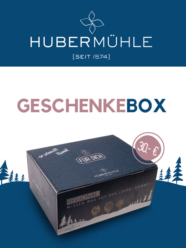
The packaging is a rigid box with a sturdy construction, featuring a thick chipboard material. The box has a smooth surface with a matte finish, predominantly in dark blue with a decorative design. The top of the box displays the brand name 'HUBERMÜHLE' prominently, along with the words 'GESCHENKEBOX' in a contrasting color. The sides of the box have a clean, precise edge, indicative of high-quality manufacturing. The bottom of the box is plain and unprinted, providing stability.
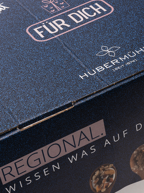
The packaging is a corrugated box with visible fluted layers when viewed from the side. It features a dark blue exterior with a textured finish that gives it a premium appearance. The box has clean edges and is constructed to hold weight, indicative of its sturdy nature for shipping purposes. There are printed graphics and text on the surface, including the brand name and other marketing messages.

The image features multiple packages of various food products, primarily made from paperboard. Each package has a smooth, flat construction without visible fluted layers, indicating they are carton boxes. The packages are predominantly white or light-colored with clear branding elements. They are designed for retail display, showcasing product information and branding prominently on the front. The edges are clean and precise, typical of folding carton design.
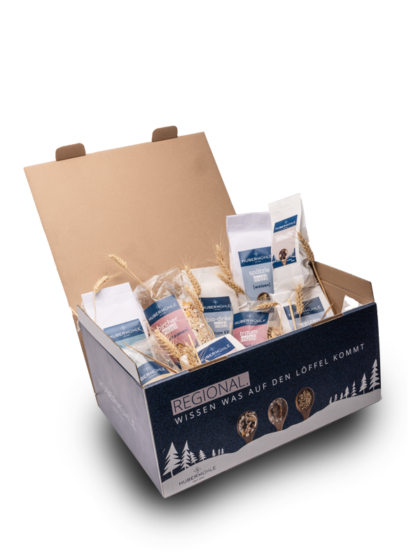
The packaging is a large, open-top display box made of corrugated cardboard. It features a sturdy construction with visible fluted layers when viewed from the side. The exterior is primarily kraft brown with a printed design on the front panel. The box has a rectangular shape and is designed to hold multiple smaller packages inside. The flaps are folded down to create an open display, and the edges are cleanly cut. The interior may show some slight wear from handling, but the overall structure appears intact.
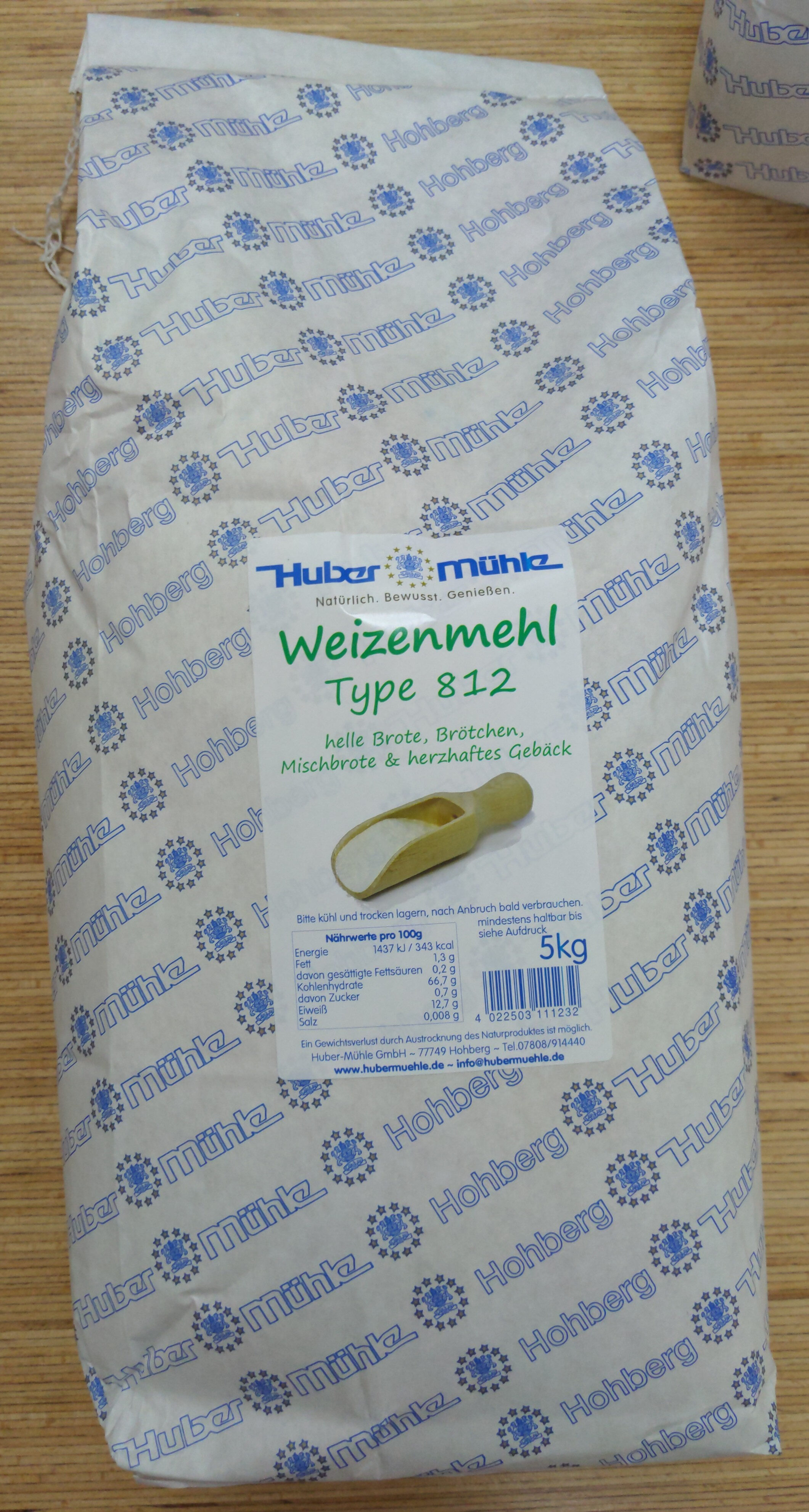
The packaging is a paper bag made from a lightweight paper material, featuring a white background with blue printed patterns. The bag is designed to hold flour, as indicated by the text on the front. It has a simple, flat construction with no visible flutes or layers, characteristic of paper bags. The edges are clean and the bag appears to be sealed at the top, likely with a fold or glue. The surface has a matte finish with a slight texture, typical for paper bags used in food packaging.
About the Brand
huber mühle is a long-standing German mill offering a diverse portfolio of grain-based products for retail and direct-to-consumer markets. Their packaging encompasses a mix of corrugated shipping boxes, rigid gift boxes, and branded paper bags, designed for both product protection and strong visual identity.
Operating since 1574, the company integrates traditional values with modern packaging solutions, supporting efficient logistics and an elevated brand presence. Their approach balances regional authenticity with practical shipping requirements, and includes both conventional and organic product lines. The use of regionally-branded, recyclable materials aligns with consumer expectations for environmental responsibility within the food sector.
Key Differentiator: huber mühle's unique value lies in their combination of heritage-based branding and multi-structure packaging formats, optimizing both shelf presence and shipping resilience while catering to health-conscious, sustainability-oriented consumers.
Design System
Visual Style
Typography utilizes bold, legible sans-serifs and serif fonts for traditional cues; the color palette centers on kraft brown, deep blue, and white with regional accent colors. The aesthetic is clean and heritage-forward, emphasizing authenticity with modern touches.
Brand Identity
Brand logo is consistently displayed on all primary and secondary packaging, supported by regional text and certification icons. Iconography is minimal, focusing on clear product and origin signals. Visual consistency is achieved through unified color schemes, logo placement, and typographic hierarchy.
Packaging Design
Material selection prioritizes recyclable paper, cardboard, and chipboard for both environmental and structural benefits. Structural design emphasizes product safety, display orientation, and modularity for multi-pack solutions, aligning with retail and e-commerce needs.
User Experience
Packaging supports an intuitive unboxing experience through easy-open formats and clear product information, reinforcing the brand’s heritage and quality messaging. Multilayered design—combining visual and tactile cues—enhances customer engagement and supports repeat purchase behavior.
Company Metrics
Business insights for huber mühle based on available data
Market Positioning
Brand Values & Focus
Key Competitors
Target Market: Health-conscious retail consumers and B2B buyers in Germany and surrounding European markets seeking premium, authentic, and sustainably packaged grain-based products.
Packaging Assessment
Overall Grade
Visual appeal and presentation quality
Packaging durability and protection
Eco-friendliness and recyclable materials
Cost efficiency and value for money
Packaging assessment for huber mühle based on industry standards and best practices
Frequently Asked Questions
What types of packaging does huber mühle use for its products?
huber mühle employs corrugated display and shipping boxes, rigid gift boxes, paper flour bags, and folding cartons. These solutions are selected to balance product safety, efficient logistics, and strong brand visibility.
How does huber mühle address sustainability in its packaging?
The company utilizes recyclable materials such as paper and cardboard, and emphasizes minimalistic yet effective designs, supporting environmentally responsible packaging practices in line with food industry standards.
What is the focus of huber mühle's packaging design?
Their packaging design centers on brand consistency, regional identity, and material durability, with a clear emphasis on customer experience and logistical efficiency.
Discover other Food & Drink companies
Explore more companies in the food & drink industry and their packaging strategies
Terres de Café
Food & Drink
Terres de Café is a specialty coffee retailer based in Paris, France, known for its commitment to sustainability and high-quality coffee sourcing.
Teegschwendner GmbH
Food & Drink
Teegschwendner GmbH is a specialty tea company based in Germany, offering a wide selection of high-quality teas and tea-related accessories. They focus on providing unique tea experiences through carefully sourced and curated products.
ruf lebensmittelwerk kg
Food & Drink
RUF Lebensmittelwerk KG is a German food production company specializing in a variety of baking mixes and drink products. Founded in 1920, the company is known for its high-quality ingredients and innovative food solutions.