HEY HOLY packaging
HEY HOLY delivers breed-specific dog food and snacks through a direct-to-consumer model, leveraging customized packaging solutions to reinforce their premium, health-focused positioning. Their packaging strategy emphasizes visual differentiation, functional resealability, and alignment with eco-conscious values.
Packaging Portfolio
HEY HOLY employs a diverse portfolio of packaging formats, including flexible stand-up pouches with resealable closures, kraft paper bulk bags, and rigid cylindrical containers for supplements. This mix addresses both small- and large-format needs while optimizing for product protection and freshness. The packaging materials are primarily paper-based or multi-layer flexible films, selected for durability, visual appeal, and partial recyclability. All formats incorporate bold, breed-focused graphics and color schemes, supporting differentiation and enhancing on-shelf visibility.

The packaging is a brown paper bag with a flat, smooth surface. It features a large image of a dog on the front, with the product name 'Shine-Bright SHEPHERDS' prominently displayed in bold, colorful text. The bag has a simple, functional design with no visible flaps or tabs, indicating it is likely a sealed bag. The overall shape is rectangular and upright, suitable for standing on a shelf.

The packaging is a cylindrical container with a dark brown exterior and a black lid. The label features a vibrant purple background with the product name 'Mighty Mobility' prominently displayed in bold, white font. There are additional icons indicating the product's origin and development by veterinarians, enhancing its credibility. The overall design is clean and modern, appealing to health-conscious consumers.

The packaging is a flat, paper bag with a kraft exterior. It features a large, colorful graphic of a dog on the front, along with product information. The bag has a smooth surface with a matte finish, and the edges are cleanly cut. The top of the bag appears to be folded over, likely for closure. The overall design is vibrant, with a blue background and bright colors used for the text and images.

The packaging is a stand-up pouch with a flat bottom, allowing it to stand upright. The front features a large image of a bulldog's face, prominently displaying the product name 'Beautiful BULLDOGS' in bold, playful typography. The color scheme transitions from a light brown kraft texture at the top to a vibrant blue at the bottom. The top of the pouch has a resealable zipper closure, and the overall design is eye-catching and colorful.
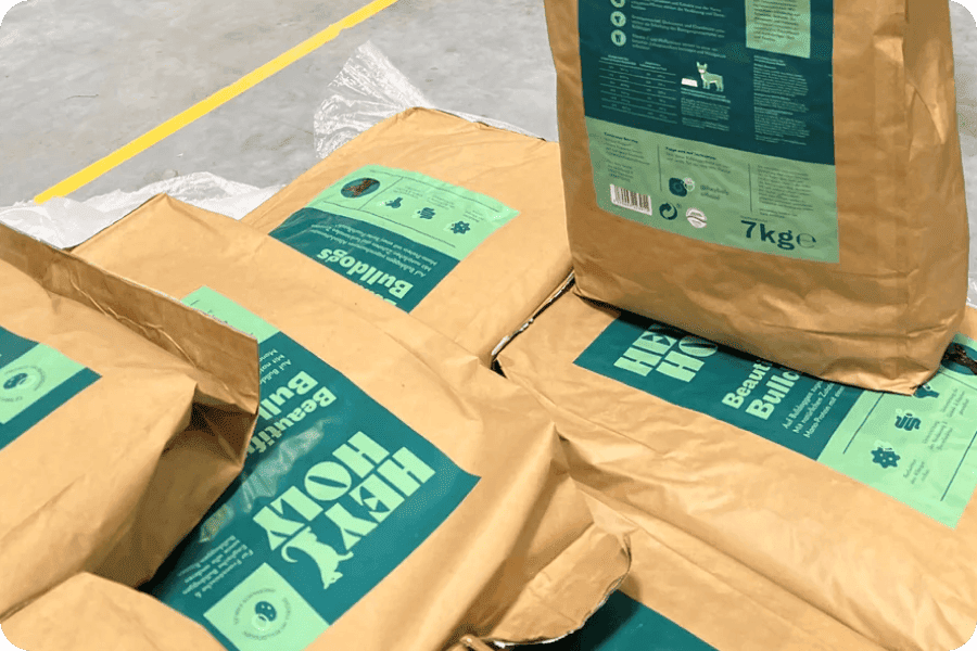
The packaging consists of multiple bags made of a brown kraft paper material, with a flat construction. Each bag is rectangular and appears to be filled with a product, likely pet food or similar bulk items. The bags feature a large, bold green print on the front, including the brand name 'HEY HOLY!' in prominent typography. The back of the bags contains additional product information and graphics. The edges of the bags are cleanly folded and sealed, indicating a well-constructed design.

The packaging is a stand-up pouch made from a flexible material, likely a combination of plastic and foil. It features a vibrant purple background with a prominent image of a dog's face, specifically a Chihuahua, at the bottom. The product name 'Marvelous MINIS' is displayed in bold, playful typography. The top of the pouch has a resealable zipper closure, allowing for easy access and storage. The sides of the pouch are slightly curved, giving it a three-dimensional appearance.
About the Brand
HEY HOLY operates in the premium pet food market, specializing in dog food tailored for specific breeds with a focus on health and nutritional precision. Their packaging approach prioritizes brand visibility, shelf impact, and consumer convenience through the use of flexible materials and bold, breed-centric graphics.
HEY HOLY’s packaging solutions encompass a mix of stand-up pouches, kraft paper bags, and cylindrical containers, each selected for optimal product protection and consumer appeal. The use of resealable closures and matte finishes enhances usability, while the consistent application of playful yet informative design elements reflects the brand’s commitment to both pet wellness and responsible packaging. The integration of eco-friendly messaging and recyclability aligns with growing industry trends toward sustainability and conscious consumption.
Key Differentiator: HEY HOLY stands out for its unified, breed-specific packaging system that combines high-impact visual branding with functional design and a stated eco-friendly ethos.
Design System
Visual Style
Typography is bold, playful, and highly legible, typically using sans-serif fonts for clarity. The color palette leverages vibrant blues, purples, and natural kraft tones, creating a distinctive contrast and fostering immediate brand recognition. Visual elements feature large pet illustrations and iconography to reinforce product segmentation and breed focus.
Brand Identity
The HEY HOLY logo is prominently displayed on all packaging, accompanied by large product names and breed identifiers. Consistent iconography is used to communicate key product features (e.g., 'Made in Germany,' 'Veterinarian-developed'). Brand colors and graphics are applied consistently across SKUs, creating a unified and recognizable brand presence.
Packaging Design
Material choices prioritize a balance between paper-based sustainability and flexible plastic for barrier properties. Structural design emphasizes resealability, flat-bottom stability, and upright shelf presentation. The philosophy is function-led, ensuring protection and convenience without sacrificing on-brand aesthetics.
User Experience
Packaging is designed for straightforward handling, resealable access, and easy storage, enhancing the consumer’s daily use. Visual hierarchy ensures that breed, benefits, and guarantees are immediately visible at point-of-purchase, supporting customer confidence and reinforcing the brand’s health-centric positioning.
Company Metrics
Business insights for HEY HOLY based on available data
Market Positioning
Brand Values & Focus
Key Competitors
Target Market: Health-conscious dog owners seeking premium, breed-tailored nutrition solutions with an emphasis on sustainability and direct-to-consumer convenience.
Packaging Assessment
Overall Grade
Visual appeal and presentation quality
Packaging durability and protection
Eco-friendliness and recyclable materials
Cost efficiency and value for money
Packaging assessment for HEY HOLY based on industry standards and best practices
Frequently Asked Questions
What types of packaging materials does HEY HOLY use for their pet food products?
HEY HOLY utilizes a combination of flexible stand-up pouches, kraft paper bags, and rigid cylindrical containers. These materials are chosen for their balance of durability, resealability, and shelf presence, supporting both product freshness and consumer convenience.
How does HEY HOLY address sustainability in its packaging?
HEY HOLY incorporates recyclable materials, especially kraft paper, into their packaging and communicates eco-friendly practices. Their return policy encourages product donation over returns, reducing waste and supporting local animal shelters.
Does HEY HOLY’s packaging support logistics and product safety?
The packaging formats—particularly the stand-up pouches and sealed paper bags—offer robust physical protection, minimizing damage during transport and maintaining product integrity.
Discover other Pets & Animals companies
Explore more companies in the pets & animals industry and their packaging strategies
Vegdog
Pets & Animals
Vegdog specializes in providing vegan and gluten-free dog food, developed in collaboration with veterinarians to ensure optimal nutrition for dogs with food sensitivities and allergies.
My Furbaby
Pets & Animals
My Furbaby provides premium, NZ-made dog food and pet essentials delivered directly to customers' doors, ensuring pets receive the best nutrition while supporting sustainability.
Natural Trail
Pets & Animals
Natural Trail produces high-quality dry and wet food for dogs and cats, focusing on their natural dietary needs. The company is committed to providing pet owners with nutritious and delicious meal options made from carefully selected ingredients.