Hestevard packaging
Hestevard specializes in veterinary-backed equine supplements, delivering targeted nutritional solutions for horse health. Their packaging strategy prioritizes product protection and premium brand presentation using a mix of carton boxes, rigid containers, and flexible pouches.
Packaging Portfolio
Hestevard’s packaging portfolio leverages a combination of single-layer paperboard cartons for sachets and powder products, rigid chipboard containers for premium formulas, and flexible stand-up pouches for pelletized supplements. These structures are designed to optimize both shelf display and shipping integrity, with the majority of formats featuring resealable closures or secure lids. The material mix prioritizes print quality and branding clarity while offering moderate levels of recyclability. Visual design elements are consistently applied across formats, enhancing both consumer recognition and perceived product quality.

The packaging is a cylindrical container made of thick, sturdy chipboard. It has a smooth surface with a kraft paper exterior, showcasing a premium appearance. The container features a green label around its circumference with printed text and graphics. The top has a flat lid that fits securely onto the body of the container, ensuring contents are protected. The overall design is clean and functional, suitable for retail display.

The packaging is a stand-up pouch made of flexible material, featuring a resealable top. It has a glossy finish with vibrant colors and graphics. The front showcases an artistic image of a horse, with the product name 'OmegaPro' prominently displayed in a modern font. The background is a soft pink, contrasting with the darker colors of the horse image. The bottom of the pouch contains a clear window that allows visibility of the product inside.
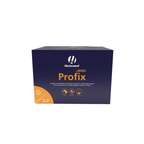
The packaging is a rectangular folding carton made of smooth, single-layer paperboard. It features clean, precise edges and folds, with a predominantly dark blue background. The front displays a large white logo with the brand name 'Hestevard' prominently featured. Below the logo, there is a product name 'Profix' in a contrasting color, along with descriptive text about the product's benefits. The carton has a matte finish with a slight sheen in certain areas, enhancing the visual appeal. The sides of the carton are printed with additional product information and graphics, maintaining a consistent design theme throughout.
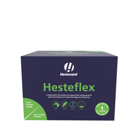
The packaging is a rectangular box with a smooth, flat construction. It features clean, precise edges and folds, indicative of a single-layer paperboard design. The box is predominantly dark blue with a contrasting green accent, showcasing a modern and clean aesthetic. The front displays the product name 'Hesteflex' in bold white lettering, accompanied by a logo at the top. The sides of the box include additional product information and graphics that align with the branding.

The packaging is a sturdy, thick-walled container with a rectangular shape. It features a smooth surface with a matte finish, predominantly in a light green color with white accents. The container has a rounded top and a flat base, providing stability. The design includes a prominent logo and product name on the front, along with icons indicating product benefits.

The packaging is a rectangular, flat, and smooth box made of single-layer paperboard. It features clean edges and folds, with a predominantly dark blue background. The front displays a large product name 'BozMerix' in white font, accompanied by green icons indicating natural ingredients. The overall design is modern and appealing, suitable for retail display.
About the Brand
Hestevard operates within the equine health sector, focusing on direct-to-consumer sales of specialized supplements. Their packaging system is engineered to support both retail appeal and logistical safety, leveraging robust carton and rigid formats alongside modern flexible pouches.
The brand's approach to packaging is characterized by a clear, consistent visual identity and functional structures that support both storage and transit requirements for premium supplements. Hestevard adapts its packaging to accommodate varying product forms—including powders, pellets, and liquids—ensuring both product integrity and user convenience. Their focus on high-quality materials and branding consistency positions them competitively within the veterinary supplement market.
Key Differentiator: Hestevard’s unique value lies in its combination of clinically oriented branding, veterinary credibility, and packaging formats that balance shelf presence with protective performance.
Design System
Visual Style
Modern sans-serif typography, high-contrast dark blue and green color palette, matte and glossy finishes for tactile differentiation, and equestrian-themed imagery.
Brand Identity
Prominent logo placement, clear hierarchy of product names, use of equine icons and veterinary cues, and strict adherence to brand color schemes for visual consistency.
Packaging Design
Preference for recyclable paperboard and chipboard in cartons and rigid containers, with flexible pouches for lighter formats. Structural choices emphasize product protection, resealability, and ease of handling.
User Experience
Design supports clear product identification, intuitive opening and resealing, and a premium unboxing impression. Educational product information and branding are positioned for both retail and direct-to-consumer channels, reinforcing trust and repeat engagement.
Company Metrics
Business insights for Hestevard based on available data
Market Positioning
Brand Values & Focus
Key Competitors
Target Market: Health-conscious horse owners, equine professionals, and veterinary practitioners seeking reliable, scientifically formulated supplements.
Packaging Assessment
Overall Grade
Visual appeal and presentation quality
Packaging durability and protection
Eco-friendliness and recyclable materials
Cost efficiency and value for money
Packaging assessment for Hestevard based on industry standards and best practices
Frequently Asked Questions
What types of packaging formats does Hestevard use for its supplements?
Hestevard utilizes a mix of carton boxes, rigid containers, and flexible stand-up pouches, each tailored to product type and usage requirements.
How does Hestevard balance packaging sustainability with product protection?
Hestevard primarily uses recyclable paperboard and chipboard for cartons and rigid containers, aiming to minimize environmental impact while ensuring product security during shipping and storage.
Does Hestevard packaging support a strong brand identity?
Yes, the packaging features consistent use of the Hestevard logo, color palette, and equestrian-themed graphics, contributing to high brand recognition and professional market positioning.
Discover other Pets & Animals companies
Explore more companies in the pets & animals industry and their packaging strategies
PetsDiet
Pets & Animals
PetsDiet specializes in premium pet food and dietary supplements for dogs and cats, emphasizing quality and health. With a focus on natural ingredients, the company aims to improve the well-being of pets through tailored nutrition.
Natural Trail
Pets & Animals
Natural Trail produces high-quality dry and wet food for dogs and cats, focusing on their natural dietary needs. The company is committed to providing pet owners with nutritious and delicious meal options made from carefully selected ingredients.
My Furbaby
Pets & Animals
My Furbaby provides premium, NZ-made dog food and pet essentials delivered directly to customers' doors, ensuring pets receive the best nutrition while supporting sustainability.