HARIBO France packaging
HARIBO France specializes in the production and distribution of confectionery, with an emphasis on gummy candies and sweets. Their packaging approach leverages vibrant, branded flexible pouches and cartons aimed at maximizing shelf appeal and consumer engagement.
Packaging Portfolio
HARIBO France’s packaging portfolio is characterized by the extensive use of flexible plastic pouches, clear plastic tubs, and retail-ready carton boxes. These solutions are optimized for visual impact with high-gloss finishes, vibrant color schemes, and transparent windows to showcase product freshness. Resealable features are integrated in select formats to enhance consumer convenience and prolong shelf life. The structural design prioritizes product protection and efficient stacking for logistics, while sustainability efforts focus on the gradual adoption of recyclable materials within regulatory constraints.
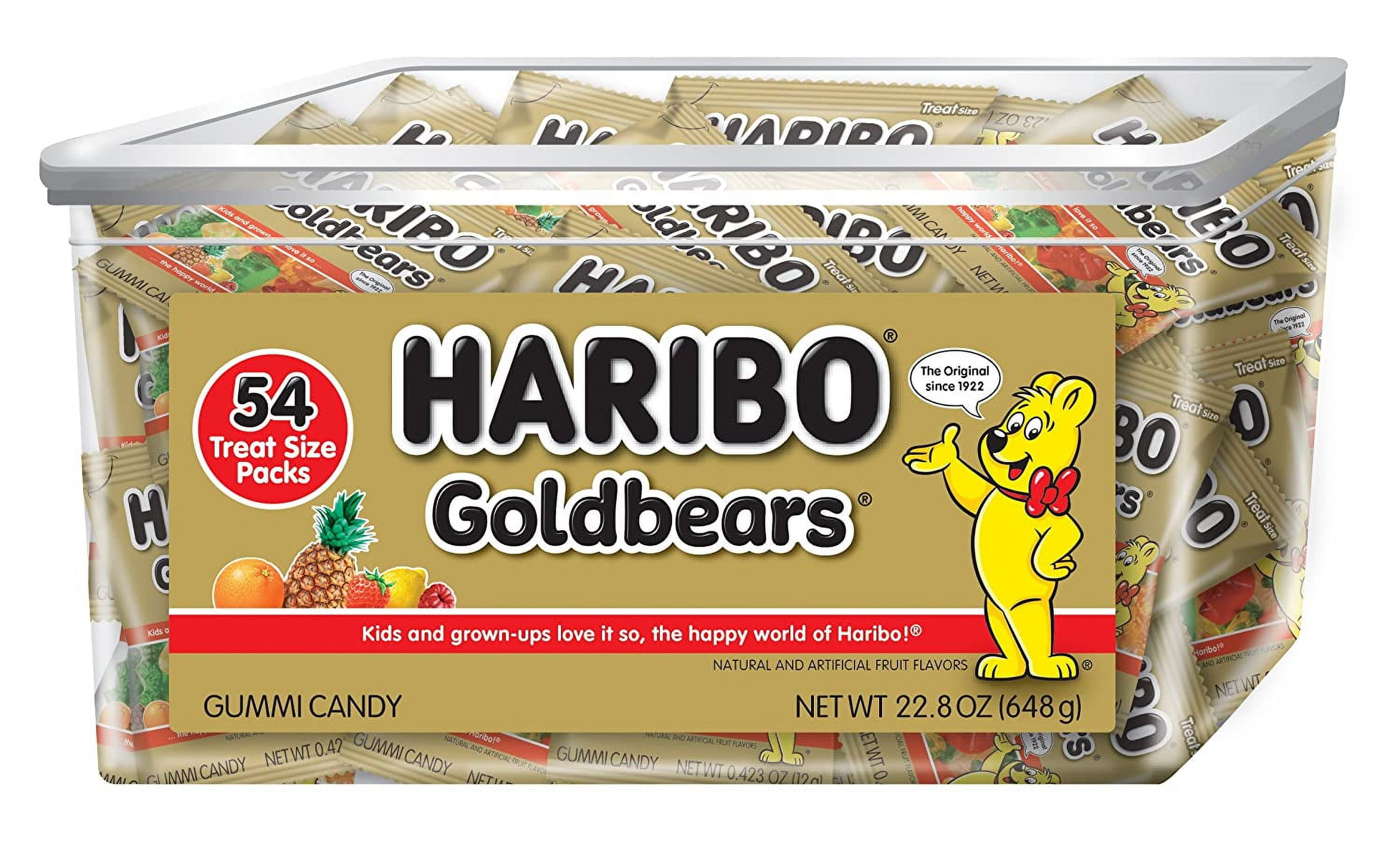
The packaging is a rectangular carton box with a smooth, flat construction. It features a clear plastic lid and a base made of sturdy paperboard. The box is predominantly yellow with colorful graphics depicting the Haribo Goldbears, along with images of fruits like pineapple. The edges are clean and precise, and the box has a glossy finish that enhances the visual appeal. The front prominently displays the Haribo logo and product name, while the sides contain additional product information and nutritional facts.

The packaging is a flexible bag made of a thin, transparent plastic material that is designed to hold gummy candy. The bag features a vibrant, colorful design with images of the product inside. The front displays the HARIBO logo prominently, along with the product name 'Goldbears' and a depiction of the gummy bears. The background is gold with colorful accents that enhance the appeal. The bag has a resealable top, allowing for easy access and storage.

The packaging consists of a clear plastic container with a round shape, featuring a tight-fitting lid. The container is filled with colorful gummy candies, showcasing a variety of shapes and colors. The exterior of the container is adorned with a vibrant label that includes the brand name 'HARIBO' prominently displayed in bold red letters. The label also features colorful graphics and product information, including the weight of 750 grams.
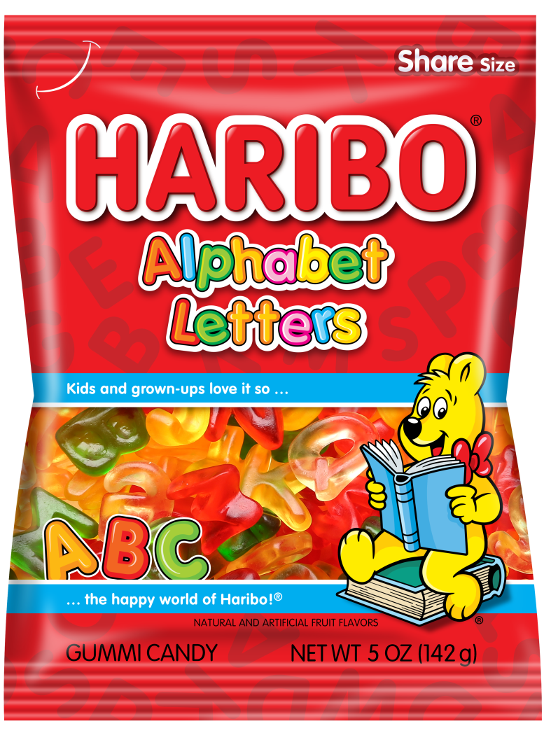
The packaging is a colorful, flexible pouch made of a thin plastic material. It features a vibrant design with a prominent logo and playful graphics. The front displays the product name 'HARIBO Alphabet Letters' in bold, playful fonts, accompanied by an illustration of a bear reading a book. The background is filled with bright colors, enhancing its appeal to children and adults alike. The pouch has a resealable top, allowing for easy access and storage.
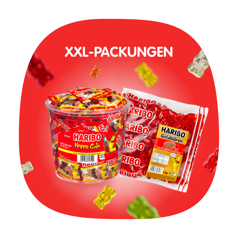
The image features a vibrant display of candy packaging, prominently showcasing a plastic tub and a bag. The tub is clear with a red label, while the bag is colorful with a clear front and a red background. Both packages display the HARIBO branding prominently, with images of the candy inside. The overall design is playful and appealing, targeting a youthful audience.
About the Brand
HARIBO France operates in the food and beverage sector, focusing on the manufacture and direct-to-consumer sale of a broad range of confectionery products. The company’s packaging is engineered for both functionality and brand communication, using colorful, child-centric visuals to reinforce brand identity while ensuring product protection.
Founded in 1967, HARIBO France has expanded its product offerings to include gummies, marshmallows, licorice, and specialty bundles, distributed via a robust e-commerce platform. Packaging choices are informed by the need for visual differentiation, shelf stability, and logistical efficiency. The use of flexible plastics with resealable features is common, while carton boxes and plastic tubs are deployed for larger or special-edition formats. Sustainability is a growing consideration, with incremental adoption of recyclable materials and process optimizations.
Key Differentiator: HARIBO France stands out for its strong integration of playful, highly recognizable branding into every packaging touchpoint, supported by a wide variety of formats that cater to both retail and e-commerce logistics.
Design System
Visual Style
Typography is dominated by bold, rounded sans-serif fonts paired with a saturated, multi-color palette (primarily reds, yellows, and gold). The overall aesthetic is playful and energetic, appealing primarily to children and families.
Brand Identity
Logo usage is prominent and consistent, with the HARIBO wordmark and mascot illustrations anchoring all packaging. Iconography includes playful bears and fruit symbols, reinforcing product flavor profiles and brand heritage.
Packaging Design
Material selection favors flexible plastics for primary packaging, with PET or PP used for tubs and pouches. Carton boxes employ high-gloss coated paperboard. The structural design philosophy balances visual appeal, tamper evidence, and logistical efficiency.
User Experience
Design choices support an engaging customer journey, leveraging tactile and visual cues to reinforce brand recognition. Resealable and transparent elements contribute to usability and product freshness, enhancing overall satisfaction in both retail and e-commerce contexts.
Company Metrics
Business insights for HARIBO France based on available data
Market Positioning
Brand Values & Focus
Key Competitors
Target Market: HARIBO France targets the mass-market confectionery segment, emphasizing both in-store and online consumers across France and Germany, with a focus on families, young adults, and children.
Packaging Assessment
Overall Grade
Visual appeal and presentation quality
Packaging durability and protection
Eco-friendliness and recyclable materials
Cost efficiency and value for money
Packaging assessment for HARIBO France based on industry standards and best practices
Frequently Asked Questions
What types of packaging formats does HARIBO France use?
HARIBO France utilizes flexible pouches, plastic tubs, carton boxes, and resealable bags, each designed for optimal product protection, branding, and consumer convenience.
How does HARIBO France address sustainability in packaging?
The company is making incremental improvements towards sustainability, including the use of recyclable plastics and carton materials, and evaluating further eco-friendly options as consumer expectations and regulations evolve.
What is the target consumer for HARIBO France packaging?
Packaging is primarily targeted at families and young consumers, with bright colors and playful graphics, while also considering convenience and freshness for e-commerce shoppers.
Discover other Food & Drink companies
Explore more companies in the food & drink industry and their packaging strategies
ruf lebensmittelwerk kg
Food & Drink
RUF Lebensmittelwerk KG is a German food production company specializing in a variety of baking mixes and drink products. Founded in 1920, the company is known for its high-quality ingredients and innovative food solutions.
Teegschwendner GmbH
Food & Drink
Teegschwendner GmbH is a specialty tea company based in Germany, offering a wide selection of high-quality teas and tea-related accessories. They focus on providing unique tea experiences through carefully sourced and curated products.
Terres de Café
Food & Drink
Terres de Café is a specialty coffee retailer based in Paris, France, known for its commitment to sustainability and high-quality coffee sourcing.