Hanqure packaging
Hanqure is a health supplement brand focused on vegan-friendly, caffeine-free recovery products, utilizing visually impactful flexible packaging to enhance consumer engagement. Their approach centers on stand-up pouches with high-impact branding, optimized for e-commerce and on-the-go use.
Packaging Portfolio
Hanqure’s packaging portfolio centers around flexible stand-up pouches constructed from multilayer polymer films, providing a lightweight and space-efficient solution. These pouches incorporate resealable zippers to ensure product integrity and freshness, supporting multiple usages and enhanced portability. The packaging features vibrant, gradient color schemes and glossy finishes, delivering strong visual shelf impact and distinctive brand recognition. The flexible format is well-suited for D2C logistics, offering reduced packaging weight for shipping and efficient storage for consumers.
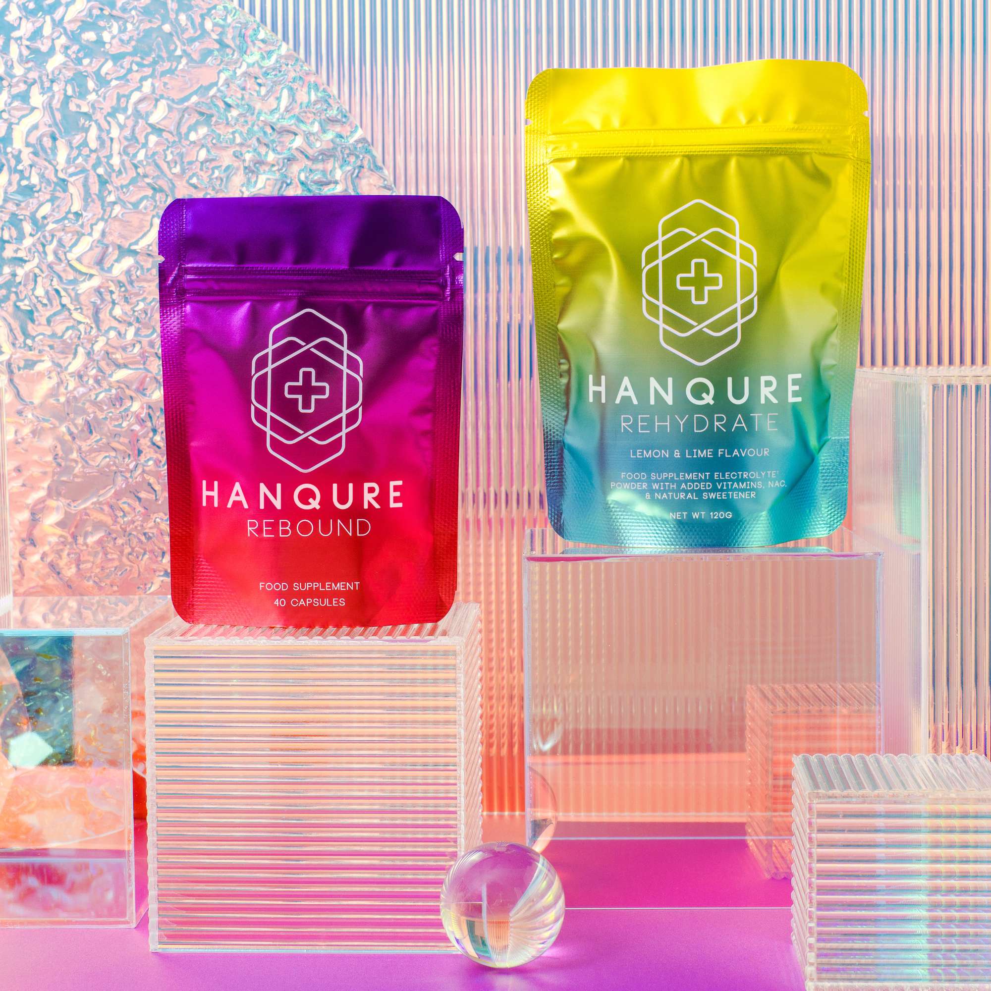
The packaging consists of two stand-up pouches, one in a vibrant pink color and the other in a gradient yellow to green. Both pouches have a glossy finish and feature a resealable top. The front of each pouch displays the product name prominently, with a geometric logo positioned above it. The background is a smooth, reflective surface that enhances the visual appeal of the pouches.
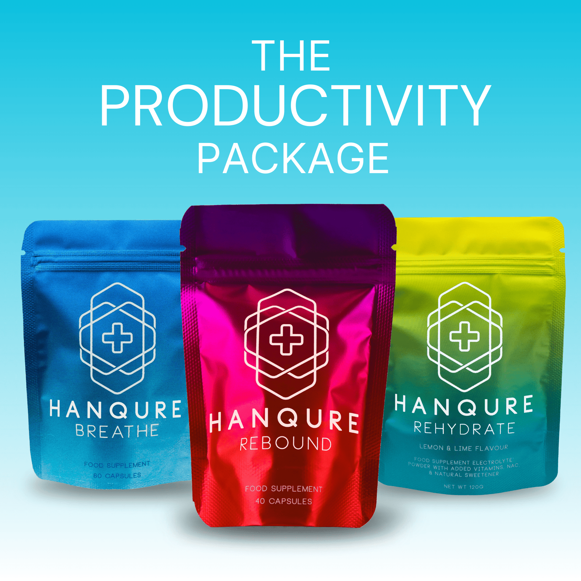
The image features three stand-up pouches, each with a vibrant color scheme and a glossy finish. The pouches are designed to stand upright, showcasing their contents. Each pouch has a zip-lock closure at the top, allowing for resealability. The front of each pouch displays the product name prominently, along with a graphic element that includes a cross symbol, indicating a health-related product. The background gradient transitions from blue to white, enhancing the visual appeal.

The packaging is a stand-up pouch made from a flexible material, featuring a vibrant gradient color scheme transitioning from purple at the top to red at the bottom. The front displays a prominent logo and product name in white text, with additional product information below. The pouch has a resealable top, indicated by a zip-lock feature, and a flat bottom allowing it to stand upright.

The packaging consists of two stand-up pouches, each featuring a vibrant gradient color scheme transitioning from purple to pink and yellow to blue. The pouches have a glossy finish that enhances the visual appeal. The front of each pouch prominently displays the brand name 'HANQURE' in bold, white letters, along with product names 'REBOUND' and 'REHYDRATE' in smaller text. The design includes a medical cross symbol, indicating a health-related product. The pouches have a resealable zipper at the top, allowing for easy opening and closing.

The packaging consists of multiple stand-up pouches arranged in a staggered formation. Each pouch features a vibrant gradient color scheme transitioning from purple at the top to a bright pink at the bottom. The front of each pouch prominently displays the brand name 'HANQURE' in bold white letters, along with the product name 'REBOUND' below it. The pouches have a glossy finish, giving them a modern and appealing look. The top of each pouch has a resealable zipper closure, allowing for easy access and storage.

The packaging is a stand-up pouch with a vibrant gradient color scheme transitioning from purple to pink. The front features a large, white logo with a cross symbol and the product name 'REBOUND' prominently displayed. The pouch has a smooth surface with a glossy finish, giving it a premium appearance. The top of the pouch has a resealable zipper, indicating functionality for repeated use.
About the Brand
Hanqure operates in the health supplement sector, targeting individuals seeking improved post-social event recovery and wellness support. The company emphasizes functionality and convenience in its packaging, selecting resealable stand-up pouches with bold, gradient colorways to reinforce brand recognition and shelf presence.
Their packaging strategy leverages flexible materials to support lightweight shipping and portability, catering to direct-to-consumer (D2C) distribution and health-conscious, mobile consumers. Branding is consistently applied with strong logo visibility and clear product differentiation across all SKUs. Hanqure prioritizes user-friendly features such as resealable zippers to maintain product freshness and facilitate repeated use.
Key Differentiator: Hanqure distinguishes itself through high-visibility, gradient-color flexible pouches that integrate bold branding and ergonomic features, specifically tailored for the health supplement e-commerce market.
Design System
Visual Style
Bold sans-serif typography, high-contrast white lettering on gradient backgrounds (purple, pink, yellow, blue), and glossy surfaces for a modern, attention-grabbing aesthetic.
Brand Identity
Consistent use of the HANQURE logo, geometric iconography, and prominent medical symbols (cross) across all packaging. Visual consistency is maintained through unified color gradients and product-specific naming conventions.
Packaging Design
Focus on flexible, multilayer stand-up pouches with resealable zip closures. Materials prioritize durability and portability, while structural design supports vertical storage and minimized shipping volume.
User Experience
The resealable pouch design and visually intuitive labeling promote an easy and engaging customer journey, reinforcing freshness, product clarity, and repeat usage in line with wellness-focused brand messaging.
Company Metrics
Business insights for Hanqure based on available data
Market Positioning
Brand Values & Focus
Key Competitors
Target Market: Health-conscious, digitally engaged consumers seeking functional, vegan-friendly supplements with a focus on convenience and modern branding, primarily in the UK and broader Tier I markets.
Packaging Assessment
Overall Grade
Visual appeal and presentation quality
Packaging durability and protection
Eco-friendliness and recyclable materials
Cost efficiency and value for money
Packaging assessment for Hanqure based on industry standards and best practices
Frequently Asked Questions
What type of packaging does Hanqure primarily use?
Hanqure primarily utilizes flexible stand-up pouches with resealable closures, constructed from multilayer polymer films for durability and visual impact.
How does Hanqure address sustainability in its packaging?
While flexible pouches reduce shipping weight and material usage, the packaging appears to be primarily plastic-based, with limited evidence of post-consumer recycled content or a fully circular material approach.
What is the main visual approach in Hanqure's packaging design?
The brand employs vibrant gradient color palettes and prominent white typography, enhancing shelf impact and immediate brand recognition.
How does Hanqure’s packaging support the D2C model?
The stand-up pouch format is optimized for efficient shipping, easy storage, and repeat use, directly supporting e-commerce fulfillment and customer convenience.
Discover other Health companies
Explore more companies in the health industry and their packaging strategies
Comvita
Health
Comvita is a New Zealand-based company specializing in high-quality Mānuka honey and natural health products. Established in 1974, it aims to connect people with the healing power of nature.
Lily & Loaf
Health
Lily & Loaf specializes in high-quality health and nutrition products, offering a range of supplements and vitamins aimed at supporting an active lifestyle. The company focuses on providing natural solutions for health and beauty.
Doctor Seaweed
Health
Doctor Seaweed specializes in natural, plant-based nutritional supplements derived from seaweed, aimed at promoting overall wellness.