Guldfynd packaging
Guldfynd is a leading Swedish jewelry retailer specializing in gold and silver products with a focus on elegant, brand-forward packaging. Their packaging approach emphasizes visual impact and consistent branding across rigid boxes and custom retail cartons, supporting both in-store and e-commerce distribution.
Packaging Portfolio
Guldfynd employs a diverse packaging portfolio centered on rigid boxes with metallic paper overlays and decorative elements for premium products, alongside custom-printed carton boxes in signature yellow and blue colorways for retail and accessory items. Their packaging structures utilize single-layer paperboard for lightweight items and thicker rigid materials for enhanced protection and perceived value. Brand elements, such as logos and website URLs, are prominently displayed to ensure high brand recall, while packaging formats are adapted to suit both gifting scenarios and logistical shipping requirements.
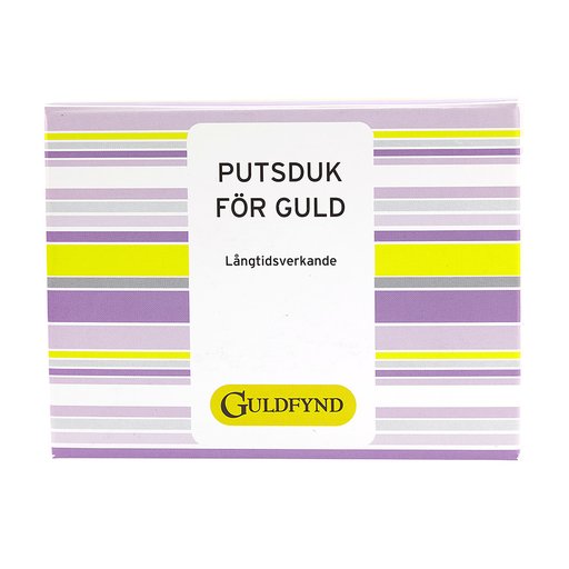
The packaging is a flat, rectangular box with smooth, clean edges and a bright yellow exterior. It features a simple design with a large, bold text printed on the front in black, stating 'PUTSDUK FÖR GULD' and 'Långtidsverkande' beneath it. The box is likely made of a single-layer paperboard, giving it a lightweight appearance. The top flaps are neatly folded and secured, indicating a tuck-tab closure method. The interior is likely plain, without any additional inserts or compartments. The overall form is compact and designed for retail display, with a professional look.
The packaging is a smooth, flat construction with clean edges and folds. It is predominantly yellow with a matte finish, featuring a simple design that includes the brand name 'Guldfynd' prominently displayed on the front. The box has a rectangular shape, typical of retail packaging, and is lightweight in appearance.
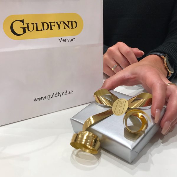
The packaging consists of a thick, sturdy box with a premium appearance. It is covered in a smooth, metallic silver paper that gives it a luxurious feel. The box is topped with a decorative golden ribbon that is elegantly tied into a bow, enhancing its gift-like quality. The overall shape is rectangular, and the dimensions suggest it is suitable for holding jewelry or other small luxury items.

The packaging is a small, square folding carton made from a single layer of paperboard. It features a smooth, flat construction with clean edges and folds. The exterior is a solid light blue color with a matte finish, giving it a modern and sleek appearance. The front of the box prominently displays the brand name 'GULDFYND' in a contrasting silver font, which is clean and legible. The overall design is minimalistic, with no additional graphics or images.
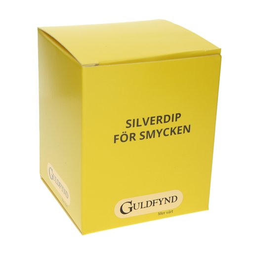
The packaging is a smooth, flat construction made from single-layer paperboard, featuring clean edges and folds. It has a square shape with a top flap that folds down to close. The exterior is printed with a glossy finish, showcasing a bright yellow background with black text. The product name 'SILVERDIP FÖR SMYCKEN' is prominently displayed, along with the brand name 'GULDFYND' in a larger font at the bottom.
About the Brand
Guldfynd operates within the jewelry sector, delivering a wide range of high-quality gold and silver accessories through both physical stores and a robust e-commerce platform. The brand has developed a reputation for premium product presentation, leveraging packaging to reinforce a luxury image and support gifting occasions.
Packaging at Guldfynd is characterized by a blend of rigid luxury boxes and branded carton solutions, tailored for jewelry and related accessories. The brand consistently uses color, logo placement, and construction techniques that align with industry standards for premium retail packaging. Regular collaborations with designers and influencers are supported by custom packaging runs, particularly for exclusive collections and seasonal promotions.
Key Differentiator: The integration of strong brand identity elements and premium unboxing experiences distinguishes Guldfynd, making packaging a core component of their customer engagement strategy.
Design System
Visual Style
Typography favors bold sans-serif fonts for high legibility, complemented by a color palette dominated by bright yellow, metallic silver, and blue. The overall aesthetic is clean, minimal, and upscale, supporting a luxury retail positioning.
Brand Identity
Logo usage is consistent, with the Guldfynd mark and brand name placed prominently on all packaging. Iconography is minimal, reinforcing a high-end image. Visual consistency is maintained through strict adherence to color and font guidelines across all product lines.
Packaging Design
Material choices emphasize rigid box construction and single-layer carton board for lighter accessories, focusing on structure and durability. The design philosophy prioritizes a balance between visual appeal and protective function, with seasonal packaging adaptations for promotional campaigns.
User Experience
The packaging is engineered to deliver a memorable unboxing experience, using tactile finishes and decorative elements to reinforce the brand’s luxury promise. The user journey is supported by clear branding and practical packaging formats that cater to both retail and e-commerce environments.
Company Metrics
Business insights for Guldfynd based on available data
Market Positioning
Brand Values & Focus
Key Competitors
Target Market: Mid- to high-income consumers across Sweden seeking premium jewelry and accessories, both in-store and online.
Packaging Assessment
Overall Grade
Visual appeal and presentation quality
Packaging durability and protection
Eco-friendliness and recyclable materials
Cost efficiency and value for money
Packaging assessment for Guldfynd based on industry standards and best practices
Frequently Asked Questions
What types of packaging formats does Guldfynd use for their jewelry products?
Guldfynd primarily utilizes rigid boxes for luxury items and custom-branded carton boxes for retail and accessory products. These formats are selected to maximize product protection, enhance shelf presence, and deliver a memorable unboxing experience.
How does Guldfynd's packaging support their brand identity?
Their packaging features consistent use of corporate colors (yellow, metallic silver, blue), logo placement, and clean typography. This approach ensures immediate brand recognition and conveys a sense of quality aligned with the jewelry market.
Is sustainability a priority in Guldfynd's packaging strategy?
While Guldfynd's packaging demonstrates a strong focus on visual appeal and product protection, the use of recyclable carton materials is evident. However, there are limited indicators of advanced eco-friendly initiatives or significant use of recycled content.
Discover other Apparel companies
Explore more companies in the apparel industry and their packaging strategies
SUICOKE JAPAN
Apparel
SUICOKE specializes in high-quality footwear and apparel, focusing on unique designs and comfort. The brand is recognized for its innovative sandals and commitment to quality craftsmanship.
Sneakers ER
Apparel
Sneakers ER is a retailer specializing in premium sneaker care products, including cleaners and protectors. They offer a variety of products designed to maintain and enhance the longevity of sneakers.
Menswear Online
Apparel
Menswear Online is a UK-based e-commerce retailer specializing in stylish men's clothing and accessories. The company offers a wide selection of premium brands, including Armani Exchange and Lacoste.