GU Energy packaging
GU Energy specializes in performance nutrition supplements for athletes, leveraging a diverse packaging strategy that includes flexible pouches, corrugated shipping boxes, and branded retail cartons. Their packaging is designed to balance product protection, brand visibility, and convenience for active consumers.
Packaging Portfolio
GU Energy's packaging portfolio encompasses flexible single-serve pouches, corrugated shipping boxes, and branded retail cartons. Flexible packaging is optimized for portability and portion control, featuring laminated films with matte or glossy finishes to enhance tactile appeal and shelf differentiation. Corrugated boxes are engineered for shipping resilience and product assortment, incorporating multi-color surface printing for strong brand presence. Retail cartons are constructed from paperboard with precise folds, supporting both merchandising and product protection. Across formats, the design prioritizes secure closure systems, clear labeling, and consistent use of brand color schemes and logos.

The image shows a variety of flexible pouches designed for energy products. Each pouch is made of a lightweight, flexible material that allows for easy handling and storage. The pouches feature vibrant colors and graphics, with some having a matte finish while others appear glossy. The overall shape is rectangular with a tapered top, allowing for easy pouring or squeezing of the contents. Each pouch has a resealable top or a tear strip for easy access.
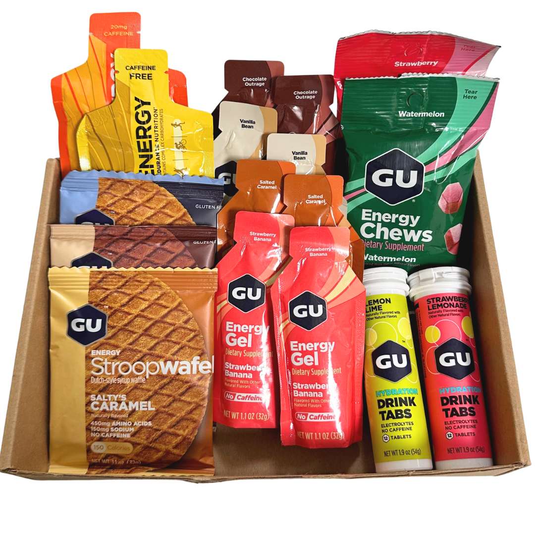
The packaging is a flat, open-top carton box made of single-layer paperboard. It features a smooth, flat construction with clean edges and precise folds. The box is primarily brown with colorful graphics on the products inside. The overall shape is rectangular, designed to hold multiple products securely.
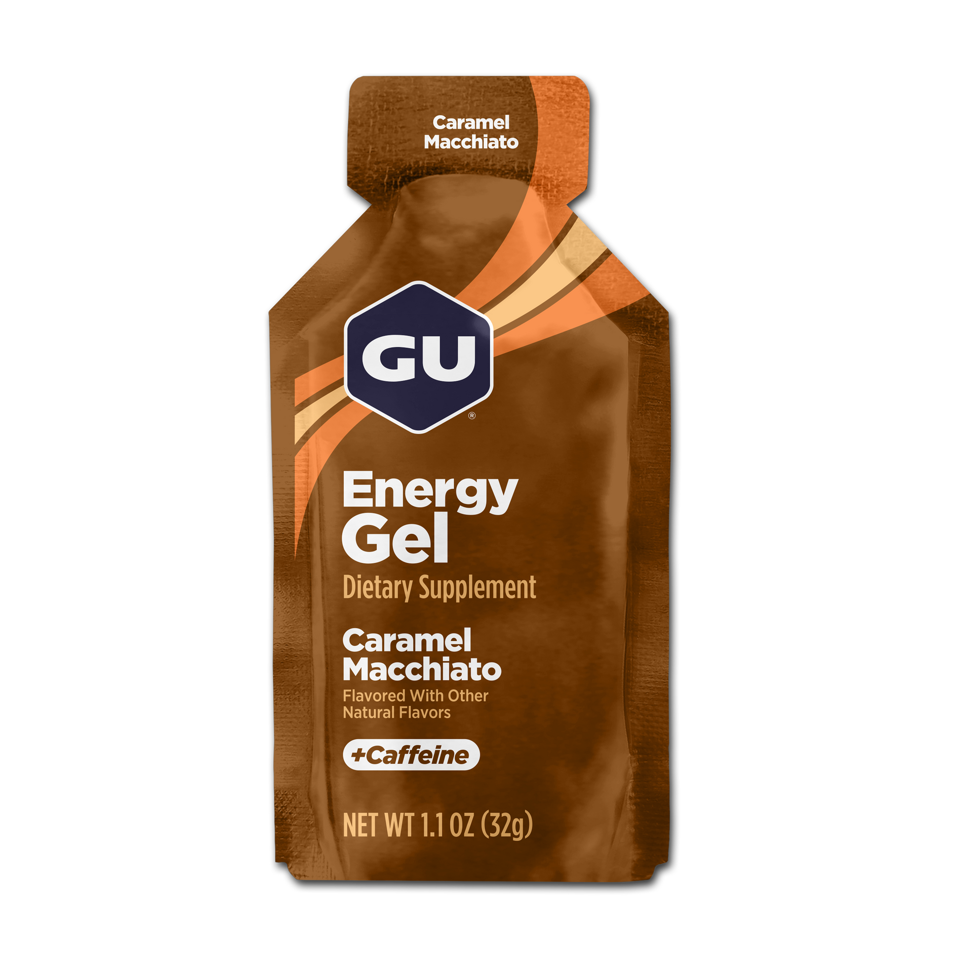
The packaging is a flexible, stand-up pouch designed for energy gel. It features a tapered top with a spout for easy dispensing. The overall shape is slim and elongated, allowing for easy handling and storage. The exterior is smooth with a matte finish, and the colors are predominantly brown with orange accents. The design includes a clear window section that allows visibility of the product inside.
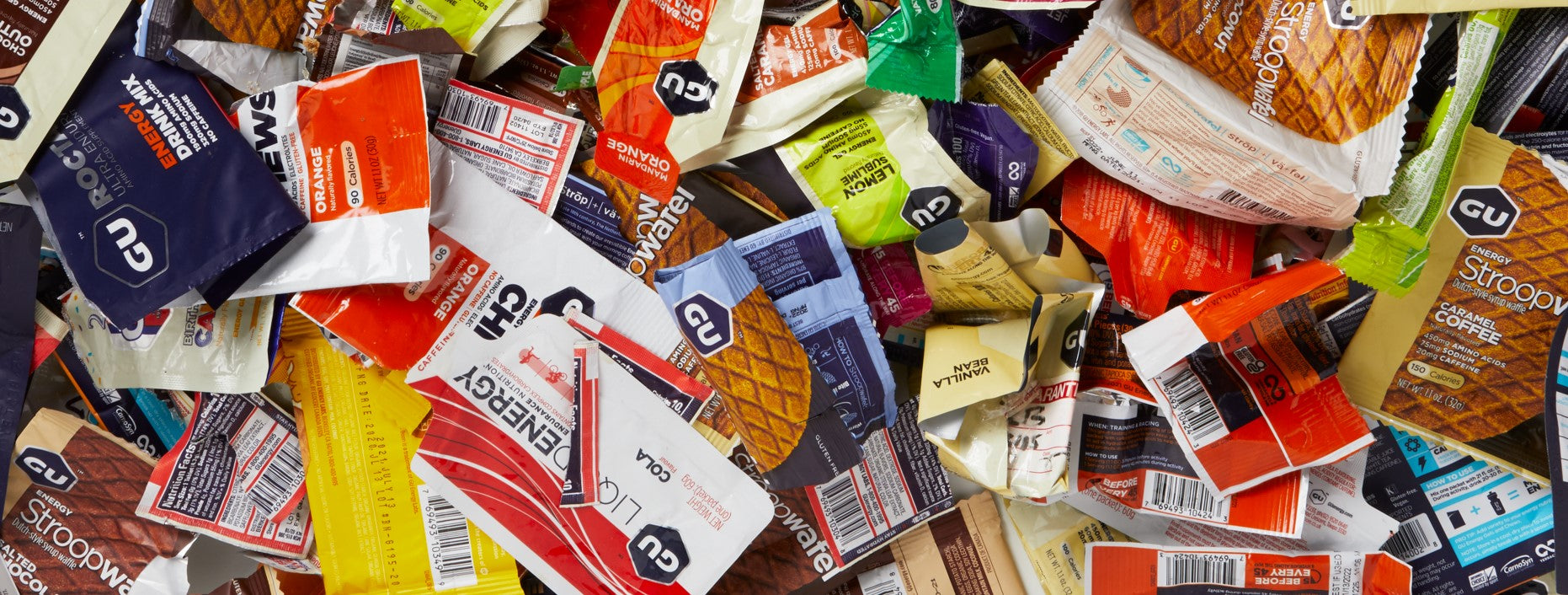
The image shows a variety of snack wrappers in a disorganized pile. The wrappers are made from thin, flexible materials, likely plastic or a composite film, designed for single-use packaging. The wrappers feature vibrant colors and various graphics, including logos and product images. The overall appearance is cluttered, with overlapping wrappers of different shapes and sizes, indicating a mix of products.
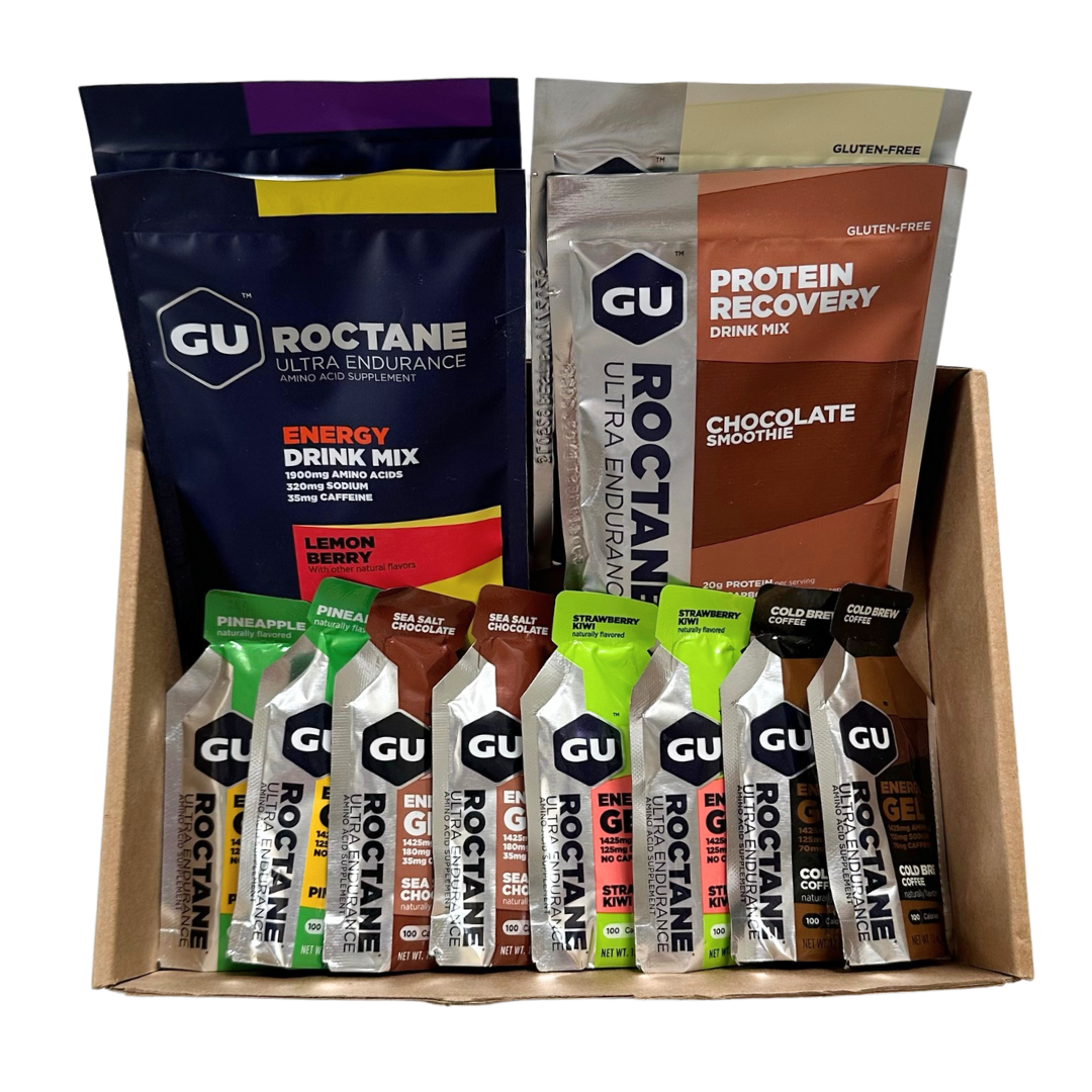
The packaging consists of a brown corrugated box with visible fluted edges when viewed from the side. The box is designed to hold multiple product packets securely, with a sturdy construction suitable for shipping. The outer surface is printed with branding elements and product information, while the interior is filled with various product samples.
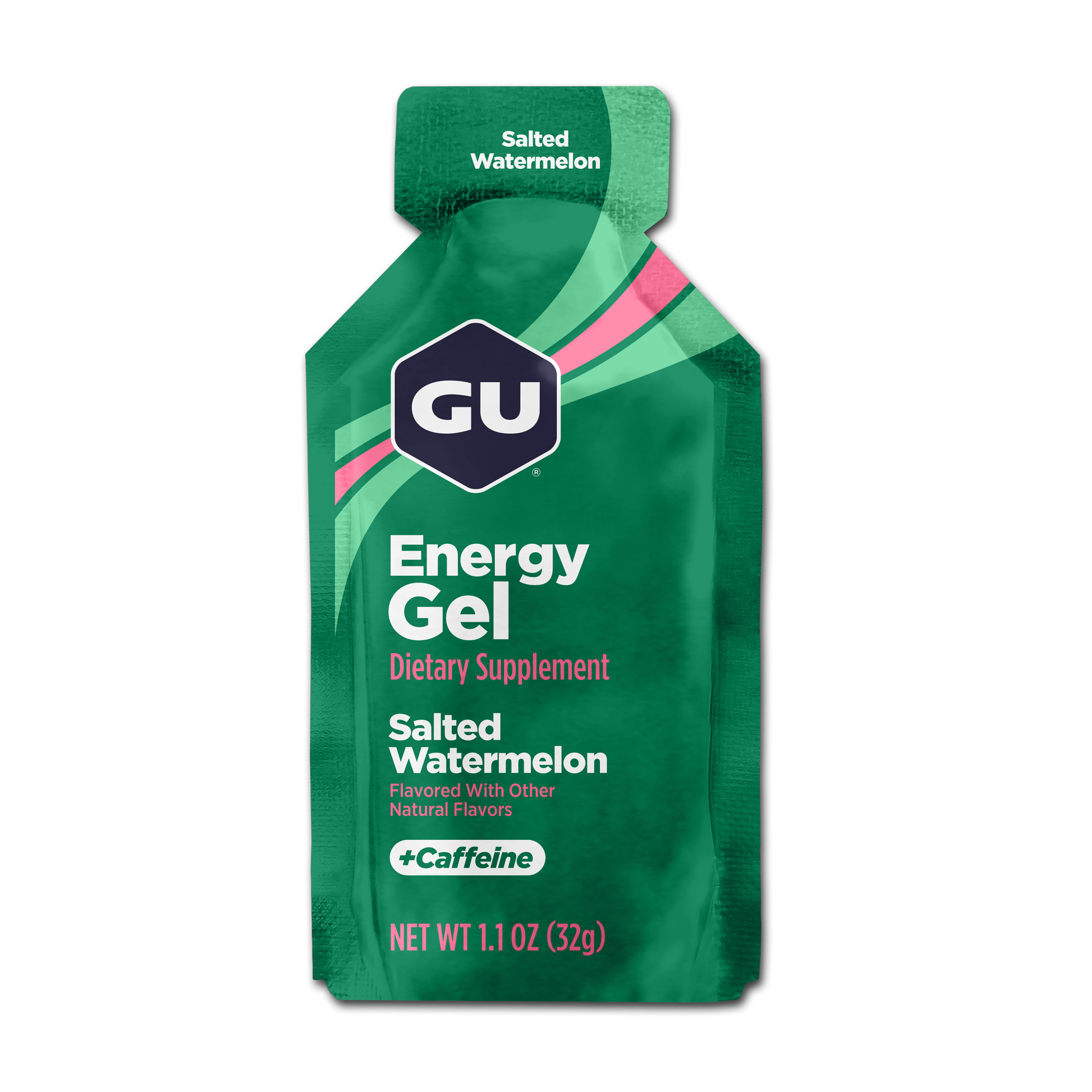
The packaging is a flexible pouch designed for energy gel. It features a tapered top for easy dispensing and a sealed bottom. The exterior is predominantly green with vibrant pink and white accents. The surface is smooth and glossy, indicating a laminate finish. The front displays product information prominently, including the flavor and dietary supplement designation.
About the Brand
GU Energy delivers a comprehensive range of energy supplements, hydration products, and performance nutrition specifically formulated for endurance athletes. The company's packaging approach is characterized by high-impact branding and structural variety tailored for both retail and direct-to-consumer e-commerce.
Their packaging portfolio includes single-use flexible pouches for gels and chews, sturdy corrugated boxes for shipping mixed product assortments, and retail-ready cartons optimized for shelf display. GU Energy emphasizes consistent brand identity across all formats, with a focus on visual clarity, product differentiation, and user convenience, enabling efficient fulfillment and strong shelf presence.
Key Differentiator: GU Energy's key differentiator lies in its integration of vivid brand graphics with functional packaging formats designed for on-the-go athletic use and e-commerce scalability.
Design System
Visual Style
Modern sans-serif typography, high-contrast color palettes with bold accent hues, and a clean, athletic-oriented aesthetic; layouts feature prominent whitespace with strategic color blocking for product differentiation.
Brand Identity
Frequent, prominent use of the GU logo, consistent iconography for product categories, and strict adherence to brand color codes; visual consistency is maintained across all packaging and digital touchpoints.
Packaging Design
Utilizes a mix of flexible multilayer films for single-use products and recyclable corrugated or carton board for bulk and shipping; structural designs emphasize durability, ergonomic access, and easy portability for athletic use.
User Experience
Packaging is engineered for quick, convenient access to nutrition during activity, with intuitive opening mechanisms, tactile finishes for grip, and clear product labeling to support customer decision-making and reinforce brand trust throughout the purchase journey.
Company Metrics
Business insights for GU Energy based on available data
Market Positioning
Brand Values & Focus
Key Competitors
Target Market: Endurance athletes, cyclists, runners, and outdoor fitness enthusiasts seeking specialized nutrition and convenient, portable supplements.
Packaging Assessment
Overall Grade
Visual appeal and presentation quality
Packaging durability and protection
Eco-friendliness and recyclable materials
Cost efficiency and value for money
Packaging assessment for GU Energy based on industry standards and best practices
Frequently Asked Questions
What types of packaging does GU Energy use for its products?
GU Energy utilizes flexible pouches for energy gels and chews, retail cartons for multi-pack offerings, and corrugated boxes for shipping. All formats include prominent branding and are engineered for durability and consumer convenience.
How does GU Energy address packaging sustainability?
While GU Energy's packaging features recyclable corrugated materials and efforts toward recycling partnerships, the use of single-use flexible plastics presents ongoing sustainability challenges typical of the sports nutrition sector.
What role does packaging play in GU Energy's brand strategy?
Packaging functions as a primary brand touchpoint, with high-visibility logos, color-coded product lines, and consistent design language enhancing consumer recognition and engagement across retail and D2C channels.
Discover other Health companies
Explore more companies in the health industry and their packaging strategies
Comvita
Health
Comvita is a New Zealand-based company specializing in high-quality Mānuka honey and natural health products. Established in 1974, it aims to connect people with the healing power of nature.
Lily & Loaf
Health
Lily & Loaf specializes in high-quality health and nutrition products, offering a range of supplements and vitamins aimed at supporting an active lifestyle. The company focuses on providing natural solutions for health and beauty.
Smart Protein
Health
Smart Protein is dedicated to transforming nutrition by providing a range of health and wellness products focused on protein supplements and vitamins.