Garden of Life packaging
Garden of Life specializes in nutritional supplements, leveraging a packaging strategy that emphasizes brand consistency, product protection, and sustainability. Their packaging portfolio incorporates a mix of rigid and folding carton boxes designed to highlight product integrity and meet the demands of health-conscious consumers.
Packaging Portfolio
Garden of Life’s packaging portfolio encompasses rigid chipboard canisters for protein powders, folding carton boxes for vitamins and probiotics, and corrugated boxes for bulk shipping. Most retail-facing formats utilize high-quality, glossy printed paperboard with precise die-cutting, supporting vibrant color reproduction and clear brand messaging. Packaging is designed to optimize shelf presence, ensure product safety, and support e-commerce fulfillment. Shipping cartons are utilitarian but robust, favoring recyclable kraft materials to balance cost and environmental impact.
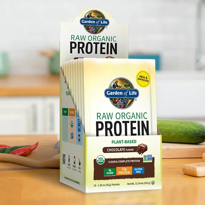
The packaging is a retail display carton designed to hold multiple individual protein packets. It features a smooth, flat construction without fluted layers, indicating it is made from single-layer paperboard. The exterior is predominantly white with vibrant colors and graphics. The front showcases the product name 'RAW ORGANIC PROTEIN' in large, bold lettering, with a prominent logo at the top. The sides have additional product information and nutritional claims. The edges are clean and precise, with a glossy finish that enhances visual appeal. The carton has a rectangular shape, designed to stand upright on a shelf.

The packaging consists of a folding carton that houses a brown glass bottle. The carton is made of smooth, flat paperboard with a glossy finish, featuring vibrant colors and clear graphics. The front displays the product name prominently, along with a guarantee statement. The edges are clean and precise, indicative of high-quality printing. The bottle inside is cylindrical with a screw-on cap, and the carton has a top flap that tucks securely to close.
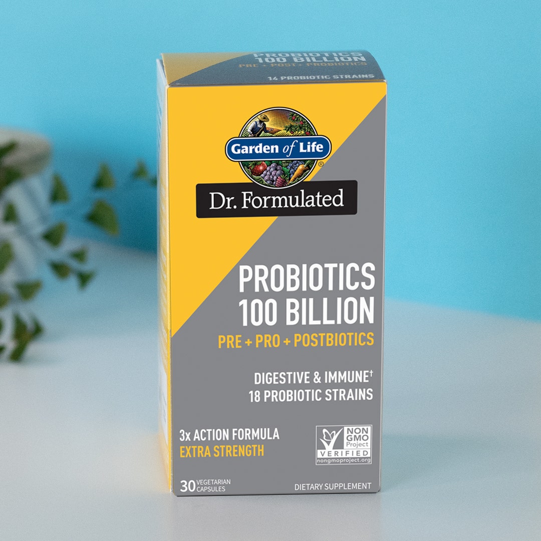
The packaging is a folding carton made of smooth, single-layer paperboard with a clean and precise construction. The box features a predominantly yellow and gray color scheme, with a glossy finish that enhances its visual appeal. The front displays the product name 'Probiotics 100 Billion' prominently, along with additional text indicating its benefits and features. The edges and folds are sharp and well-defined, typical of retail packaging. The top flap is designed to tuck into the box, ensuring a secure closure.
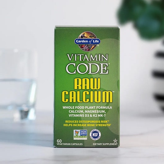
The packaging is a folding carton made of smooth, flat paperboard. It features a predominantly green color scheme with bold yellow and white text. The edges are clean and precise, with no visible fluted layers, indicating a single-layer construction typical of carton boxes. The front displays the product name 'VITAMIN CODE RAW CALCIUM' prominently, along with additional product information and branding elements. The overall shape is rectangular, designed for retail display.
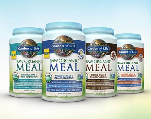
The packaging consists of cylindrical containers made of thick, sturdy chipboard with a premium appearance. Each container has a smooth surface with a glossy finish, featuring vibrant colors and clear graphics. The containers are designed to stand upright and have a consistent height and diameter, giving them a uniform look. The lids are likely screw-on or snap-on, providing secure closure.
About the Brand
Garden of Life is a leading provider of clean, organic nutritional supplements, operating primarily through a D2C model. Their packaging is engineered for visual clarity, shelf presence, and product safety, aligning closely with industry demands for transparency and traceability.
The company’s packaging selections reflect a balance between premium presentation and operational efficiency, with a focus on recyclable materials, tamper-evident closures, and prominent branding. Recurrent use of custom rigid and folding cartons for both retail and e-commerce settings demonstrates a structured approach to both marketing and logistics. Their shipping cartons, while utilitarian, support supply chain resilience and bulk fulfillment.
Key Differentiator: Garden of Life’s unique value lies in its integration of whole food-based product messaging with packaging that foregrounds certifications, ingredient transparency, and visual brand cohesion.
Design System
Visual Style
The visual design system is built on a clean, modern sans-serif typography, with a vibrant yet natural color palette dominated by green, blue, and earth tones. Glossy finishes and high-contrast layouts enhance shelf visibility and communicate product purity.
Brand Identity
Logo usage is prominent on all primary and secondary packaging, accompanied by consistent iconography for certifications and key benefits. The approach favors clear, hierarchical labeling to reinforce brand trust and quick consumer recognition.
Packaging Design
Material selection prioritizes recyclable chipboard, glass, and paperboard, with a structural focus on rigid canisters and folding cartons for optimal protection and retail display. The design philosophy emphasizes tamper evidence, clear product information, and minimized excess material.
User Experience
Packaging is engineered to provide a secure, positive unboxing experience, guiding the customer from initial recognition to product use. Structural integrity and easy-open features support both in-store and e-commerce channels, while clear labeling and certification marks reinforce brand trust along the customer journey.
Company Metrics
Business insights for Garden of Life based on available data
Market Positioning
Brand Values & Focus
Key Competitors
Target Market: Health-conscious consumers seeking clean label supplements with certified organic and non-GMO ingredients, distributed via direct-to-consumer online channels and retail partners.
Packaging Assessment
Overall Grade
Visual appeal and presentation quality
Packaging durability and protection
Eco-friendliness and recyclable materials
Cost efficiency and value for money
Packaging assessment for Garden of Life based on industry standards and best practices
Frequently Asked Questions
What types of packaging materials does Garden of Life use for their supplements?
Garden of Life primarily utilizes rigid chipboard containers, folding carton boxes, and glass bottles, with a focus on recyclable and visually appealing materials suitable for both retail display and direct-to-consumer shipping.
How does Garden of Life address sustainability in its packaging?
Sustainability is addressed through the use of recyclable paperboard, minimized use of non-recyclable plastics, and shipping cartons made from corrugated cardboard. However, further advancements could include expanded use of post-consumer recycled content and reduced packaging footprint.
How does the packaging design support Garden of Life’s brand identity?
The packaging consistently features the Garden of Life logo, signature color palette, and clear labeling of certifications, supporting a cohesive and trustworthy brand experience for consumers.
Discover other Health companies
Explore more companies in the health industry and their packaging strategies
Comvita
Health
Comvita is a New Zealand-based company specializing in high-quality Mānuka honey and natural health products. Established in 1974, it aims to connect people with the healing power of nature.
Smart Protein
Health
Smart Protein is dedicated to transforming nutrition by providing a range of health and wellness products focused on protein supplements and vitamins.
Doctor Seaweed
Health
Doctor Seaweed specializes in natural, plant-based nutritional supplements derived from seaweed, aimed at promoting overall wellness.