Ferrocalm packaging
Ferrocalm delivers gut health solutions for individuals with IBS, utilizing carton-based packaging to ensure product integrity and clear brand communication. Their packaging strategy balances retail presentation with protection, emphasizing clinical credibility and customer reassurance.
Packaging Portfolio
Ferrocalm’s packaging portfolio is centered on single-layer paperboard folding cartons, designed for both retail display and direct-to-consumer shipping. The cartons feature precise folding, clean edges, and a glossy or semi-gloss finish, with vibrant, health-oriented graphics and detailed product information. All packaging includes prominent branding, consistent logo placement, and clear nutritional and clinical claims, supporting both shelf appeal and regulatory compliance. The material selection favors recyclability, though the use of coatings may marginally reduce environmental performance in certain regions.

The packaging is a flat, rectangular folding carton made of single-layer paperboard. It features a smooth, clean construction with precise edges and folds, typical of retail packaging. The exterior is predominantly white with a glossy finish, adorned with colorful graphics and text. The front displays the product name 'Ferrocalm' prominently, along with a circular logo and a Trustpilot rating star graphic. The sides contain additional product information and nutritional details.

The packaging consists of a smooth, flat construction made of single-layer paperboard. The boxes are primarily white with a colorful design that includes a prominent logo and product information. The edges are clean and precise, indicating a well-constructed folding carton. The overall shape is rectangular, suitable for retail display.
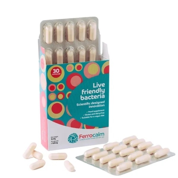
The packaging is a folding carton made of smooth, single-layer paperboard. It features a colorful design with circular patterns in various colors, prominently displaying the product name 'Live friendly bacteria' and additional information in a clear font. The carton has a clean and precise construction with sharp edges and folds, typical of retail packaging. The front panel has a window showing the capsules inside, while the sides and back contain product information and branding elements.

The packaging is a flat, rectangular box with smooth, clean edges and folds. It features a predominantly white exterior with colorful graphics. The front displays the brand name 'Ferrocalm' prominently, along with a tagline and product details. The box is designed for retail display, likely intended for shelves. The overall appearance is light and inviting, suitable for a health supplement.

The packaging is a folding carton made from a single layer of paperboard. It features a smooth, flat construction with clean edges and folds. The exterior is brightly colored with a playful design, incorporating circles in various sizes and colors against a turquoise background. The front prominently displays the product name 'Live friendly bacteria' in bold, white font, along with additional text about the product's benefits. The sides and back contain further product information and nutritional details.
About the Brand
Ferrocalm specializes in scientifically formulated probiotic supplements tailored for IBS sufferers. The company prioritizes transparent, research-backed solutions and uses packaging that reflects its clinical focus while supporting e-commerce and retail distribution.
With a direct-to-consumer model and a foundation in clinical research, Ferrocalm positions itself as a specialist in symptom-specific gut health management. Their packaging choices center on single-layer paperboard folding cartons, providing both shelf visibility and logistical efficiency. Branding is consistently integrated into the packaging, reinforcing trust and enabling clear differentiation from generic probiotic brands.
Key Differentiator: Ferrocalm stands out for its IBS-specific probiotic formulation, supported by over a decade of research, and for packaging that visually communicates scientific credibility and user trust.
Design System
Visual Style
The visual design employs modern sans-serif typography, a predominantly white background, and a palette of turquoise, green, and accent colors to convey clinical clarity and healthfulness. Graphics include playful, circular motifs that align with gut health themes.
Brand Identity
Logo usage is consistent and prominent across all packaging, with standardized placement and clear, legible product naming. Iconography is minimal but supports health cues, and overall visual consistency is maintained throughout the product range.
Packaging Design
Packaging is constructed from single-layer paperboard, with a folding carton structure optimized for moderate protection and efficient logistics. Structural design emphasizes flat surfaces for graphic application and retail display, balancing cost-effectiveness with brand impact.
User Experience
The unboxing process is straightforward, with clear, inviting graphics and immediate presentation of product and health claims. Packaging supports customer trust by making research and clinical validation visible, while the physical design facilitates easy access and reinforces the brand’s commitment to user-centricity.
Company Metrics
Business insights for Ferrocalm based on available data
Market Positioning
Brand Values & Focus
Key Competitors
Target Market: Health-conscious consumers, specifically adults experiencing IBS or gut inflammation, seeking clinically validated probiotic solutions via e-commerce and retail channels.
Packaging Assessment
Overall Grade
Visual appeal and presentation quality
Packaging durability and protection
Eco-friendliness and recyclable materials
Cost efficiency and value for money
Packaging assessment for Ferrocalm based on industry standards and best practices
Frequently Asked Questions
What type of packaging does Ferrocalm use for its probiotic supplements?
Ferrocalm utilizes single-layer paperboard folding cartons with a focus on clean construction, vibrant graphics, and prominent brand elements. These cartons are optimized for both retail display and e-commerce shipment.
How does Ferrocalm’s packaging support product safety during shipping?
The folding carton structure provides moderate protection against physical damage and tampering, suitable for most supplement logistics scenarios, though additional secondary packaging may be required for extended transit or higher-risk shipments.
Are Ferrocalm’s packaging materials recyclable?
The primary packaging material—paperboard—is widely recyclable, supporting moderate sustainability goals within the health supplement industry. However, the presence of any laminated or glossy finishes may affect recyclability in certain regions.
How does packaging contribute to Ferrocalm’s brand positioning?
Packaging design emphasizes scientific trust and approachability through consistent use of brand logos, clear typography, and a palette that aligns with health and wellness cues, directly reinforcing the brand’s research-driven promise.
Discover other Health companies
Explore more companies in the health industry and their packaging strategies
Lily & Loaf
Health
Lily & Loaf specializes in high-quality health and nutrition products, offering a range of supplements and vitamins aimed at supporting an active lifestyle. The company focuses on providing natural solutions for health and beauty.
Comvita
Health
Comvita is a New Zealand-based company specializing in high-quality Mānuka honey and natural health products. Established in 1974, it aims to connect people with the healing power of nature.
Smart Protein
Health
Smart Protein is dedicated to transforming nutrition by providing a range of health and wellness products focused on protein supplements and vitamins.