FALKE packaging
FALKE specializes in premium legwear and underwear, emphasizing craftsmanship and comfort. Their packaging approach utilizes structured carton and rigid boxes with a strong focus on brand consistency and visual appeal, tailored for a high-end retail and D2C experience.
Packaging Portfolio
FALKE’s packaging portfolio is characterized by the use of high-quality folding carton and rigid box structures, predominantly leveraging white paperboard substrates with matte finishes and transparent display windows. The packaging consistently incorporates playful yet refined graphics, product-specific iconography, and prominent brand identifiers such as the 'FALKE' logo and 'WE CARE' tagline. Structural choices prioritize both shelf presence and product visibility while offering moderate protection during transit. The aesthetic is contemporary, supporting clear product differentiation in retail environments and enhancing the direct-to-consumer unboxing experience.
The packaging is a folding carton with a smooth, flat construction, featuring a white exterior with colorful graphics. The box has clean edges and precise folds, typical of retail packaging. The top is open, revealing the contents inside, and the sides display playful illustrations of socks and feet, enhancing the visual appeal.
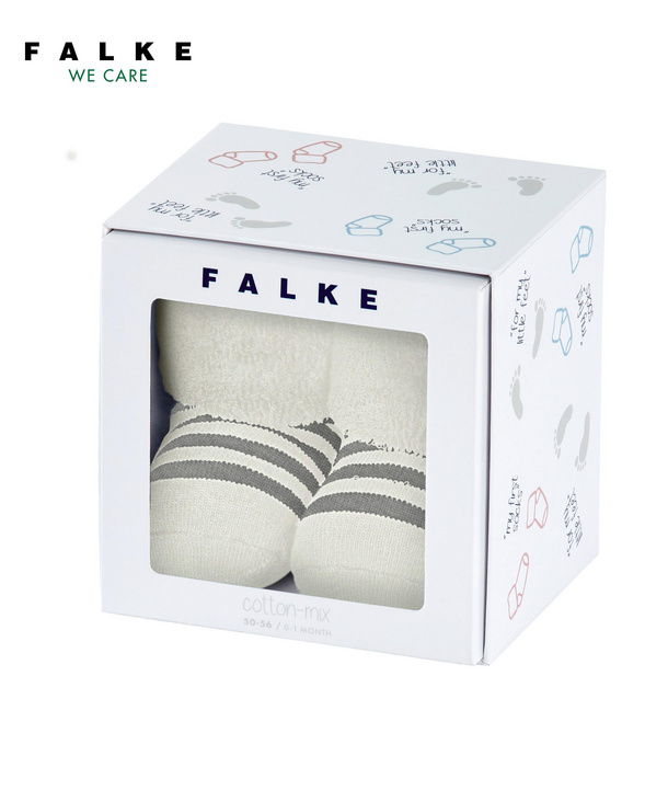
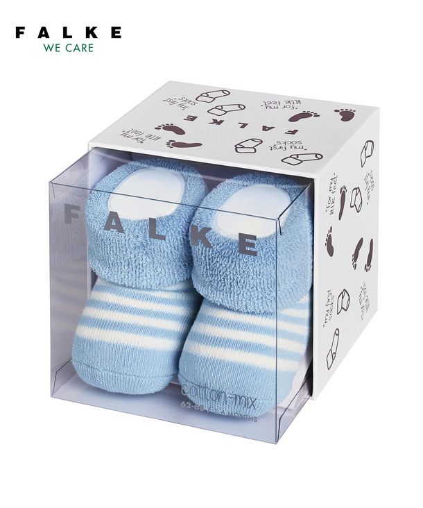
The packaging is a rigid box with a transparent front panel that displays the contents inside. The box is predominantly white with a playful design featuring various foot and sock illustrations. The top of the box has a clear plastic lid, allowing visibility of the socks. The sides and back are printed with soft colors and simple graphics, enhancing the overall aesthetic appeal.
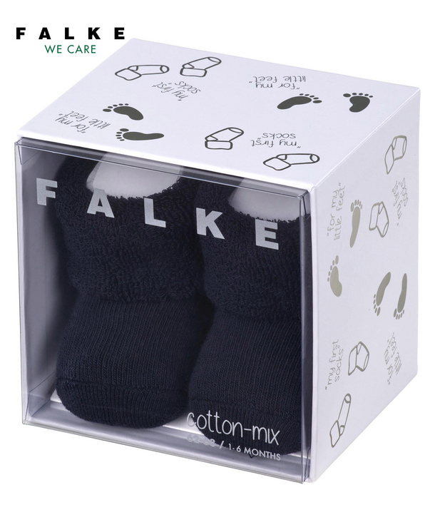
The packaging is a folding carton made of smooth, white paperboard. It features a clear plastic window on the front, allowing visibility of the contents inside. The edges are clean and precise, with a foldable design that allows the box to close securely. The surface is printed with playful graphics of socks and footprints in a light brown color, enhancing its appeal for a children's product. The overall shape is rectangular, designed to hold a pair of socks.
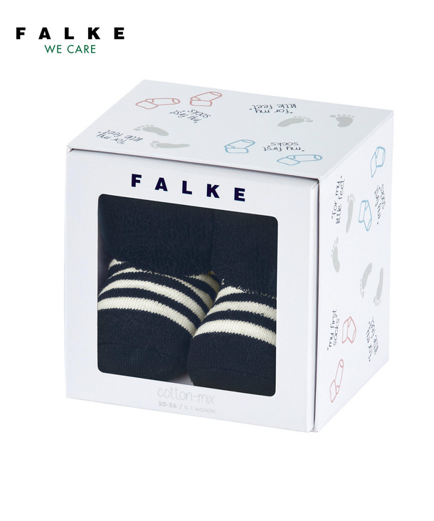
The packaging is a folding carton with a smooth, flat construction made from single-layer paperboard. It features a cube shape with clean, precise edges and folds. The exterior is predominantly white with colorful graphics depicting socks and foot prints, enhancing its appeal for retail. The top has a clear window showcasing the contents inside, which are cotton socks. The overall design is light and modern, suitable for a children's product.
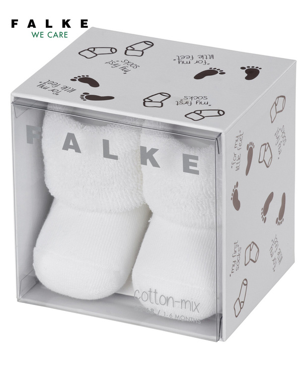
The packaging is a rigid box with a transparent front panel showcasing the product inside. The box features a predominantly white exterior with playful graphics depicting various sock patterns and foot illustrations. The top and bottom sections are solid white, while the sides have a patterned design. The box has a clean, precise construction with sharp edges and folds, giving it a premium appearance.
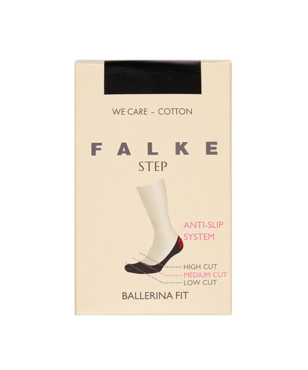
The packaging is a flat, rectangular folding carton made from a single layer of paperboard. It features a smooth, matte finish with a light beige color. The front displays the brand name 'FALKE' prominently in bold, uppercase letters, with a pink graphic indicating the anti-slip system and cut types. The edges are clean and well-defined, with precise folds. The top has a black ribbon closure, adding a touch of elegance.
About the Brand
FALKE is a legacy apparel brand recognized for its high-quality socks, hosiery, and underwear, with an operational emphasis on quality, innovation, and meticulous craftsmanship.
Founded in 1895, FALKE has evolved into a leader in the legwear segment, serving a diverse clientele through a D2C model and advanced e-commerce platform. The company’s packaging strategy aligns closely with its premium market positioning, leveraging custom-designed cartons and rigid boxes that reinforce both product protection and brand storytelling. FALKE’s commitment to visual coherence and consumer experience is evident in all packaging touchpoints, from material selection to retail presentation.
Key Differentiator: FALKE’s unique integration of traditional craftsmanship with modern, brand-driven packaging design distinguishes its unboxing experience and reinforces its luxury positioning in the apparel sector.
Design System
Visual Style
Modern sans-serif typography, a neutral color palette dominated by white with accents of soft pastels and occasional bold print, and minimalist graphic illustrations create a clean, approachable, and premium visual language.
Brand Identity
The FALKE logo is consistently displayed in bold, uppercase lettering with clear placement, often accompanied by the 'WE CARE' tagline. Iconography and product graphics are playful but restrained, supporting strong brand recognition and visual cohesion across product lines.
Packaging Design
Material selection favors recyclable paperboard for folding cartons and rigid boxes, with the inclusion of transparent plastic windows for product visibility. Design emphasizes precise construction, clean edges, and retail-ready presentation, balancing durability with visual appeal.
User Experience
Packaging is engineered to maximize shelf impact and unboxing satisfaction, with clear, informative graphics and tactile features like ribbon closures. The design supports the customer journey from digital purchase through to delivery, reinforcing FALKE’s premium positioning and attention to detail.
Company Metrics
Business insights for FALKE based on available data
Market Positioning
Brand Values & Focus
Key Competitors
Target Market: Discerning consumers seeking premium legwear and underwear, including both adults and children, with a focus on quality, comfort, and luxury presentation.
Packaging Assessment
Overall Grade
Visual appeal and presentation quality
Packaging durability and protection
Eco-friendliness and recyclable materials
Cost efficiency and value for money
Packaging assessment for FALKE based on industry standards and best practices
Frequently Asked Questions
What packaging formats does FALKE utilize for its legwear and apparel products?
FALKE primarily employs folding carton boxes and rigid boxes with transparent panels, using single-layer paperboard and rigid paperboard materials. These formats are optimized for both retail presentation and product protection.
How does FALKE’s packaging support its premium brand positioning?
FALKE’s packaging features clean structural design, custom graphics, and high-impact branding elements such as prominent logos and taglines. This cohesive approach enhances the perceived value and supports the brand’s luxury image.
What sustainability initiatives are reflected in FALKE’s packaging choices?
While FALKE utilizes recyclable paperboard and maintains a minimalist material approach, there is limited evidence of advanced sustainability practices such as compostable materials or explicit carbon reduction claims.
Discover other Apparel companies
Explore more companies in the apparel industry and their packaging strategies
SUICOKE JAPAN
Apparel
SUICOKE specializes in high-quality footwear and apparel, focusing on unique designs and comfort. The brand is recognized for its innovative sandals and commitment to quality craftsmanship.
Sneakers ER
Apparel
Sneakers ER is a retailer specializing in premium sneaker care products, including cleaners and protectors. They offer a variety of products designed to maintain and enhance the longevity of sneakers.
Compressport International
Apparel
Compressport International specializes in high-end compression garments and sports accessories designed for athletes. Founded in 2008 and based in Geneva, Switzerland, the company caters to the needs of trail runners, triathletes, and other fitness enthusiasts.