Fairment packaging
Fairment specializes in premium probiotic and dietary supplements, utilizing a direct-to-consumer model to deliver health-focused products across Europe. Their packaging strategy emphasizes modern carton and rigid box formats with strong branding, prioritizing both consumer experience and product protection.
Packaging Portfolio
Fairment’s packaging portfolio is dominated by folding carton boxes and rigid kit boxes, constructed from single-layer paperboard and reinforced where necessary for premium starter kits. These solutions offer a balance between retail shelf presence and shipping durability, with corrugated boxes used for logistics and D2C fulfillment. Visual consistency is achieved through matte finishes, bold color palettes, and clear typography. The emphasis on structural rigidity and branded elements supports both product security and customer perception of quality.
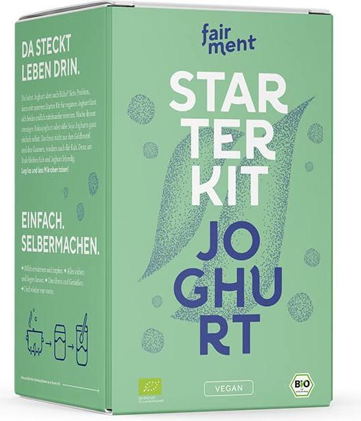
The packaging is a folding carton made of smooth, single-layer paperboard. It features a clean, flat construction with precise edges and folds. The exterior is predominantly green with a matte finish, showcasing a modern design aesthetic. The front displays the product name 'STARTER KIT JOGHURT' in bold, white lettering, accompanied by a stylized leaf graphic that adds a natural touch. The sides include additional text in German, emphasizing the product's simplicity and DIY nature. The overall form is rectangular, typical for retail packaging.

The packaging is a brown corrugated box, featuring a sturdy construction typical for shipping purposes. The box has visible fluted edges when viewed from the side, indicating its corrugated nature. It is filled with neatly rolled white socks, each secured with a gray band that has branding elements. The box appears to be opened slightly, showing the contents inside.

The packaging is a folding carton made from a single layer of paperboard. It features a smooth, flat construction without any visible fluted layers. The carton is predominantly yellow with red accents. The top of the carton has a pointed closure typical of ice cream packaging. The edges are clean and precise, indicating a well-constructed fold. The surface has a matte finish, giving it a classic look. There are no visible signs of wear or damage.

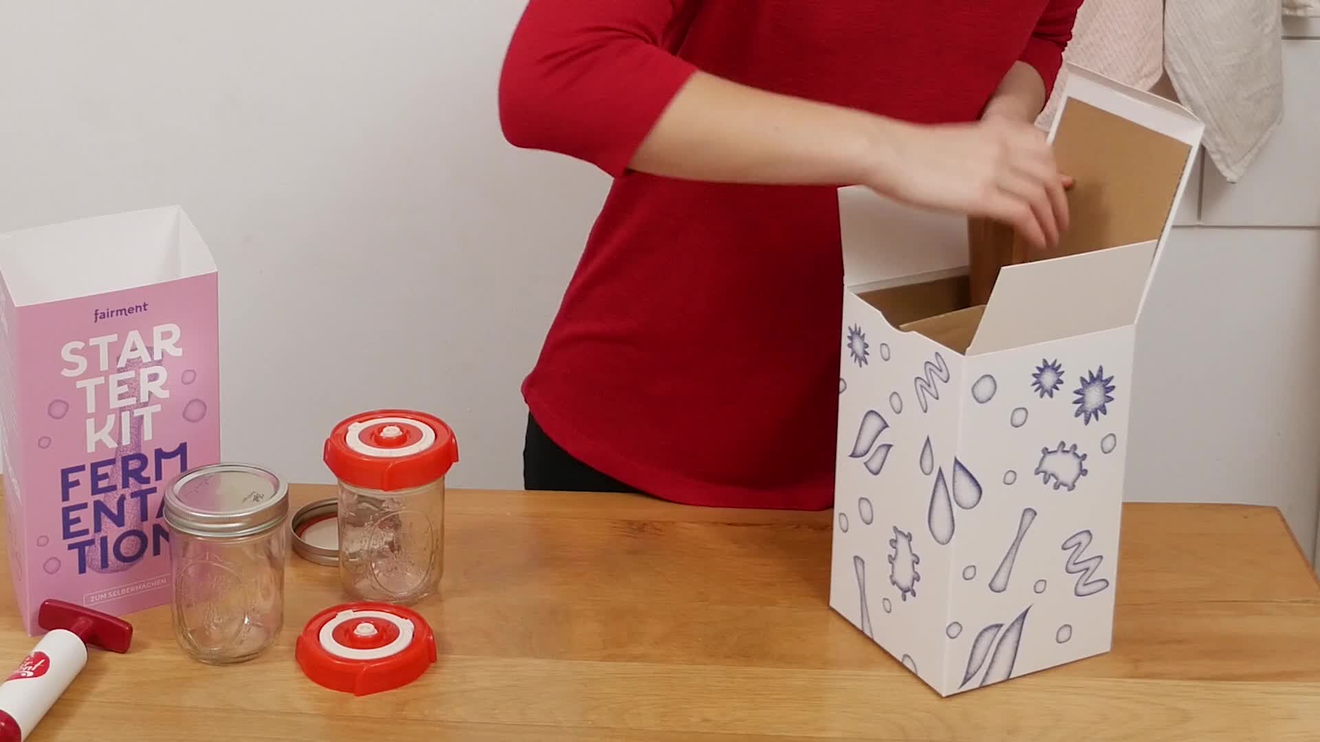
The packaging consists of a sturdy, thick-walled box with a premium feel, featuring a colorful exterior design. The box is predominantly pink with bold white and purple text stating 'STARTER KIT FERMENTATION'. The construction includes a top flap that opens to reveal additional components inside, including jars and a wooden tool. The interior is organized to hold various items securely, suggesting a thoughtful design for product presentation.
The packaging is a folding carton made of single-layer paperboard. It features a smooth, flat construction with clean edges and folds. The exterior is predominantly white with colorful graphics, including illustrations of water droplets and fermentation-related motifs. The top flaps are designed to tuck in securely, and the overall shape is rectangular, suitable for retail display.

The packaging consists of a tall, rectangular box with a smooth, flat construction. The box features a vibrant orange background with bold, white typography. The design includes playful graphics that suggest a fun and engaging product experience. The edges are clean and precise, indicating a well-constructed folding carton. The box appears to be used for retail display, likely containing a starter kit for making cheese alternatives.
About the Brand
Fairment delivers scientifically formulated probiotics and supplements, supported by a packaging approach that balances branding, product integrity, and consumer engagement.
Operating primarily in German-speaking regions, Fairment's packaging leverages folding cartons, rigid boxes, and corrugated materials designed for both retail and shipping. Their solutions reflect careful attention to aesthetic consistency and logistical requirements, supporting their position as a health and wellness leader in probiotics and fermented foods. Packaging choices are tailored to emphasize natural ingredients and clinical credibility while maintaining an efficient supply chain.
Key Differentiator: Strong alignment of packaging design with health-focused branding and user experience, integrating modern aesthetics with structural robustness.
Design System
Visual Style
Modern sans-serif typography, bold and vibrant color palettes (green, orange, pink, yellow), and matte finishes characterize the visual style, producing a clean and approachable aesthetic.
Brand Identity
Consistent use of the Fairment logo, clear product naming, and iconography such as leaf and fermentation motifs ensure strong brand recall. Branding elements are prominently displayed on every package, reinforcing visual identity across products.
Packaging Design
Material selection prioritizes recyclable paperboard and rigid cardboard for both sustainability and product protection. Structural design focuses on precise folding, secure closures, and retail-ready formats, with attention to both functional and visual aspects.
User Experience
Packaging design supports an intuitive and engaging unboxing journey, reinforcing the brand’s health-conscious message at every touchpoint. Clear labeling, organized interior layouts for kits, and easy-open mechanisms enhance customer satisfaction and trust.
Company Metrics
Business insights for Fairment based on available data
Market Positioning
Brand Values & Focus
Key Competitors
Target Market: Health-conscious consumers in Germany, the Netherlands, Belgium, and Luxembourg seeking premium probiotic and gut health solutions.
Packaging Assessment
Overall Grade
Visual appeal and presentation quality
Packaging durability and protection
Eco-friendliness and recyclable materials
Cost efficiency and value for money
Packaging assessment for Fairment based on industry standards and best practices
Frequently Asked Questions
What types of packaging does Fairment use for their products?
Fairment utilizes a combination of folding cartons, rigid boxes, and corrugated shipping boxes, selected to balance product protection, retail presentation, and branding consistency.
How does Fairment address sustainability in its packaging?
Fairment prioritizes recyclable paperboard and minimalistic packaging, aiming to reduce environmental impact while maintaining product safety and brand appeal.
Does Fairment customize packaging for product launches or seasonal campaigns?
Fairment demonstrates a moderate likelihood of custom packaging, adapting visual design and materials to new products and campaigns as part of their D2C marketing strategy.
Discover other Health companies
Explore more companies in the health industry and their packaging strategies
Lily & Loaf
Health
Lily & Loaf specializes in high-quality health and nutrition products, offering a range of supplements and vitamins aimed at supporting an active lifestyle. The company focuses on providing natural solutions for health and beauty.
Bio-Synergy
Health
Bio-Synergy is a UK-based company specializing in health and fitness products, including nutritional supplements and DNA testing kits. Their mission is to support individuals in achieving their health and fitness goals through innovative products and personalized insights.
Smart Protein
Health
Smart Protein is dedicated to transforming nutrition by providing a range of health and wellness products focused on protein supplements and vitamins.