Elternfee packaging
Elternfee specializes in practical consumer goods for parents, including apparel, accessories, and organizational products. Their packaging strategy utilizes branded retail cartons and fabric pouches, emphasizing visual coherence and functional design to suit both e-commerce and retail environments.
Packaging Portfolio
Elternfee's packaging portfolio consists primarily of custom folding cartons for hair accessories and multi-use zippered fabric pouches for their bag products. The folding cartons are constructed from smooth, flat paperboard, offering strong visual impact at point-of-sale and incorporating hang tabs for retail display. The fabric pouches are made from durable polyester or nylon, designed for practical reuse and to withstand daily handling. Both formats integrate high-visibility branding elements, including logo application and consistent color schemes, aligning with the company's parent-focused, playful aesthetic.
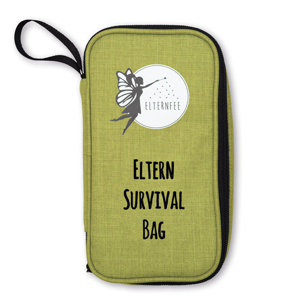
The packaging is a zippered pouch with a rectangular shape. It features a textured surface that resembles fabric, giving it a soft appearance. The pouch is primarily green with a smooth finish, and it has a black zipper along the top edge. The front displays a graphic of a fairy and the text 'Eltern Survival Bag' in bold, black lettering. The overall design is simple yet appealing, aimed at a target audience likely interested in parenting or family-related products.
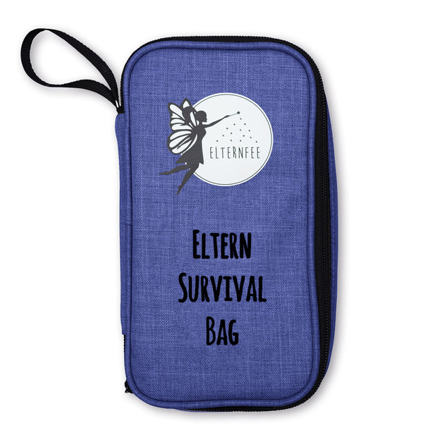
The packaging is a zippered pouch made from a textured fabric material. It features a prominent logo of a fairy and the text 'Eltern Survival Bag' printed on the front. The pouch has a rounded shape with a zipper closure along the top edge, allowing for easy access to the contents inside. The color is a deep blue with a fabric-like texture, giving it a soft yet durable appearance.

The packaging consists of a flat, smooth paperboard card that holds a scrunchie. The card has a top header with a hole for hanging display. The scrunchie itself is made of fabric with a checkered pattern in pink, blue, and white colors. The card features a clean design with a fairy logo and product name, and it is likely printed with a glossy finish.

The packaging consists of three individual folding cartons, each containing a hair scrunchie. The cartons are made of smooth, flat paperboard with clean, precise edges and folds. Each carton features a hanging tab at the top for retail display. The front of each carton displays vibrant graphics and product information, while the back is likely plain or contains additional details. The overall appearance is colorful and appealing, targeting a fashion-conscious audience.
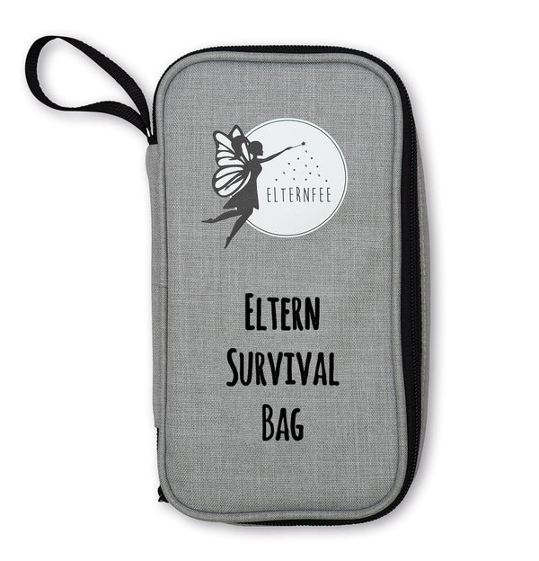
The packaging is a zippered pouch made from a textured fabric material, likely polyester or nylon, with a smooth zipper closure along one edge. The exterior features a light gray color with a subtle texture, giving it a durable appearance. The front displays a graphic of a fairy and the text 'ELTERNFEE' in a bold, black font, along with the phrase 'Eltern Survival Bag' in a slightly smaller font beneath it. The overall design is simple yet visually appealing, with a clean and organized look.

The packaging appears as a compact travel bag or pouch designed for convenience. It features a rectangular shape with a zippered closure along the top. The exterior is made of a durable fabric with a grey color scheme, complemented by a lighter grey section. The front displays a circular logo with a fairy silhouette and the text 'ELTERNFEE' prominently. The overall design is functional and stylish, suitable for carrying small items.
About the Brand
Elternfee is a Munich-based D2C brand offering functional and stylish products for parents, with a core focus on combining utility with appealing design. The company's packaging approach leverages customized carton boxes and branded fabric pouches to enhance product visibility and user convenience.
Founded in 2021, Elternfee operates with a lean team and focuses on delivering a cohesive brand experience through its packaging. The packaging solutions are tailored to distinct product categories—retail cartons for hair accessories and multi-use fabric pouches for bags—prioritizing both shelf impact and everyday usability. Consistency in branding across all packaging touchpoints reinforces their position in the consumer goods market.
Key Differentiator: Elternfee’s brand equity is built around playful, parent-focused product design and packaging that merges practicality with aesthetic appeal, ensuring both brand recognition and user engagement.
Design System
Visual Style
The visual design employs playful, rounded typography and a palette dominated by bright, pastel colors (pinks, blues, greens, and greys), supporting a whimsical and approachable aesthetic.
Brand Identity
Brand identity is reinforced through frequent use of the fairy logo, consistent product naming conventions, and clear, legible iconography. Branding remains prominent across all packaging types, supporting immediate recognition.
Packaging Design
Material choices prioritize lightweight, durable substrates—paperboard for cartons and synthetic fabric for pouches—balancing cost efficiency with shelf appeal. Structural designs incorporate retail-ready features like hang tabs and zipper closures for added functionality.
User Experience
Packaging design supports a positive user journey by enabling easy product access, encouraging reuse (especially with pouches), and delivering a cohesive, emotionally resonant unboxing experience. The blend of practicality and style enhances both initial impression and long-term brand engagement.
Company Metrics
Business insights for Elternfee based on available data
Market Positioning
Brand Values & Focus
Key Competitors
Target Market: Modern parents in Germany and broader D2C e-commerce customers seeking practical, stylish solutions for family life.
Packaging Assessment
Overall Grade
Visual appeal and presentation quality
Packaging durability and protection
Eco-friendliness and recyclable materials
Cost efficiency and value for money
Packaging assessment for Elternfee based on industry standards and best practices
Frequently Asked Questions
What types of packaging does Elternfee use?
Elternfee utilizes custom-printed folding cartons for smaller accessories and branded fabric zippered pouches for their bag products, ensuring both retail display suitability and practical reuse.
How does Elternfee's packaging support their brand identity?
The packaging integrates consistent use of the fairy logo, playful typography, and cohesive color schemes, reinforcing brand recognition and a visually engaging unboxing experience tailored for parents.
Is Elternfee's packaging sustainable?
While carton boxes are likely recyclable, fabric pouches are designed for reuse, supporting moderate sustainability. However, material specifics such as use of recycled content or certifications are not disclosed.
Discover other Apparel companies
Explore more companies in the apparel industry and their packaging strategies
Menswear Online
Apparel
Menswear Online is a UK-based e-commerce retailer specializing in stylish men's clothing and accessories. The company offers a wide selection of premium brands, including Armani Exchange and Lacoste.
Compressport International
Apparel
Compressport International specializes in high-end compression garments and sports accessories designed for athletes. Founded in 2008 and based in Geneva, Switzerland, the company caters to the needs of trail runners, triathletes, and other fitness enthusiasts.
SUICOKE JAPAN
Apparel
SUICOKE specializes in high-quality footwear and apparel, focusing on unique designs and comfort. The brand is recognized for its innovative sandals and commitment to quality craftsmanship.