Dynutrition packaging
Dynutrition is a UK-based health and nutrition brand specializing in vitamins, dietary supplements, and nutrition products sold through its e-commerce platform. The company employs a modern, brand-forward packaging strategy using a mix of rigid containers, folding cartons, and flexible pouches to optimize product safety, shelf appeal, and user experience.
Packaging Portfolio
Dynutrition's packaging portfolio is characterized by a strategic mix of single-layer folding cartons for protein bars, rigid HDPE and PET containers for powders and capsules, and multilayer flexible pouches for protein blends. Each format is chosen to balance product protection, regulatory labeling, and shelf display requirements. The use of matte and glossy finishes, resealable closures, and bold graphics enhances both functionality and visual impact. Packaging consistently incorporates prominent logos, ingredient callouts, and nutrition facts to support consumer decision-making and compliance.

The packaging is a cylindrical container designed for holding dietary supplement powder. It features a smooth, rigid structure with a twist-off lid. The exterior is predominantly white with vibrant colors and graphics that highlight the product name and benefits. The label wraps around the container, providing a clean and modern aesthetic.

The packaging is a cylindrical container with a black lid and a predominantly black body featuring a glossy finish. The container is labeled with a bold design that includes a diagonal white stripe across the front, prominently displaying the product name 'THE CREATINE' in large white font. Below the product name, there is additional information about the product, including its flavor ('CHERRY') and net weight ('400g'). The design incorporates a mix of colors, including black, white, and red, with a modern aesthetic. The lid appears to be a screw-on type, providing a secure closure.

The packaging is a flat, rectangular box made of single-layer paperboard. It features a smooth surface with clean, precise edges and folds. The box is predominantly black with vibrant colors used for the branding and product information. The top of the box has a glossy finish, enhancing its visual appeal. The design includes a prominent logo and product name, along with nutritional information and branding elements on the sides.
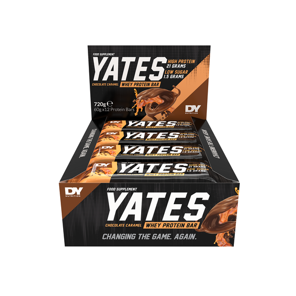
The packaging is a folding carton box designed to hold multiple protein bars. It features a smooth, flat construction without any visible fluted layers, indicating it is made from single-layer paperboard. The box has a predominantly black background with vibrant graphics showcasing the product. The edges are clean and precise, with folds that allow for easy assembly. The surface has a matte finish, enhancing the visual appeal. The front displays the product name 'YATES' prominently, along with nutritional information and branding elements.

The packaging is a stand-up pouch made of a flexible material. It features a flat bottom that allows it to stand upright. The front has a large, clear window displaying the product inside, with a white background and bold black text. The design includes colorful accents in blue and light gray, with a prominent logo at the top. The sides are smooth, and the top has a resealable zipper closure.

The image features two distinct packaging types for dietary supplements. The first is a black bottle with a matte finish, featuring a screw-on cap. The label is predominantly black with white and red accents, displaying the product name 'BLACKBOMBS™' in bold typography. The second is a cylindrical container with a glossy finish, predominantly white with a blue label that reads 'SLENDER' and includes additional product information. Both packages have clear, precise edges and are designed for retail display.
About the Brand
Dynutrition delivers a comprehensive range of health supplements and nutrition products directly to consumers, emphasizing quality and regulatory compliance. Their packaging approach leverages visually impactful designs and a combination of rigid, flexible, and carton formats to protect products and reinforce brand identity.
Operating in the highly competitive health sector, Dynutrition prioritizes packaging that balances product integrity with customer experience. The brand utilizes single-layer paperboard cartons for protein bars, rigid plastic containers for powders and capsules, and resealable stand-up pouches for protein and specialty blends. Each packaging format is tailored for optimal logistics performance, retail presentation, and regulatory labeling requirements. Branding is consistently applied across all formats, using bold graphics, clear typography, and prominent logo placement to enhance shelf recognition and consumer trust.
Key Differentiator: Dynutrition's packaging strategy stands out for its integration of high-impact visual branding with functional packaging structures designed to maintain product quality and optimize the unboxing experience.
Design System
Visual Style
Bold sans-serif typography, high-contrast color palettes (black, white, red, blue), and a modern, minimalist aesthetic with matte and gloss finishes for premium appeal.
Brand Identity
Consistent use of the DY Nutrition and DV Nutrition logos, clear iconography for product benefits, and standardized label layouts across all packaging formats ensure strong brand recognition and visual coherence.
Packaging Design
Material selection prioritizes single-layer paperboard for cartons, rigid plastics for containers, and multilayer flexible films for pouches. Structural designs focus on retail durability, resealability, and product visibility when possible (e.g., windowed pouches).
User Experience
Packaging is engineered to support an intuitive unboxing process, with easy-open features, clear labeling, and tactile finishes that reinforce the brand promise and facilitate trust during the customer journey.
Company Metrics
Business insights for Dynutrition based on available data
Market Positioning
Brand Values & Focus
Key Competitors
Target Market: Health-conscious consumers in the UK and Europe seeking high-quality vitamins, dietary supplements, and nutrition products via e-commerce channels.
Packaging Assessment
Overall Grade
Visual appeal and presentation quality
Packaging durability and protection
Eco-friendliness and recyclable materials
Cost efficiency and value for money
Packaging assessment for Dynutrition based on industry standards and best practices
Frequently Asked Questions
What types of packaging does Dynutrition use for its health products?
Dynutrition uses a combination of folding carton boxes, rigid plastic containers, and flexible stand-up pouches. Each solution is selected based on product type, protection needs, and branding requirements.
How does Dynutrition ensure the safety and integrity of its products during shipping?
The company employs rigid containers and sturdy carton boxes with secure closures to minimize damage during transit, supported by material choices that offer both durability and product protection.
Does Dynutrition prioritize sustainability in its packaging?
Dynutrition incorporates recyclable materials in its paperboard cartons and investigates options for eco-friendly flexible packaging, though rigid plastic containers remain prevalent for product security.
Discover other Health companies
Explore more companies in the health industry and their packaging strategies
Comvita
Health
Comvita is a New Zealand-based company specializing in high-quality Mānuka honey and natural health products. Established in 1974, it aims to connect people with the healing power of nature.
Lily & Loaf
Health
Lily & Loaf specializes in high-quality health and nutrition products, offering a range of supplements and vitamins aimed at supporting an active lifestyle. The company focuses on providing natural solutions for health and beauty.
Smart Protein
Health
Smart Protein is dedicated to transforming nutrition by providing a range of health and wellness products focused on protein supplements and vitamins.