Double Dutch Drinks packaging
Double Dutch Drinks specializes in premium mixers and tonics, emphasizing bold flavors and a vibrant brand image. Their packaging strategy utilizes visually impactful carton and corrugated formats to support product differentiation and ensure safe delivery.
Packaging Portfolio
Double Dutch Drinks adopts a dual packaging portfolio consisting of folding carton boxes for retail and shelf display, and corrugated cases for wholesale and e-commerce fulfillment. Carton boxes are constructed from single-layer paperboard with clean edges, vibrant color printing, and a glossy finish, supporting strong on-shelf differentiation and brand recall. Corrugated boxes utilize layered fluted board to provide durability and product protection for bulk shipments and retail displays. Across all formats, packaging incorporates bold graphics, clear product labeling, and functional closures to optimize both presentation and logistics efficiency.

The packaging consists of two distinct folding cartons, one featuring a vibrant, colorful design with tropical fruit illustrations and the other a more subdued, elegant design. Both cartons have smooth, flat construction without visible fluted layers, indicating they are made from single-layer paperboard. The edges are clean and precise, with a glossy finish that enhances the visual appeal. The cartons are designed to hold bottles of tonic water, with cut-out windows on the front for visibility.
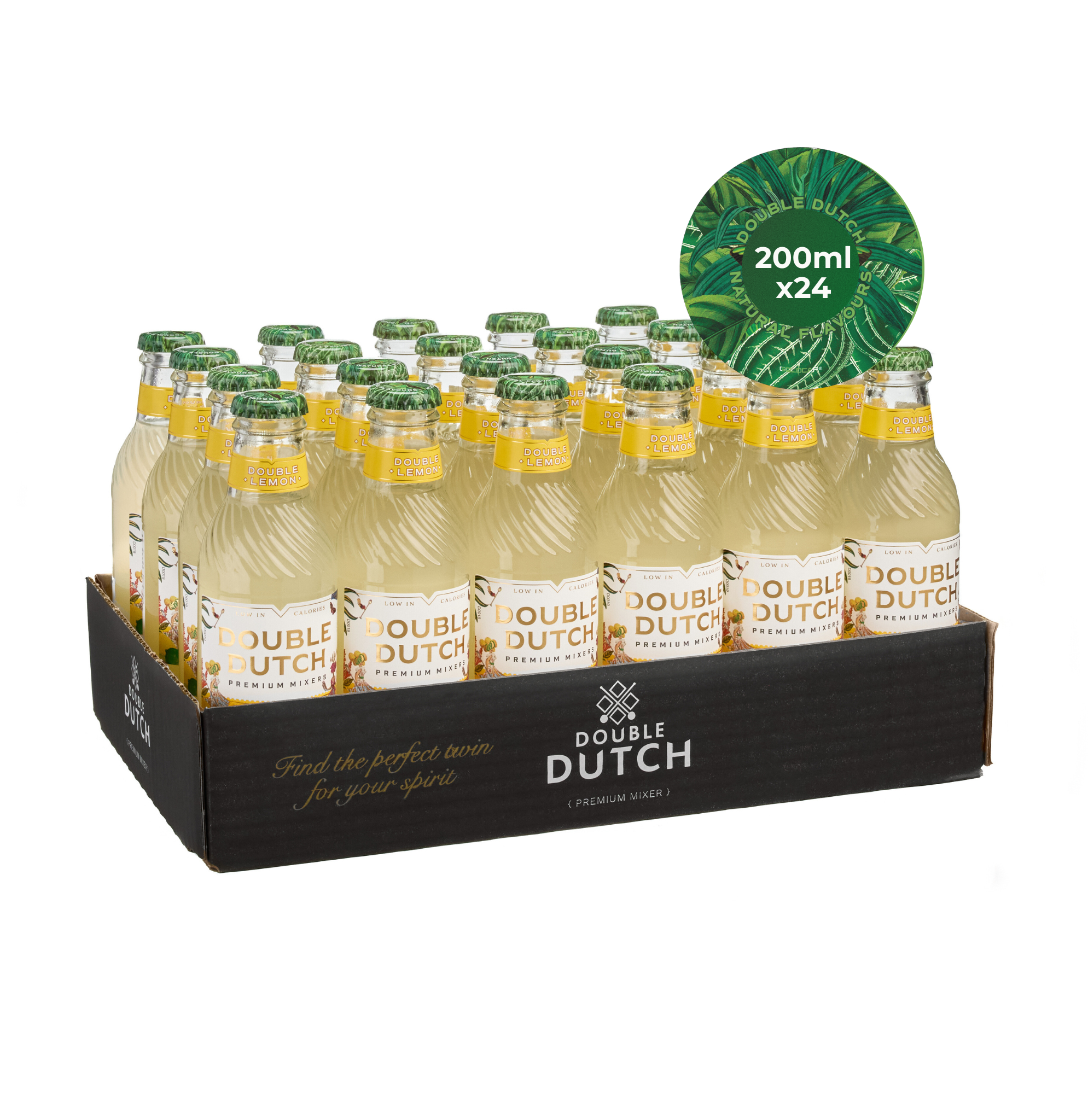
The packaging consists of a corrugated display box containing 24 bottles of Double Dutch drinks. The box is made of layered paperboard with visible fluted edges, typical of corrugated construction. It features a black exterior with printed branding elements and a colorful circular label on the top. The box has a sturdy construction suitable for shipping and retail display, with slight wear visible on the edges.

The packaging is a folding carton with a smooth, flat construction. It features a colorful design with vibrant graphics of fruits and herbs, indicative of cocktail ingredients. The box has clean, precise edges and folds, with a glossy finish that enhances the visual appeal. The front displays the brand name 'DOUBLE DUTCH' prominently, along with product information and a decorative border.

The packaging is a folding carton box with a smooth, flat construction. It features a colorful design with tropical motifs and images of fruits. The box has clean, precise edges and folds, and is predominantly white with vibrant graphics. The front displays the brand name 'DOUBLE DUTCH' prominently, along with illustrations of cocktails and fruits, suggesting a premium product. The box has a tuck-in flap closure at the top.

The packaging consists of multiple folding cartons arranged in a stacked formation. Each carton is made from a single-layer paperboard, exhibiting smooth, flat surfaces without any visible fluted layers. The boxes are predominantly white with vibrant, colorful graphics depicting various flavors and ingredients. The edges and folds of the cartons are clean and precise, indicating a well-constructed design. The overall appearance is light and retail-friendly, suitable for display on shelves.
About the Brand
Double Dutch Drinks operates in the premium beverage mixer segment, targeting consumers seeking innovative flavors and quality experiences. Their packaging approach is characterized by colorful, branded carton boxes and robust corrugated solutions tailored for both retail and e-commerce channels.
Packaging consistently integrates brand identity through bold graphics, fruit and herb illustrations, and a glossy finish to enhance shelf appeal. Structural choices include folding cartons for smaller volumes and corrugated boxes for bulk and display, balancing retail visibility with shipping protection. As a B Corp, the brand’s packaging decisions reflect a commitment to sustainability, with a focus on recyclable materials and efficient structures.
Key Differentiator: Double Dutch Drinks stands out for its distinctive flavor combinations and strong sustainability positioning, reinforced by packaging that merges visual vibrancy with eco-conscious material selection.
Design System
Visual Style
Typography features bold, sans-serif fonts for maximum legibility and brand assertiveness. The color palette is predominantly white, accented by vibrant hues inspired by fruit and botanical ingredients, creating a fresh and energetic on-shelf presence. The overall aesthetic is modern, playful, and visually layered.
Brand Identity
Logo usage is prominent and consistent, appearing on all principal display panels. Iconography includes illustrated fruits and herbs that reinforce the mixer’s ingredients. Visual consistency is maintained through recurring brand elements and a uniform application of color and typography.
Packaging Design
Material selection prioritizes recyclable paperboard and corrugated cardboard, aligning with sustainability goals. Structural philosophy emphasizes flat, smooth surfaces, precise folding, and window cut-outs for product visibility where applicable. Design balances protection, ease of handling, and visual impact.
User Experience
Packaging is engineered for both functional efficiency and positive emotional impact, with high-quality finishes, intuitive opening mechanisms, and visually engaging graphics that guide the customer journey from unboxing to consumption. The design promotes brand engagement and encourages repeat purchase through memorable presentation.
Company Metrics
Business insights for Double Dutch Drinks based on available data
Market Positioning
Brand Values & Focus
Key Competitors
Target Market: The target market includes premium beverage consumers, cocktail enthusiasts, and environmentally aware shoppers in the UK and international markets seeking high-quality mixers with unique flavor profiles.
Packaging Assessment
Overall Grade
Visual appeal and presentation quality
Packaging durability and protection
Eco-friendliness and recyclable materials
Cost efficiency and value for money
Packaging assessment for Double Dutch Drinks based on industry standards and best practices
Frequently Asked Questions
What types of packaging materials does Double Dutch Drinks use?
Double Dutch Drinks primarily utilizes single-layer paperboard cartons for retail and display, alongside corrugated cardboard boxes for bulk shipping and logistics, both chosen for their balance of visual appeal and protective qualities.
How does Double Dutch Drinks’ packaging support its brand values?
Packaging leverages bold, colorful graphics and clear logo placement to communicate brand identity, while the use of recyclable materials and efficient structures aligns with their B Corp sustainability commitments.
How does the company address packaging sustainability?
Double Dutch Drinks emphasizes recyclable packaging materials and streamlined structures to minimize environmental impact, consistent with their status as a B Corp and their focus on responsible sourcing.
Discover other Food & Drink companies
Explore more companies in the food & drink industry and their packaging strategies
Teegschwendner GmbH
Food & Drink
Teegschwendner GmbH is a specialty tea company based in Germany, offering a wide selection of high-quality teas and tea-related accessories. They focus on providing unique tea experiences through carefully sourced and curated products.
ruf lebensmittelwerk kg
Food & Drink
RUF Lebensmittelwerk KG is a German food production company specializing in a variety of baking mixes and drink products. Founded in 1920, the company is known for its high-quality ingredients and innovative food solutions.
Terres de Café
Food & Drink
Terres de Café is a specialty coffee retailer based in Paris, France, known for its commitment to sustainability and high-quality coffee sourcing.