Doc Berger Anti-Aging packaging
Doc Berger Anti-Aging specializes in advanced anti-aging skincare, leveraging German manufacturing standards and personalized skin analysis. Their packaging strategy employs modern, premium materials and structures to reinforce a high-end brand image while supporting direct-to-consumer logistics.
Packaging Portfolio
Doc Berger Anti-Aging’s packaging portfolio incorporates rigid boxes, folding cartons, metallic foil sachets, and transparent zippered pouches—each selected for optimal product protection and consumer perception. Rigid tubes and chipboard containers offer high durability for serums and creams, while metallic sachets provide barrier protection and premium aesthetics for single-use products such as eye patches. Consistent use of matte and glossy finishes, clean labeling, and restrained color palettes reinforce a clinical, high-end image. The packaging designs balance shelf presence, logistical protection, and tactile unboxing experiences, though recyclable content is present primarily in paperboard components.

The packaging consists of three cylindrical containers made of thick, sturdy material, likely chipboard or plastic. Each container has a smooth, matte white finish with minimalistic design elements. The tops feature a pump dispenser, indicating a focus on functionality for dispensing product. The containers are labeled with black text that includes the brand name 'DOC-BERGER' and the product designation 'Retinol 0.3'. The overall appearance is sleek and modern, suggesting a premium product.

The image features two distinct packaging types: a transparent zippered pouch and a foil sachet. The pouch is made of clear plastic with a bright yellow zipper and contains several cylindrical containers. The eye patch sachet is made of a metallic gold foil with a printed design featuring an illustration of an eye and product information. The pouch has a smooth surface and a glossy finish, while the sachet has a matte texture with vibrant printed graphics.

The packaging consists of several cylindrical and rectangular containers, primarily in a sleek, minimalist design. The containers are predominantly white with a matte finish, giving them a modern and premium appearance. Each container features a pump or dropper top, indicative of cosmetic use. The overall aesthetic is clean and sophisticated, aligning with high-end skincare products.
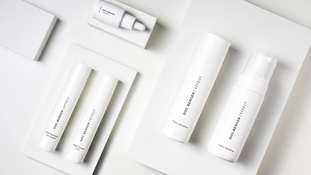
The packaging consists of several white paperboard containers, including cylindrical tubes and a smaller rectangular box. The tubes have a smooth, flat construction with clean edges and folds, indicative of single-layer paperboard. The overall appearance is minimalistic and modern, emphasizing a premium look. The packaging is arranged neatly on a light background, enhancing its aesthetic appeal.

The packaging consists of a folded carton box with a smooth, flat construction. It features a light brown exterior with a glossy finish. The edges are clean and precise, indicating high-quality paperboard material. The box is designed to hold eye patches, with a front panel displaying the product name and branding elements. The interior may contain additional informational panels or inserts related to the product.
About the Brand
Doc Berger Anti-Aging operates within the premium skincare segment, focusing on cosmetic products targeting anti-aging concerns. Their packaging approach aligns with luxury market expectations, utilizing rigid boxes, cartons, and specialty pouches to enhance perceived value and ensure product integrity.
The brand's packaging consistently features minimalistic, clean designs with prominent branding, supporting a cohesive identity across product lines. Material selection emphasizes durability and visual appeal, with a mix of rigid and flexible formats adapted to product type and end-user interaction. While the portfolio prioritizes aesthetics and product protection, there is moderate evidence of sustainability considerations such as recyclable paperboard and reduced secondary packaging.
Key Differentiator: Doc Berger Anti-Aging differentiates itself through a combination of personalized customer engagement, German-made quality, and a packaging system that reinforces a premium, clinical, and trustworthy aesthetic.
Design System
Visual Style
The visual design employs sans-serif typography, predominantly in black on white or light neutral backgrounds, with limited accent colors such as yellow for highlights. The overall aesthetic is minimalist and clinical, emphasizing clarity and sophistication.
Brand Identity
Brand logos and company names are consistently applied across all packaging types, with iconography limited to essential product cues and QR codes for digital engagement. Visual consistency is maintained through uniform font usage, hierarchy, and restrained graphics.
Packaging Design
Material choices include rigid chipboard, recyclable paperboard, and high-barrier foils. Structural design prioritizes clean lines, precise folds, and functional dispensers (e.g., pumps, droppers) to facilitate user interaction and product protection.
User Experience
Packaging supports the customer journey by offering a visually coherent and tactile unboxing experience, reinforced by clear labeling and easy-to-navigate structures. The design system aims to build trust, facilitate product understanding, and enhance perceived value at every touchpoint.
Company Metrics
Business insights for Doc Berger Anti-Aging based on available data
Market Positioning
Brand Values & Focus
Key Competitors
Target Market: Affluent adults seeking high-performance anti-aging skincare, predominantly in the DACH region and other Tier I markets, with a preference for premium, science-backed cosmetic solutions.
Packaging Assessment
Overall Grade
Visual appeal and presentation quality
Packaging durability and protection
Eco-friendliness and recyclable materials
Cost efficiency and value for money
Packaging assessment for Doc Berger Anti-Aging based on industry standards and best practices
Frequently Asked Questions
What types of packaging formats does Doc Berger Anti-Aging utilize?
The company employs a mix of rigid boxes, folding cartons, transparent pouches, metallic foil sachets, and cylindrical tubes, tailoring structures to product type and unboxing expectations.
How does Doc Berger Anti-Aging’s packaging contribute to product protection during shipping?
Packaging incorporates sturdy materials such as chipboard, rigid tubes, and reinforced cartons, providing robust protection for delicate skincare formulations and minimizing transit-related damage.
Is sustainability a primary focus in Doc Berger Anti-Aging’s packaging choices?
While some recyclable paperboard and minimalistic designs suggest eco-consciousness, the overall packaging system prioritizes aesthetics and product security, resulting in a moderate sustainability profile.
Discover other Beauty & Fitness companies
Explore more companies in the beauty & fitness industry and their packaging strategies
Institut Karité Paris
Beauty & Fitness
Institut Karité Paris specializes in luxury beauty products made with natural Shea Butter, offering a wide range of skincare and body care solutions. The brand combines Parisian heritage with a commitment to quality and creativity in its offerings.
Orris Paris
Beauty & Fitness
Orris Paris specializes in creating artisanal skincare products that combine potent botanical ingredients with modern cleansing rituals. The company emphasizes natural, holistic practices in its formulations.
Owari
Beauty & Fitness
Owari specializes in 100% natural beauty and fitness products, designed to enhance health and wellness. The company proudly offers its products made in France, emphasizing quick delivery and customer support.