Diso packaging
Diso develops innovative health supplements, utilizing fast-dissolving vitamin strips and gummies to facilitate consumer convenience and absorption. The brand employs visually distinctive, retail-ready packaging that emphasizes clarity, portability, and modern design for direct-to-consumer distribution.
Packaging Portfolio
Diso's packaging solutions encompass rigid chipboard boxes, folding carton formats, and selective use of metal tins, each engineered for enhanced product protection and retail viability. The packaging leverages single-layer and multi-layer paperboard for lightweight strength, with matte and gloss finishes that improve shelf appeal and tactile quality. High-impact graphics, color-coding, and bold typography are systematically applied to facilitate rapid product identification and reinforce category segmentation. The structures are optimized for compactness and stackability, ensuring efficient transit and shelf display while providing a consistent visual brand language across SKUs.
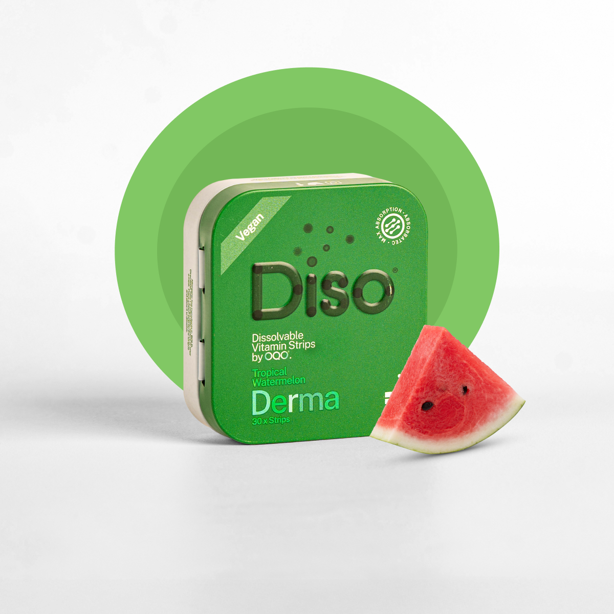
The packaging is a small, rectangular box with a smooth, flat construction. It features a thick, sturdy chipboard material that gives it a premium feel. The box is predominantly green with a glossy finish, showcasing a vibrant design. The front displays the brand name 'Diso' prominently in a bold font, accompanied by a circular logo. The product name 'Derma' is also featured, indicating the type of product inside. The edges are clean and precise, with no visible fluted layers, indicating it is not corrugated. The box has a hinged lid that opens easily, suggesting a secure closure mechanism.

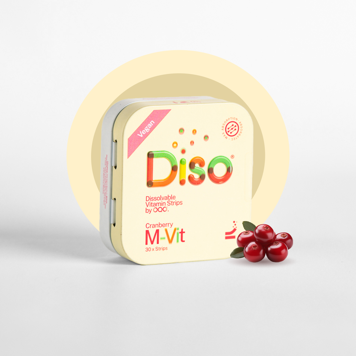
The packaging is a small, rectangular tin box with a hinged lid. The exterior features a smooth, metallic finish with a light gold color on the lid and a white base. The lid has a slight curvature, and the edges are rounded, giving it a sleek appearance. The front displays colorful graphics with the word 'Diso' prominently featured in a playful font, accompanied by a small logo and product description. The interior is metallic and smooth, with no additional compartments or inserts.
The packaging is a square-shaped rigid box with a sturdy construction. It features a smooth, matte finish with a light cream color. The edges are clean and well-defined, indicating a premium quality. The top has a slight lift-off lid, which is characteristic of rigid boxes, allowing easy access to the contents inside. The box is adorned with colorful graphics and text, including the brand name 'Diso' prominently displayed on the front.

The packaging is a flat, square-shaped box with a smooth, single-layer paperboard construction. It features a vibrant red exterior with a matte finish, and the edges are clean and precise. The front displays the brand name 'Diso' prominently in a bold font, along with the product name 'Energy' in a contrasting color. The overall design includes circular graphic elements that add a modern touch.
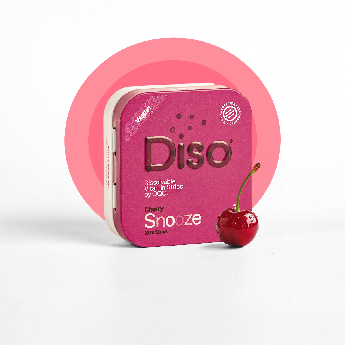
The packaging is a small, square box with a smooth, sturdy construction. It features a vibrant pink exterior with rounded edges and a glossy finish. The front displays the product name 'Diso' prominently in white, with the product type 'Snooze' and flavor 'Cherry' in smaller text. The box is adorned with a cherry graphic, enhancing its appeal. The overall design is clean and modern, with a cohesive color scheme.
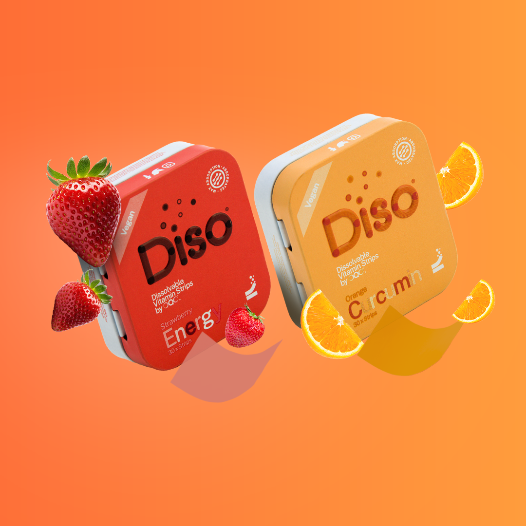
The packaging consists of two small, square boxes with smooth, flat construction. Each box features a vibrant color scheme, with one box in red and the other in orange. The edges are clean and precise, indicative of a folding carton design. The boxes are adorned with colorful graphics, including images of strawberries and oranges, which enhance their appeal. The overall appearance is lightweight and designed for retail display.
About the Brand
Diso specializes in nutraceutical products, with a core focus on rapid-absorption vitamin strips and energy gummies. Their packaging strategy integrates compact, rigid, and carton box solutions with bold, health-centric graphics to reinforce brand recognition and support e-commerce logistics.
The company’s portfolio reflects a strong alignment with retail and direct-to-consumer needs, using a mix of sturdy chipboard rigid boxes, lightweight folding cartons, and metal tins. Each format is tailored for shelf presence, product protection, and ease of use. Emphasis on distinctive color-coding and clear labeling facilitates product differentiation, while the overall construction supports efficient warehousing and last-mile delivery.
Key Differentiator: Diso distinguishes itself through the integration of high-absorption supplement formats with visually impactful, consumer-friendly packaging engineered for both retail and online fulfillment.
Design System
Visual Style
Modern sans-serif typography, high-contrast color palettes (vibrant reds, greens, oranges, and pinks), and clean, geometric layouts with circular graphic elements for a contemporary, health-focused aesthetic.
Brand Identity
Consistent use of the Diso logo and bold product titles on all packaging. Iconography is purposeful, signaling product benefits (e.g., vegan, dissolvable). Visual consistency is maintained through uniform color themes and centralized logo placement.
Packaging Design
Material choices prioritize chipboard and paperboard for rigidity and recyclability, augmented by tin for select SKUs. Structural design emphasizes easy-open mechanisms, precise edges, and compact dimensions to balance protection, accessibility, and visual appeal.
User Experience
Packaging is streamlined for fast, intuitive unboxing, with clear product labeling and graphics supporting consumer decision-making. The approachable, vibrant design enhances emotional engagement and aligns with the brand’s commitment to making nutrition accessible and enjoyable.
Company Metrics
Business insights for Diso based on available data
Market Positioning
Brand Values & Focus
Key Competitors
Target Market: Health-conscious adults and families in the UK and Europe seeking convenient, effective nutritional supplements delivered directly to their homes.
Packaging Assessment
Overall Grade
Visual appeal and presentation quality
Packaging durability and protection
Eco-friendliness and recyclable materials
Cost efficiency and value for money
Packaging assessment for Diso based on industry standards and best practices
Frequently Asked Questions
What types of packaging does Diso primarily use for its products?
Diso primarily utilizes rigid chipboard boxes, folding carton boxes, and metal tin boxes, each selected for their protective qualities, visual appeal, and ability to support rapid unboxing and resealing.
How does Diso's packaging support its direct-to-consumer (D2C) business model?
Diso’s packaging is optimized for D2C logistics through its compact form factors, durable structures, and clear branding, ensuring products are secure during transit and immediately recognizable upon arrival.
Is sustainability a focus in Diso’s packaging strategy?
While Diso uses recyclable paperboard and metal materials for most primary packaging, there is limited public information on the use of eco-certifications or advanced sustainable practices, indicating room for further improvement.
Discover other Health companies
Explore more companies in the health industry and their packaging strategies
Comvita
Health
Comvita is a New Zealand-based company specializing in high-quality Mānuka honey and natural health products. Established in 1974, it aims to connect people with the healing power of nature.
Doctor Seaweed
Health
Doctor Seaweed specializes in natural, plant-based nutritional supplements derived from seaweed, aimed at promoting overall wellness.
Bio-Synergy
Health
Bio-Synergy is a UK-based company specializing in health and fitness products, including nutritional supplements and DNA testing kits. Their mission is to support individuals in achieving their health and fitness goals through innovative products and personalized insights.