Detox Trading packaging
Detox Trading specializes in organic superfoods and supplements, distributing a diverse range of health-focused products via their e-commerce platform. Their packaging approach leverages natural materials and resealable pouches to balance product freshness, brand identity, and environmental awareness.
Packaging Portfolio
Detox Trading employs a packaging portfolio dominated by flexible stand-up pouches made from kraft paper composites with a plastic lining, optimizing for freshness, resealability, and product visibility. Transparent windows and resealable zippers are standard, providing both consumer convenience and extended shelf life. Carton boxes are used strategically for multipacks and gift sets, offering additional protection and organized retail presentation. The consistent use of earthy, matte finishes and color-coded labels ensures shelf differentiation and clear product identification, while maintaining a cohesive brand image aligned with natural and health-driven positioning.
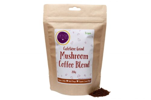
The packaging is a stand-up pouch made of a multi-layer material that includes a kraft paper exterior with a matte finish. The pouch features a resealable zipper at the top, allowing for easy opening and closing. The front displays a window that shows the product inside, which is ground coffee. The design includes playful graphics and text in a mix of red and brown colors, with a vegan label prominently displayed.

The packaging consists of three stand-up pouches, each featuring a rounded top with a resealable zipper. The pouches have a matte finish with a kraft paper appearance, providing a natural look. Each pouch has a circular label in the center with a distinct color scheme for each product, including red, green, and purple. The labels contain product names, weights, and branding elements.
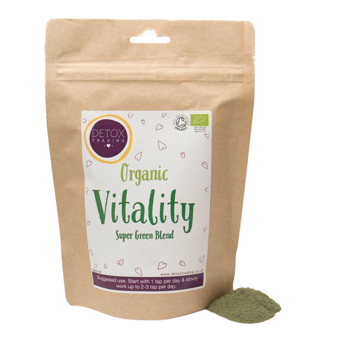
The packaging is a stand-up pouch made from a composite material that appears to be a blend of kraft paper and a plastic lining. The front features a clear window showing the product inside, with a zip-lock closure at the top. The design includes a vibrant green color for the product name, 'Organic Vitality', and a circular logo in purple with the brand name 'DETOX TRADING'. The overall appearance is clean and modern, with a matte finish on the kraft paper.
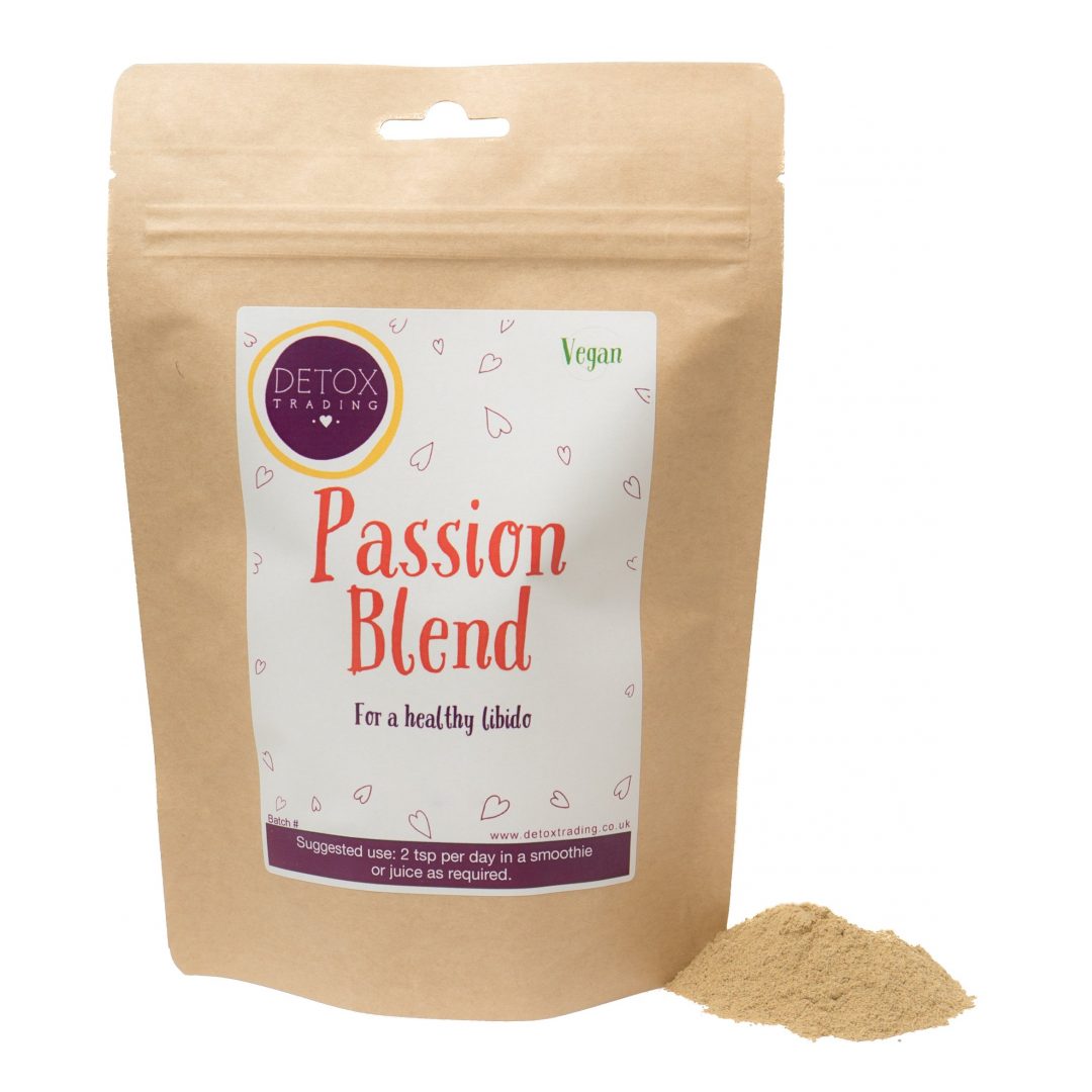
The packaging is a stand-up pouch made from a composite material that includes a kraft paper exterior with a smooth finish. The pouch has a resealable zip closure at the top, allowing for easy access and storage. The front features a large, colorful label with the product name and branding elements, while the back is likely plain or contains additional product information.
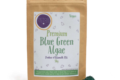
The packaging is a stand-up pouch made from a flexible material, likely a composite of plastic and paper. It features a kraft paper exterior with a smooth finish. The front has a clear window that allows visibility of the product inside. The top of the pouch has a resealable zipper closure, ensuring freshness after opening. The overall shape is rectangular with a flat bottom, allowing it to stand upright. The design includes rounded corners and a slight taper towards the top.
About the Brand
Detox Trading, a UK-based direct-to-consumer company, delivers organic and wild-harvested superfoods, supplements, and herbal medicines. Their packaging strategy centers on flexible stand-up pouches and kraft cartons, emphasizing product integrity and a natural brand aesthetic.
Founded in 2007, Detox Trading operates at the intersection of health-conscious consumer demand and responsible sourcing. The company uses composite kraft paper pouches with resealable zippers and transparent windows, supporting both freshness and product visibility. Carton boxes are employed for multipacks, optimizing logistics and in-transit presentation. Branding is consistently integrated through clear logo placement and color-coded labels, reflecting a unified visual identity across SKUs.
Key Differentiator: Detox Trading stands out for its focus on natural, eco-aligned packaging formats that reinforce brand authenticity and transparency, while supporting a strong direct-to-consumer model.
Design System
Visual Style
The visual design style emphasizes clean sans-serif typography, natural earthy tones (browns, greens, muted reds), and a matte finish. Product labels use a color-coding system for quick SKU differentiation, with minimalist graphic accents for clarity.
Brand Identity
Brand identity is reinforced through frequent logo placement, clear product naming, and a restrained use of iconography. Consistent label layouts and a circular logo motif contribute to high visual coherence across all packaging formats.
Packaging Design
Material choices prioritize kraft paper composites for sustainability and tactile appeal, combined with plastic linings for barrier performance. Structural design focuses on stand-up pouches with resealable features, and carton boxes for bundled products, balancing protection and unboxing experience.
User Experience
The packaging supports a positive customer journey by enabling product visibility (windows), easy resealing for freshness, and intuitive opening. The design underscores Detox Trading’s health focus and transparency, fostering trust and repeat engagement.
Company Metrics
Business insights for Detox Trading based on available data
Market Positioning
Brand Values & Focus
Key Competitors
Target Market: Health-conscious UK consumers seeking organic superfoods, supplements, and herbal wellness products, with a preference for sustainable and transparent brands.
Packaging Assessment
Overall Grade
Visual appeal and presentation quality
Packaging durability and protection
Eco-friendliness and recyclable materials
Cost efficiency and value for money
Packaging assessment for Detox Trading based on industry standards and best practices
Frequently Asked Questions
What packaging materials does Detox Trading primarily use?
Detox Trading primarily utilizes stand-up pouches constructed from kraft paper composites with a plastic lining, featuring resealable zippers and transparent product windows. Carton boxes are also used for bundling and multipacks.
How does the packaging design reflect Detox Trading's brand values?
Packaging design employs earthy color palettes, minimalistic graphics, and prominent logo placement, reinforcing Detox Trading’s commitment to health, sustainability, and product authenticity.
Is Detox Trading's packaging recyclable or eco-friendly?
Most packaging uses kraft paper components and minimal plastic, providing partial recyclability and moderate environmental impact. The resealable pouches extend product shelf life, but full compostability is limited by plastic layers.
Discover other Health companies
Explore more companies in the health industry and their packaging strategies
Doctor Seaweed
Health
Doctor Seaweed specializes in natural, plant-based nutritional supplements derived from seaweed, aimed at promoting overall wellness.
Bio-Synergy
Health
Bio-Synergy is a UK-based company specializing in health and fitness products, including nutritional supplements and DNA testing kits. Their mission is to support individuals in achieving their health and fitness goals through innovative products and personalized insights.
Lily & Loaf
Health
Lily & Loaf specializes in high-quality health and nutrition products, offering a range of supplements and vitamins aimed at supporting an active lifestyle. The company focuses on providing natural solutions for health and beauty.