DESEO Patisserie & Chocolaterie packaging
DESEO Patisserie & Chocolaterie is a Polish dessert brand specializing in artisanal pastries, confectionery, and custom corporate offerings. Their packaging strategy emphasizes premium materials, strong brand identity, and a balance between presentation and product protection.
Packaging Portfolio
DESEO implements a diversified packaging strategy that includes corrugated kraft boxes for secure shipping and gifting, aesthetically designed folding carton boxes for retail and limited edition desserts, and flexible kraft paper pouches with windows for nut and confectionery products. The inclusion of branded glass jars for spreads and chocolate creams further elevates the premium positioning. Protective filler materials, such as crinkle paper, are used for cushioning during transport. Branding is consistently applied across packaging formats, ensuring strong shelf presence and consumer recognition.

The packaging consists of a brown corrugated box with visible fluted edges when viewed from the side. The box is filled with crinkled paper filler to protect the contents, which include several folded cartons with colorful designs. The box has a sturdy construction suitable for shipping and appears to have been sealed with tape. The external surface is clean, with no visible signs of wear or damage.
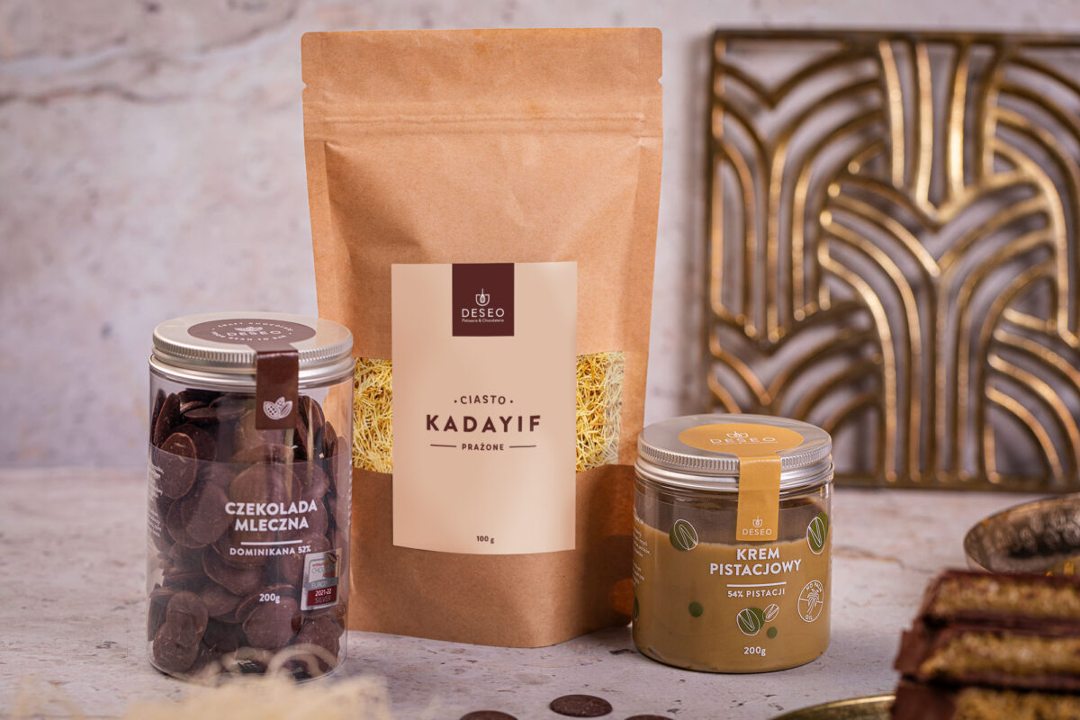
The image features three distinct food packaging types: a kraft paper pouch, a glass jar with a metal lid, and another glass jar with a plastic lid. The kraft pouch is flat with a smooth surface, featuring a central label with a logo and product name. The glass jars are cylindrical, showcasing the contents through transparent glass, with labels that include product names and branding elements.

The packaging consists of three stand-up pouches made from a kraft paper exterior with a transparent plastic window. Each pouch has a flat bottom allowing it to stand upright. The pouches are sealed at the top with a fold-over flap. The surface is smooth with a matte finish. The front features a large, clear window that allows visibility of the contents, which are hazelnuts. The pouches are labeled with a simple design that includes the brand name 'DESEO' prominently displayed, along with product information in a clean, modern font.

The packaging is a flat, rectangular box with a smooth, single-layer paperboard construction. The exterior features a vibrant pink design with geometric patterns, while the base appears to be a kraft-colored paperboard. The edges are clean and precise, indicating a well-constructed folding carton. The box has a glossy finish that enhances the visual appeal of the printed design. There are no visible fluted layers, confirming it as a carton box.

The packaging is a corrugated box with a sturdy construction, featuring a brown kraft exterior. The box has visible fluted edges when viewed from the side, indicating its corrugated nature. The top flaps are securely closed, and the interior is filled with crinkle paper for cushioning. The box contains various items, including bags of treats and a card, suggesting it is designed for shipping or gift purposes.
About the Brand
DESEO Patisserie & Chocolaterie operates across eleven locations in Poland, delivering a wide range of desserts and pastries with a focus on innovation, quality, and customer experience. The brand leverages modern patisserie techniques and responsible ingredient sourcing, reflected in both their product and packaging choices.
Founded in 2015, DESEO has established a reputation for unique flavor combinations and high-quality presentation. Their packaging portfolio demonstrates a consistent use of branded, visually appealing solutions that support logistics, gifting, and retail needs. The company incorporates both structural integrity for shipping and aesthetic elements for customer engagement, with packaging formats ranging from corrugated shipping boxes to flexible retail pouches and glass jars.
Key Differentiator: DESEO stands out for its integration of contemporary design, strong branding, and a focus on sustainability within its packaging solutions—particularly in the premium food and beverage sector.
Design System
Visual Style
DESEO employs minimalist sans-serif typography, a restrained yet vibrant color palette (notably pinks, browns, and natural kraft tones), and a clean, modern layout approach. Visual hierarchy is maintained through bold logo placement and clear product labeling.
Brand Identity
The DESEO logo is prominently displayed on all packaging, with consistent use of logotype and supporting iconography. Visual consistency is achieved through uniform label design, color schemes, and high-quality print finishes across all formats.
Packaging Design
Material choices prioritize food safety, durability, and shelf appeal, with a mix of corrugated cardboard, rigid cartons, flexible kraft pouches, and glass jars. The structural philosophy emphasizes protection for fragile goods while maintaining a premium, gift-ready appearance.
User Experience
Packaging design supports the customer journey by enhancing unboxing rituals, facilitating gifting, and providing clear product visibility. Branding and tactile elements reinforce a sense of quality and exclusivity, contributing to positive emotional engagement and repeat purchases.
Company Metrics
Business insights for DESEO Patisserie & Chocolaterie based on available data
Market Positioning
Brand Values & Focus
Key Competitors
Target Market: Premium dessert consumers, corporate clients seeking customized confectionery, and gift buyers in Poland’s metropolitan areas.
Packaging Assessment
Overall Grade
Visual appeal and presentation quality
Packaging durability and protection
Eco-friendliness and recyclable materials
Cost efficiency and value for money
Packaging assessment for DESEO Patisserie & Chocolaterie based on industry standards and best practices
Frequently Asked Questions
What types of packaging does DESEO use for its products?
DESEO utilizes corrugated boxes for shipping and gifting, retail carton boxes for specialty desserts, flexible stand-up pouches for nuts and confections, and glass jars for select spreads and chocolates. Each packaging type is tailored to product requirements and brand presentation.
How does DESEO address sustainability in its packaging?
The company employs recyclable kraft paper, corrugated cardboard, and reusable glass jars, aligning with its stated commitment to responsible sourcing. However, specific details about material certifications or life cycle impact are not disclosed.
What is the visual and branding approach of DESEO’s packaging?
Packaging features a modern and clean design with prominent use of the DESEO logo, cohesive color palettes, and minimalist typography, ensuring consistency across all packaging formats.
Discover other Food & Drink companies
Explore more companies in the food & drink industry and their packaging strategies
Teegschwendner GmbH
Food & Drink
Teegschwendner GmbH is a specialty tea company based in Germany, offering a wide selection of high-quality teas and tea-related accessories. They focus on providing unique tea experiences through carefully sourced and curated products.
Terres de Café
Food & Drink
Terres de Café is a specialty coffee retailer based in Paris, France, known for its commitment to sustainability and high-quality coffee sourcing.
ruf lebensmittelwerk kg
Food & Drink
RUF Lebensmittelwerk KG is a German food production company specializing in a variety of baking mixes and drink products. Founded in 1920, the company is known for its high-quality ingredients and innovative food solutions.