CurraNZ packaging
CurraNZ specializes in health supplements derived from New Zealand blackcurrants, utilizing research-backed formulations for performance and immunity. Their packaging strategy centers on branded carton boxes optimized for direct-to-consumer e-commerce, featuring visually impactful designs with clear product information.
Packaging Portfolio
CurraNZ consistently employs custom single-layer paperboard carton boxes for all product lines, leveraging both glossy and matte surface finishes to enhance visual impact. The packaging structures are flat, rectangular, and precisely folded, optimizing for shelf presence and efficient stacking during shipping. Design elements include vibrant color palettes, prominent logo placement, and health certifications (e.g., vegan), which are critical for consumer trust in the health supplement market. Recyclable materials are used, but the presence of glossy coatings may affect full recyclability in some regions.
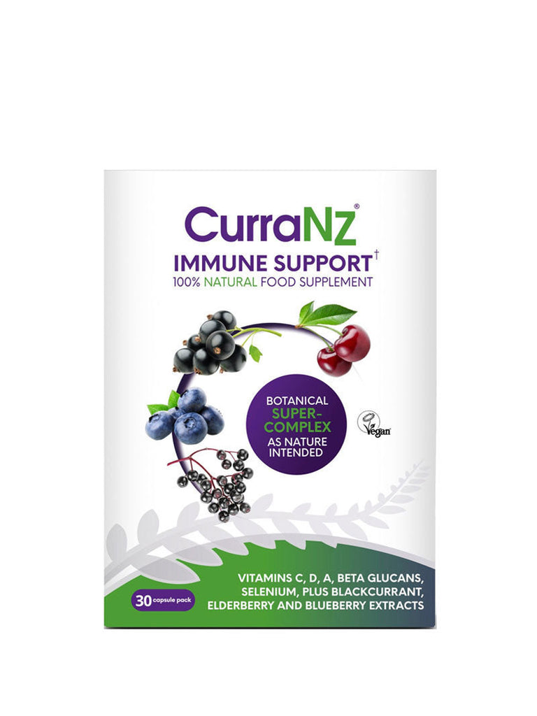
The packaging is a flat, rectangular box made of single-layer paperboard. It features a smooth, flat construction without any visible fluted layers, indicating it is a carton box. The surface is predominantly white with colorful graphics depicting various fruits, suggesting a health-focused product. The edges are clean and precise, and the box has a glossy finish, enhancing its visual appeal. The front displays the product name 'CurraNz Immune Support' prominently, along with a vegan certification logo.
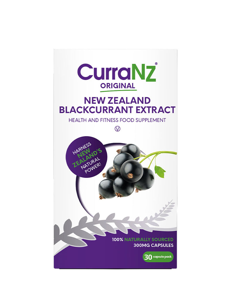
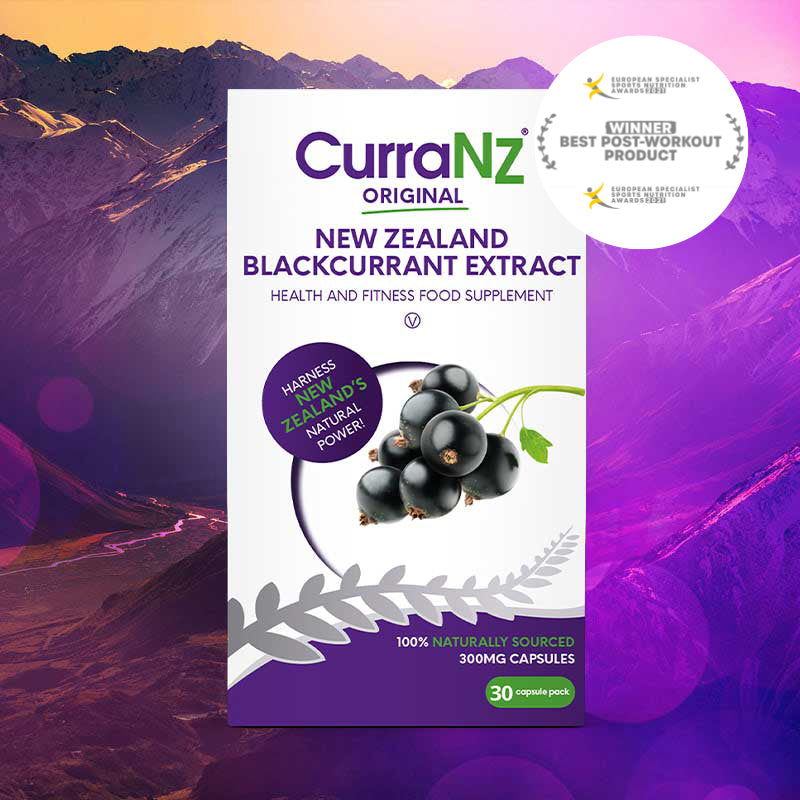
The packaging is a flat, rectangular box made of single-layer paperboard. It features a smooth, clean construction with precise edges and folds. The box is predominantly white with vibrant purple and green graphics. The front displays the product name and description prominently, along with an image of blackcurrants. The overall design is sleek and modern, appealing to health-conscious consumers.

The packaging is a flat, rectangular box made of smooth, single-layer paperboard. It features a vibrant purple background with a prominent white panel on the front displaying the product name 'CurraNz IMMUNE SUPPORT' in bold, modern typography. The box has clean, precise edges and folds, indicative of a folding carton. The front also includes images of berries and a red sale tag indicating '40% OFF'. The overall design is colorful and eye-catching, suitable for retail display.
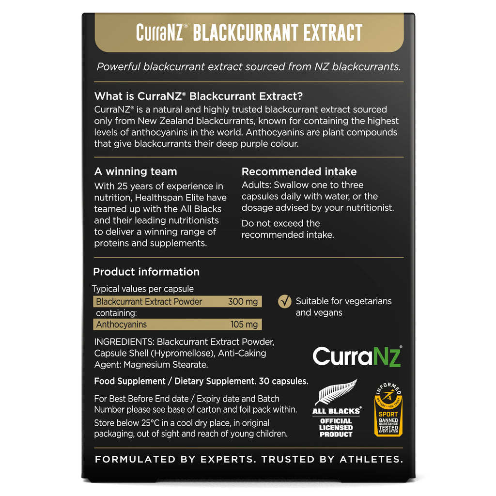
The packaging is a flat, rectangular box made from single-layer paperboard. It features a smooth, clean construction without any visible fluted layers. The exterior is predominantly white with vibrant colors and graphics, including images of blackcurrants and a logo. The edges are sharp and well-defined, indicating precise folding. The surface has a glossy finish, enhancing the visual appeal. The box is designed to hold capsules and has a clear opening on the top.
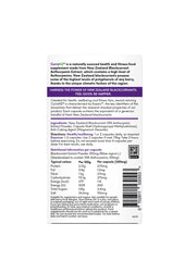
The packaging is a flat, rectangular box made from single-layer paperboard. It features smooth edges and a clean, precise fold pattern. The exterior is predominantly white with colorful graphics and text printed on it. The box has a glossy finish, enhancing its visual appeal. The design includes nutritional information, ingredients, and branding elements prominently displayed.
The packaging is a flat, rectangular folding carton made of smooth, single-layer paperboard. It features a clean, precise construction with sharp edges and folds. The exterior is predominantly black with vibrant colors used for text and graphics, including white and green. The design includes a prominent logo and product information on the front, with additional details on the sides and back. The surface has a matte finish, giving it a premium look and feel.
About the Brand
CurraNZ delivers premium blackcurrant-based health supplements aimed at athletes and health-conscious consumers, supported by scientific research and professional endorsements. Their packaging approach emphasizes strong brand identity, product differentiation, and functional retail presentation.
The company leverages custom retail carton boxes made from single-layer paperboard, optimized for shelf presence and e-commerce shipping. Consistent use of vibrant graphics, glossy finishes, and prominent branding supports consumer trust and product recognition. Packaging is designed to communicate health benefits and product attributes effectively, aligning with the brand’s market positioning in the competitive health supplement sector.
Key Differentiator: CurraNZ stands out for its integration of science-led product claims with high-visibility, information-rich packaging, ensuring both consumer education and brand reinforcement at the point of sale.
Design System
Visual Style
Typography choices emphasize bold, legible sans-serif fonts for clarity, complemented by a vibrant palette of purples, whites, greens, and blacks. The overall aesthetic is modern, clean, and health-focused, supporting product differentiation and shelf impact.
Brand Identity
Logo is prominently placed on all packaging fronts, accompanied by clear product names and supporting icons (e.g., vegan certification). Visual consistency is maintained across product lines through repeated color schemes, structured layouts, and standardized iconography.
Packaging Design
Material selection centers on single-layer paperboard cartons, favoring a balance between print quality and environmental considerations. Structural design philosophy prioritizes precise folding for durability and visual appeal, with an emphasis on flat, rectangular forms suited for D2C distribution.
User Experience
The packaging design supports the customer journey by delivering immediate product recognition, clear health messaging, and reassurance through visual cues. Unboxing is streamlined and visually engaging, reinforcing brand loyalty and perceived product quality.
Company Metrics
Business insights for CurraNZ based on available data
Market Positioning
Brand Values & Focus
Key Competitors
Target Market: Health-conscious consumers, athletes, and individuals seeking natural performance and immunity supplements, primarily in the UK and global e-commerce markets.
Packaging Assessment
Overall Grade
Visual appeal and presentation quality
Packaging durability and protection
Eco-friendliness and recyclable materials
Cost efficiency and value for money
Packaging assessment for CurraNZ based on industry standards and best practices
Frequently Asked Questions
What type of packaging does CurraNZ use for its supplements?
CurraNZ primarily utilizes flat, rectangular carton boxes made from single-layer paperboard, featuring both glossy and matte finishes. The packaging is designed for optimal visual appeal, product protection, and effective brand communication.
How does CurraNZ packaging support logistics and e-commerce?
The retail carton structure offers durability for shipping and efficient stacking, minimizing product damage during transit. The design is tailored to support direct-to-consumer fulfillment and retail requirements.
Is CurraNZ packaging sustainable?
CurraNZ uses recyclable paperboard for its packaging, which aligns with industry sustainability standards. However, reliance on glossy finishes and non-disclosed sourcing limits full eco-certification.
How does packaging contribute to the CurraNZ brand experience?
Packaging features consistent brand elements, vibrant colors, and clear health messaging, reinforcing trust and supporting a premium unboxing experience for customers.
Discover other Health companies
Explore more companies in the health industry and their packaging strategies
Comvita
Health
Comvita is a New Zealand-based company specializing in high-quality Mānuka honey and natural health products. Established in 1974, it aims to connect people with the healing power of nature.
Lily & Loaf
Health
Lily & Loaf specializes in high-quality health and nutrition products, offering a range of supplements and vitamins aimed at supporting an active lifestyle. The company focuses on providing natural solutions for health and beauty.
Bio-Synergy
Health
Bio-Synergy is a UK-based company specializing in health and fitness products, including nutritional supplements and DNA testing kits. Their mission is to support individuals in achieving their health and fitness goals through innovative products and personalized insights.