Curaprox packaging
Curaprox delivers premium oral care solutions to a broad consumer base, utilizing a packaging strategy centered on high-visibility branding, modern aesthetics, and protective design. Their packaging combines functional retail cartons and rigid travel cases to maintain product integrity and reinforce their Swiss quality positioning.
Packaging Portfolio
Curaprox employs a dual-format packaging portfolio, utilizing folding carton boxes for individual toothbrushes and dental floss, and rigid plastic cases for bundled travel sets. Carton boxes feature clear plastic windows, vibrant color schemes, and precise folding, maximizing visibility and on-shelf differentiation. Rigid boxes are engineered for durability and reusability, supporting portable use scenarios. Across all formats, packaging is tailored for both children and adults, with playful graphics for younger users and minimalist, professional finishes for adult products. The integration of branding elements such as logos and color palettes is consistently executed, aligning with premium market positioning.
The packaging is a thin, flat, and smooth carton box designed to hold a toothbrush. It features a transparent plastic front that allows visibility of the product inside. The packaging has a colorful design with playful graphics of cartoon characters, appealing to children. The edges are clean and precise, indicative of a folding carton structure.

The packaging is a compact, flat-folded carton designed for retail display. It features a smooth, single-layer paperboard construction with a clean, precise folding pattern. The front of the carton is predominantly blue with a white header that includes a cut-out for hanging. The edges are sharp and well-defined, indicating a high-quality manufacturing process. The surface has a matte finish, giving it a premium feel.

The packaging is a small, rectangular travel case made of thick, sturdy plastic. It features a smooth, glossy surface with a bright blue color. The case has a hinge on one side, allowing it to open and close easily. Inside, it contains a toothbrush, a tube of toothpaste, and a dental tool, all organized neatly. The interior is designed to hold these items securely, preventing movement during transport.
The packaging is a thin, flat, and smooth folding carton designed to hold a toothbrush. It features a clear plastic window that showcases the product inside. The carton has a colorful design with playful graphics, including cartoon characters, and is predominantly white with vibrant colors. The edges are clean and precise, indicating a well-constructed folding carton.
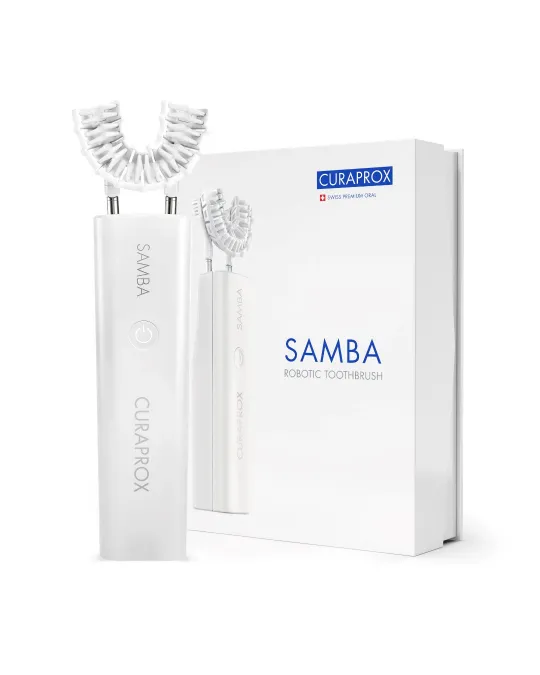
The packaging is a flat, smooth, and rectangular box made from single-layer paperboard. It features a clean design with precise edges and folds, typical of retail packaging. The exterior is predominantly white with minimalistic graphics, showcasing a modern aesthetic. The front displays the product name 'SAMBA' in bold, blue font, along with the brand name 'CURAPROX' in smaller text below. The overall appearance is sleek and professional, aimed at attracting consumers in a retail environment.

The packaging is a compact, rigid box designed to hold a travel set of oral care products. It features a bright green exterior with a smooth finish, indicative of a high-quality construction. The box has a rectangular shape with rounded edges, enhancing its portability. The front displays a vibrant design with the CURAPROX logo prominently featured alongside product graphics. The packaging is visually appealing, with a combination of colors that include green, pink, and yellow, creating a fresh and inviting look.
About the Brand
Curaprox is a Swiss oral care company providing toothbrushes, toothpaste, and interdental solutions, with packaging systems designed to balance brand presentation and practical protection. Their packaging portfolio demonstrates consistent use of branded carton boxes and rigid travel sets, supporting both retail appeal and safe transport.
The company employs folding carton packaging for individual oral care items and sturdy rigid boxes for bundled travel kits, integrating clear windows and vibrant graphics to drive shelf differentiation. Packaging elements are tailored for distinct age segments, incorporating playful visuals for children and minimalist, modern designs for adults. All formats display prominent logo placement and color schemes aligned with Curaprox’s brand guidelines.
Key Differentiator: Curaprox stands out for its cohesive application of Swiss-inspired branding across all packaging formats, merging premium visual cues with functional product protection in both retail and travel-use scenarios.
Design System
Visual Style
Modern sans-serif typography, a color palette dominated by white, blue, and vibrant accent colors, and a clean, uncluttered aesthetic with playful elements for children’s products.
Brand Identity
Consistent use of the Curaprox logo, prominent product names, and signature color schemes; iconography is minimal but leveraged for age segmentation and educational cues. Visual consistency is maintained across all packaging and digital assets.
Packaging Design
Material selection emphasizes single-layer paperboard for cartons and thick plastic for travel cases, focusing on lightweight protection and visibility. Structural design prioritizes clean lines, precise folds, and secure closures to safeguard oral care products.
User Experience
Packaging design supports intuitive unboxing and product identification, using transparent windows and color coding for ease of selection. For travel kits, rigid cases enhance portability and repeat use, reinforcing brand loyalty while delivering a positive unboxing experience.
Company Metrics
Business insights for Curaprox based on available data
Market Positioning
Brand Values & Focus
Key Competitors
Target Market: Health-conscious consumers seeking premium oral care solutions, including adults and children in North America with an emphasis on quality and brand trust.
Packaging Assessment
Overall Grade
Visual appeal and presentation quality
Packaging durability and protection
Eco-friendliness and recyclable materials
Cost efficiency and value for money
Packaging assessment for Curaprox based on industry standards and best practices
Frequently Asked Questions
What types of packaging does Curaprox use for its oral care products?
Curaprox utilizes a mix of folding carton boxes, rigid plastic travel cases, and retail cartons with product windows. These formats are optimized for shelf presence, brand consistency, and secure product containment.
How does Curaprox address sustainability in its packaging?
While Curaprox’s packaging includes recyclable carton boxes and durable travel cases for repeated use, the presence of plastic windows and rigid plastic components suggests moderate progress toward full eco-friendly solutions.
How effective is Curaprox’s packaging in protecting products during shipping?
The use of rigid cases and well-constructed carton boxes provides good protection against damage, supporting reliable product delivery and minimizing returns due to transit issues.
Discover other Health companies
Explore more companies in the health industry and their packaging strategies
Smart Protein
Health
Smart Protein is dedicated to transforming nutrition by providing a range of health and wellness products focused on protein supplements and vitamins.
Lily & Loaf
Health
Lily & Loaf specializes in high-quality health and nutrition products, offering a range of supplements and vitamins aimed at supporting an active lifestyle. The company focuses on providing natural solutions for health and beauty.
Doctor Seaweed
Health
Doctor Seaweed specializes in natural, plant-based nutritional supplements derived from seaweed, aimed at promoting overall wellness.