Crazy Nutrition packaging
Crazy Nutrition delivers direct-to-consumer sports nutrition supplements, utilizing bold, branded flexible packaging to reinforce product identity and user engagement. Their packaging strategy centers on high-impact visuals, resealable pouches, and consistent branding for a cohesive consumer experience.
Packaging Portfolio
Crazy Nutrition primarily employs flexible stand-up pouches constructed from composite plastics with foil layers for barrier protection. These pouches feature gusseted bottoms for shelf stability, resealable zipper closures to preserve product freshness, and high-gloss or matte finishes for visual impact. The material choice balances lightweight shipping efficiency with robust protection against moisture and contamination, while the format supports high-quality print graphics for clear branding and nutritional information display.
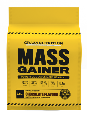
The packaging is a stand-up pouch made from a flexible material, primarily yellow in color with black text. The front features bold typography stating 'MASS GAINER' prominently at the center, with additional product information below. The top of the pouch has a resealable zipper, and the bottom is gusseted to allow it to stand upright. The surface is smooth with a matte finish, and the overall design is clean and modern.

The packaging features a stand-up pouch design with a flat bottom that allows it to stand upright. The material appears to be a flexible plastic or composite material, likely with a foil layer for barrier protection. The front of the pouch is predominantly yellow with bold black text stating 'MASS GAINER'. The top of the pouch has a resealable zipper closure, which is common in flexible packaging to maintain product freshness. The sides of the pouch are smooth, and there are no visible fluted layers, indicating it is not corrugated or rigid. The design includes images of chocolate and vanilla flavors, enhancing visual appeal.

The packaging consists of three stand-up pouches, each featuring a bright yellow background with black stripes at the top and bottom. The pouches have a glossy finish and are designed to stand upright. Each pouch has a clear window that showcases the product inside. The front of the pouches displays bold text indicating the product name and flavor, with additional details such as nutritional information and branding elements.

The packaging is a stand-up pouch made of flexible material, featuring a resealable top. The front displays a large, bold '100% TRI-PROTEIN' text in a prominent font, with a white background and colorful accents. The pouch has a glossy finish, enhancing its visual appeal. The sides are smooth and flat, with no visible fluted layers, indicating it is not corrugated. The bottom is designed to allow the pouch to stand upright.

The packaging is a stand-up pouch made from a flexible material, featuring a bright yellow color with black accents. The front displays bold text indicating the product name 'INTENSIVE PRE-TRAIN' in large, black, capital letters. Below this, there is smaller text detailing the product type as a 'FOOD SUPPLEMENT' and the flavor as 'BLUE RASPBERRY FLAVOUR'. The top of the pouch has a resealable zipper, and the bottom is gusseted to allow it to stand upright. There are also graphics indicating it is an 'OFFICIAL TRAINING PRODUCT' and 'APPROVED'.

The packaging is a stand-up pouch made from a flexible material that allows it to maintain an upright position. It features a vibrant yellow color with black caution stripes along the top and bottom edges. The front displays the product name 'ULTIMATE CRN-5' in bold, black lettering, with the product description 'DIETARY SUPPLEMENT' and flavor information 'ORANGE & MANGO FLAVOR' in smaller text. The pouch has a glossy finish, enhancing its visual appeal.
About the Brand
Crazy Nutrition provides a range of athletic supplements with a focus on both product efficacy and branded packaging consistency. Their packaging uses flexible stand-up pouches, designed for durability and standout shelf presence, suited for the health and fitness sector.
The company's packaging approach emphasizes product protection, clear communication of nutritional information, and strong brand identity. Consistent use of bold color palettes, clear typography, and resealable features enhances usability and supports a premium positioning in the supplements market.
Key Differentiator: Crazy Nutrition differentiates itself through cohesive, high-visibility packaging that combines functional resealability with bold, fitness-oriented design elements, directly targeting the performance-focused consumer.
Design System
Visual Style
The visual design utilizes bold sans-serif typography, a high-contrast yellow and black color palette, and large, legible product names. Accents of white and secondary colors are used for flavor differentiation and callouts.
Brand Identity
Branding is enforced through prominent logo placement, consistent use of caution-stripe iconography, and uniform layout hierarchy across all SKUs. Visual consistency is maintained through repetition of color schemes and typographic scale.
Packaging Design
Material selection prioritizes flexible laminate structures for light weight and protection. Stand-up pouch format with resealable features reflects a functional, performance-driven design philosophy, supporting both logistics and end-user requirements.
User Experience
The packaging design streamlines the user journey from purchase to consumption, with easy-open resealable closures, clear product information on front panels, and highly visible branding to reinforce trust and repeat engagement.
Company Metrics
Business insights for Crazy Nutrition based on available data
Market Positioning
Brand Values & Focus
Key Competitors
Target Market: Active consumers and athletes seeking premium nutritional supplements with a focus on performance, quality, and convenience, primarily in the UK and international D2C markets.
Packaging Assessment
Overall Grade
Visual appeal and presentation quality
Packaging durability and protection
Eco-friendliness and recyclable materials
Cost efficiency and value for money
Packaging assessment for Crazy Nutrition based on industry standards and best practices
Frequently Asked Questions
What type of packaging does Crazy Nutrition use for its supplements?
Crazy Nutrition utilizes flexible stand-up pouches made from composite materials, featuring resealable closures to maintain product freshness and enhance user convenience.
How does Crazy Nutrition's packaging support its brand identity?
Their packaging employs a consistent color palette, bold typography, and prominent logo placement, ensuring instant brand recognition and alignment with their fitness-focused brand ethos.
What sustainability measures are incorporated in Crazy Nutrition's packaging?
While flexible pouches offer material efficiency, recycling rates depend on local infrastructure. There is limited evidence of significant use of recycled content or advanced eco-friendly materials, but the format reduces bulk and shipping impact compared to rigid alternatives.
Discover other Health companies
Explore more companies in the health industry and their packaging strategies
Comvita
Health
Comvita is a New Zealand-based company specializing in high-quality Mānuka honey and natural health products. Established in 1974, it aims to connect people with the healing power of nature.
Bio-Synergy
Health
Bio-Synergy is a UK-based company specializing in health and fitness products, including nutritional supplements and DNA testing kits. Their mission is to support individuals in achieving their health and fitness goals through innovative products and personalized insights.
Lily & Loaf
Health
Lily & Loaf specializes in high-quality health and nutrition products, offering a range of supplements and vitamins aimed at supporting an active lifestyle. The company focuses on providing natural solutions for health and beauty.