Coolblue packaging
Coolblue is a leading Dutch retailer specializing in consumer electronics, recognized for its customer-first philosophy and omnichannel presence. The company uses a data-driven approach to packaging, employing custom rigid and carton boxes designed for both brand impact and practical product protection.
Packaging Portfolio
Coolblue employs a diverse packaging portfolio primarily comprising rigid boxes for gift and premium products, folding carton boxes for retail display, and corrugated cardboard for shipping. Their packaging consistently utilizes high-quality chipboard and paperboard materials, with a focus on structural rigidity and precise manufacturing. The brand’s signature blue and orange colorways and playful typography are integrated across all formats, while carton and rigid boxes are optimized for both shelf impact and product safety. Packaging choices reflect a balance between visual branding, durability, and logistical efficiency, with moderate emphasis on recyclability.
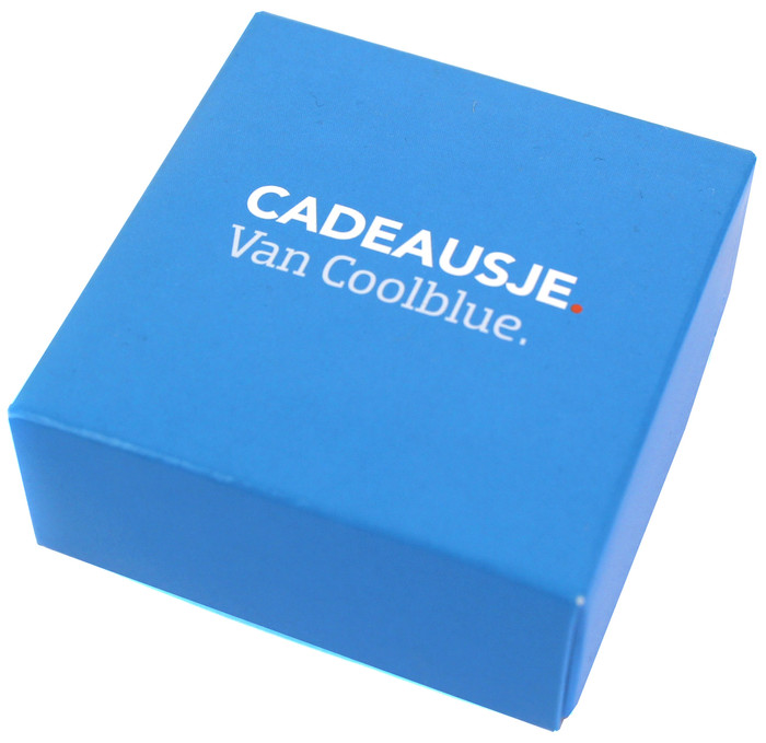
The packaging is a small, square box with a solid structure, made from thick chipboard. It features a smooth, matte finish in a vibrant blue color. The box has clean, precise edges and corners, indicating high-quality construction. The top of the box is adorned with white text that reads 'CADEAUSJE Van Coolblue.' in a modern font, suggesting a premium feel. The box does not have any visible flaps or tabs, indicating it is a rigid structure that likely opens from the top.
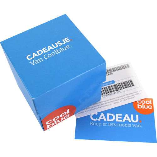
The packaging is a small, square gift box with a solid, sturdy construction. It features a bright blue exterior with a matte finish. The edges are clean and well-defined, indicating high-quality manufacturing. The box has a simple yet elegant design with a prominent circular logo in orange that reads 'Coolblue'. A small card is placed beside the box, also featuring the Coolblue branding in a similar color scheme.
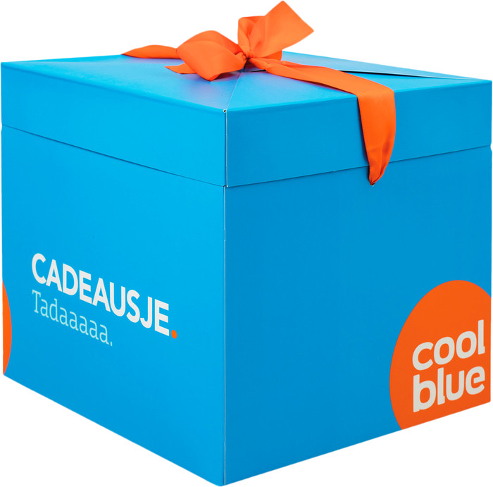
The packaging is a rigid box with a sturdy construction, featuring a thick chipboard material. It has a vibrant blue exterior with a smooth finish and is adorned with an orange ribbon tied in a bow on the top. The box has clean, precise edges and a square shape, giving it a premium appearance. The front side displays the brand name 'coolblue' in white text, along with the word 'CADEAUSJE.' and 'Taddaaaaa.' in a playful font.
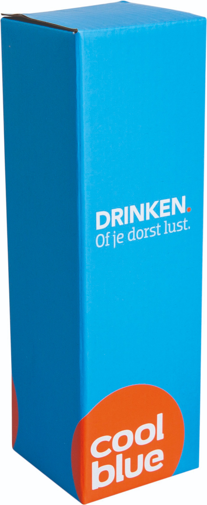
The packaging is a tall, rectangular carton with a smooth, flat construction. It features a vibrant blue exterior with a glossy finish. The edges are clean and precise, indicating a well-constructed folding carton. The front displays bold white text stating 'DRINKEN. Of je dorst lust.' and the Coolblue logo in an orange circle at the bottom. The overall appearance is lightweight and designed for retail display.
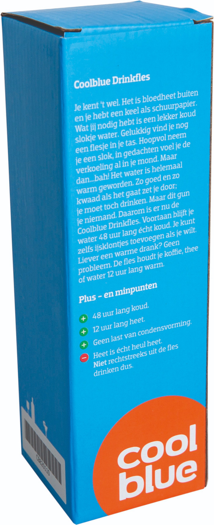
The packaging is a tall, rectangular box made of single-layer paperboard. It features smooth, flat construction without any visible fluted layers, indicating it is a carton box. The box has clean edges and folds, with a predominantly blue exterior and white text. The design includes various graphics and text elements that provide product information and branding.
About the Brand
Coolblue operates as a prominent B2C retailer in the consumer electronics sector, offering a diverse product portfolio ranging from computers and tablets to kitchen appliances and smart home devices. Their packaging strategy is characterized by high-visibility branding, structural rigidity, and a consistent blue and orange color palette.
The company leverages custom rigid and carton packaging formats to reinforce its playful, approachable brand identity while ensuring products remain secure during transit. Coolblue’s packaging consistently integrates brand elements and messaging, enhancing the unboxing experience and supporting their focus on customer satisfaction. With a strong presence in both e-commerce and physical retail, their packaging solutions are designed to be both durable and visually distinctive across channels.
Key Differentiator: Coolblue’s packaging stands out for its integration of brand storytelling, robust construction, and a seamless blend of retail display and shipping requirements, reflecting a holistic approach to the customer journey.
Design System
Visual Style
Coolblue’s packaging design uses bold sans-serif typography, a vivid blue primary color complemented by orange accents, and a minimalistic, playful aesthetic. The visual language prioritizes clarity and emotional engagement.
Brand Identity
Brand identity is reinforced through consistent application of the Coolblue logo, circular iconography, and signature catchphrases. Visual consistency is achieved via a strict color scheme, clear type hierarchy, and uniform logo placement.
Packaging Design
Material selection favors rigid chipboard for premium products and high-grade folding carton for general retail items, with corrugated cardboard for logistics. Structural design emphasizes sturdiness, clean lines, and easy-open features.
User Experience
Packaging design enhances the customer journey by combining durability with visual delight, providing clear messaging and brand cues at every touchpoint, and delivering a consistently positive unboxing and post-purchase experience.
Company Metrics
Business insights for Coolblue based on available data
Market Positioning
Brand Values & Focus
Key Competitors
Target Market: Netherlands-based consumers seeking premium consumer electronics with strong after-sales support and an engaging unboxing experience.
Packaging Assessment
Overall Grade
Visual appeal and presentation quality
Packaging durability and protection
Eco-friendliness and recyclable materials
Cost efficiency and value for money
Packaging assessment for Coolblue based on industry standards and best practices
Frequently Asked Questions
What types of packaging does Coolblue use?
Coolblue primarily utilizes rigid gift boxes and folding carton boxes with high-quality finishes, complemented by shipping-optimized corrugated boxes. Their packaging solutions are tailored to product type and designed for both presentation and logistical safety.
How sustainable is Coolblue’s packaging?
Coolblue’s packaging demonstrates moderate sustainability, with recyclable paper-based materials and efficient use of space. However, the use of rigid formats and premium finishes may impact full recyclability and resource optimization.
How does Coolblue’s packaging enhance the customer experience?
The packaging features a distinctive color palette, playful messaging, and high-quality construction, all of which contribute to a memorable unboxing experience that reinforces brand loyalty.
Discover other Consumer Electronics companies
Explore more companies in the consumer electronics industry and their packaging strategies
OtterBox
Consumer Electronics
OtterBox specializes in protective cases and accessories for mobile devices, ensuring durability and style for users. Founded in 1998, the company has built a reputation for quality and innovation in the consumer electronics market.
beyerdynamic
Consumer Electronics
beyerdynamic is a leading manufacturer of high-quality audio equipment, including headphones, microphones, and studio gear, known for its commitment to sound excellence and innovative technology.
Tchibo Direct GmbH
Consumer Electronics
Tchibo Direct GmbH is a consumer goods company based in Hamburg, Germany, specializing in coffee products and a variety of other consumer goods. The company operates both online and offline, offering a wide range of products from coffee machines to home and garden items.