Cool4Horses packaging
Cool4Horses develops natural supplements and topical solutions for equine skin health, specializing in the management of summer eczema. Their packaging strategy prioritizes functional, brand-consistent formats that emphasize clear labeling and ease of use within a direct-to-consumer model.
Packaging Portfolio
Cool4Horses employs a pragmatic packaging mix consisting mainly of flexible plastic bags for supplements and rigid bottles for oils. Labels highlight product details and brand elements, supporting easy identification and regulatory compliance. The packaging is designed for efficient storage, shipping durability, and straightforward use in stable environments. While the design language is consistent and supports the brand's natural ethos, the predominant use of plastics indicates moderate sustainability, with opportunities for increased use of biodegradable or recycled materials.
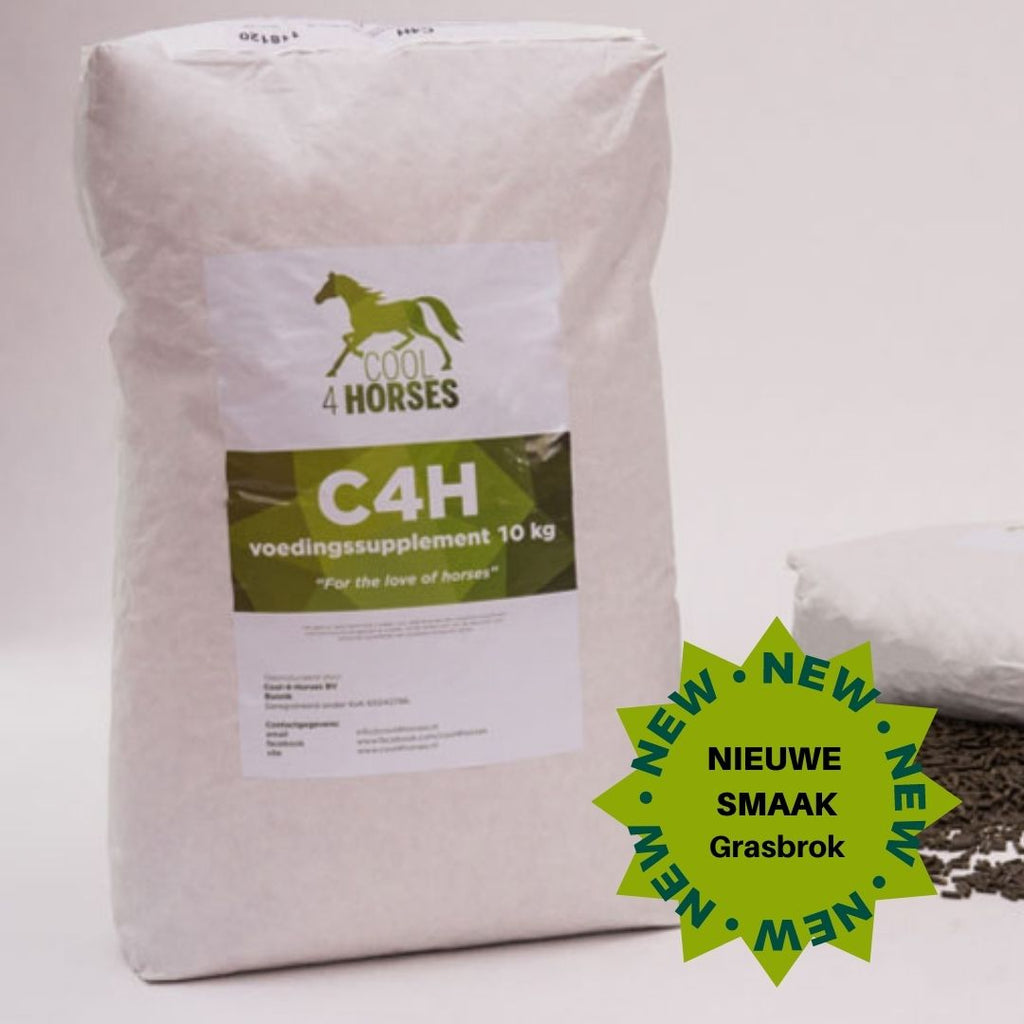
The packaging appears to be a large, white sack made of a durable, flexible material. It has a simple, functional design with a flat top and no visible closure mechanism. The surface is smooth and lacks any fluted layers, indicating it is not corrugated. The front features a large label with product information and branding elements. The overall shape is rectangular, with a slightly bulging appearance due to the contents inside.
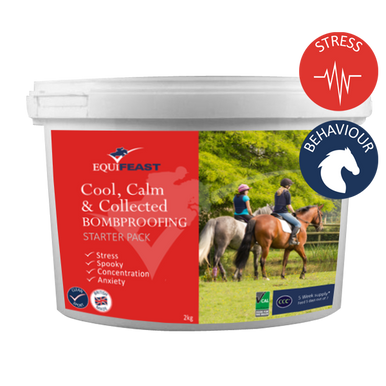
The packaging is a round, opaque plastic tub with a screw-on lid. The tub has a smooth surface with a glossy finish, predominantly white with colorful graphics. The front features an image of horses and riders in a natural setting, along with product information and branding elements. The lid is adorned with icons indicating product benefits related to stress and behavior.
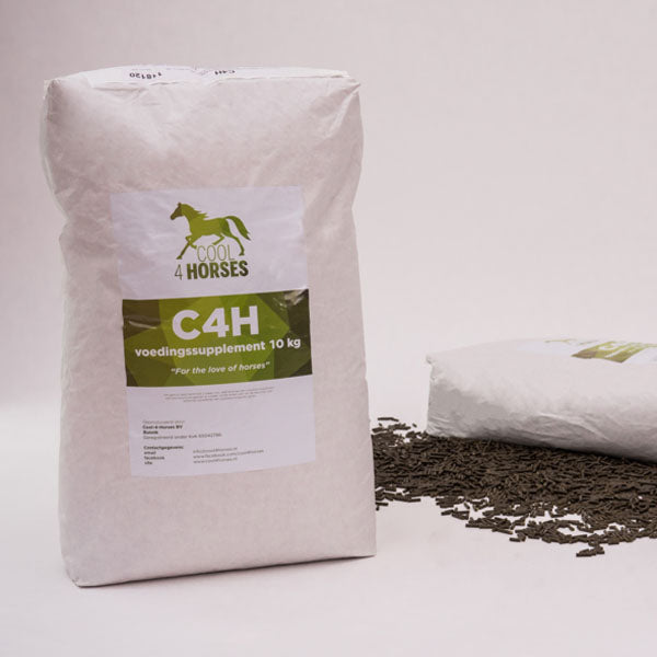
The packaging consists of a white, flexible bag made of a thin, smooth material. It features a large label on the front with a green logo and text. The bag is filled with a dark, granular substance, likely a horse feed supplement. The top of the bag is sealed, and there are no visible flaps or structural elements typical of rigid or corrugated packaging. The overall shape is rectangular and upright, suggesting it is designed for easy storage and dispensing.
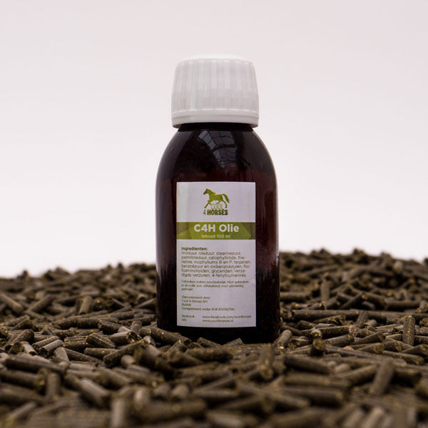
The packaging consists of a dark brown plastic bottle with a white screw-on cap. The bottle has a rounded body and a narrow neck, typical for liquid products. The label is prominently displayed on the front, featuring a white background with green text and graphics. The label includes product information and branding elements. The overall shape is cylindrical, and the bottle appears to be designed for easy handling and pouring.
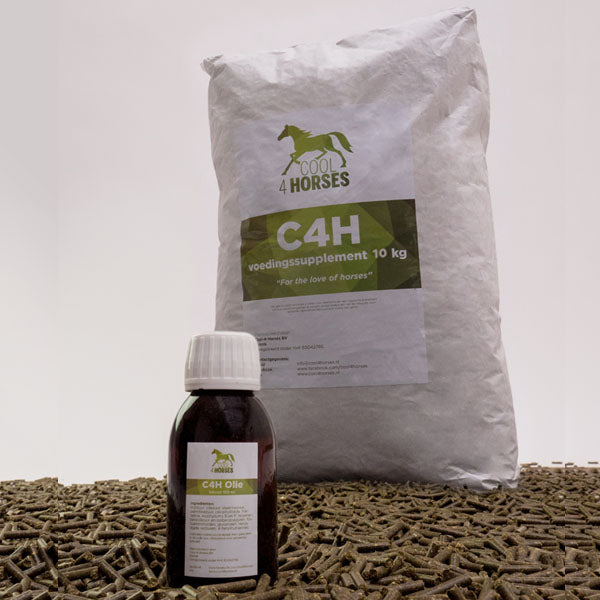
The image features a large white bag and a small dark bottle. The bag is made of a smooth, flexible material with a matte finish and a simple design. It has a clean, rectangular shape with a top opening that appears to be sealed. The bottle is made of dark glass or plastic with a white cap, featuring a label that includes branding and product information. The overall appearance is functional and straightforward, suitable for retail display.
About the Brand
Cool4Horses operates in the veterinary and equine care segment, offering a targeted portfolio of herbal supplements and topical oils to address horse skin conditions. The company leverages a direct-to-consumer e-commerce model to reach niche audiences seeking natural alternatives to traditional treatments.
The brand's packaging approach is centered on utilitarian designs, typically employing flexible bags and rigid bottles with matte finishes and clear, functional labeling. Packaging solutions are chosen for durability, storage efficiency, and alignment with the company's commitment to natural, straightforward care. The visual language reinforces trust and transparency, featuring consistent green and white color schemes and prominent use of brand elements.
Key Differentiator: Cool4Horses distinguishes itself by integrating educational content and a science-backed, natural formulation ethos into both its product development and packaging presentation, fostering credibility and customer confidence.
Design System
Visual Style
Utilizes sans-serif typography for clarity, a green-and-white color palette to signal natural health, and simple, clean layout structures for readability and trust.
Brand Identity
Features prominently placed logo, horse silhouette iconography, and consistent color use across packaging. Branding maintains high legibility and reinforces the company's focus on horse care and natural solutions.
Packaging Design
Prioritizes robust, lightweight plastic bags and bottles for protection and cost efficiency. Design philosophy emphasizes functional packaging with straightforward labeling, minimizing excess material and focusing on utility.
User Experience
Packaging supports the customer journey through clear product information, intuitive open/close mechanisms, and educational cues that align with the brand's focus on knowledge-sharing and trust-building.
Company Metrics
Business insights for Cool4Horses based on available data
Market Positioning
Brand Values & Focus
Key Competitors
Target Market: Horse owners and caretakers in the EU seeking natural, science-backed skin care and nutritional solutions for equine health, with a growing interest in chemical-free and holistic pet care products.
Packaging Assessment
Overall Grade
Visual appeal and presentation quality
Packaging durability and protection
Eco-friendliness and recyclable materials
Cost efficiency and value for money
Packaging assessment for Cool4Horses based on industry standards and best practices
Frequently Asked Questions
What types of packaging materials does Cool4Horses use for its products?
Cool4Horses primarily utilizes flexible plastic bags for dry supplements and rigid plastic or glass bottles for topical oils. The packaging is designed for durability, ease of handling, and clear product identification.
How does Cool4Horses ensure its packaging remains aligned with its brand values?
The company consistently applies a green and white color palette, horse-themed iconography, and prominent logo placement across all packaging, reflecting its natural and equine-focused brand identity.
Does Cool4Horses use sustainable or recyclable packaging materials?
While the packaging is functional and supports product protection, current materials primarily consist of standard plastics with limited explicit emphasis on recyclability or eco-friendly substrates.
Discover other Pets & Animals companies
Explore more companies in the pets & animals industry and their packaging strategies
Natural Trail
Pets & Animals
Natural Trail produces high-quality dry and wet food for dogs and cats, focusing on their natural dietary needs. The company is committed to providing pet owners with nutritious and delicious meal options made from carefully selected ingredients.
My Furbaby
Pets & Animals
My Furbaby provides premium, NZ-made dog food and pet essentials delivered directly to customers' doors, ensuring pets receive the best nutrition while supporting sustainability.
MisterMax
Pets & Animals
MisterMax specializes in textile care products and services, focusing on cleaning, stain removal, and odor control solutions for various fabrics and environments.