Chartreuse packaging
Chartreuse is a historic French producer of herbal liqueurs, renowned for maintaining artisanal, tradition-driven production and packaging methods. Their packaging approach emphasizes premium materials and sophisticated presentation, aligning with the brand’s luxury positioning within the spirits sector.
Packaging Portfolio
Chartreuse's packaging portfolio features a strategic mix of rigid wooden boxes—often with natural finishes and engraved branding—for high-value and limited releases, as well as single-layer paperboard cartons for mainstream retail products. Structural formats prioritize product security and shelf appeal, with the use of custom inserts and precise closures. Visual elements such as embossed logos, signature color palettes (notably green), and tactile finishes are deployed to reinforce luxury perceptions and brand recognition. The portfolio underscores a balance between artisanal craftsmanship and retail functionality, tailored to both collectors and everyday consumers.

The packaging is a tall, rectangular carton box designed to hold a liquor bottle. It features a smooth, flat construction without any visible fluted layers, indicating it is made from single-layer paperboard. The box has clean, precise edges and folds, typical of retail packaging. The exterior is predominantly white with vibrant green and orange graphics, including the product name and brand logo. The box has a glossy finish, enhancing its visual appeal.

The packaging is a tall, rectangular carton box designed to hold a bottle of Chartreuse liqueur. It features a smooth, flat construction without any visible fluted layers, indicating it is made from single-layer paperboard. The box has clean, precise edges and folds, typical of retail packaging. The exterior is predominantly green with a glossy finish, showcasing vibrant graphics and text. The front displays the brand name 'Chartreuse' prominently, along with product information. The back of the box contains additional details about the product, including a description and legal information. The box has a tuck-in flap at the top for closure, ensuring the contents are secure. There are no visible signs of wear or damage, indicating it is in good condition. Overall, the design is eye-catching and aligns with the brand's identity.
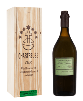
The packaging consists of a tall, rectangular rigid box made from thick chipboard, designed to hold a bottle of liqueur. The box features a natural wood finish with a smooth texture, showcasing a light wood grain pattern. The front of the box is adorned with a dark brown logo and text, prominently displaying the brand name 'CHARTREUSE V.E.P.' along with a cross emblem and decorative stars. The box has a clean, precise construction with sharp edges and corners, indicating high-quality craftsmanship. The interior is likely designed to securely hold the bottle, possibly with a custom insert.

The packaging is a sturdy wooden box with a natural wood finish. It features a smooth surface with visible grain patterns, suggesting high-quality craftsmanship. The box has a rectangular shape, designed to snugly fit a bottle. The lid is separate and fits securely over the base, indicating a premium construction. The exterior is uncoated, showcasing the natural wood texture.

The packaging consists of a tall, rectangular rigid box designed to hold a bottle of Chartreuse. The box features a sturdy construction with thick chipboard walls, providing a premium feel. The exterior is finished in a dark color, likely a matte or satin finish, with embossed or printed text and graphics. The top of the box has a clean cut with a slight overhang, and the front displays the brand name prominently. The box has a luxurious appearance, indicative of high-quality packaging for a premium product.
About the Brand
Chartreuse specializes in high-quality herbal liqueurs, leveraging centuries-old recipes and craftsmanship. Their packaging reflects a commitment to heritage and premium product presentation, utilizing both rigid wooden boxes and custom carton formats.
The company’s packaging portfolio demonstrates a preference for rigid, high-strength materials such as chipboard and natural wood, often paired with bespoke inserts for product security. Branding is highly consistent, with prominent logo placement and distinctive color schemes reinforcing Chartreuse’s identity across all packaging formats. This strategy targets both retail and gifting channels, emphasizing durability and visual impact.
Key Differentiator: Chartreuse’s unique value lies in its integration of authentic heritage motifs and artisanal materials into its packaging, differentiating it from competitors in the premium spirits sector.
Design System
Visual Style
The visual design employs classic serif and sans-serif typography, a predominantly green and natural wood color palette, and a minimalist yet refined aesthetic to signal tradition and luxury.
Brand Identity
Branding is executed through prominent logo display, consistent use of cross emblems and heritage motifs, and cohesive application of color and iconography across all packaging formats, ensuring instant brand recognition.
Packaging Design
Material selections focus on high-density chipboard, natural wood, and premium paperboard, reflecting a philosophy of durability and authenticity. Structural choices emphasize secure enclosures and custom inserts for product stability.
User Experience
The design supports the customer journey by creating a memorable unboxing experience, reinforcing brand heritage, and providing clear product information, all while ensuring product safety and premium tactile feedback.
Company Metrics
Business insights for Chartreuse based on available data
Market Positioning
Brand Values & Focus
Key Competitors
Target Market: Premium spirits consumers, specialty retailers, and collectors seeking authentic heritage products with high visual and material quality.
Packaging Assessment
Overall Grade
Visual appeal and presentation quality
Packaging durability and protection
Eco-friendliness and recyclable materials
Cost efficiency and value for money
Packaging assessment for Chartreuse based on industry standards and best practices
Frequently Asked Questions
What types of packaging does Chartreuse use for its products?
Chartreuse employs a mix of rigid wooden boxes for high-value or limited-edition products and high-quality carton boxes for standard retail offerings. Both formats prioritize visual branding, product protection, and a premium unboxing experience.
How does Chartreuse ensure the safety of its products during shipping?
Packaging solutions incorporate durable structures—such as thick chipboard or solid wood—with custom inserts to minimize movement and maximize protection during transit.
Is Chartreuse packaging environmentally sustainable?
Chartreuse’s use of natural wood and recyclable carton suggests moderate sustainability; however, the prevalence of rigid and specialty materials may limit full recyclability compared to lightweight alternatives.
Discover other Food & Drink companies
Explore more companies in the food & drink industry and their packaging strategies
Terres de Café
Food & Drink
Terres de Café is a specialty coffee retailer based in Paris, France, known for its commitment to sustainability and high-quality coffee sourcing.
Teegschwendner GmbH
Food & Drink
Teegschwendner GmbH is a specialty tea company based in Germany, offering a wide selection of high-quality teas and tea-related accessories. They focus on providing unique tea experiences through carefully sourced and curated products.
ruf lebensmittelwerk kg
Food & Drink
RUF Lebensmittelwerk KG is a German food production company specializing in a variety of baking mixes and drink products. Founded in 1920, the company is known for its high-quality ingredients and innovative food solutions.