Celebrate Vitamins packaging
Celebrate Vitamins delivers specialized vitamins and nutritional supplements, targeting diverse health requirements with a focus on quality and customer-centricity. Their packaging strategy emphasizes clear branding, functional formats, and a cohesive visual identity to support product integrity and user trust.
Packaging Portfolio
Celebrate Vitamins’ packaging portfolio centers on retail carton boxes, flexible laminated pouches, and rigid plastic bottles, tailored to product type and storage requirements. Carton boxes are constructed from paperboard, offering high print fidelity and shelf presence, while flexible pouches utilize resealable features and transparent windows for visibility and freshness. The material selection ensures product safety and regulatory compliance, though most packaging appears to prioritize consumer convenience and branding over advanced sustainability innovations. Structural formats focus on easy handling, clear labeling, and tamper-evidence, supporting logistics and customer experience.

The packaging consists of various retail cartons and bottles, primarily made of smooth, flat paperboard. The cartons are designed with clean edges and folds, featuring a glossy finish. The color scheme is predominantly red with white and colorful accents. Each package has clear branding elements, including the Celebrate logo and product names. The bottles are made of opaque plastic with screw-on caps, while the pouches have a resealable top.

The packaging consists of flexible pouches for multivitamin soft chews. Each pouch has a clear front panel allowing visibility of the product inside, with a white background and colorful graphics representing the flavors. The pouches are sealed at the top and bottom, with a resealable zipper at the top for easy access. The design features vibrant images of the fruits corresponding to each flavor, enhancing visual appeal.
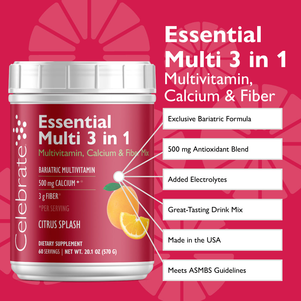
The packaging is a smooth, flat construction made of single-layer paperboard, featuring a cylindrical shape typical of drink mix containers. The exterior is predominantly a vibrant pink with a glossy finish, showcasing a large graphic of a lemon slice. The top has a white plastic screw-on lid, while the body of the container has clean, precise edges and folds. The label is printed with bright colors and clear text, emphasizing the product's features.

The packaging consists of three individual pouches, each containing soft chews. The pouches are made of a flexible material that appears to be a laminated film, allowing for a lightweight and resealable design. The front features a clear window displaying the caramel-colored soft chews, while the back includes nutritional information and product details. The pouches are sealed at the top with a heat seal, and they have a matte finish with a slight sheen on the printed areas.

The packaging consists of a retail carton that is smooth and flat, made from a single layer of paperboard. The carton is predominantly green with white text and graphics, featuring a clear and precise folding pattern. The edges are clean, and the surface has a matte finish. The front displays the product name and nutritional information in a clear font, with a vibrant image of the product (soft chews) prominently featured. The overall shape is rectangular, designed for easy shelf display.
About the Brand
Celebrate Vitamins is a health-focused company specializing in high-quality vitamins and dietary supplements for consumers with specific nutritional needs. The brand has established a reputation for quality and transparency, reflected in its rigorous ingredient sourcing and comprehensive product testing.
Operating primarily through an e-commerce platform, Celebrate Vitamins addresses niche health requirements, including bariatric and specialty diets. The company's packaging strategy is designed to reinforce trust and clarity, using clear labeling, vibrant color schemes, and consistent branding across its portfolio. Carton boxes and flexible pouches are utilized to balance shelf appeal, protection, and consumer convenience.
Key Differentiator: Celebrate Vitamins stands out for its targeted product formulations and a transparent, health-driven brand identity reflected consistently in both packaging design and product presentation.
Design System
Visual Style
The visual style features sans-serif typography for legibility, a vibrant color palette dominated by greens, reds, and pinks, and high-contrast graphics to highlight product benefits. The aesthetic is clean, modern, and health-centric, supporting strong shelf visibility.
Brand Identity
Logo placement is consistent and prominent across all packaging, often accompanied by clear product names and benefit icons. Iconography is used to reinforce product attributes, with a high level of visual consistency across the range to build brand recognition.
Packaging Design
Material choices prioritize food-safe paperboard for cartons and laminated films for pouches, with an emphasis on smooth finishes and protective closures. Structural design principles focus on tamper-evidence, resealability for pouches, and ergonomic shapes for consumer handling.
User Experience
Design decisions prioritize clear product identification, simplified unboxing, and intuitive information hierarchy, enhancing the customer journey from online purchase to product use. Visual appeal and functional packaging elements contribute to a positive brand experience and reinforce consumer trust.
Company Metrics
Business insights for Celebrate Vitamins based on available data
Market Positioning
Brand Values & Focus
Key Competitors
Target Market: Consumers seeking high-quality vitamins and dietary supplements, including those with bariatric, specialty, and dietary-specific health needs, primarily in the direct-to-consumer e-commerce segment.
Packaging Assessment
Overall Grade
Visual appeal and presentation quality
Packaging durability and protection
Eco-friendliness and recyclable materials
Cost efficiency and value for money
Packaging assessment for Celebrate Vitamins based on industry standards and best practices
Frequently Asked Questions
What types of packaging does Celebrate Vitamins use for its supplements?
Celebrate Vitamins primarily utilizes retail carton boxes, flexible laminated pouches, and rigid plastic bottles. Each format is selected to match product requirements regarding preservation, display, and user accessibility.
How does Celebrate Vitamins address sustainability in its packaging choices?
While the company employs recyclable paperboard for many cartons and some flexible materials, there is limited evidence of advanced sustainable initiatives such as compostable films or post-consumer recycled content. Opportunities remain for further improvement in environmental impact.
What is the focus of Celebrate Vitamins’ packaging design?
Their packaging design emphasizes clear communication of nutritional benefits, easy product identification, and vibrant, health-oriented visuals that align with their brand values and customer expectations.
Discover other Health companies
Explore more companies in the health industry and their packaging strategies
Lily & Loaf
Health
Lily & Loaf specializes in high-quality health and nutrition products, offering a range of supplements and vitamins aimed at supporting an active lifestyle. The company focuses on providing natural solutions for health and beauty.
Comvita
Health
Comvita is a New Zealand-based company specializing in high-quality Mānuka honey and natural health products. Established in 1974, it aims to connect people with the healing power of nature.
Smart Protein
Health
Smart Protein is dedicated to transforming nutrition by providing a range of health and wellness products focused on protein supplements and vitamins.