Brogaarden packaging
Brogaarden specializes in tailored equine nutrition and animal care, offering a diverse range of feed, supplements, and bedding solutions. Their packaging emphasizes product segmentation and brand visibility, with a strong focus on functional design and retail shelf impact.
Packaging Portfolio
Brogaarden's packaging portfolio encompasses robust multi-layer retail feed bags, flexible stand-up pouches with resealable closures, and high-visibility carton boxes. Material selection focuses on a mix of durable plastics, paperboard, and laminated substrates designed for moisture resistance and product freshness. Structural formats are tailored for bulk storage and retail shelf presentation, while color-coded designs and prominent equestrian imagery streamline product identification and brand differentiation. The packaging consistently balances logistical durability, consumer usability, and clear communication of nutritional benefits.

The packaging consists of a large, upright bag designed for retail display, featuring a vibrant red background with a prominent image of a horse. The bag has a matte finish, with a clear focus on the product name and branding elements. The top section is slightly tapered, and the bag appears to have a sealed bottom with no visible closure mechanism. The design includes a large number '1' indicating the product line, and the text is bold and easily readable.

The packaging is a flat, flexible bag with a smooth surface and a glossy finish. It features a prominent image of a horse in motion, set against a natural background. The bag is predominantly white with a blue and gray color scheme. The product name 'Brogaarden Optimal MASH' is displayed at the top in bold, clear typography, with the '3 in 1' feature highlighted in a circular graphic at the bottom. The overall design is clean and visually appealing, aimed at attracting attention in a retail setting.
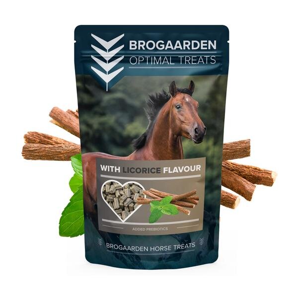
The packaging is a stand-up pouch made from a flexible material that allows it to maintain an upright position. The front features a large image of a horse, prominently displayed, alongside a product name and flavor indication. The overall color scheme is a mix of dark blue and earthy tones, with a glossy finish that enhances visual appeal. The pouch has a clear window in the shape of a heart, showcasing the product inside, which consists of small, dark pellets. The top of the pouch has a resealable zipper closure, allowing for easy access and storage.

The packaging consists of a large bag with a vibrant yellow background featuring a prominent image of a horse. The bag is designed for retail display, showcasing the product name 'COOL SPORT' in bold white lettering. The top section includes the brand name 'Brogaarden' prominently displayed. The overall design is clean with a focus on equestrian themes, utilizing a combination of images and text to convey product information.

The packaging consists of a large, upright bag designed for retail display. It features a vibrant green background with a prominent image of a horse's head on the right side. The left side displays a smaller bag with a similar design, indicating a product line. The text 'SPORT POWER' is prominently featured in white, bold font, along with the brand name 'BROGAARDEN' in a smaller size. The overall design is clean and modern, with a focus on equestrian themes.
About the Brand
Brogaarden is a leading provider in the Pets & Animals sector, focusing on high-quality horse feed, bedding, and nutritional supplements. Their packaging approach prioritizes clear product differentiation, robust materials, and consistent brand presentation to meet the expectations of both individual horse owners and equestrian facilities.
The company leverages over a century of expertise to inform both its product and packaging strategies, ensuring that packaging not only protects the contents but also communicates essential nutritional information and brand identity. By integrating visual cues like color coding and equestrian imagery, Brogaarden's packaging facilitates product selection and aligns with customer needs, while the use of flexible pouches and retail feed bags optimizes logistics and storage efficiency.
Key Differentiator: Brogaarden's unique value lies in the combination of tailored nutrition expertise and a packaging system engineered for both retail clarity and practical functionality in the equine care market.
Design System
Visual Style
Brogaarden employs bold, high-contrast color palettes with primary colors (green, yellow, red, blue) to signal product segmentation. Typography is clear, modern sans-serif for readability, with large product names and supporting details. Equine imagery is central to the aesthetic, reinforcing product purpose and target audience.
Brand Identity
Consistent use of the Brogaarden logo and distinct product naming across all SKUs. Iconography is minimal, focusing on product benefits and nutritional features. Visual consistency is achieved through uniform layout, color-coding, and recurring graphic motifs aligned with equestrian themes.
Packaging Design
Material choices prioritize durability—multi-layer plastic for feed bags, flexible pouches for treats, and carton board for smaller items. Structural design emphasizes stackability, tamper resistance, and easy handling. The philosophy balances protection with retail visibility, facilitating both transport and in-store display.
User Experience
Packaging is designed for straightforward navigation: clear labeling, resealable features on pouches, and ergonomic shapes for bulk bags enhance user handling. Visual hierarchy and color segmentation support quick decision-making and reinforce the premium, expert-driven brand experience.
Company Metrics
Business insights for Brogaarden based on available data
Market Positioning
Brand Values & Focus
Key Competitors
Target Market: Primarily horse owners, equestrian facilities, and animal care professionals within Denmark and broader European markets, seeking premium animal nutrition and related supplies.
Packaging Assessment
Overall Grade
Visual appeal and presentation quality
Packaging durability and protection
Eco-friendliness and recyclable materials
Cost efficiency and value for money
Packaging assessment for Brogaarden based on industry standards and best practices
Frequently Asked Questions
What types of packaging formats does Brogaarden use for their products?
Brogaarden utilizes a variety of packaging formats including large multi-layer feed bags, flexible stand-up pouches, and carton boxes, each designed for optimal product protection, retail presentation, and ease of handling.
How does Brogaarden address sustainability in its packaging?
While Brogaarden employs durable materials for product safety, the use of flexible plastics and carton board indicates moderate sustainability efforts. There is evidence of recyclable components, but opportunities remain for increased use of recycled content and reduced plastic.
How does Brogaarden’s packaging support its brand identity?
The packaging consistently features the Brogaarden logo, equestrian imagery, and clear color-coded product lines, supporting immediate brand recognition and facilitating easy product selection for customers.
Discover other Pets & Animals companies
Explore more companies in the pets & animals industry and their packaging strategies
Vegdog
Pets & Animals
Vegdog specializes in providing vegan and gluten-free dog food, developed in collaboration with veterinarians to ensure optimal nutrition for dogs with food sensitivities and allergies.
My Furbaby
Pets & Animals
My Furbaby provides premium, NZ-made dog food and pet essentials delivered directly to customers' doors, ensuring pets receive the best nutrition while supporting sustainability.
MisterMax
Pets & Animals
MisterMax specializes in textile care products and services, focusing on cleaning, stain removal, and odor control solutions for various fabrics and environments.