Boxbollen packaging
Boxbollen delivers gamified fitness products with a distinctive, retail-ready packaging approach characterized by vibrant branding and compact carton formats. Their packaging strategy emphasizes visual impact and cohesive brand recognition across direct-to-consumer and international e-commerce channels.
Packaging Portfolio
Boxbollen’s packaging portfolio predominantly features single-layer paperboard carton boxes with matte or glossy finishes, tailored for retail and e-commerce environments. The packaging is engineered for lightweight protection, utilizing precise folds and stackable cube shapes to support both individual and multipack configurations. Consistent use of bold red and pink color palettes, combined with high-contrast white typography and logos, ensures immediate brand recognition on shelf and during unboxing. This approach prioritizes visual impact and cost-effective production, while providing adequate product protection for the compact, lightweight nature of Boxbollen’s fitness products.
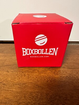
The packaging is a square-shaped box with smooth, flat surfaces and clean edges. It features a bright red exterior with white text and graphics. The box has a foldable design, typical of retail cartons, and appears to be lightweight yet sturdy. The top flaps are folded down neatly, indicating a secure closure.
The packaging is a small, cube-shaped box with smooth, flat surfaces. It features a bright red exterior with a clean, white logo prominently displayed on the front. The edges are sharp and well-defined, indicating a precise folding and assembly process. The box has a glossy finish, enhancing its visual appeal and giving it a premium look.

The packaging consists of several small, square boxes made of smooth, single-layer paperboard. Each box features clean, precise edges and folds, with a bright red exterior. The boxes are adorned with a white logo prominently displayed on the front, along with marketing text. The overall appearance is lightweight and designed for retail display.

The packaging consists of three stacked red boxes, each with a smooth, flat construction. The boxes have clean, precise edges and folds, indicative of single-layer paperboard. The surface is bright red with a matte finish, featuring white text and logos. The overall appearance is lightweight and designed for retail display.

The packaging consists of several small, square boxes that are made of smooth, flat paperboard. Each box has clean, precise edges and folds, indicating a single-layer construction without any visible fluted layers. The boxes are predominantly pink with white text and graphics, featuring the brand name 'BOXBOLLEN' prominently displayed on each side. The overall appearance is lightweight and suitable for retail display, with a glossy finish that enhances visual appeal. The boxes are stacked together, suggesting they are part of a family pack offering.

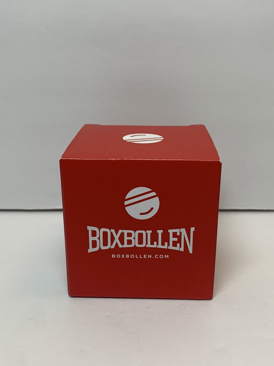
The packaging is a square, folding carton made from a single layer of paperboard. It has a smooth, flat construction with clean edges and folds. The exterior is a soft pink color with a matte finish, giving it a lightweight appearance. The front features a large white logo with the brand name 'BOXBOLLEN' prominently displayed, along with the website 'BOXBOLLEN.COM' underneath. The overall design is simple yet elegant, suitable for retail display.
About the Brand
Boxbollen integrates fitness with entertainment, offering gamified exercise equipment aimed at enhancing user engagement through playful design and interactive technology. Their packaging reinforces brand identity by utilizing bold colors, prominent logos, and retail-optimized paperboard structures.
With a direct-to-consumer business model, Boxbollen prioritizes packaging that balances shelf appeal and logistical efficiency. The company’s packaging choices consistently feature bright, matte or glossy-finished carton boxes, leveraging high visibility and clear brand messaging. This approach supports both individual sales and bulk purchasing options, including family and multi-pack formats, while maintaining cost-effectiveness and scalability for expanding international distribution.
Key Differentiator: Boxbollen stands out for its gamified approach to fitness and its highly cohesive, visually distinct packaging that aligns closely with the playful, community-driven brand ethos.
Design System
Visual Style
Typography is clean and sans-serif, optimized for readability and modern appeal. The color palette centers on bright red and pink hues, accented with white, creating a playful yet energetic aesthetic. Overall style is minimalistic, focusing on high visual contrast and simplicity.
Brand Identity
Brand identity is reinforced through prominent, consistently placed logos and the frequent use of the brand’s web address. Iconography and visual motifs are playful and contemporary, aligning with Boxbollen’s focus on fun and engagement. Visual consistency is maintained across product variants and packaging sizes.
Packaging Design
Material choices favor single-layer, recyclable paperboard, balancing cost efficiency with protection for lightweight products. Structural design emphasizes compact, cube-shaped cartons for stackability and retail display, with clean folds and secure closures for logistics reliability.
User Experience
Packaging is designed to enhance the customer journey through strong shelf presence, easy unboxing, and clear messaging. The playful visuals and tactile finishes support the brand’s emotional positioning, making the experience suitable for gifting and family engagement.
Company Metrics
Business insights for Boxbollen based on available data
Market Positioning
Brand Values & Focus
Key Competitors
Target Market: Health-conscious consumers, families, and fitness enthusiasts in the US, Canada, UK, and Europe seeking interactive, gamified exercise solutions.
Packaging Assessment
Overall Grade
Visual appeal and presentation quality
Packaging durability and protection
Eco-friendliness and recyclable materials
Cost efficiency and value for money
Packaging assessment for Boxbollen based on industry standards and best practices
Frequently Asked Questions
What type of packaging does Boxbollen primarily use?
Boxbollen primarily utilizes retail carton boxes made from single-layer paperboard. These boxes are lightweight, feature vibrant color schemes, and are designed for both visual appeal and logistical efficiency.
How does Boxbollen's packaging support their brand strategy?
The packaging employs consistent branding elements—such as bold logos, signature color palettes, and clear typography—to reinforce Boxbollen’s playful, fitness-focused identity across all consumer touchpoints.
Is Boxbollen's packaging environmentally friendly?
Boxbollen’s packaging uses recyclable paperboard materials, but there is limited evidence of advanced sustainability initiatives beyond standard recyclability.
How does the packaging contribute to the unboxing experience?
The use of vibrant colors, clean box construction, and prominent branding elements creates a visually engaging and emotionally positive unboxing experience, particularly suited for gifting and family-oriented products.
Discover other Sports companies
Explore more companies in the sports industry and their packaging strategies
fizik
Sports
Fizik specializes in high-performance cycling equipment, particularly shoes and saddles designed for competitive cycling. The company combines innovative materials and technology to ensure comfort and efficiency for cyclists.
Sidi Sport S.R.L.
Sports
Sidi Sport S.R.L. is an Italian company specializing in high-quality cycling and motorcycling footwear and apparel. With a long-standing heritage in the sporting goods industry, Sidi is known for its innovative designs and commitment to performance.
Santini
Sports
Santini is a sporting goods company specializing in high-quality cycling apparel and accessories. Founded in 1965, it combines decades of experience with innovative designs tailored for cyclists.