Body Coaches packaging
Body Coaches provides health and fitness solutions through personalized coaching and nutritional supplements, with a packaging strategy that emphasizes high-quality rigid and carton box formats for their products. Their approach prioritizes durability, visual appeal, and clear brand representation to align with their evidence-based, premium positioning.
Packaging Portfolio
Body Coaches utilizes a portfolio dominated by rigid boxes and high-quality carton packaging, characterized by thick-walled chipboard construction, matte and glossy surface finishes, and minimalist branding elements. The rigidity of the boxes ensures excellent product protection and enhances the perceived value of supplements and kits. Branding is consistently applied through foil stamping, debossed logos, and clean typography, reinforcing the luxury positioning. While the packaging supports strong shelf appeal and unboxing engagement, material choices are weighted toward premium substrates with moderate recyclability, indicating a focus on presentation and safety over cost minimization or maximal sustainability.

The packaging consists of a sturdy, thick-walled box with a smooth, matte finish. It features a soft pink color with a subtle sheen, giving it a premium appearance. The box is rectangular with clean edges and corners, indicating high-quality construction. The lid is separate from the base, allowing for easy access to the contents inside. The exterior is adorned with gold foil lettering that reads 'COACH NEW YORK', enhancing its luxury appeal.

The packaging is a sturdy, square box with thick walls, typically around 2-3mm in thickness. It features a smooth, matte finish in a soft pink color. The box is adorned with a prominent logo and text in black, which includes the word 'COACH' and 'NEW YORK', suggesting a luxury brand. The edges are clean and precise, indicating high-quality construction. The box appears to have a lid that fits snugly over the base, typical of rigid boxes, and there are no visible flaps or tabs.
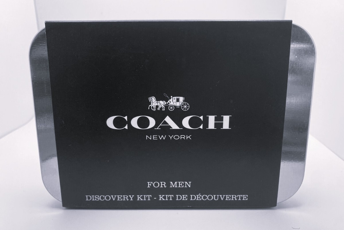
The packaging is a sturdy, rectangular box with a premium appearance. It features thick walls, likely made of chipboard, and has a smooth, matte black finish. The top of the box is adorned with the brand name 'COACH' in large, white serif font, accompanied by a horse and carriage graphic. The overall design is elegant and minimalist, emphasizing luxury.
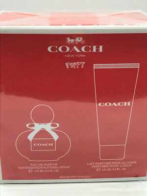
The packaging is a flat, rectangular box made from a single layer of paperboard. It features a smooth surface with clean edges and precise folds. The box is predominantly red with a glossy finish, giving it a vibrant appearance. The front displays a large white logo 'COACH' prominently, along with a graphic representation of a perfume bottle and a lotion tube, both outlined in white. The overall design is minimalistic yet elegant, aligning with luxury branding.
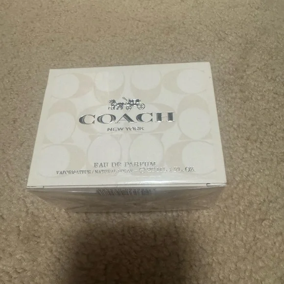
The packaging is a rigid box with a thick, sturdy construction. It features a smooth, white exterior with a glossy finish. The box has clean, precise edges and corners, indicating high-quality manufacturing. The top of the box is adorned with a silver logo that reads 'COACH NEW YORK', which is prominently displayed. The sides of the box are plain, maintaining a minimalist aesthetic. The interior is likely designed to securely hold a perfume bottle, although it is not visible in the image.
About the Brand
Body Coaches operates in the Beauty & Fitness sector, focusing on direct-to-consumer sales of nutritional supplements and personalized wellness coaching. The company's packaging leverages rigid and carton box formats with a minimalist, luxury-oriented design to reinforce brand quality and product integrity.
Their packaging portfolio is characterized by thick-walled rigid boxes and premium retail cartons, frequently utilizing matte and glossy finishes, precise structural engineering, and brand-centric graphics. This approach aims to optimize both the customer’s unboxing experience and product protection, while supporting the company’s focus on evidence-based nutrition and fitness. The high degree of design consistency and quality control in packaging reflects the brand’s commitment to credibility and customer trust.
Key Differentiator: Body Coaches distinguishes itself through the integration of Human Based Nutrition (HBN) into both its product design and packaging, ensuring a tailored, premium unboxing experience that supports its reputation for personalized, evidence-based wellness solutions.
Design System
Visual Style
The visual approach centers on minimalist typography—typically sans-serif or refined serif fonts—paired with soft, neutral color palettes such as matte white, soft pink, and black, often highlighted with metallic accents for a premium feel.
Brand Identity
Logo usage is prominent, with the brand name and iconography (e.g., silver or gold foil logos) consistently featured on the packaging exterior. Visual consistency is maintained through precise edge treatments, uniform box structures, and restrained graphic elements.
Packaging Design
Material selection prioritizes rigid chipboard and high-quality paperboard for structural integrity. Design philosophy emphasizes clean lines, sturdy construction, and a tactile sense of quality, with packaging formats tailored for both logistics safety and luxury presentation.
User Experience
The design supports the customer journey by creating a premium, memorable unboxing moment, reinforcing trust and perceived value. Packaging is engineered for ease of opening, secure product containment, and clear brand messaging, supporting both functional and emotional aspects of the user experience.
Company Metrics
Business insights for Body Coaches based on available data
Market Positioning
Brand Values & Focus
Key Competitors
Target Market: Fitness enthusiasts, health-conscious individuals, and consumers seeking evidence-based nutritional guidance and premium wellness products in the German and broader European D2C market.
Packaging Assessment
Overall Grade
Visual appeal and presentation quality
Packaging durability and protection
Eco-friendliness and recyclable materials
Cost efficiency and value for money
Packaging assessment for Body Coaches based on industry standards and best practices
Frequently Asked Questions
What types of packaging does Body Coaches use for its products?
Body Coaches primarily utilizes rigid boxes and high-quality carton boxes, chosen for their durability, structural integrity, and ability to support a premium brand image. These formats are used for both supplements and promotional kits.
How does Body Coaches' packaging contribute to customer experience?
The packaging design emphasizes minimalist aesthetics, precise construction, and clear branding, resulting in a visually appealing and emotionally engaging unboxing experience that aligns with the company’s focus on health and quality.
Is sustainability considered in Body Coaches' packaging solutions?
While the packaging demonstrates high-quality materials and construction, use of rigid and carton boxes offers moderate recyclability. However, further transparency on material sourcing and eco-initiatives would be needed for a comprehensive sustainability assessment.
Discover other Beauty & Fitness companies
Explore more companies in the beauty & fitness industry and their packaging strategies
Orris Paris
Beauty & Fitness
Orris Paris specializes in creating artisanal skincare products that combine potent botanical ingredients with modern cleansing rituals. The company emphasizes natural, holistic practices in its formulations.
Institut Karité Paris
Beauty & Fitness
Institut Karité Paris specializes in luxury beauty products made with natural Shea Butter, offering a wide range of skincare and body care solutions. The brand combines Parisian heritage with a commitment to quality and creativity in its offerings.
Cultiv Cosmetique
Beauty & Fitness
Cultiv Cosmetique is a French skincare brand that provides organic and eco-friendly beauty products inspired by nature. They focus on effective skincare solutions for various skin concerns.