Bioxidea packaging
Bioxidea specializes in luxury skincare solutions, with a product portfolio centered on face and body masks. The brand’s packaging strategy emphasizes premium materials, elegant structural formats, and a highly visual unboxing experience designed to reinforce its high-end market positioning.
Packaging Portfolio
Bioxidea’s packaging portfolio features a mix of rigid chipboard gift boxes with magnetic closures, decorative ribbons, and compartmentalized inner structures, as well as single-layer paperboard cartons for retail display. The use of matte and glossy finishes, sharp edge construction, and brand-consistent color palettes (primarily black, gold, and pastel tones) is prominent. Packaging is engineered for visual impact and product protection, with an emphasis on tactile luxury and organized presentation. The design supports both premium gifting and efficient retail shelf presence, reflecting a strategic alignment with the luxury skincare segment.

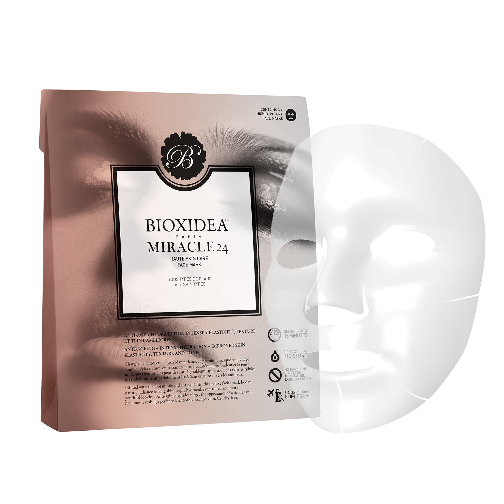
The packaging is a flat, rectangular carton designed for retail display. It features a smooth, single-layer paperboard construction with a glossy finish. The front of the package prominently displays a close-up image of a face, emphasizing the product's application. The edges are clean and precise, with sharp folds at the corners. The overall design is sleek and modern, appealing to a beauty-conscious audience.

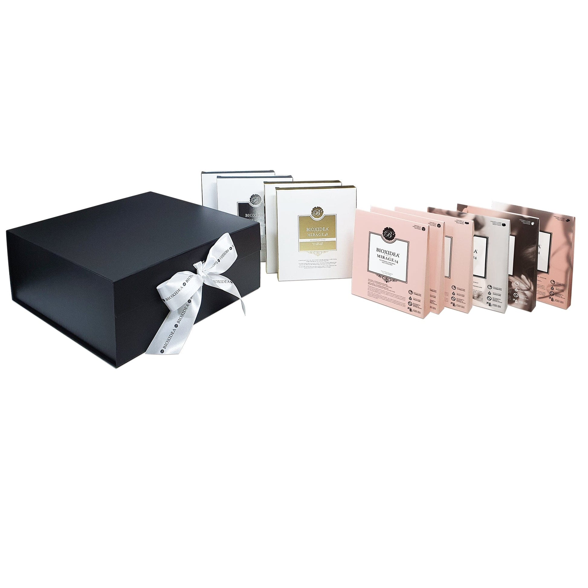
The packaging consists of a large, sturdy black box with a gold logo on the front. Inside, there are three individual white boxes, each with a gold logo and text. The outer box has a smooth finish, while the inner boxes are also smooth but may have a slight sheen. The overall design is elegant and premium, suitable for high-end products.

The packaging is a flat, rectangular carton with smooth, flat construction. It features a pastel pink exterior with a glossy finish. The front displays a large, ornate logo at the top, along with the product name 'MIRAGE24' in a bold font. The edges are clean and precise, with no visible fluted layers, indicating it is made from a single layer of paperboard. The back includes product information and usage instructions in smaller text.

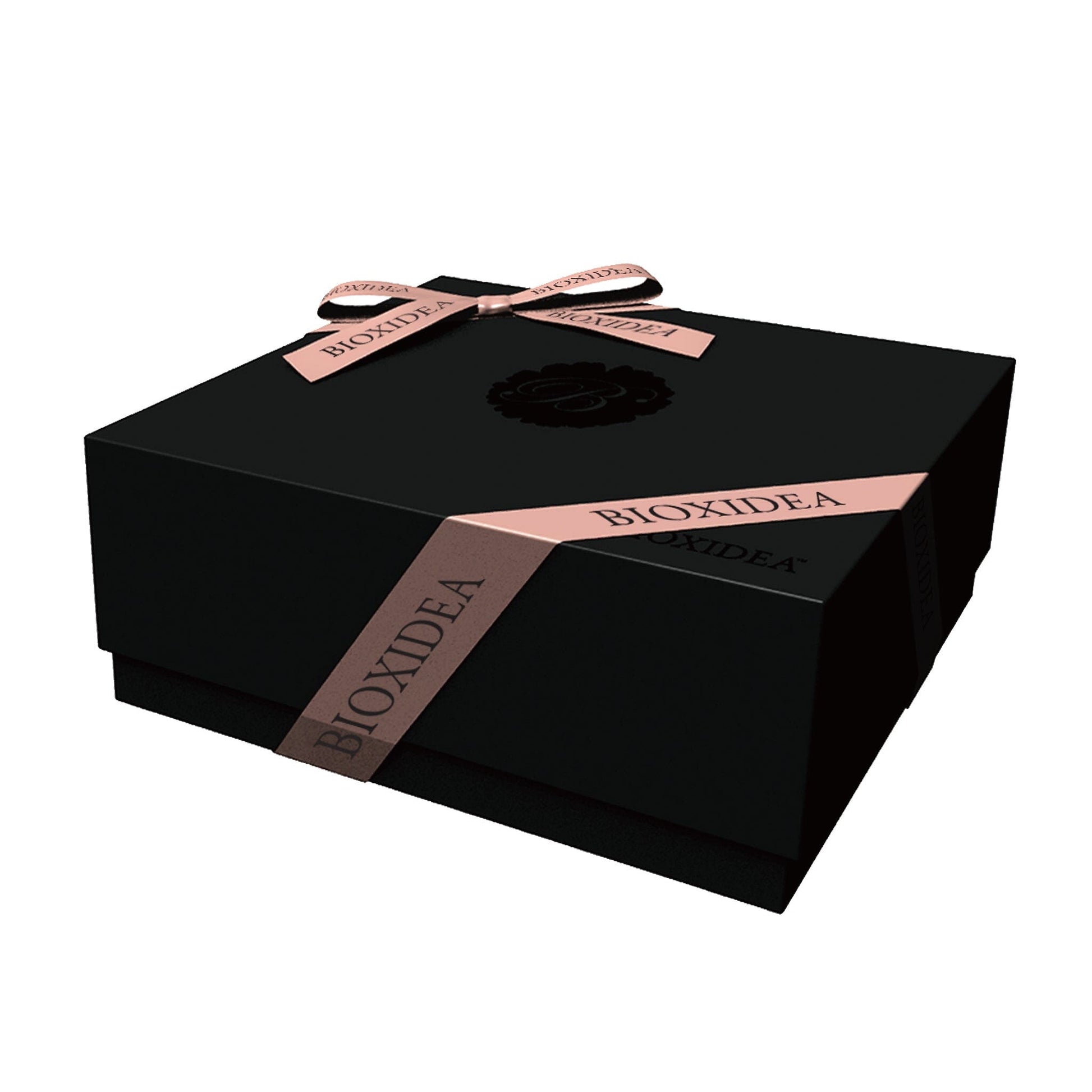
The packaging is a sturdy, thick-walled box with a luxurious appearance. It features a black exterior with a smooth finish and is adorned with a decorative ribbon in a contrasting color. The box has a clean, precise construction with no visible fluted layers, indicating it is made from chipboard. The edges are sharp and well-defined, contributing to its premium feel.

The packaging consists of a thick, sturdy black box with a smooth surface finish. It is adorned with a decorative ribbon tied in a bow at the front. The box appears to have a magnetic closure, providing a premium feel. Inside, there are several smaller boxes or compartments that are neatly arranged, likely containing products. The overall design is elegant and sophisticated, suitable for high-end retail.

The packaging consists of a thick, sturdy chipboard box with a premium finish. The exterior is matte black with a glossy logo and decorative elements. The box features a magnetic closure and a ribbon pull for easy opening. The inner boxes are neatly arranged and are made of lighter paperboard, each with a distinct color and finish. The overall design is elegant and sophisticated, suitable for high-end products.
About the Brand
Bioxidea is a direct-to-consumer beauty brand focused on luxury skincare, notably face and body masks, utilizing advanced formulations and premium packaging. The company’s approach to packaging is tightly integrated with its branding, employing high-quality rigid boxes and retail cartons to deliver a refined customer experience.
Operating from London with a global e-commerce platform, Bioxidea’s packaging is designed to support both product safety and a memorable first impression. Rigid chipboard gift boxes, magnetic closures, and detailed inner compartments are common, conveying a sense of exclusivity and attention to detail. The visual consistency and material quality are aligned with luxury expectations in the beauty sector.
Key Differentiator: Bioxidea differentiates itself through its commitment to luxury unboxing experiences, consistent high-end aesthetics, and innovative use of structural packaging elements that elevate product presentation beyond standard retail norms.
Design System
Visual Style
Minimalist typography with elegant, serif and sans-serif combinations; a color palette dominated by matte black, gold, white, and pastel shades; overall aesthetic emphasizes sophistication and understated luxury.
Brand Identity
Consistent use of the Bioxidea logo in metallic or contrasting tones, clear product naming, and refined iconography. Visual elements are harmonized across all packaging formats to maintain brand recognition and premium perception.
Packaging Design
Preference for rigid chipboard materials in gift sets, magnetic closures, and ribbon embellishments; single-layer paperboard for retail cartons. Structural design prioritizes crisp edges, compartmentalization, and a layered unboxing sequence.
User Experience
Packaging design is optimized for a high-impact unboxing experience, with easy-open features, organized product arrangement, and tactile cues that reinforce brand value. The visual and physical quality is calibrated to exceed customer expectations in the luxury skincare category.
Company Metrics
Business insights for Bioxidea based on available data
Market Positioning
Brand Values & Focus
Key Competitors
Target Market: Affluent, beauty-conscious consumers seeking premium skincare solutions and high-quality presentation, primarily in mature global e-commerce markets.
Packaging Assessment
Overall Grade
Visual appeal and presentation quality
Packaging durability and protection
Eco-friendliness and recyclable materials
Cost efficiency and value for money
Packaging assessment for Bioxidea based on industry standards and best practices
Frequently Asked Questions
What packaging materials does Bioxidea primarily use?
Bioxidea primarily utilizes rigid chipboard boxes with premium finishes, magnetic closures, and decorative ribbons for gift sets, alongside single-layer paperboard cartons for individual masks and treatments.
How does Bioxidea's packaging enhance the customer experience?
The brand’s packaging emphasizes tactile quality, visual sophistication, and organized product arrangement, contributing to a luxurious unboxing experience that aligns with its upscale positioning.
Does Bioxidea use sustainable packaging?
While the brand’s packaging demonstrates durability and premium appeal, the use of chipboard and coated papers suggests moderate sustainability; recyclable elements are present but not maximized compared to leading eco-focused brands.
Discover other Beauty & Fitness companies
Explore more companies in the beauty & fitness industry and their packaging strategies
Institut Karité Paris
Beauty & Fitness
Institut Karité Paris specializes in luxury beauty products made with natural Shea Butter, offering a wide range of skincare and body care solutions. The brand combines Parisian heritage with a commitment to quality and creativity in its offerings.
Cultiv Cosmetique
Beauty & Fitness
Cultiv Cosmetique is a French skincare brand that provides organic and eco-friendly beauty products inspired by nature. They focus on effective skincare solutions for various skin concerns.
Owari
Beauty & Fitness
Owari specializes in 100% natural beauty and fitness products, designed to enhance health and wellness. The company proudly offers its products made in France, emphasizing quick delivery and customer support.