Beate Johnen packaging
Beate Johnen specializes in premium skincare and nutritional products, employing a packaging strategy that emphasizes visual appeal and brand clarity. Their solutions leverage flexible pouches, carton boxes, and rigid containers, aligning with industry standards for product safety and consumer experience.
Packaging Portfolio
Beate Johnen’s packaging strategy incorporates flexible stand-up pouches with resealable closures for supplements, folding carton boxes for cosmetic ampoules, and rigid jars for high-value skincare products. Material choices prioritize lightweight plastic films, single-layer paperboard, and sturdy opaque plastics or glass for jars, balancing product protection with retail visibility. The brand favors pastel color schemes, matte finishes, and clear typography, providing strong shelf appeal and consistent brand messaging across formats. Packaging design is optimized for retail and e-commerce, ensuring both functional security and a premium tactile experience.
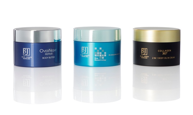
The packaging consists of three jars with a premium appearance, each featuring a thick, sturdy construction typical of rigid boxes. The jars have a smooth surface finish and are made from opaque materials, likely plastic or glass, with a glossy sheen. Each jar is topped with a colored lid that contrasts with the body of the jar, enhancing the visual appeal. The labels are cleanly applied and feature elegant fonts and graphics, indicative of high-quality cosmetic products.

The packaging is a stand-up pouch with a smooth, flat construction. It features a resealable top and a clear window that allows visibility of the contents. The exterior is primarily a soft pink color with a matte finish, giving it a premium appearance. The design includes a logo and product name prominently displayed, along with additional text indicating the product's purpose.

The packaging is a stand-up pouch with a smooth, flat construction. It features a soft, matte finish with a pastel pink color dominating the design. The front displays the product name 'COLLAGEN* BOOSTER DRINK PLUS' in a bold, modern font, accompanied by a subtle graphic of molecular structures in a lighter shade. The top of the pouch has a resealable zipper closure, allowing for easy access and storage. The back of the pouch likely contains nutritional information and usage instructions, though not visible in the image.

The packaging consists of a smooth, flat construction without visible fluted layers, indicative of a carton box. It features a clean, rectangular shape with precise edges and folds. The surface is predominantly white with a glossy finish, enhancing its retail appeal. The front displays a prominent logo and product name in a modern font, with a subtle color scheme that suggests a premium product. The overall design is sleek and minimalistic, aimed at attracting consumers in a retail environment.

The image features a variety of packaging types, primarily focusing on pouches and small containers. The pouches are made of a flexible material, likely a type of plastic or composite film, with a smooth surface finish. They display vibrant colors, with some featuring a glossy finish. The pouches have clear branding elements and product information prominently displayed. The overall shape is rectangular with a resealable top, and they appear to be designed for retail display.
About the Brand
Beate Johnen operates within the beauty and fitness industry, offering a comprehensive range of skincare and nutritional supplements. Their packaging approach utilizes modern materials and formats to ensure both product integrity and retail appeal.
The brand’s packaging portfolio includes stand-up pouches for supplements, folding cartons for cosmetic ampoules, and rigid jars for premium skincare products. Consistent branding, pastel color palettes, and matte finishes are prevalent, supporting a cohesive shelf presence. The company’s marketing and packaging choices reinforce its focus on quality and customer engagement, but there is moderate evidence of sustainability integration.
Key Differentiator: Distinctive use of flexible pouches and premium jars with consistent branding elements, enhancing both product visibility and perceived value within the competitive beauty market.
Design System
Visual Style
A soft, pastel-oriented color palette (primarily pinks, peaches, and whites) combined with modern sans-serif typography and matte or glossy surface finishes creates a clean, approachable, and premium aesthetic. Minimalistic layouts are used for clarity and visual hierarchy.
Brand Identity
Consistent logo placement (often the full 'Beate Johnen' or 'BJ' monogram), use of product line identifiers (e.g., 'Nutri Solution', 'Wrinkle Expert'), and clear iconography support instant brand recognition. Visual elements are unified across packaging types for a cohesive brand experience.
Packaging Design
Selecting flexible films for pouches, paperboard for folding cartons, and rigid plastics or glass for jars, the structural philosophy emphasizes ease of use, product protection, and retail readiness. Resealable closures and windowed pouches are used for consumer convenience and transparency.
User Experience
Design features such as resealable pouches, ergonomic jars, and clear labeling support a positive customer journey from purchase to unboxing. Visual coherence and tactile finishes reinforce the brand’s premium positioning and facilitate repeat purchase behavior.
Company Metrics
Business insights for Beate Johnen based on available data
Market Positioning
Brand Values & Focus
Key Competitors
Target Market: End-consumers seeking premium beauty and wellness solutions, with a focus on the German and broader European markets through direct-to-consumer e-commerce channels.
Packaging Assessment
Overall Grade
Visual appeal and presentation quality
Packaging durability and protection
Eco-friendliness and recyclable materials
Cost efficiency and value for money
Packaging assessment for Beate Johnen based on industry standards and best practices
Frequently Asked Questions
What types of packaging does Beate Johnen use for their products?
Beate Johnen employs stand-up flexible pouches, folding carton boxes, and rigid jars, selecting materials and structures that balance shelf appeal, protection, and brand presentation.
How does Beate Johnen’s packaging support their premium positioning?
The packaging utilizes matte finishes, soft color palettes, and prominent brand elements to convey a premium aesthetic, while rigid containers and resealable closures reinforce product safety and a high-quality unboxing experience.
How sustainable is Beate Johnen’s packaging?
While some materials are recyclable and designs are lightweight to reduce waste, comprehensive evidence of advanced sustainability practices such as biodegradable materials or carbon-neutral operations is limited.
Is Beate Johnen’s packaging designed for e-commerce logistics?
Yes, packaging formats such as resealable pouches and sturdy cartons provide adequate protection for direct-to-consumer shipping, supporting their B2C e-commerce model.
Discover other Beauty & Fitness companies
Explore more companies in the beauty & fitness industry and their packaging strategies
Institut Karité Paris
Beauty & Fitness
Institut Karité Paris specializes in luxury beauty products made with natural Shea Butter, offering a wide range of skincare and body care solutions. The brand combines Parisian heritage with a commitment to quality and creativity in its offerings.
Cultiv Cosmetique
Beauty & Fitness
Cultiv Cosmetique is a French skincare brand that provides organic and eco-friendly beauty products inspired by nature. They focus on effective skincare solutions for various skin concerns.
Owari
Beauty & Fitness
Owari specializes in 100% natural beauty and fitness products, designed to enhance health and wellness. The company proudly offers its products made in France, emphasizing quick delivery and customer support.